Create interior designs for ACDF Architecture
Create interior designs for ACDF Architecture,
Canadian architecture ACDF has created interiors of the technological headquarters of the American Video Publisher, 2K in Montreal, Canada.
The interiors of the new offices feature a plate of materials that evoke the interior of the boutique hotel instead of technology headquarters, adding “warmth and sophistication”.

The project has been designed as a good example of how ACDF has invented a specific software atmosphere,
such as offices, and giving traditional feelings to traditional elements without extravagance.
Design features
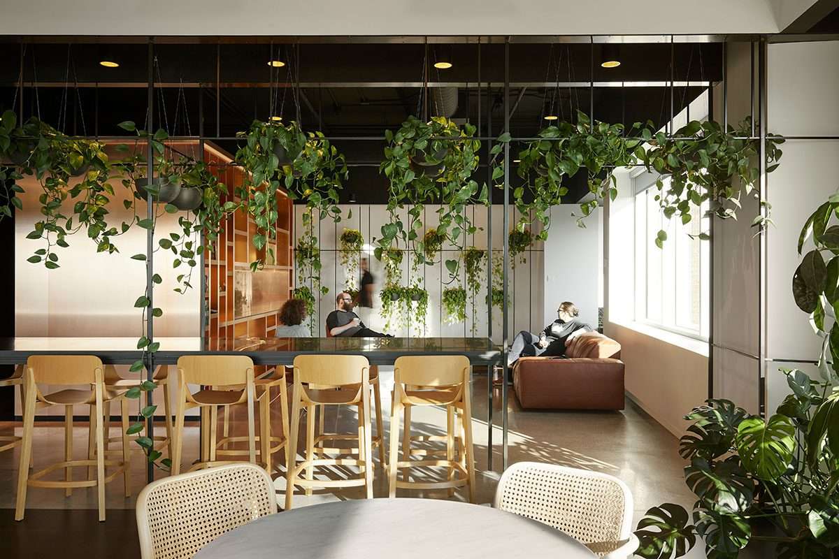
Designs are rich in interior gardens for each team, as shelves, wooden panels,
black metal structures, copper panels and colored glass are mixed to create a bold and sharp atmosphere.
Montreal is a center for gaming companies, and 2K wanted a distinctive office on others for its Cloud Chamber.
ACDF was inspired by residential architecture in the middle of the century,
as a starting base, playing with lineage, vision lines and unilateral color system.
It has an area of 30 thousand square feet (2787 square meters) and accommodates more than 150 people.
Looking at the large capacity, ACDF designed dramatically lit areas,
in response to a very specific work environment for developers,
and other angles immersed in light -like gardens and external terraces.
The studio has provided a coherent design, creating a range of different atmosphere,
from more privacy to general, which is combined together in a flowing way.
The contrast between darkness and the motivation of light
Located on the fifth floor of a former data center of a bank credit card that has been largely renewed.
The studio designed the office on the topic “contrast between calming darkness and motivating light.”
The creation of contradictory areas “for a more focused and independent work with a darker color”
would bring intimate and brighter aesthetic areas, while the white bishop aims to express openness and cooperation.
Work spaces were organized in the open floor scheme as groups with an area that can be identified for each of the 2K teams.
Each team has its own open area for individual work,
characterized by furniture that corresponds to the faded colors of the carpets in their small offices and the locations of the meetings.

ACDF worked with the windows of the building that comes out of the interface,
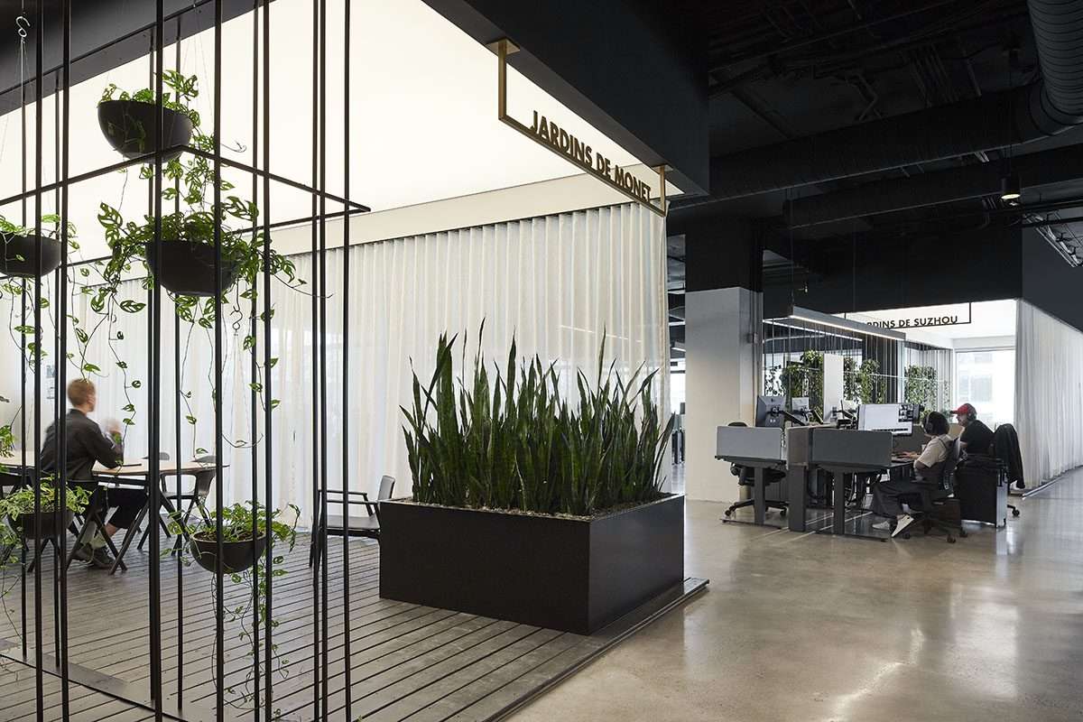
to create “bright cooperative gardens for each team.
He benefited from the 3D cover of the building and used its natural pillars to distinguish between the regions.
Therefore, the gardens are equipped with a wooden surface, black metal structures,
and stents of the writing panels, hanging plants,
and white curtains that can be opened or closed according to the required privacy level.
Instead of adding the traditional walls to divide the ground plate,
ACDF used the distances between existing structures and closed central sizes to create an uncontrolled rotation with moments that encourage interaction,
thus enhancing a sense of team spirit.

Unifying a series of internal units
From the areas of facilities to the elevator columns, a series of internal units is visible and wrapped in a warm plate of copper panels,
wooden panels and colored glass.
To add these sizes, which also include an entrance, a reception office,
special offices and storage of coats for the harsh winter classes in Montreal,
a sense of arrangement and rhythm, and the skill of the sea of offices with skill.
Various lighting strategies, from the back tension to open air ducts,
also add to the roofs extending all over.
Other details are cabinets made of pale oak wood, polished concrete floors,
and elegant and elegant furniture pieces, which inspire a future atmosphere for space.
The office space in Montreal, like most major cities, is empty because of the epidemic,
and many employers and owners of buildings seek to find ways to create attractive workplaces.
ACDF is designed by an environment that welcomes and inspires,
through high -quality materials and deliberate details, by providing larger spaces for teamwork and socialization balanced with special spaces that resemble the home comfort to focus fully on work.
The project provides space where employees and teams can find what they are looking for at a certain time, while also encouraging society and enhancing teamwork.
By choosing a silent more complex design, designers sought to create a composure and improved space in the office.
For more architectural news


