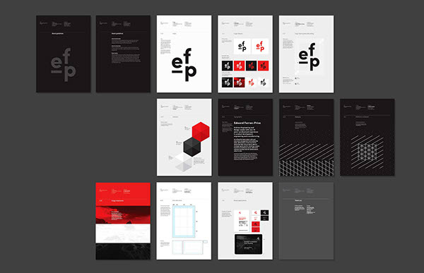
ef-p
Edward Farren-Price is an engineer with a history as an industrial designer working at top firms like Dyson. He required a brand identity and company name to help create a memorable impression with his future clients. After discussions and answering a set of questions I arrived on a solution that revolved around the idea of three; three letters in his new business name while working in three dimensions.
This idea was expanded into all aspects of the brand identity – three colours; black, white and red, a pattern based on the isometric grid showing three dimensions, broken into three interlocking parts; point, line and plane as well as layouts based around divisions of thirds. Imagery of water was used occasionally to display the patterns found in nature and coupled with the ef-p patterns as a juxtaposition. All of this was then applied to stationery, email signature, holding page as well as MS Office temples for future use.
Studio Photography: Robin Hearfield and Harley Johnston