OMA Converts a Historic Bakery into the Lantern Arts Centre
Dutch architectural studio OMA has undertaken the transformation of an early-1900s bakery and warehouse into a vibrant arts centre, named the Lantern Arts Centre, as part of the Little Village development in Detroit. This project, which encompasses 22,300 square feet (2,072 square metres), offers a versatile space for two arts non-profits and includes retail, studio spaces, and an expansive courtyard.
Historical Context and Building Composition
The Lantern combines three distinct structures, each built at different times between the 1920s and 1960s. The oldest buildings feature brick construction, while the newest incorporates a Concrete Masonry Unit (CMU) wall. The structures are arranged in a linear fashion, with the northernmost building rising to two storeys and the others remaining single storey. This amalgamation of architectural styles and materials presents a unique challenge and opportunity for adaptive reuse.
Design Philosophy and Execution
OMA’s design approach sought to blend the solidity of the former bakery with elements that create a sense of mystery and openness. According to Jason Long, an OMA partner, the renovation aims to balance familiarity with a fresh, inviting aesthetic. This is achieved through the strategic use of windows and light, transforming the robust, industrial building into a beacon of creativity and community.
Courtyard and Structural Additions
A notable feature of the Lantern is its central courtyard, created from a collapsed section of the original structure. The courtyard includes terracotta bleacher steps and a white-painted lattice that evokes the metal rafters left exposed from the original building. This semi-enclosed space serves as a communal area that connects the various parts of the arts centre.
At the rear of the courtyard, a new structure with a sawtooth roof was added. This structure, clad in standing seam metal, acts as the main entrance and links the two-storey and CMU buildings, providing a cohesive transition between the old and new elements of the complex.

Facade and Window Design
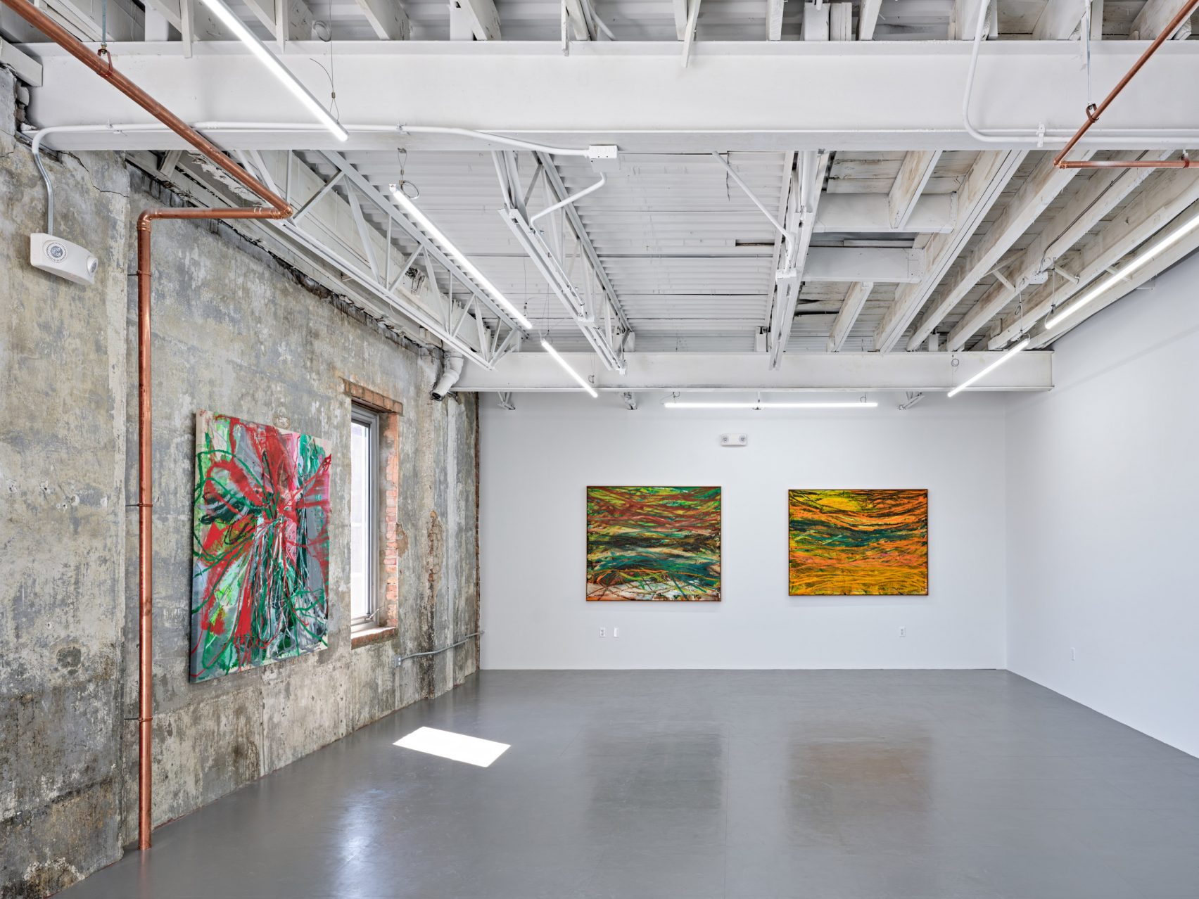
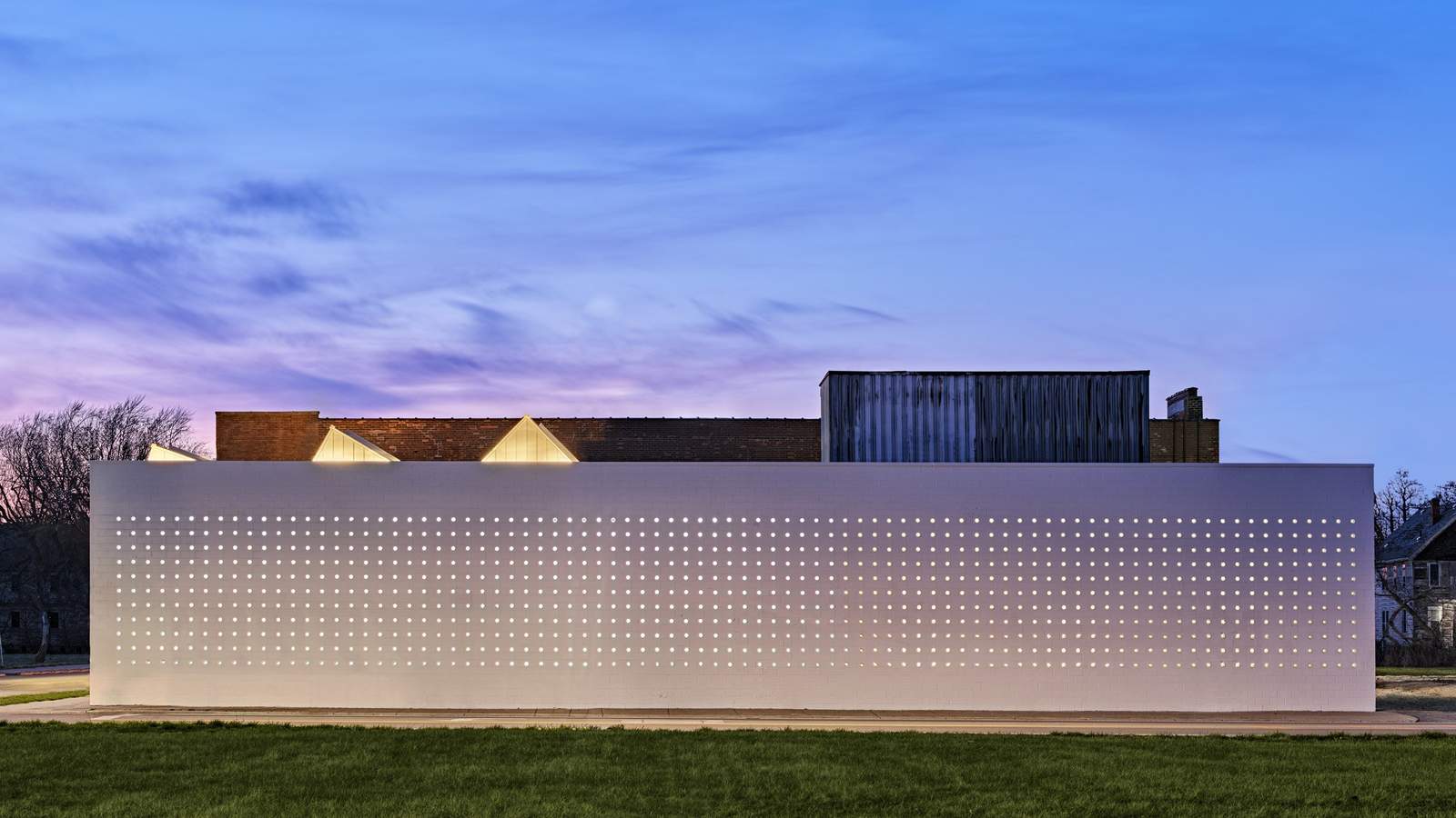
The renovation of the two-storey brick structure involved repairing and expanding boarded-up windows to enhance natural ventilation and light. Artist studios now occupy the second floor, benefiting from the improved interior environment. The south building’s original CMU wall presented a different challenge; instead of conventional windows, OMA opted to drill 1,353 holes into the facade. These holes were filled with glass blocks and, when illuminated from within at night, create the “lantern” effect that inspired the building’s name.
Interior Aesthetic and Functional Spaces
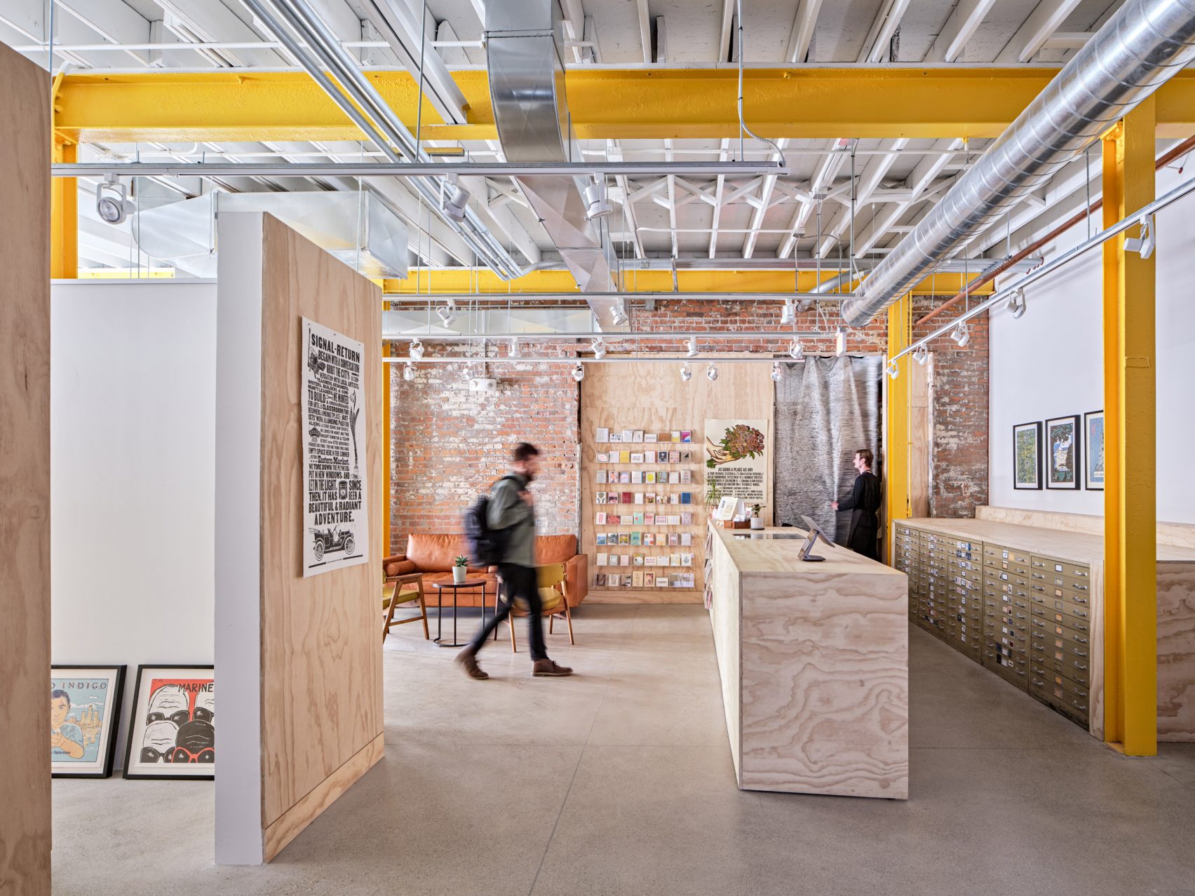
Inside the Lantern, much of the industrial character was preserved, with exposed brick walls and visible I-beams, some painted yellow for emphasis. The choice to leave many of the original finishes exposed highlights the building’s historical context and industrial past.
Plywood framing is used to delineate open spaces and form built-in shelving and reception areas. The integration of state-of-the-art HVAC systems, left exposed, complements the industrial aesthetic while ensuring modern functionality. These design choices create a raw yet polished environment suitable for artistic and community activities.
Community Impact and Future Prospects
The Lantern is part of the broader Little Village development spearheaded by the Library Street Collective. This initiative aims to repurpose historical structures into vibrant arts spaces. Other projects in the development include the conversion of a church into an art gallery by Peterson Rich Office and the transformation of an industrial marina by SO-IL and Office of Strategy + Design.
Anthony and JJ Curis, co-founders of the Library Street Collective, expressed their excitement about the Lantern’s potential to support local businesses, artists, and non-profits. They envision the arts centre fostering inclusivity, education, and accessibility, thereby positively impacting the neighborhood and the wider community.
Conclusion
OMA’s conversion of the bakery and warehouse into the Lantern arts centre exemplifies a thoughtful and innovative approach to adaptive reuse. By preserving the historical integrity of the original structures while incorporating modern design elements, the Lantern stands as a testament to the potential of architecture to revitalize and enrich urban spaces. The project not only enhances the cultural fabric of Detroit’s Little Village but also sets a precedent for future developments that seek to balance heritage and contemporary functionality.

Photography: Jason Keen
Finally, find out more on ArchUp:


