Optical store design with organic shapes made of clay
Optical store design with organic shapes made of clay,
Alan Prekop designed an optics store with organic, liquid forms diluted with clay in Bratislava, Slovakia.
Design Features
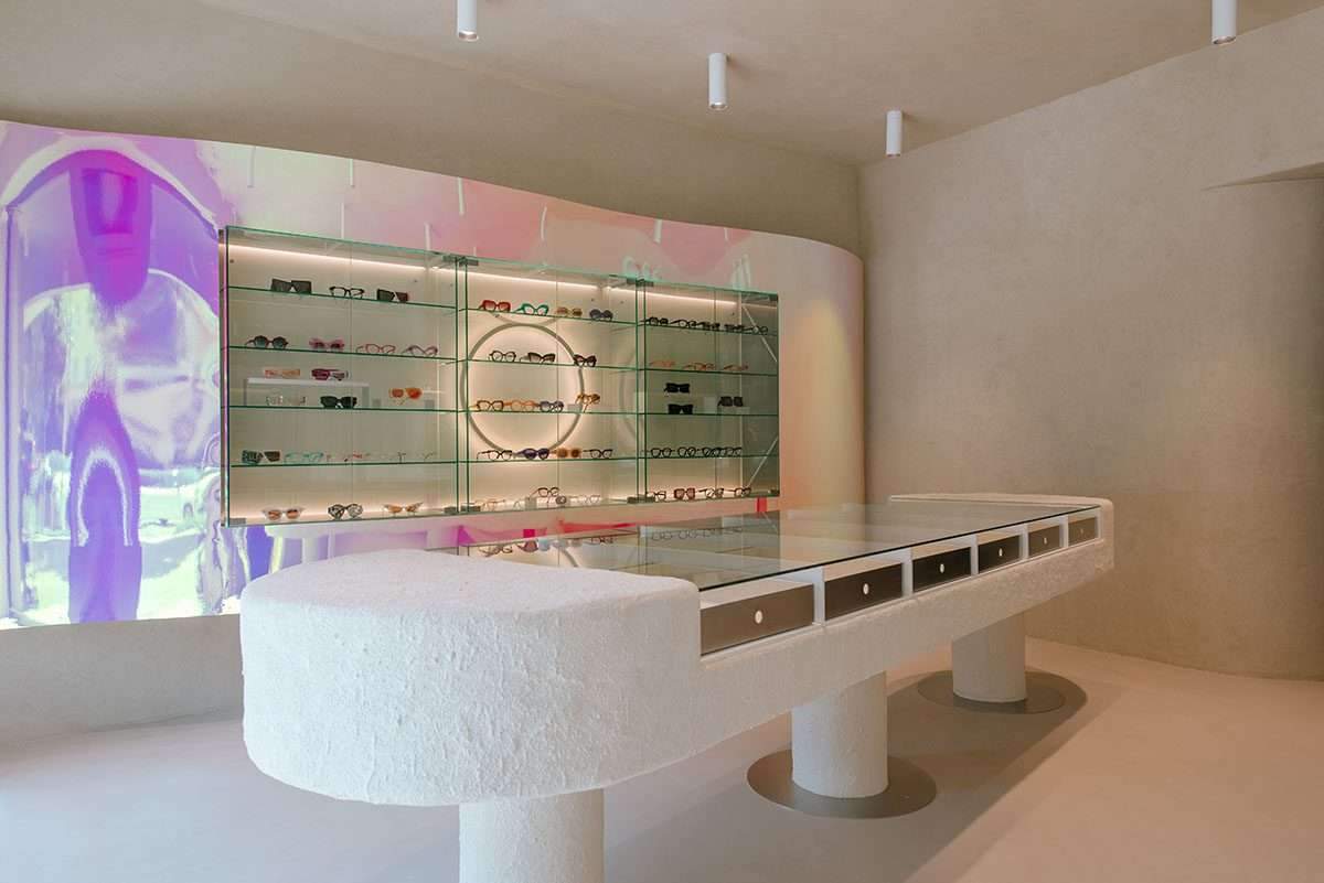
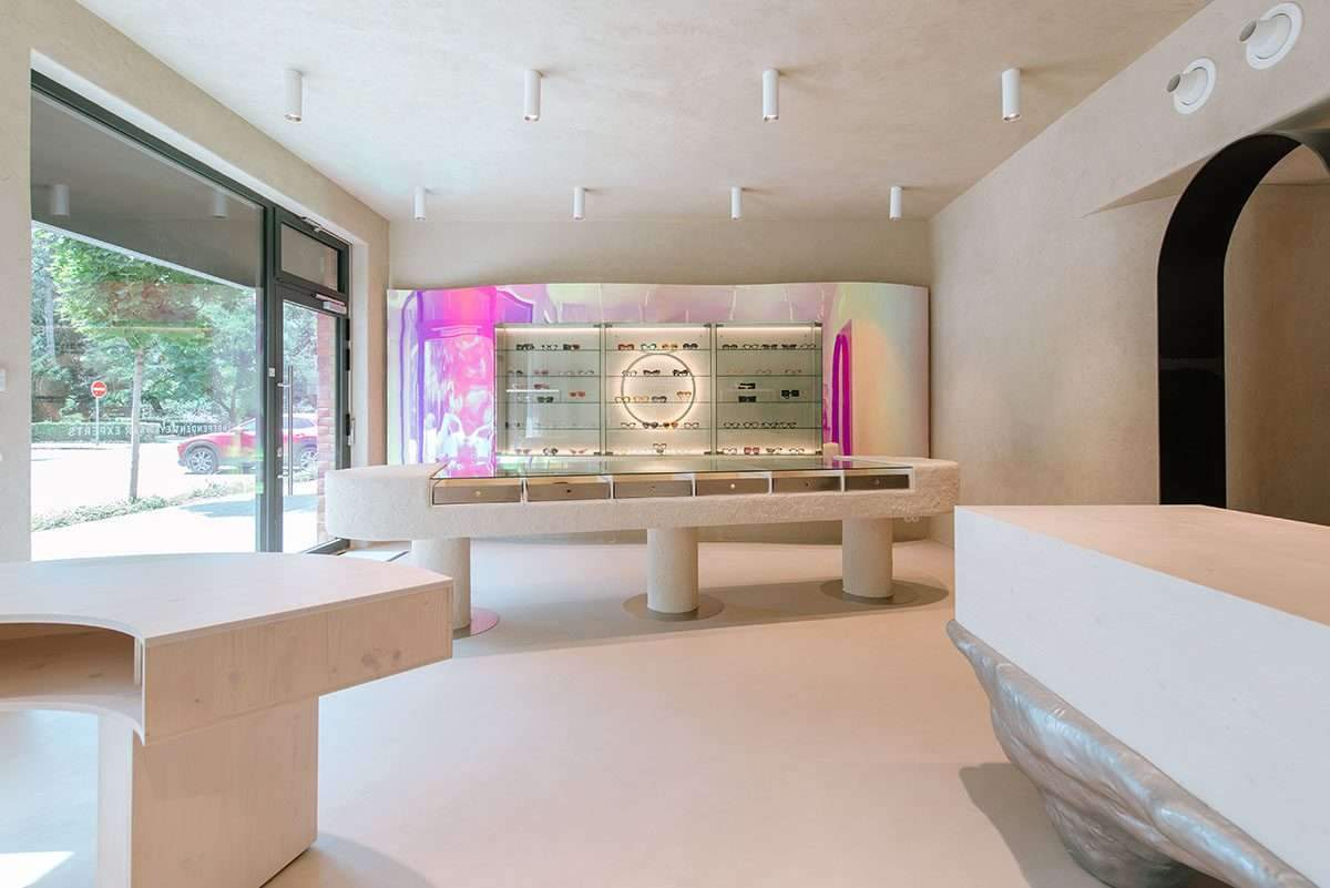
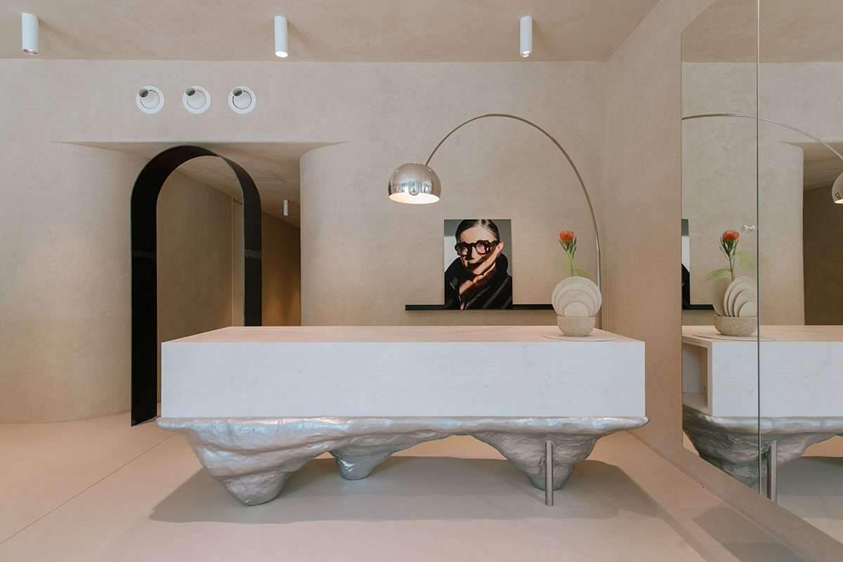
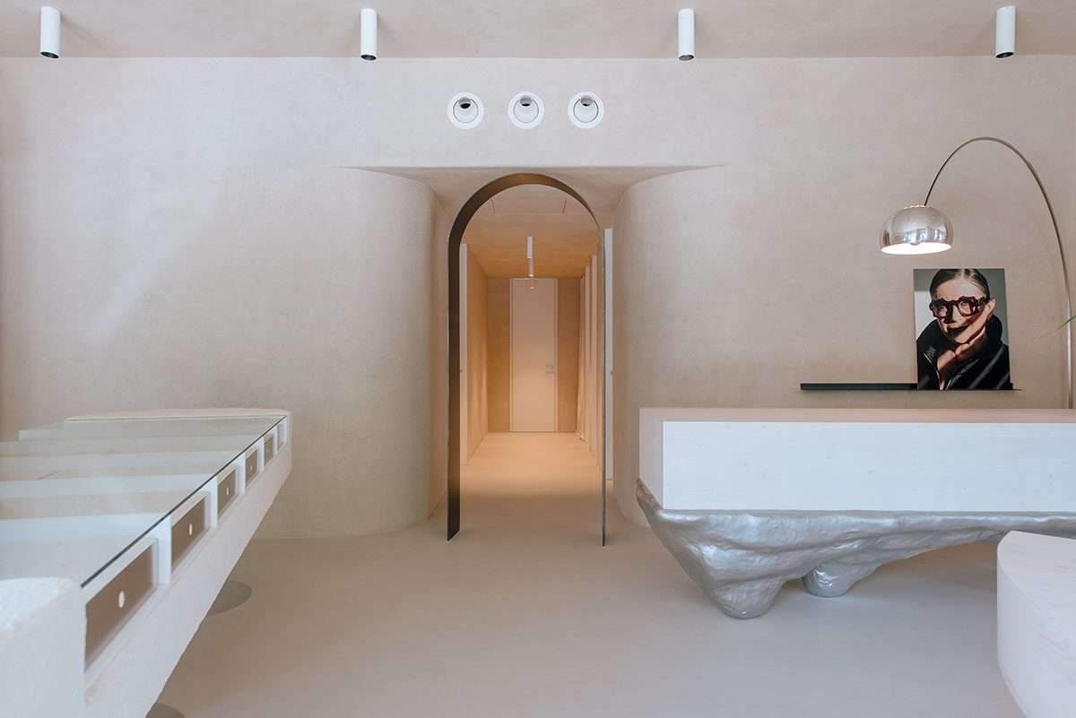
The 90-square-meter store, named IOKO, highlights artistic touches and smooth surfaces with a carved display table in the center of the space.
The materiality of the choice of colors may play a major role in controlling the space,
by presenting soft transitions.

Like the color screen that reflects off the wall creating a playful contrast,
the shop’s interior design refers to the materials the products are made from.
Architect Alan Prikop used natural materials in the showroom,
as these mugs are handmade from natural materials such as cotton acetate.
Design material
The most important materials used inside the store are clay, steel and wood,
and considering that clay is the main material,
it has been given priority to be used on walls in the form of plaster.
As the terracotta plasters frame the space in an organic and fluid form,
it flows from the main showroom into the background, office and optician’s examination room.
The role of this material is to naturally guide clients from one space to another,
as the boundaries between the individual functions are formed by a steel arch.
The gate also enhances the feeling of the connection between functions and the fluidity of space,
and this gate is an unclosed arc.
Design shape
The main showroom is made up of five elements that act as solitaire elements,
at the same time an abstract and deconstructed image of the glasses is created, by grouping them together.
The two main features are the bi-color wave and the clay table where the products/glass is displayed.
The earthenware table was designed by Alan Prekop in collaboration
with the studio in Bratislava and artistic ceramicist Zheni, who completed the countertop treatment in her modular style.
While the table takes its soft shape using multiple layers of clay so that the table does not have a regular formal shape.
Thanks to this, the table becomes the most interesting element of the showroom,
which with its structure shows the organic nature of the natural materials used in the interior.
The product display is also designed like a wave emerging from the wall, with its color and significance;
it sets the tone for the entire interior design.

Bi-color chips are also used on the prominent waveform of the screen,
which reflects the light flux at different angles.
Thus changing the color spectrum of the interior, the entire interior is decorated in soft and light sandy shades.
For more architectural news
The design of Claridge’s first spa evokes traditional Japanese temples