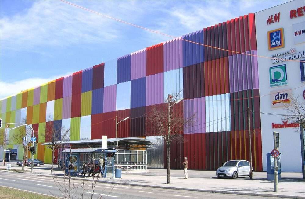
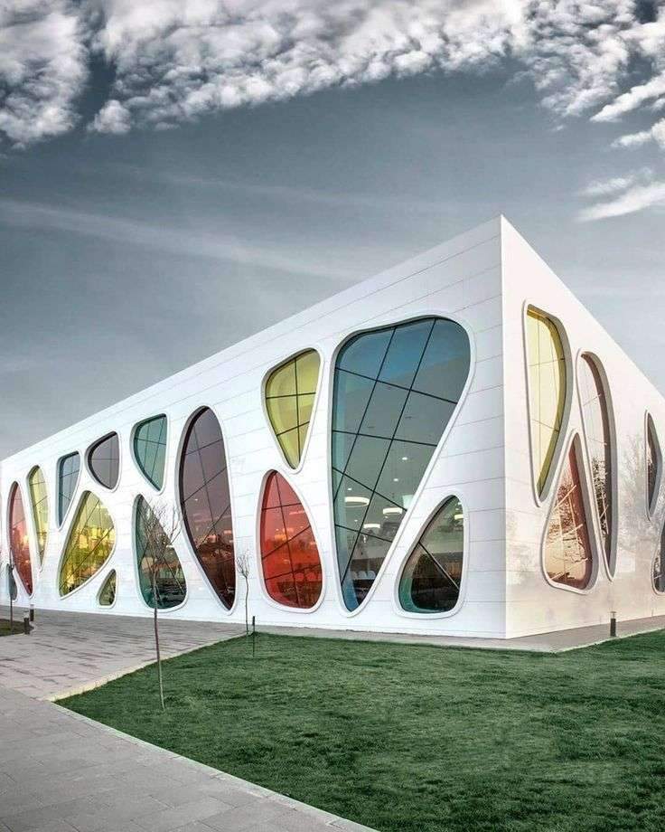
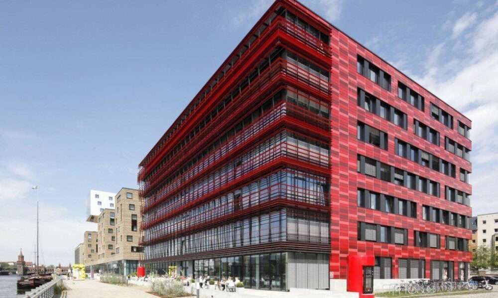
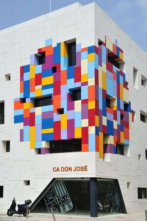
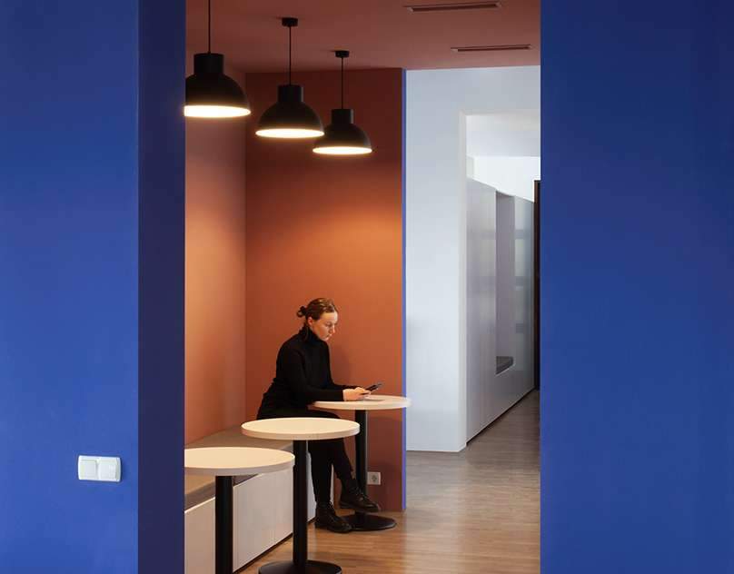
While the architecture of a building affects our lives in many different dimensions, the choice of colors in construction makes the way we build more impactful.
The use of color in architecture has evolved a lot in the past few years.
Although colors have a great connection with the subconscious mind, they play a vital role in creating harmony between interior and exterior architectural elements.
From building materials such as wood, stone, brick and fiber cement to popular textures for ceramic tiles and windows, the look and feel of each color is of great importance to creating the perfect atmosphere for a building.

The importance of colors in construction
Be a sense of connection
Different colors carry different meanings to different people and even in different cultures.
So, when you are trying to communicate a message through a building, there is no better way than to look for colors that not only follow your culture but also people’s feelings.
Choosing the right colors in the building also creates a sense of communication between the people in that building.
reflect the essence of the building
Color is one of the most powerful expressive elements in architectural design that is used to emphasize the character of the entire building.
You can incorporate different materials, patterns, and most importantly, colors into your building to reflect the vision behind your brand.
Many of the world’s leading companies have paid great attention to developing sophisticated color palettes to stand out their brand among competitors and spark an emotional connection with customers as well as employees.
Impact on our psychology
We are all wired differently based on our experiences, associations, and abilities, and this affects the way we perceive visual stimuli.
Colors are the determining factor in how different people respond to their surroundings, and they can either improve moods of calm or joy, depending on how they are used.
A lot of color research related to principles of psychology states that the colors we choose to build and design a building have a long-term effect on our subconscious mind.
This is why all advanced builders never neglect the principles of color psychology while planning the architecture of a building.
It is contained
Color is a visual language that all of us understand, and it affects our emotions and mood in many different ways.
This is why, during the construction of a new building or the renovation of an old building, choosing the right color palette is essential to achieving the functionality of that space.
Materials used to create colors in buildings
You have probably come across a project for a kindergarten, school or recreation center once before.
And I thought a touch of cheerful color on the front would do that a lot.
However, what options do we have for bringing color into the architectural facade?
By default, we think of the most basic, available, and seemingly economical material: paint.
Paint is advancing lately with new and better types developing now and then, but is it good enough for your exterior?
You’ve probably heard once or twice before that plain old paint on the facade makes a building look cheap and unfashionable.
But how do you add a fun variety of color to your interface?
How is an architectural elevation designed?
We will give you a list of materials that are available in a variety of colors and that you can use flexibly and fashionably to wrap your elevations

List of materials for your architectural facade
minerals
Painted metal is one of the elegant solutions to the issue of color, and colored metal sheets come in different shapes,
Most of them are made of aluminum or stainless steel.
The panels are also painted and coated with protective chemicals to keep them bright and shiny.
Sometimes, instead of choosing the normal hardboard,
Architects prefer to use aluminum mesh panels with small regular holes.
These panels give a semi-transparent effect to the architectural façade.

glass
Colored glass is another option to revive your architectural facade,
and glass acquires color when some minerals and metal oxides are added to it during its production.
For example, iron oxide gives glass a bluish-green tint, while nickel gives it a blue,
violet, or black tint, depending on its concentration.

Ceramic
Ceramic is very attractive as pottery,
but it is also popular as a material for flooring and wall cladding.
Especially in damp areas like bathrooms and kitchens.
It has three main types: porcelain, stoneware, and clay,
which is one of the forms of ceramics that belongs to the porcelain family.
It has been used since ancient times for sculptures, vessels,
and decorative elements and to add a touch of red to architectural facades.

concrete
Although concrete slabs and tiles feature a shade of cement gray,
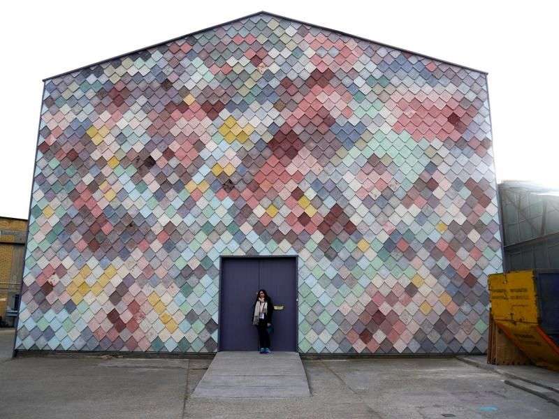
except that it will still look good in color, such was the case with the Yardhouse in London.
The Yardhouse in London, United Kingdom
Yardhouse displays the beauty of concrete tiles when given different colours,
The plank-like tiles were handcrafted on site and randomly colored with various pastel dyes.
The result is this diverse, harmonious, and charming façade.
While this could be seen as a paint job, the final impression is definitely more amazing.

hybrids
If one material doesn’t work, you can use several.
One way to do this is to combine two or more different materials into a single interface.
But, another step forward is to combine these different materials into one,
and this is what many manufacturers of architectural materials are doing now.
Stone materials in the design of walls and floors in commercial and residential buildings

