Beauty center design with green interiors

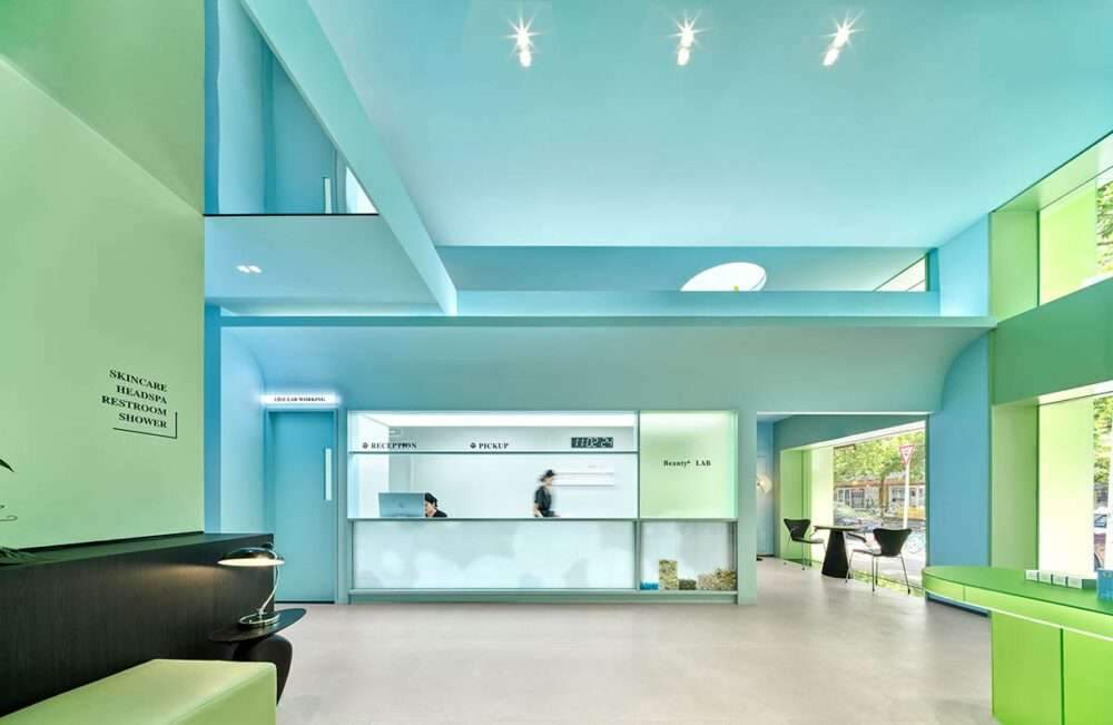
Chinese design company ISENSE DESIGN created a beauty and skin care center full of green interiors
by combining “organic nature” and “scientific professionalism”.
The 155-square-meter center, named Beauty Technology for Skin Care,
is located in Shuangjing Street, Chaoyang District, Beijing, China.
Design features
The designers faced the challenges of creating a memorable brand identity,
integrating the brand seamlessly into the community,
Achieving a visual balance between the concepts of “organic nature” and “scientific professionalism”.
Currently, most salons are dominated by neutral colors such as beige, wood, black and white.
There are no homegrown beauty brands that embrace strong spatial color.
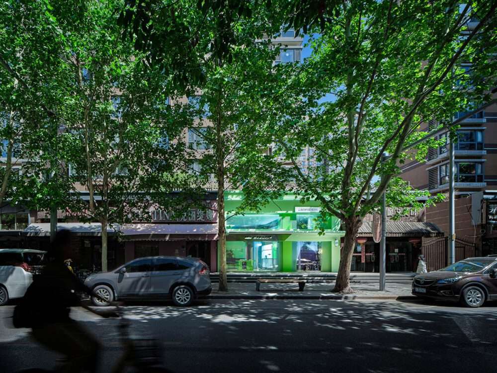
Therefore, the studio decided to boldly use the sixth color of Beauty Cloud White to seize the opportunity to become the first color IP.
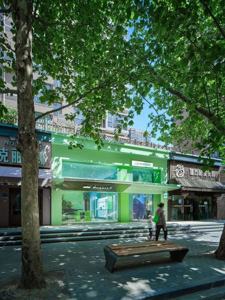
The sixth main color is applied to the exterior facade and small interior spaces,
instantly impressing people with the trademark green color.
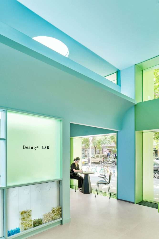
While blue, as an additional color, is widely used in indoor public areas to balance green and achieve a natural, refreshing and calm feel in the space.
The designers connect the reception desk, cash register, and drafting room to the logistics space.
What makes the space LAB-like is the main view in the lobby.
Customers can also see the whole process of formulating skin care essence through the window.
They can either take the unused essence home or put the empty bottle in the collection box on the bar counter after trying the beauty products.
The dynamic lightbox displays images of light and shadows
that correspond to the dappled tree shadows cast by sunlight, and the texture can be changed.
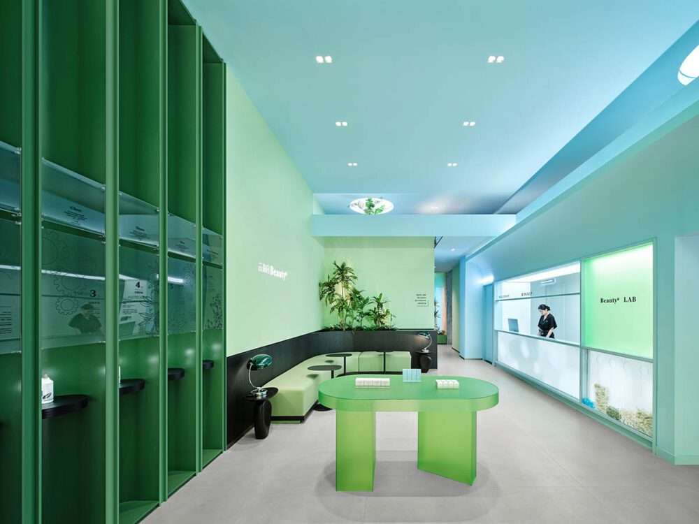
Therefore, the designers created an optically false second floor by interlocking the local blocks to enrich the spatial hierarchy.
The functions of the partially accessible area include material storage, ductwork maintenance, etc.
The entrance display area is used to display the brand culture and some products.
To maximize the work area, the corridor is arranged after the skin care room in a zigzag fashion.