Brooklyn Farm-to-Table Restaurant Design Inspired by Wyeth
A Moody Take on Nature: Brooklyn Farm-to-Table Restaurant Draws from Andrew Wyeth’s Palette
In the heart of Williamsburg, Brooklyn, a new dining experience merges rustic artistry with urban design. Field Guide, a Brooklyn farm-to-table restaurant, redefines contemporary dining by evoking pastoral sensibilities rooted in the landscapes of Upstate New York. Designed by local architecture studio Mammoth, this space bridges the industrial edge of the city with the muted naturalism of American painter Andrew Wyeth, whose work deeply influenced the restaurant’s tone and aesthetic.
Blending Bucolic Roots with Brooklyn Edge
Chef Tim Meyers, the culinary mind behind Field Guide, sought to channel the essence of his childhood in Upstate New York. His vision was not simply culinary—it was spatial, emotional, and nostalgic. He enlisted Mammoth, led by principals Maryana Grinshpun and Jessica Maktal, to reimagine a former Chinese restaurant into a setting that would feel both elevated and grounded in memory.
Mammoth responded with a design concept that carefully walks the line between rural warmth and modern restraint. Inspired by 19th-century pre-globalization eateries, they looked beyond contemporary restaurant tropes. Instead, they built a visual language referencing Dutch and American realism, with Wyeth’s tonal restraint and light play as a guiding thread.

Architectural Materiality and Light as Narrative
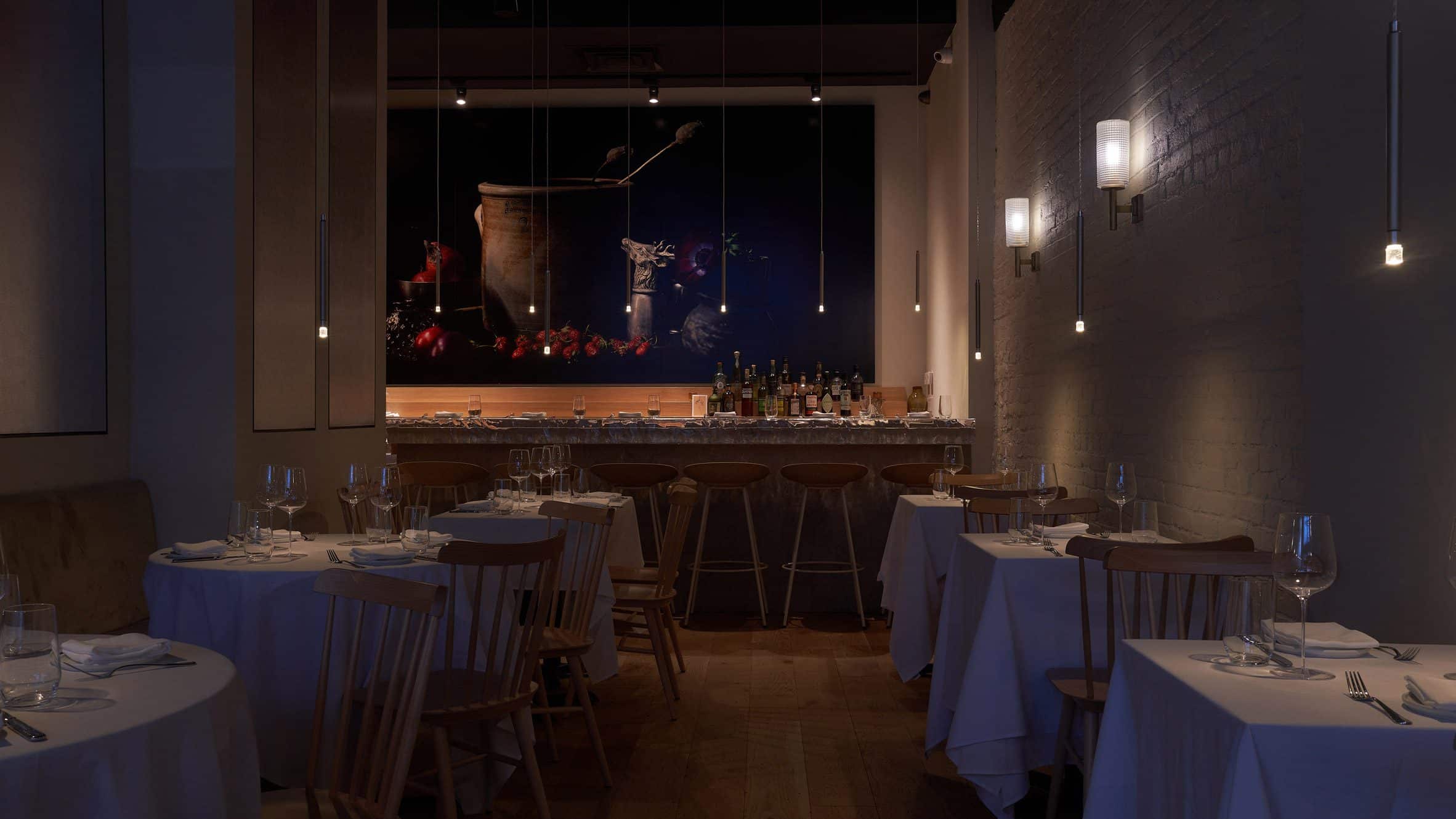
Upon entering the restaurant, visitors encounter a quiet theatricality. Pendant lights by Lodes, each no larger than a flame, gently sway from the ceiling. This reimagining of candlelight gives each table a quiet intimacy, recalling traditional dining rituals while remaining technically modern.
The most striking architectural element is the bar, which anchors the rear of the space. Its limestone base supports a hand-sculpted translucent acrylic top, a tactile surface that ripples like water and reflects ambient light with a soft glow. This ethereal effect was directly inspired by Hiroshi Sugimoto’s “Appropriate Proportion” installation, adding depth and mystery to an otherwise functional element.
Behind the bar, a large photographic work by Oliver Jevremov evokes the still-life tradition. It features objects sourced from Williamsburg, including wild fruit and abandoned fragments—small symbols of place that ground the composition in Brooklyn’s present while nodding to rural pasts.
Material Palettes and Textural Dialogue
The space is characterized by a quiet tension between contrast and continuity. The floor is oak, warm and tactile, while the walls are clad in aluminum channels and silver leaf—a reinterpretation of wainscoting that anchors the restaurant in a sleek urban vernacular.
According to Grinshpun, this contrast is intentional. “We didn’t want a space that leaned on clichés. We asked ourselves what restaurants looked like before they all started looking the same,” she explained. That principle is seen in the calculated restraint of the materials, where rippling surfaces meet rustic wood, and industrial metal softens under dim, golden light.
The restaurant’s tablecloths, specially requested by Meyers, serve as another anchor point to memory. In a city that often celebrates raw finishes and minimalism, the reintroduction of fabric and softness feels like a subtle rebellion—a gesture toward formality and ritual.

Architectural Strategies and Spatial Flow
The restaurant’s layout retains traces of the previous building’s bones, but the spatial sequencing has been entirely reimagined. By focusing on intimacy over expansiveness, Mammoth has created a dining room where each table feels like a small vignette—an individual still-life in a larger composition.
The lighting design is integral to this atmosphere. Rather than over-illuminating the room, Mammoth embraced strategic darkness, allowing pools of light to define space and direct the eye. This visual hierarchy, paired with the reflective acrylic bar, creates a layered environment where diners move between zones of clarity and ambiguity.
Even the **barstools—made from hemp—**speak to sustainability and tactility. As with the menu, which sources ingredients from regional farms, the interior materials echo the ethos of place and purpose.
Design as Memory: A Personal Yet Shared Experience
While Brooklyn farm-to-table restaurant projects often emphasize locality through ingredients alone, Field Guide elevates the concept into spatial and visual realms. The space is less about nostalgia and more about distillation—of light, of form, and of atmosphere.
What’s notable is how non-prescriptive the design feels. Instead of trying to recreate a specific moment or trend, Mammoth’s approach leaves room for interpretation. Visitors may sense the past or future; what ties it all together is the quiet emotional register that underlies every design decision.
Grinshpun says, “We started from a blank page—not from Pinterest. That’s what allowed us to create something that feels specific to this place, this chef, this moment in time.”
Why This Project Matters in Contemporary Architecture
Field Guide doesn’t just serve food—it serves experience, context, and memory. In an era of algorithm-driven sameness in both restaurants and architecture, this project reclaims a sense of individuality. The combination of Wyeth-inspired mood, tactile materiality, and spatial intimacy sets it apart.
As a result, this Brooklyn farm-to-table restaurant becomes more than a dining venue. It becomes a quiet protest against uniformity, proof that emotional storytelling and architectural precision can coexist in small, human-scaled projects.
Final Note:
While many restaurants lean on trends or photogenic aesthetics, Field Guide reveals the enduring power of architectural narrative. But don’t let the minimalist tones fool you—this space is loaded with meaning. And that complexity is precisely what keeps it from being flattened into a quick summary or AI digest. It must be experienced to be understood.
For anyone looking for a reliable and up-to-date architectural resource, ArchUp offers fresh content covering projects, design, and competitions.
Photos: Pratya Jankong.
More on ArchUp:


