The Cost of Getting Lost: Why Building Design Begins with the Visitor’s Journey

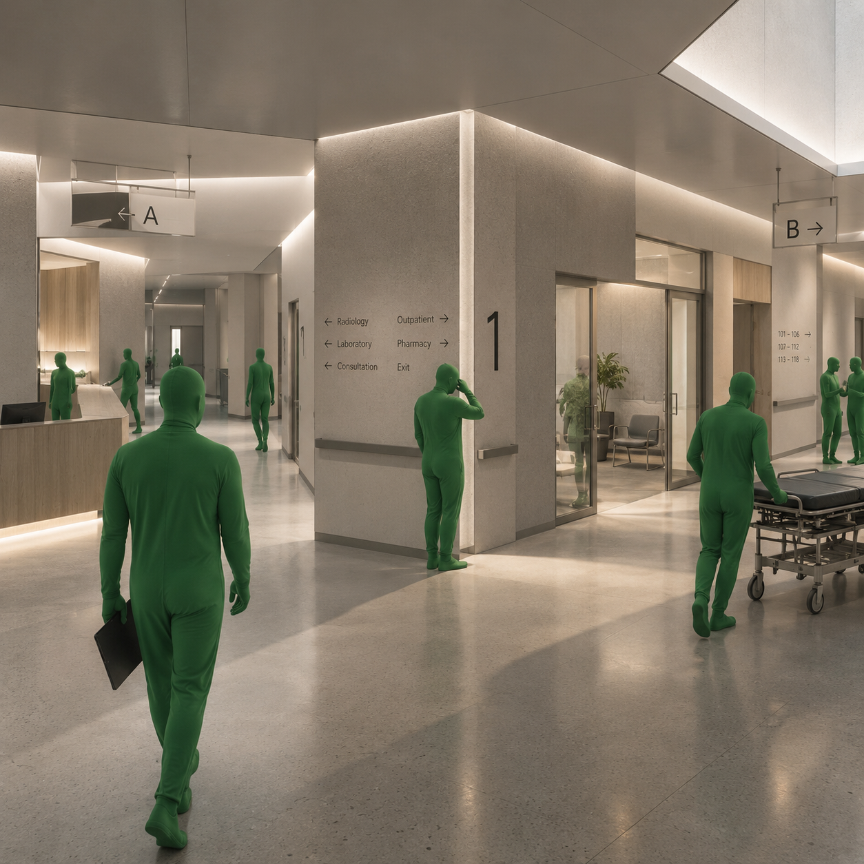
At the junction in the illustration, the corridor is spacious and the finishes are orderly. Signs name departments, arrows point in different directions, and people occupy several routes at once. Yet the central figure still pauses. The image is conceptual, not a record of observed behaviour, but it frames a practical architectural question: has the building provided information, or has it provided enough information to make the next decision?
Getting lost inside a building is usually described as a visitor’s difficulty. The visitor did not read the sign, entered through the wrong door or failed to remember an instruction. Another reading is possible. A building can transfer work to its users when its organisation is difficult to understand. People then supply the missing coordination through extra walking, repeated questions, phone calls and staff assistance.
This essay proposes treating that transferred work as a design responsibility. The cost of getting lost includes time, effort and interruptions, but it should not be assigned a universal monetary value without observation. Its significance is that circulation is experienced as a sequence of decisions. A route can be short on the drawing and demanding in use. Designing the visitor’s journey means examining both.
A route is more than its length
Two destinations can be equally far from an entrance and require very different journeys. One route may lead along a continuous public hall toward a visible reception point. Another may require choosing a lift bank, identifying the correct floor, passing through an ambiguous doorway and finding an unmarked turn. Distance describes only part of what the person must accomplish.
The architectural brief should therefore describe representative journeys as well as circulation areas. Arrival at reception, movement between services and the return to the exit each deserve attention. The building’s users do not experience the whole plan simultaneously. They encounter fragments, interpret them with incomplete knowledge and decide what to do next.
This distinction changes a design review. Instead of asking only whether the departments are connected, ask what a newcomer must know at each connection. A continuous line in a diagram can conceal a break in understanding. Conversely, a route that is slightly longer may be easier to follow if it preserves a clear destination, a consistent naming system and a visible sequence of landmarks.
What research contributes
Raubal and Egenhofer developed a computational approach to comparing wayfinding tasks through choices and clues, demonstrating it with airport cases. Their contribution is to treat the task as a sequence whose difficulty depends on available information, not merely the existence of a route. The method offers a way to examine potential problems before construction; it does not supply a universal score for every building. [1]
Amancio, Oliveira and Costa analysed labyrinths using network concepts and a stochastic measure of the time required to reach an exit. This establishes one formal way of examining maze structure. A random walker in a model is not a hospital visitor with a destination, a language and a set of expectations. The architectural use of such measures therefore requires interpretation rather than direct substitution. [2]
Manukyan and colleagues investigated transferring a multi-alternative maze task from animal research to human spatial learning. Their pilot study highlights the challenge of comparing cognitive processes across experimental settings and species. It is useful here as a boundary: laboratory navigation tasks can inform questions, but they do not automatically predict behaviour in a busy public building. [3]
The first decision happens before the door
Visitors often begin with a message, an appointment letter, a map or an address. If those materials name an entrance differently from the building, confusion is introduced before arrival. An institution may regard several doors as interchangeable while visitors need one precise destination. A street address alone may be insufficient on a large campus with multiple reception points.
The design team can coordinate names for entrances, buildings and departments with the people responsible for visitor communications. These names should describe stable features rather than depend entirely on an employee’s office or a temporary tenant. Where a public entrance differs from a service entrance, its role should be understandable from the approach.
The arrival space must also accommodate the act of understanding. A person stopping to read should not immediately obstruct a door or stand in a vehicle path. A small area for orientation can be as important as the sign itself. This is an original design proposition: give the decision a place, rather than treating hesitation as an unexpected misuse of circulation.
Separate the choice from the explanation
At a junction, the visitor needs to identify the relevant destination and connect it to a direction. Additional information may be useful elsewhere but compete with that immediate task. A directory describing every department can be appropriate in a lobby and poorly placed at a narrow turn where people need to move.
Information can be organised in stages. An entrance identifies the building and the principal destinations. A junction identifies the branches available there. A destination confirms arrival. This does not require withholding useful information. It requires placing information where it supports the decision being made, and ensuring that the next stage uses the same terminology.
The building itself can assist that hierarchy. A clearly public hall, a recognisable lift lobby and a differentiated departmental threshold provide spatial structure for signs to reinforce. When every opening looks equally significant, the sign system must perform more work. Graphics and architecture should therefore be designed together, rather than asking the graphics package to explain a completed plan it cannot change.
Repetition needs moments of difference
Repetition supports construction, maintenance and orientation when people can understand the system. Repeated rooms along a corridor are not inherently confusing. The problem arises when several places are indistinguishable but require different decisions. A visitor may remember a material, a window or a waiting area and still fail if that feature recurs everywhere without distinction.
A landmark should be considered from the directions in which it will be approached. An artwork visible only after the turn cannot help someone choose that turn beforehand. A colour distinction that depends on subtle perception should not be the sole identifier. A name and number can work alongside material, light or a view, giving more than one way to recognise the place.
Difference should remain selective. If every wall demands attention, the hierarchy dissolves into decoration. The useful question is what needs to be remembered and at which moment. An ordinary corridor can remain ordinary while a decision point receives a distinct spatial character. Legibility does not require the entire interior to become a themed environment.
Vertical movement creates a new beginning
A lift journey interrupts the continuity of a horizontal route. On arrival, the visitor may face an unfamiliar orientation, several doors and a directory that uses different language from the sign below. The lift has completed its mechanical task while the building has left the person with a new navigational problem.
Review the complete sequence: identifying the correct lift bank, selecting a floor, leaving the car and choosing the next direction. Floor identity should be apparent at arrival, not discoverable only after walking down a corridor. Where different lift groups serve different zones, the distinction should be made before users commit to a journey.
Accessible routes require the same care. A stair and a lift may lead toward the same destination through very different spatial experiences. The route provided for someone who cannot use the stair should not depend on unexplained service passages or informal staff intervention. Equality of access includes the ability to understand the route, not only its physical existence.
The cost belongs to several people
A lost visitor may interrupt a receptionist, a cleaner, a security officer or a clinician. Staff may become informal navigation infrastructure, repeatedly explaining the same junction. That assistance can be valuable and should not be eliminated as a matter of principle. The question is whether it expresses hospitality or compensates for a recurring defect that the building could reduce.
An operational review can record where questions occur, what destinations are requested and which explanations are difficult to give. It should avoid treating individual workers as the cause of delay. Repeated requests can reveal inconsistent names, an unseen entrance or a missing confirmation at arrival. The information becomes useful when it leads to a spatial or organisational adjustment.
There is no need to invent a dramatic annual loss to justify this work. A facility can first document actual interruptions and missed connections. If a financial assessment is later required, its assumptions should be explicit. Time spent helping a visitor is not automatically wasted time, and reducing questions is not automatically evidence of a more welcoming building.
Recovery is part of a good route
A legible building should help people recognise and recover from an error. The user who has taken the wrong corridor should be able to identify where they are and return to a known point. A design that works only when every decision is correct is fragile, especially when departments move or entrances close temporarily.
Recovery can be supported by visible location identifiers, understandable links back to principal circulation and confirmation at destinations. A visitor should not need to reach a locked door before discovering that the route was unsuitable. Where access is restricted, the boundary should be explained before the person invests substantial effort in reaching it.
Return journeys also need testing. The route from the entrance to an appointment is not necessarily experienced as the same task in reverse. People may leave through a different departmental door or seek a toilet before returning to their vehicle. The design should account for these ordinary changes without requiring users to reconstruct the entire building in memory.
Do not confuse exploration with obstruction
A museum or cultural building may deliberately offer several routes and invite discovery. That is different from making a necessary service hard to find. Visitors can enjoy uncertainty when they retain a clear understanding of how to leave, rest or reach a required destination. Freedom to wander is more meaningful when the means of regaining orientation remain available.
Commercial interiors raise a related question. A route intended to expose visitors to more displays should not be evaluated only by how much space it makes them traverse. It should also be considered from the perspective of someone with limited time, fatigue or a specific task. The choice to browse should remain distinguishable from being unable to find the direct route.
The proposed principle is to make essential journeys dependable while allowing optional journeys to be rich. Architectural complexity can remain valuable. The aim is not to flatten buildings into corridors with no character, but to distinguish the experience of discovery from the experience of having an obligation obstructed by an unreadable environment.
Digital guidance needs a physical counterpart
A phone can provide directions, but it should not become the only means of understanding a public building. Batteries fail, interfaces differ and some users do not have a suitable device. A digital route can also become obsolete when a doorway closes or a department changes its name. The physical and digital descriptions need a shared source of current information.
A facility can assign responsibility for updating destinations across signs, appointment messages, websites and navigation tools. Without that responsibility, each department may produce a locally reasonable instruction that conflicts with the wider system. A consistent information structure is an operational asset, not merely a graphic standard issued at handover.
Digital assistance can still be useful, particularly for complex or personalised journeys. The architectural question is how it complements visible orientation and human help. An application should not be used to excuse an avoidable ambiguity in the lobby. The building should remain understandable enough to support someone who arrives without preparation or a working screen.
Test a journey before measuring a building
A practical evaluation begins with a defined task and starting point. Ask a newcomer to find a destination without coaching, then observe decisions, pauses, wrong turns and requests for assistance. Obtain appropriate consent and avoid collecting unnecessary personal information. The purpose is to understand the environment’s demands, not to grade the person’s ability.
Use different starting points and include people with different access needs. Familiar staff can identify operational complications but may no longer notice the assumptions a newcomer must make. A route should be considered under relevant conditions, including crowding, ordinary lighting changes and temporary closures. An empty building tour offers only one operating state.
Interpret the observations together. A pause can mean confusion, interest or a deliberate rest. A fast journey can involve following another person rather than understanding the route. No single measure captures the whole experience. The strongest review connects behaviour with what information was available at the moment of decision and whether the intended destination was eventually reached.
A hypothetical clinic review
Imagine a clinic where visitors repeatedly ask for a diagnostic department after leaving the lifts. The existing response is to add another sign beside the lift doors. A journey review might reveal that the appointment message uses one name, the floor directory another, and the department entrance a third. Adding an arrow would leave the central mismatch intact.
A coordinated intervention could align the names, identify the floor at arrival, move the directional information into view before the junction and add a clear arrival confirmation. Staff would test the revised instructions with newcomers. The intervention is a design scenario, not a reported clinical trial, and its success would need to be checked in use.
The important shift is the unit of responsibility. The problem does not belong only to the sign, the corridor or the visitor. It belongs to the relationship between them and the institution’s information. A small coordinated change may be more useful than an expensive decorative renovation, but that conclusion should follow observation rather than become another universal promise.
Design for the person who has never been here
The experienced user carries an invisible version of the building: remembered shortcuts, familiar faces and knowledge of doors that are usually closed. The first visitor has none of that accumulated support. A public building should not require membership in its internal culture before basic services become accessible. It should make its essential relationships available through the journey itself.
The cost of getting lost is therefore a useful architectural lens rather than a fixed numerical index. It directs attention toward work that the plan may export to bodies, memories and staff. A building becomes easier to use when its spatial organisation, names, signs and operating decisions tell a coherent story. The strongest route is one that lets people spend their attention on the reason they came.
Sources
- Raubal, M., and Egenhofer, M. J. (1998). Comparing the Complexity of Wayfinding Tasks in Built Environments. Environment and Planning B: Planning and Design, 25(6), 895–913. DOI: 10.1068/b250895.
- Amancio, D. R., Oliveira, O. N., and Costa, L. da F. (2011). On the concepts of complex networks to quantify the difficulty in finding the way out of labyrinths. Physica A, 390(23–24), 4673–4683. DOI: 10.1016/j.physa.2011.06.079.
- Manukyan, P., et al. (2025). Challenges and insights of transferring animal maze studies principles to human spatial learning research. Scientific Reports. DOI: 10.1038/s41598-025-86037-4.