Five highlights from Zaha’s Moonsoon: An Interior in Japan
Five Highlights from Zaha’s Monsoon: An Interior in Japan
The exhibition offers a journey from the conception of the venue – conveyed through a series of archival models, presentation documents, and sketches – to its built form, presented through images and one-to-one recommissioned furniture from the bar’s interior.
“Our latest exhibition showcases the creative processes behind one of Zaha Hadid’s earliest and less well-known projects,” said Zaha Hadid Foundation director Paul Greenhalgh. “Moonsoon was created at the time of the incredible explosion of the Japanese economy, and the design boom that accompanied it.”
“Japan provided opportunities for emerging architects to work on experimental projects. For the foundation, it is a chance for us to dive deep into the archives and highlight works rarely seen before.”
Monsoon’s design referenced some of the early 20th-century avant-grade movements that emerged out of Russia, such as the works of Russian abstract artist Kazimir Malevich.
Furthermore, Angular, twisting, and geometric shapes were translated into functional architectural volumes and layers. Additional design references include the works of sculptor Alexander Calder, French liquor commercials from the 1950s, and imagery of orange peel and pasta.
Zaha’s Monsoon: An Interior in Japan takes place at the Zaha Hadid Foundation headquarters in Clerkenwell, London, which functioned as Hadid’s headquarters from 1985 until she died in 2016.
Read on for Deurell’s five highlights:
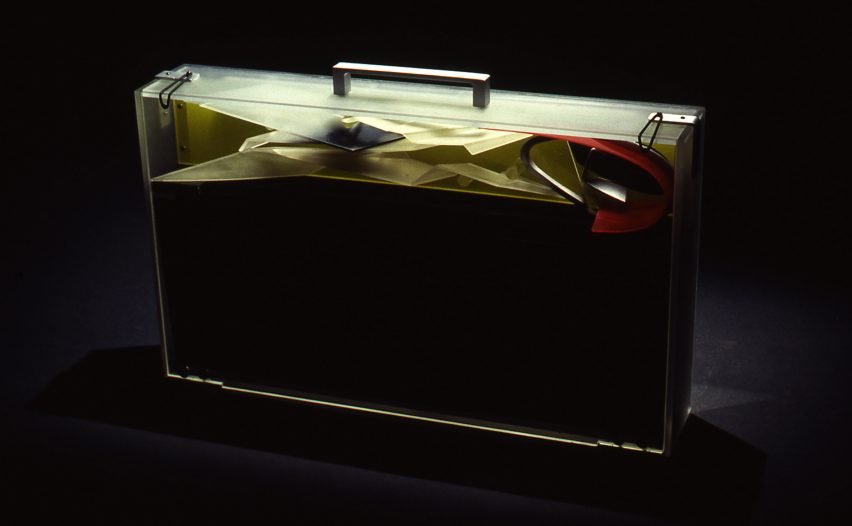
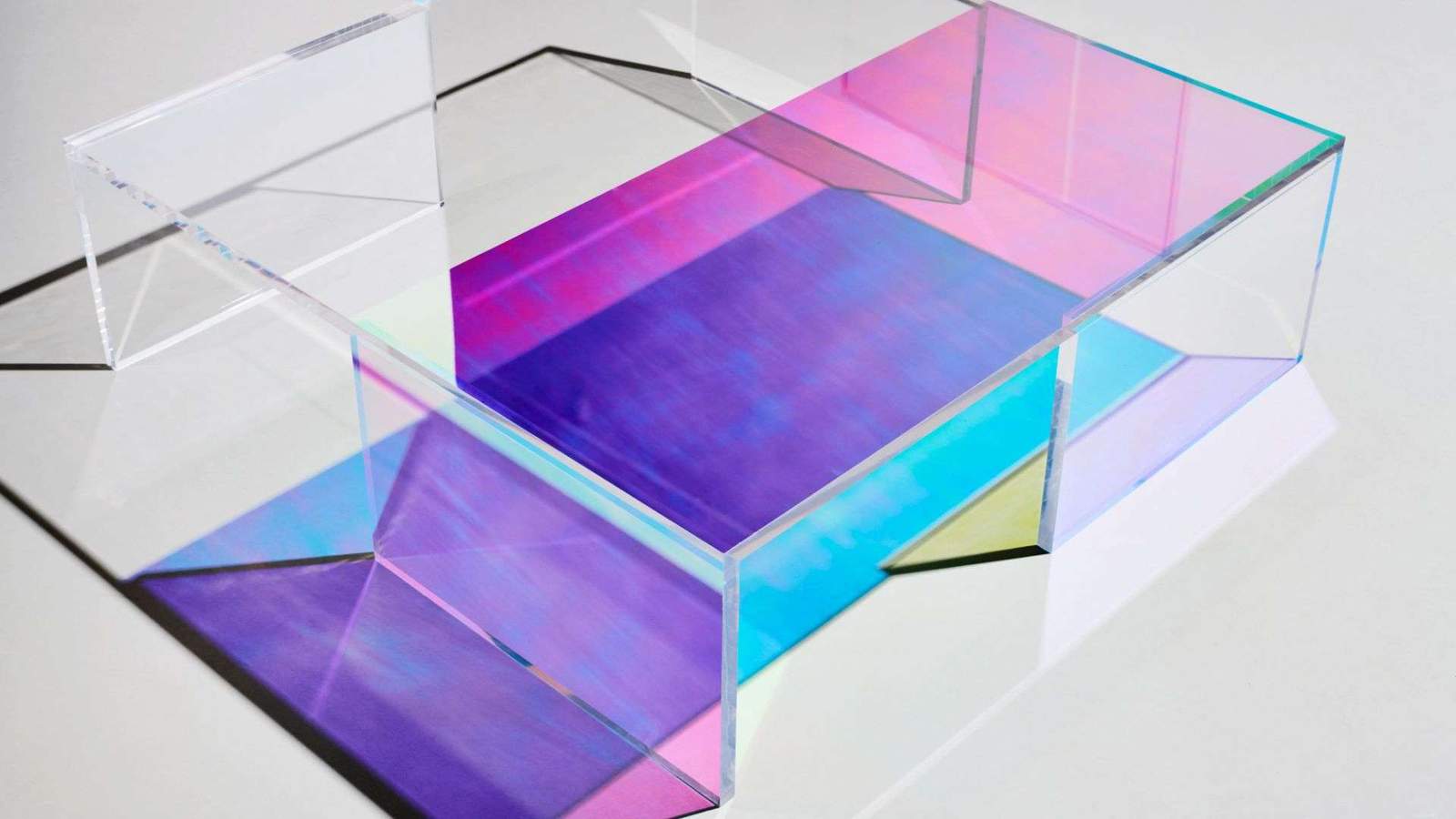
Presentation case, acrylic and aluminum by Zaha Hadid Architects, 1989-90
“The idea of our exhibition came about with the discovery of a Perspex briefcase in the archive. This briefcase was made by Daniel Chadwick as a container for the Moonsoon design concept.
“It carried elements of model as well as 14 paintings, six perspective drawings, and 13 collages shown in this exhibition. The case would be taken to the clients as a form of presentation strategy, where the works on paper would be laid out and the model assembled.”
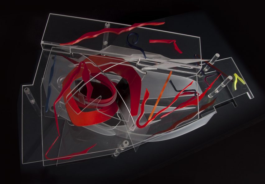
Presentation model, acrylic by Zaha Hadid Architects, 1989-90
“This model, made by Daniel Chadwick, was created to illustrate a concept. Rather than as a replica of the restaurant’s final form. Here an ‘orange peel’ shape swirls through the two floors, and the colorful shards represent the furniture and interior elements. At the time it was made, the interior and furniture designs had yet to be finalized.
“Zaha Hadid Architects embraced the transparency of acrylic to make the relationship between interior and spatial elements in the model easier to view. Moreover, In the future, digital models would provide the transparent layering effects that Hadid sought to achieve through the early use of acrylic.”
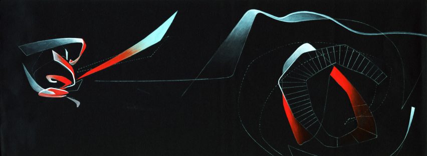
Interior concepts, acrylic paint on black cartridge paper by Zaha Hadid Architects, 1989-90
“This painting belongs to a suite of 14 paintings originally stored in the Perspex briefcase. Moonsoon’s concept was partially inspired by fire and ice, which is illustrated through the reds and blues in this painting. A swirling ‘orange peel’ shape represents the central furnace penetrating through the two floors, whereas splintered ‘ice shards’ symbolize tables.
“Zaha Hadid Architects used paintings to explore concepts that could not be shown through conventional perspective drawings. Various team members contributed to the paintings. The works were derived from sketches, which had been transferred to tracing paper and then onto cartridge paper, and subsequently colored in, often by Hadid herself. Their warped shapes and layering anticipated the possibilities later offered by CAD software.”
Zaha’s Monsoon, by Marwan Kaabour, 2023
“Not everything in the show came from that briefcase. There were boxes upon boxes of archival material too. During the research phase, colleagues at Zaha Hadid Architects told me: ‘Go find the little doodle’. That turned out to be a sheet of Arabic letterforms spelling out Zaha and Moonsoon, and the recurring swirly shape. Which you see in the model and paintings.
“With some help from Marwan Kaabour, who designed the graphic identity for the exhibition. I learned that the swirl is a stylized version of the letter H in Zaha. Marwan has done some amazing work for Phaidon and V&A before and runs the Instagram account Takweer on queer narratives in the SWANA region. I asked him to make a video based on the archival material we had found.
“This snippet is taken from that video. It charts the development of Moonsoon’s ‘orange peel’ structure, from the brief to its final built form. Beginning with sketches of the words مونسون [Moonsoon] and زها [Zaha] based on Arabic letterforms, through references to orange peel, pasta, and the works of Alexander Calder, it concludes with their eventual translation into the technical drawings informing the construction, as well as images of the construction and built.”
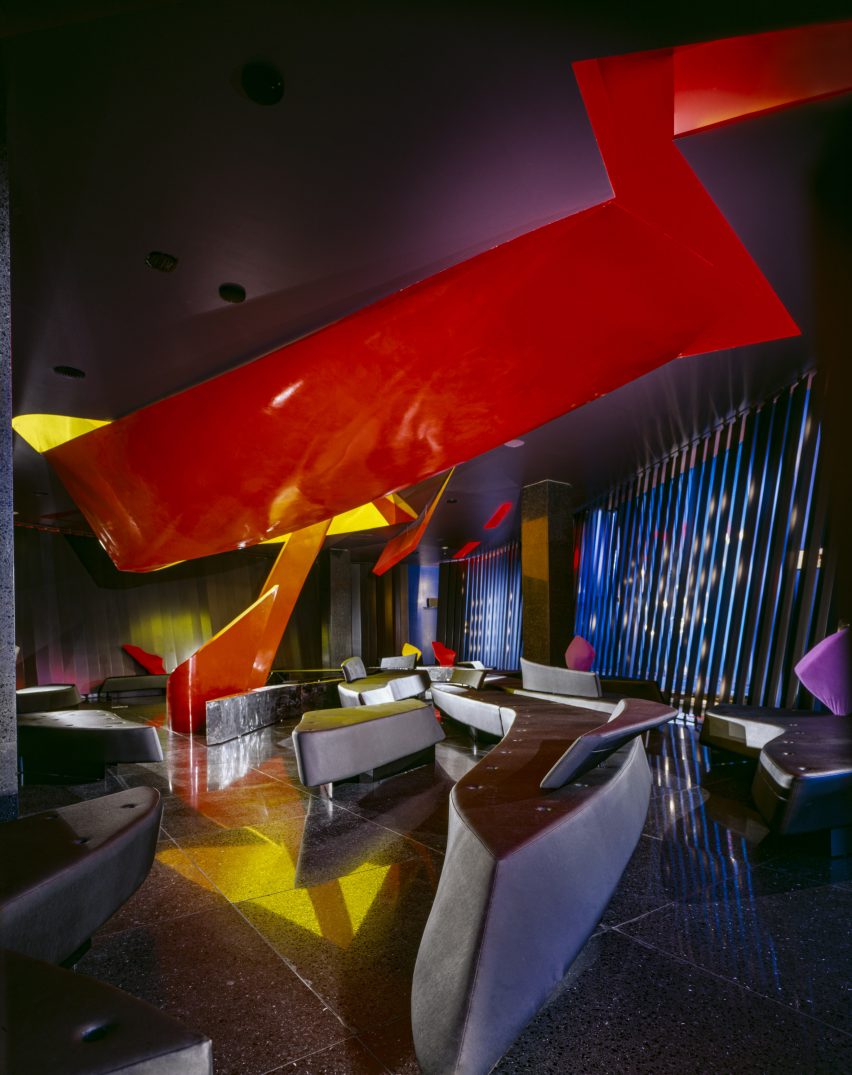
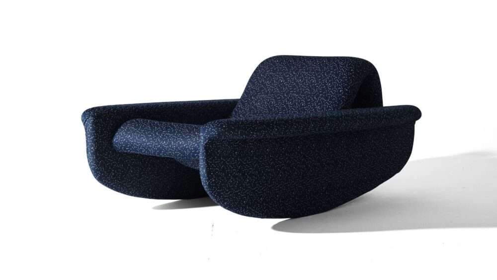
Sofa and tray table by Zaha Hadid Architects, 1989-90 (remade in 2014)
“Finally, the exhibition includes a boomerang-shaped sofa from the bar. The furniture for Moonsoon employed intersecting curves and diagonal planes to create an interior landscape. Designed by Michael Wolfson, the differently-sized sofas have interchangeable plug-in backrests and tray tables. Also, It came in different colors and finishes.
“Waiters could set the tables on their stands when delivering the drinks to guests. I am not sure how well this waiting method worked in practice. But it is interesting to think about this furniture as part of a design historical tradition of flexible seating landscapes. We know that Zaha was a fan of Verner Panton’s work, for example.”
Read more on Archup:


