Revitalizing Commercial Spaces: Merging Function with Beauty
In a bold architectural move, Odami, a local design studio, transformed a commercial space in a Toronto shopping center into a modern women’s clothing store. This project wasn’t simply about rearranging the space; it aimed to redefine the relationship between the shopper and the product within a commercial setting.
Meeting Modern Retail Demands with Architecture
The 5,500-square-foot (511-square-meter) space is located in Uptown Bayview Village, a shopping center built in the 1960s. It was part of a wave of small retail spaces that emerged in residential neighborhoods during that period.
Smart Renovation over Major Demolition
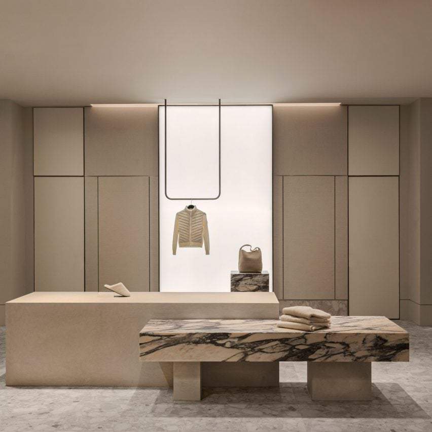
Rather than making drastic structural changes, the design team chose to focus on smart renovations. They added elements that brought warmth and elegance to the space. These included natural leather, custom-designed marble, and carefully placed small display screens.
Design as a Narrative Tool
One of the standout features of the project is its use of design as a storytelling medium. Each section of the store creates a personal shopping experience, moving beyond the simple act of selling products. The space encourages interaction and discovery, offering a more engaging environment.

Lighting as a Substitute for Natural Light: The Challenge of Enclosed Spaces
One major challenge when designing commercial spaces in enclosed malls is the lack of windows and natural light. This absence can affect the sense of vitality and openness. The Odami team encountered this issue during the project since the store was completely surrounded by interior walls with no external openings.
Innovative Solutions to Compensate for the Lack of Natural Light
To compensate for the absence of natural light’s dynamic changes throughout the day, the team designed large light panels that filled the space with intelligent artificial lighting. These panels did more than just illuminate the store; they created dramatic and evolving atmospheres, enhancing customers’ experience as they moved through the space.
🔗 Read also:
Between Illusion and Reality: Lighting as a Visual Narrative
The concept extended beyond functional lighting. It aimed to mimic natural light, evoking emotions in visitors. The designers wanted the lighting to become a key part of the visual story, introducing surprise and excitement into an otherwise enclosed design.

Color Harmony and Materials: A Calm and Effective Design Language
The Odami team aimed to create an elegant commercial environment without visual clutter by using a neutral color palette. This palette brings visual calmness, allowing the products to shine without being overshadowed by excessive decoration.
Thoughtful Distribution to Enhance the Visitor’s Experience
The team carefully distributed these subtle tones around the edges of the open space. This formed a serene backdrop that allowed the clothing and accessories in the foreground to stand out. This treatment balances simplicity and luxury, adding harmony to the store’s design.
Variety in Display Methods: Deliberate Simplicity
To highlight the displayed items, the design team used several methods to enhance product clarity:
- Thin U-shaped rods suspended from the ceiling, designed to hang individual garments or large scarves.
- Elegant marble platforms used to display bags or shoes, giving them a distinctive presence in the space.
These choices reflect a display philosophy that respects each piece, allowing visitors to focus on details without visual distractions.

Neutral Colors… But Not Boring
Even though the store design relied on a neutral color palette, the space’s visual vitality remained intact. The materials used—whether refined or textured—helped create a rich visual rhythm without the need for bold colors.
This balance between color tranquility and material diversity added depth to the space, making the visual experience enjoyable without distracting the visitor from the products.
From a Multi-Brand Store… to a Chic Boutique
The Andrews store is known for offering multiple brands and a wide range of products. Despite the variety, the primary design goal was to evoke the feel of an exclusive, boutique-style store, not a conventional retail space.
The design focused on reducing clutter, highlighting individual products, and offering a refined, personalized shopping experience, even with the wide selection on display.

Using Marble and Fabric: A Visual Composition that Organizes the Space
One of the most striking design elements of the store was the use of Calacatta Rosenoir marble, known for its rich details and deep colors. The team didn’t just use this marble as a luxurious material; it became part of the store’s visual identity, guiding the visitor’s movement and directing their gaze.
Floor Composition: Between Fluidity and Organization
Instead of using traditional display platforms, the design team created low, geometric floor compositions that interweave and intersect, subtly defining different areas within the open space.
Variety in Materials and Sizes to Achieve Balance
These compositions included more than just marble; they also featured:
- Leather cushions in warm, sandy tones.
- A variety of small sizes that reflect a sense of design and add visual depth without overcrowding the space.
This careful mix contributed to a balance between elegance and function, making each part of the store feel thoughtfully designed and creating a seamless, enjoyable experience from the very first step.

Multi-Functional Units: A Functional Design Beyond Traditional Form
The Odami team didn’t just divide the space visually; they integrated multi-functional elements into a unified and flexible design. The straight modular units don’t stand apart. Instead, they intertwine and intersect organically, creating continuously evolving and interconnected forms throughout the store.
Between Display and Rest: Multipurpose Design Serving the Experience
The spaces created by this composition serve multiple purposes, most notably:
- Comfortable seating areas that allow shoppers to rest inside the store.
- Unconventional product displays that break away from the usual design style.
- Integrated storage solutions that hide clutter while maintaining the flow of the overall space.
The design team describes these elements as “climbing in and out of each other,” highlighting the organic harmony between function and form. Nothing feels forced or isolated from the overall context.
Dim Lighting and Thoughtful Backgrounds: The Role of Walls in Enhancing the Display
In the Andrews store, lighting became more than just illumination. It transformed into a design element that enhanced the products’ aesthetic appeal while adding layers of depth to the space.
Integrated Light Panels… with a Calm Rhythm
The team installed additional light panels covered with stainless steel mesh inside the walls. These panels create soft, indirect lighting, offering a quiet backdrop for the products on the shelves. This gentle illumination highlights the products without overwhelming them.
Architectural Integration that Hides Functional Details
The walls surrounding the store were wrapped in micro-cement, a material that gives a smooth, flowing texture. This smart treatment didn’t only serve an aesthetic purpose but also concealed doors to the fitting rooms, keeping the space’s design clean and pure.

Facade Design: Capturing Attention Without Stealing the Spotlight
The display screens and windows were integral to the overall design philosophy. The Odami team reimagined the display facades to create coordinated sightlines that ensure the focus stays directly on the clothing, both from inside and outside the store.
Highlighting the Clothing… Not Decorating the Walls
The design team expressed their goal: “We wanted to create a rich, tangible atmosphere that fades into the background, giving space to the store’s main feature: the clothing.”
This philosophy dictates that every design element — from lighting to materials to display facades — serves one purpose: to highlight the product without distracting from it.

A Glimpse into Odami’s Previous Work: Diversity in Contexts and Consistency in Vision
Odami’s expertise goes beyond store design. The studio has worked on various spaces that showcase a deep understanding of integrating function and aesthetics. In Toronto, their home city, the team has completed several notable projects, including:
- A beachfront home designed with intersecting levels along Lake Ontario’s shores.
- The AESOP store in Yorkville, where the team used rich ruby-toned walls to enhance the brand’s identity.
Odami’s work has also expanded internationally. Recently, they designed a skincare brand location in Los Angeles, featuring mint green surfaces. This project demonstrates the team’s ability to adapt to the unique visual identities of different brands.