Stop! Seating Turns Road Barriers Into Social Infrastructure

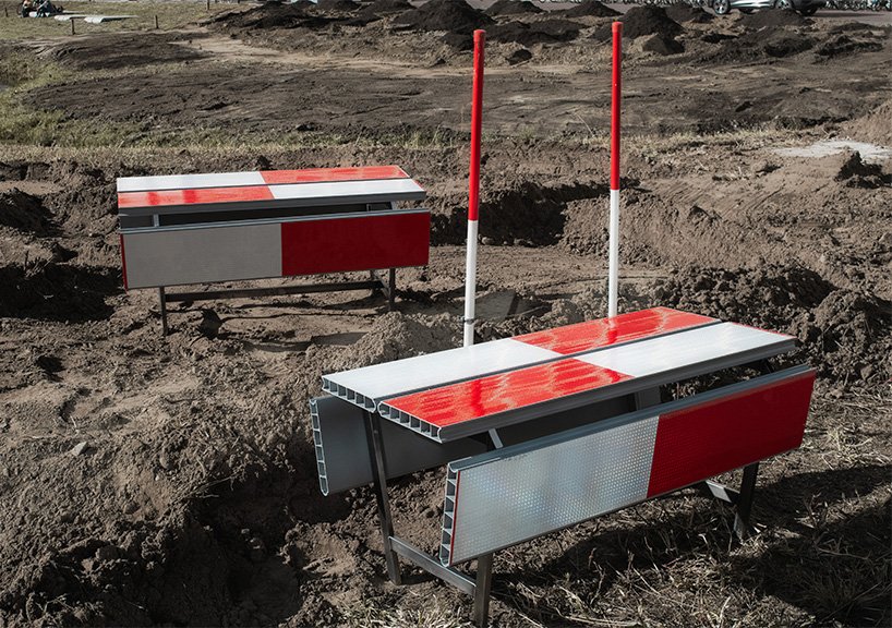
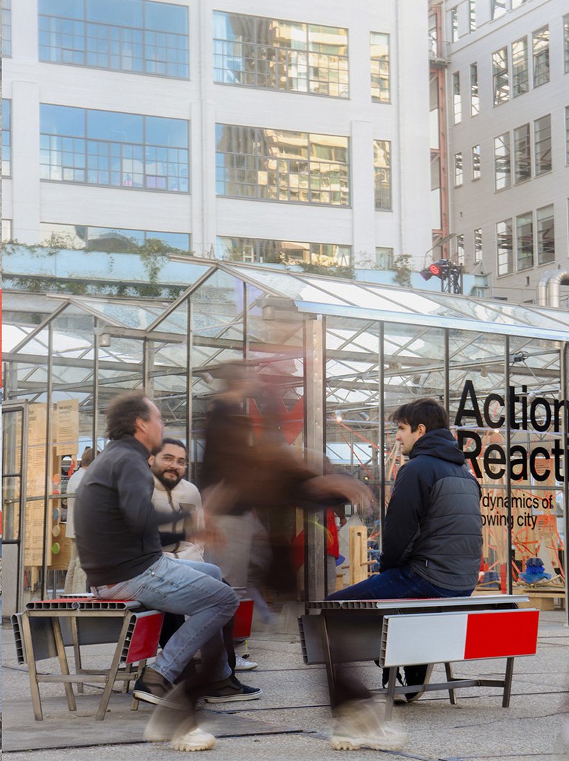
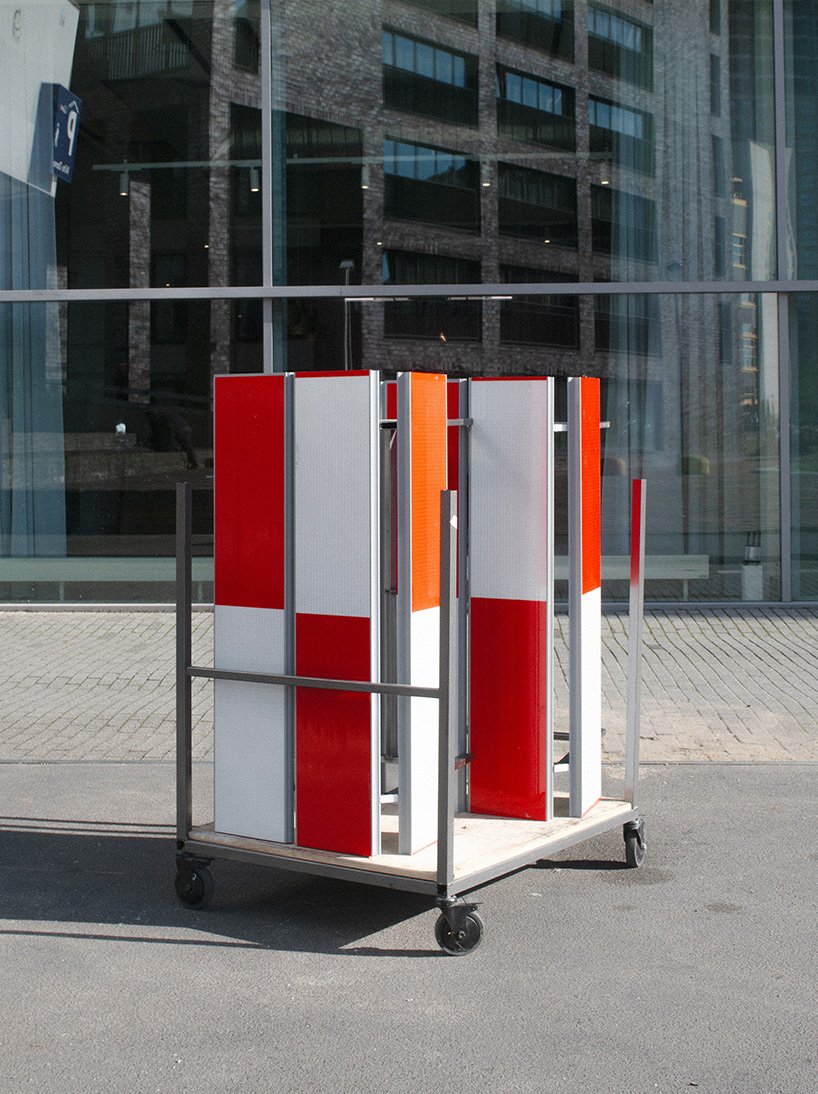
The red-and-white schrikhek is an everyday instrument of Dutch streets: an aluminium barrier that marks construction zones and redirects people. In the Stop! collection, Studio Martins Mezulis and 13_0663_tsx keep that recognisable visual code but reverse its social role. Benches and stools no longer tell pedestrians to move away; they ask them to stop, sit and share an edge.
From a control object to an invitation
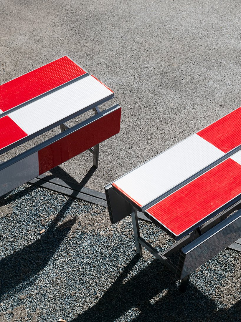
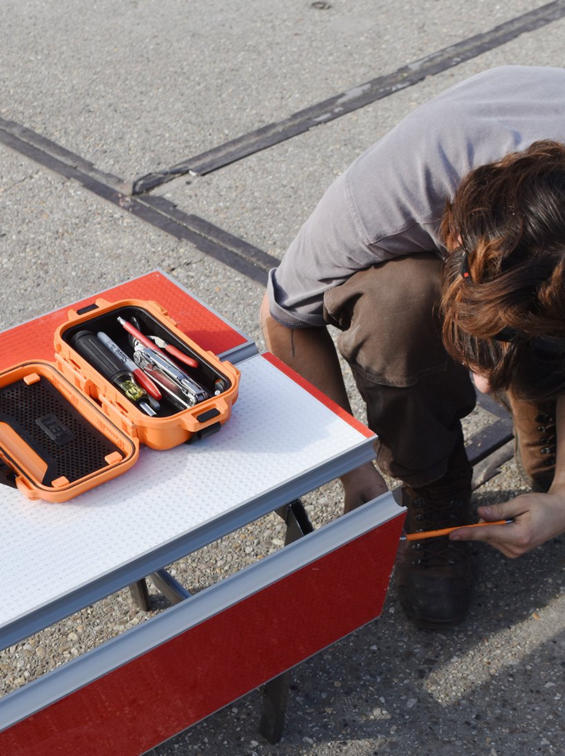
The project works because it does not disguise its reference. High-visibility panels, light frames and the familiar striped pattern remain readable, while the altered proportions introduce seat surfaces and more open orientations. This is a small formal move with a large behavioural consequence: a device associated with detour becomes a marker for occupation.

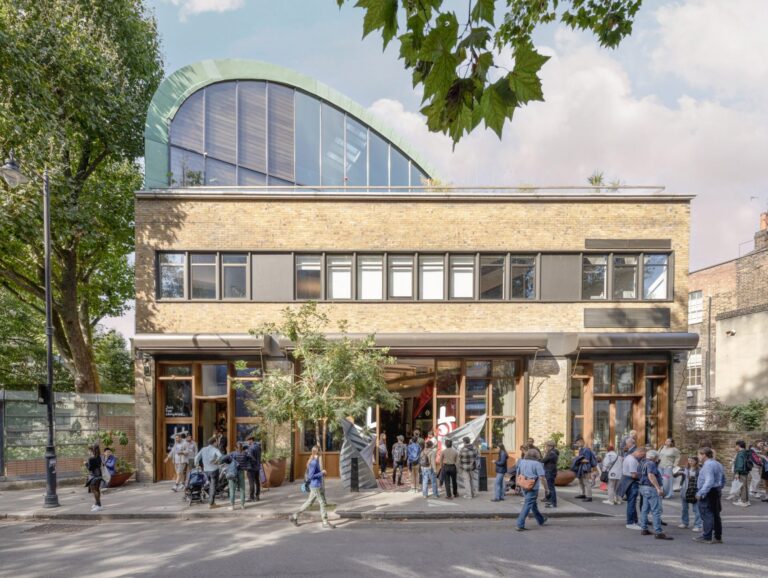
At Strijp-S Ketelhuisplein and Design Perron in Eindhoven, the public debut placed the pieces in active pedestrian settings. That context matters. Their colour makes them easy to locate, but the success of the invitation depends on leaving enough room around each piece for people to pass, turn and gather without recreating the obstruction the collection is designed to question.
Visibility remains part of the function
Street furniture often tries to recede into a coordinated palette. Stop! takes the opposite position: visibility is operational. The red-and-white field can announce a resting point across a temporary event landscape, while the repeated frame gives several pieces a shared identity. The design therefore operates at two scales—close to the body as a seat, and at a distance as a wayfinding cue.

A product with spatial consequences
The collection is not a complete public-realm system, and the available information does not document anchoring, accessibility dimensions or long-term weathering. Its contribution is more specific: it shows how a standardised urban object can be reconsidered through posture and adjacency. A barrier normally organises space by separation; a bench organises it by proximity. That change affects circulation, conversation and the time people spend in a place.
For permanent use, placement would need to resolve the tension between high visibility and clear pedestrian movement. In temporary settings, however, the recognisable construction language may help pieces feel immediately legible and easy to group without elaborate signage.
Credits
Design: Studio Martins Mezulis and 13_0663_tsx. Images: © Studio Martins Mezulis and 13_0663_tsx.
✦ ArchUp Editorial Insight
The documented pressure is simple: Dutch road barriers are designed to halt movement, yet the same streets also need places where people can pause without adding a completely separate family of objects. The designers’ decision is to retain the barrier’s red-and-white visibility and aluminium language while changing its geometry into benches and stools. That shift produces an immediate public reading: the object is familiar enough to be noticed from a distance, but its seat height and orientation replace prohibition with invitation. For users, the value lies less in visual novelty than in the legibility of a pause point within busy temporary settings. For operators, reusing a recognised construction vocabulary could support clear placement and quick recognition, although the published project information does not establish durability, accessibility or long-term maintenance performance. The trade-off is equally important: a form associated with control may remain playful in a design event but could feel ambiguous if installed without sufficient circulation space or context. Architecturally, the collection demonstrates that social infrastructure can begin with a precise change in posture—turning a line that blocks passage into an edge that supports gathering.