The Poster Must Explain

Prepared by the ArchUp Research Team.
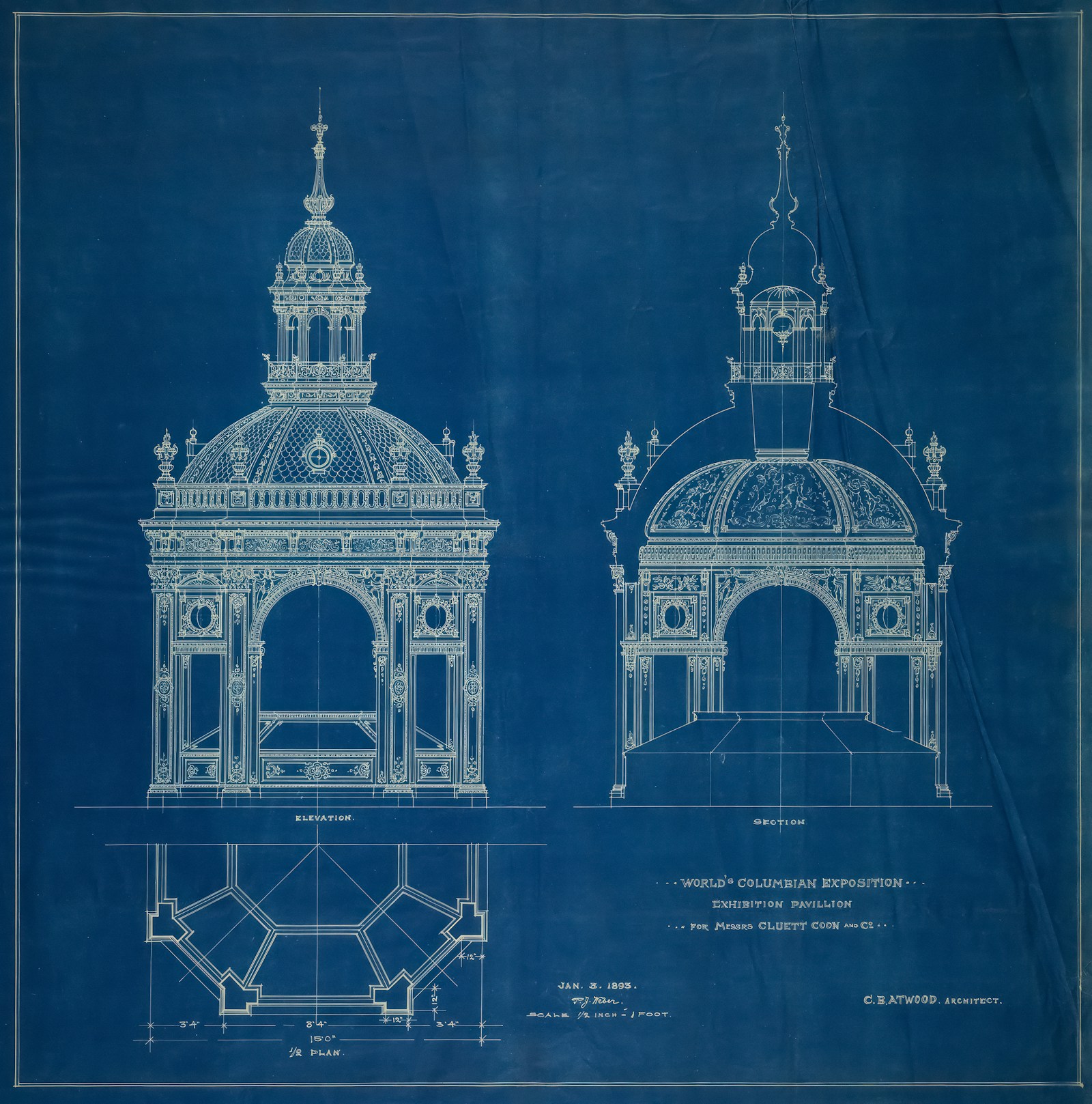
The blue sheet holds several kinds of knowledge at once. An elevation describes an architectural face. A section exposes a relationship that the façade cannot show. A plan locates parts beside one another. Lettering identifies the drawing and its scale. In the historical blueprint selected for this essay, these elements share a surface without becoming interchangeable. Their coexistence raises a contemporary design question: when a project becomes a poster, a presentation board or a social post, what must remain visible for somebody else to understand it?
An architectural image can invite attention before a reader understands anything about a building. That invitation matters. Yet a beautiful first impression is only the beginning of a communication task. The poster must establish what the project proposes, which evidence supports that proposition and how the reader should move through it. When those relationships disappear, graphic polish can make a weak argument look finished. The challenge is to give visual pleasure a useful job within the explanation.
Architectural poster design has consequences for how a building is understood. Cropping can remove the connection to the street. A colour system can clarify circulation or imply a hierarchy that the scheme does not possess. An enormous rendering can push the only useful section into a corner. A translated caption can become too small to read. These decisions shape what an audience can inspect, question and remember. The designer therefore participates in the public account of the project, even when no wall or doorway is being moved.
What the research can establish
This essay develops an architectural application of a supplied research overview on graphic design. Bibliographic records, abstracts and selected accessible passages were checked against publisher and institutional sources. It does not claim a complete independent reading of every original paper. The studies concern different settings, including education, professional identity, printed communication, automation and production practices. Their findings are not a single experiment on architectural posters, and they cannot prove that a particular layout will improve engagement or project comprehension.
Several distinctions nevertheless provide a useful basis for design. Juliette Cezzar proposes translation, creation and articulation as capacities around which design education can be organised [1]. Corazzo and colleagues examine the difficulty of establishing a graphic design research culture through the specific record of the United Kingdom's Research Excellence Framework 2014 [2]. Meron investigates practitioners' perceptions of job titles and professional status [3]. Together, these works make it reasonable to ask who defines the communication problem and how design decisions become explainable. The following architectural workflows are this essay's proposals, rather than tested outcomes attributed to those papers.
Write the communication brief before arranging the page
A useful brief begins with an audience and a decision. A competition juror may need to compare the scheme against a programme. A resident may need to understand how access changes. A prospective client may want to recognise the office's approach. A student reviewing a precedent may need a readable section and a reliable account of its source. The same project can serve these audiences, but a single hierarchy rarely serves all of them equally well.
The brief should therefore state a sentence the reader ought to be able to explain after viewing the work. For a hypothetical community building, that sentence might be: the public entrance and shared room are organised around a shaded threshold. The board then needs evidence of the threshold, its relationship to the street and the route to the shared room. A dramatic aerial view may remain useful, but it cannot carry a spatial claim that its viewpoint hides.
This approach changes the first conversation with a graphic designer. Instead of asking for a more exciting board, the team can identify a missing relationship, an ambiguous sequence or an unsupported statement. It can also establish responsibilities. The architect verifies spatial information. The editor checks the wording and the status of claims. The designer proposes a hierarchy and tests its reading. These roles can overlap in a small practice, but the responsibilities should remain identifiable. Without that distinction, revisions easily become an exchange of preferences that nobody can resolve.
Give every image a distinct evidentiary role
A rendering, a diagram and a photograph answer different questions. A rendering presents a designed proposition under selected conditions. A diagram simplifies relationships for a specific purpose. A photograph records an appearance from a particular viewpoint and moment. A plan or section describes spatial relationships through a drawing convention. None should silently inherit the authority of another. A proposed interior should not be presented as evidence of actual occupation, and a conceptual diagram should not look like a measured performance result.
The page can make those distinctions legible through concise captions and consistent labels. Proposed, completed, schematic and observed are substantive information when they describe what is actually being shown. The caption should explain why the image is present, rather than repeat its title. A section caption might identify the relationship between an entrance and an upper gallery. It should not claim successful natural ventilation merely because arrows have been drawn across the section.
Hierarchy also concerns the distribution of attention. If the central argument depends on a section, that section needs enough space to be inspected. If the project concerns a street edge, the graphic field should preserve the relevant context. Leaving white space can make these relationships easier to follow, but empty space is not evidence of quality by itself. A dense board can be coherent when its sequence is clear. A sparse board can be evasive when it withholds the material required to assess its claim.
Build a reading sequence, then test it
The title should name an argument or a subject precisely enough to orient the reader. A short introductory statement can explain the problem. The principal drawing then shows the relationship that carries the argument. Supporting views address questions that emerge from it. This is a proposed editorial sequence, not a universal template. A material investigation, a planning consultation and a product poster require different orders because they ask the audience to do different things.
Graphic consistency reduces the effort needed to follow that order. A repeated colour should retain a stable meaning. Comparable diagrams should use compatible conventions. Labels should identify the same space in the same way across images. An unexplained change from one naming system to another imposes unnecessary interpretive work. Conversely, a deliberate exception can be valuable when it signals a change of scale, a different scenario or a limitation in the evidence.
Testing should ask for comprehension before preference. Show a draft to someone outside the immediate design team and ask what the project changes, which image supports that conclusion and what remains unclear. This is a practical review exercise, not a substitute for formal user research. Record misunderstandings and revise the layout that produced them. A viewer who admires the colour palette but cannot locate the entrance has supplied different feedback from a viewer who understands the proposal and dislikes the typography.
Accessibility belongs in the commission
Cornish and colleagues studied visual accessibility in graphic design through communication between clients and designers, drawing on 122 participants in a context concerned with printed material [4]. The study supports treating accessibility as something that must be discussed and assigned within the project. It does not establish a universal font size for every architectural board, screen or reading distance. A useful application is to define the expected viewing conditions before the layout becomes difficult to change.
A poster across a room and a drawing inspected at a desk present different demands. A phone introduces a smaller viewport and changing display conditions. Text placed over a detailed rendering may become unstable even when it looks acceptable on a large monitor. Fine grey lines may disappear in a proof. A colour distinction may need a second cue, such as a label or pattern. These are reasons to inspect the actual output, rather than approve everything from the designer's working file.
For digital publication, meaningful alternative text should describe the image's relevant information without turning into a list of search terms. If a complex drawing cannot be explained adequately in a short description, adjacent prose can provide the central relationship. Search optimisation has a supporting role here: the title and description should help the appropriate reader find the material. They should not promise measured environmental performance, construction completion or public approval that the article does not establish.
Arabic and English require an editorial relationship
A bilingual board is a coordination task. Translation changes phrase length, emphasis and reading direction. Simply shrinking the Arabic until it fits an English box transfers the cost of the layout to the Arabic reader. Giving both languages identical visual dimensions can also fail when their typographic structures and explanatory needs differ. The relevant objective is equivalent access to the argument, rather than mechanical sameness in every line.
The team can decide which information must appear in both languages on the same surface and which belongs in separate editions. Project status, drawing labels, explanatory captions and essential qualifications deserve consistent treatment. Translations should be reviewed in their final positions because proximity creates meaning. A correct sentence placed beside the wrong diagram is still a communication error. Numbering and symbols need a shared scheme that survives movement between the versions.
Reading direction should influence the sequence of headings and supporting text without distorting the architecture. Mirroring an entire board can reverse a plan, a north arrow or a directional route. Those elements must preserve their verified spatial orientation. A better approach is to reorganise the editorial frame while treating drawings as controlled project information. The result may be two related compositions with different rhythms, both accountable to the same building and the same underlying evidence.
A social post is a different publication
A presentation board distributes information across a field. A carousel distributes it across a sequence. A single social image has to carry a narrower claim. Moving between these formats should therefore begin with a new reading plan. Exporting the complete board into a square often preserves the file while losing the explanation. The drawings remain technically present, but the reader may have no practical way to inspect them at the intended viewing size.
For the hypothetical community building, a carousel might open with the shaded threshold and a concise statement of the design question. A following frame could locate the entrance in the plan. Another could show the section that explains enclosure and height. A later frame could state a limitation or an unresolved operational question. The order is illustrative. Its purpose is to make every frame contribute something the previous frame could not communicate clearly.
The accompanying text should preserve the difference between a design intention and a demonstrated result. Engagement statistics, if actually measured, describe responses within a particular distribution context. They do not automatically establish architectural quality or comprehension. A useful editorial review asks whether the post attracted attention, whether its central explanation was understandable and whether its claims remained accurate. Those questions are related, but they require different evidence and should not collapse into a single popularity score.
Use AI to explore options while retaining an account of decisions
Matthews, Shannon and Roxburgh review automation and its implications for graphic design and education [5]. Their work provides a reason to examine how roles and skills are reorganised, rather than assume that every automated task removes the need for judgment. More recent research by Zhang, Wei and Qian investigates image generation in a scientific journal cover task with twenty participants who had relevant design or AI experience [6]. That setting matters. Findings about its creative process should not be generalised into a verdict on every architectural workflow.
For architectural publishing, the practical question is what a generated option is permitted to change. Explorations of composition, illustration or an abstract visual theme can be useful when their status is clear. A model should not silently invent a built condition, modify a plan, manufacture a material connection or create a false performance diagram. If an illustration is generated, its presentation should make that status clear. Visual plausibility cannot verify a fact about a project.
Keep the brief, selected alternatives and reasons for important choices. Ask whether a variation improves the explanation or merely introduces another attractive surface. Recheck labels and all project information after any automated operation. A record of decisions supports revision and accountability, especially when several people handle a publication. It also preserves the designer's ability to explain why one option was selected. The relevant professional contribution is the reasoning that connects visual decisions to the communication problem.
Production is part of the design argument
A printed poster has a material life beyond its screen preview. Bonsu, Chisin and Cronjé examine sustainability challenges in graphic design practices in Ghana, including production knowledge and waste management [7]. This is a situated study, not a measurement of all printing industries. Its relevance to architectural communication lies in the way design decisions continue into proofing, manufacturing, use and disposal. A responsible production brief should identify those stages instead of treating the exported PDF as the end of the work.
Confirm the finished size, intended duration, installation method, printer's requirements and realistic quantity. Inspect a proof where the decision warrants one. Coordinate colour handling with the actual production process, rather than assume that one conversion rule fits every printer. Check fine lines, image resolution at output size, cropping, bleed where required and the readability of small captions. These checks serve communication and can also prevent avoidable reprints caused by errors discovered too late.
Environmental claims need the same care as architectural claims. A paper description alone does not establish the footprint of a complete campaign. Quantity, transport, finishes, reuse and the available disposal route can affect the decision. A digital alternative also has a delivery context and resource demands. Without a defined comparison and evidence, the article or poster should avoid declaring one route categorically sustainable. A more useful practice is to document the production choices made and the information still missing.
Protect the labour that makes clarity possible
Clear communication requires time for editing, drawing preparation, translation, review and correction. Those tasks are easy to hide behind the request for a quick post. Butaru and Mateescu's study of graphic illustrators examines the relationship between creative work, precarity and AI within its particular social context [8]. It does not provide a fee schedule for architectural communication. It does encourage attention to the working arrangements that determine whether judgment and revision can actually take place.
An architectural office can make the process more reliable by naming an approver, agreeing the deliverables and identifying the point at which project information is ready for layout. Later changes may still be necessary. They should be recognised as changes with consequences for translation, checking and production. Repeatedly replacing drawings after captions have been approved creates more than inconvenience: it can break the relationship between what an image shows and what the publication says about it.
Quality review should therefore include the brief, the evidence, the language and the output. A visually elegant poster with incorrect labels has failed. An accurate board whose relevant information is unreadable has also failed. Treating these as shared responsibilities allows designers to argue for a necessary revision without reducing the discussion to taste. It makes professional authority more concrete: the ability to state the purpose of a decision, test its consequences and accept responsibility for the result.
A worked example without an invented success claim
Consider a hypothetical board for that community building. Its first version contains a large evening rendering, four tiny drawings and a paragraph describing openness. The problem is not necessarily the rendering's beauty or size. It is that the word openness has no clear object. Does it refer to access from the street, visibility through an entrance, flexible room use or public opening hours? Each interpretation requires different evidence, and some require operational information that a drawing cannot supply.
The revised brief chooses one proposition: the entrance sequence connects the street to the shared room through a shaded threshold. The plan becomes large enough to trace that route. The section explains the threshold's enclosure. The rendering shows the intended spatial atmosphere and is identified as a proposal. Captions state what each view contributes. The paragraph names the operational questions that remain unresolved, including how public access would be managed. No invented measurement is needed to make the argument more precise.
For print, the team reviews the complete hierarchy at the intended size and viewing distance. For social publication, it divides the explanation into frames and rewrites the accompanying text. For Arabic, it reconstructs the editorial sequence while preserving the orientation and information of the drawings. A reader review then checks whether the entrance relationship is understandable. Until that review occurs, improved comprehension remains an intention, not a result that the publication is entitled to claim.
The poster is an interface with the project
The historical blueprint in the opening image does not offer a ready template for contemporary platforms. Its usefulness lies in the visible distinction between forms of architectural knowledge sharing one sheet. The present challenge is to maintain that distinction across more audiences, languages and formats, while allowing each publication to develop an appropriate visual character. A poster can be expressive and still make its evidence inspectable.
The strongest architectural communication gives readers a route from attention to understanding and from understanding to a useful question. That route depends on editorial choices, graphic hierarchy, accessible reading, honest imagery and a workable production process. Design earns its authority by making those relationships clear. The poster must explain because architecture becomes publicly discussable through what its representations allow other people to see.
Image credit: Peter Joseph Weber, World’s Columbian Exposition, Cluett Coon & Co. Exhibition Pavilion, Chicago, Illinois, Plan, Elevation, and Section, 1893. Blueprint on paper. Art Institute of Chicago, via its Unsplash collection. The historical drawing illustrates relationships between architectural representations; it is not documentation of the hypothetical project discussed here.
Sources
- Cezzar, J. Teaching the Designer of Now: A New Basis for Graphic and Communication Design Education. She Ji, 2020, 6(2), 213–227. DOI: 10.1016/j.sheji.2020.05.002.
- Corazzo, J., Harland, R. G., Honnor, A., and Rigley, S. The Challenges for Graphic Design in Establishing an Academic Research Culture: Lessons from the Research Excellence Framework 2014. The Design Journal, 2020, 23(1), 7–29. Published online in 2019. DOI: 10.1080/14606925.2019.1682446.
- Meron, Y. Terminology and Design Capital: Examining the Pedagogic Status of Graphic Design through Its Practitioners’ Perceptions of Their Job Titles. International Journal of Art & Design Education, 2021, 40(2), 374–388. DOI: 10.1111/jade.12353.
- Cornish, K., Goodman-Deane, J., Ruggeri, K., and Clarkson, P. J. Visual accessibility in graphic design: A client–designer communication failure. Design Studies, 2015, 40, 176–195. DOI: 10.1016/j.destud.2015.07.003.
- Matthews, B., Shannon, B., and Roxburgh, M. Destroy All Humans: The Dematerialisation of the Designer in an Age of Automation and its Impact on Graphic Design: A Literature Review. International Journal of Art & Design Education, 2023, 42(3), 367–383. DOI: 10.1111/jade.12460.
- Zhang, H., Wei, J., and Qian, C. Z. Reimaging intuition: How artificial intelligence image-generation technologies reshape graphic designers’ creative patterns. Thinking Skills and Creativity, 2026, 60, 102061. DOI: 10.1016/j.tsc.2025.102061.
- Bonsu, G. A., Chisin, A. V., and Cronjé, J. Challenges to Sustainability in the Graphic Design Practices of a Developing Nation. Design and Culture, 2020, 12(1), 57–81. Published online in 2019. DOI: 10.1080/17547075.2020.1694263.
- Butaru, L. T., and Mateescu, V. M. Glamorous precarity: graphic illustrators in the twilight of artificial intelligence. Dialectical Anthropology, 2025, 49(2), 271–285. DOI: 10.1007/s10624-025-09768-w.