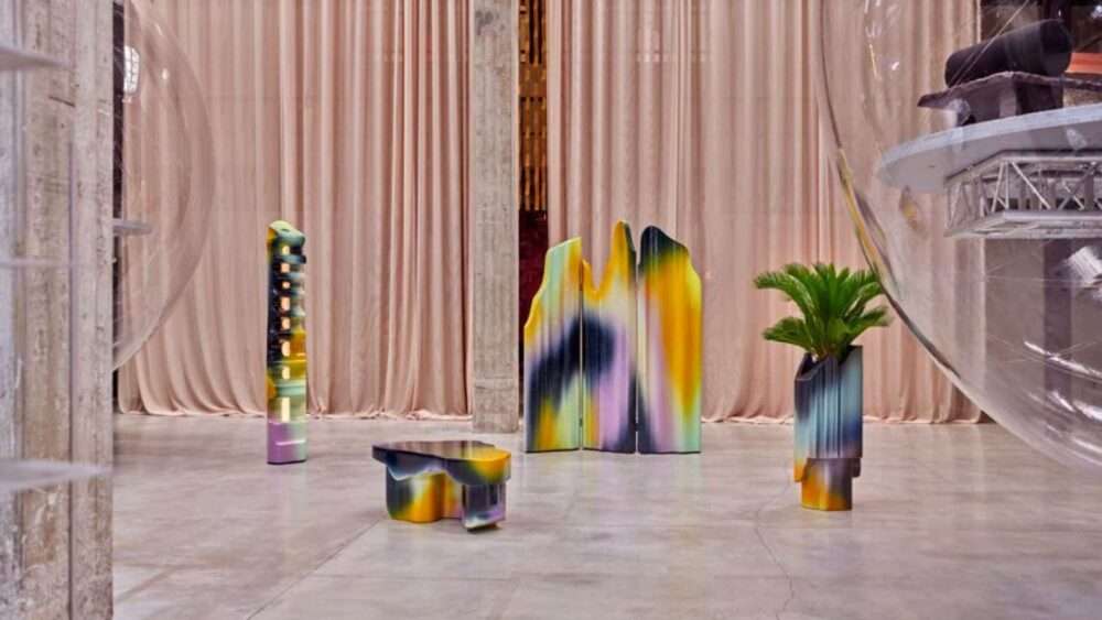
Vibrant new look, celebrating the colorful and diverse world of WWF Market.
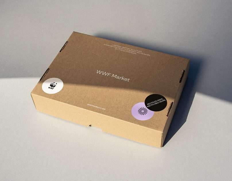
The World Wildlife Fund (WWF) is an international non-governmental organization founded in 1961, working in the fields of wilderness preservation and the reduction of human impact on the environment. WWF Market is WWF’s official merchandise store, powered by Reflect Studio. The market offers a wide selection of products ranging from sustainably made clothes to zero plastic alternatives for everyday use. These essentials are made with the hope of building a better future for the planet and its people. The brand’s colorful world consists of responsibly manufactured garments and accessories that are made to last.
In July 2021, WWF Market got a distinct visual makeover. The new visual identity is a combination of an extensive color palette, playful iconography, and natural photography.
WWF Market’s wordmark is designed to be simple and neutral for staying behind the NGO’s iconic panda logo, -the most recognizable symbol for global conversation – . Including the wordmark, the visual identity uses NN Nouvelle Grotesk for its ambitious and playful nature as a primary typeface.
The color palette is a spectrum between muted colors inspired by nature and bright hues emphasizing the inspirational and hopeful personality of the brand. Working as an extensive color palette system, it provides many combinations and fits the brand’s colorful product range smoothly.
The iconography that’s woven into visual language is a continuation of the illustrative designs prominent in the products. This approach also aims to enhance the effectiveness of long texts and helps spread WWF’s message to wider, younger audiences.


Credits:
Design & direction: Hazal Özkaya
Graphic design: Ceren Abay
Photography creative direction: Eren Gedik
Photography: Turan Ertekin