China retail store design with smooth and wavy walls
China retail store design with smooth and wavy walls,
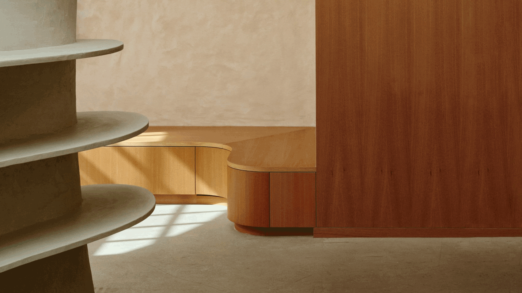
Jinan Truly Malaysia’s Home is a retail store designed by Panda NANA,
which elevates the customer experience into a sensory space that combines ‘Landscape, Brand and Experience’.
The project has an area of 200 square meters,
and features undulating walls that seamlessly wrap around the entire interiors and create a cave-like retail space.
The studio was inspired by the idea of creating the store space from the national flower of Malaysian culture,
in order to express brand attributes including concepts related to the product.
Architects have implemented a large number of “alien senses” on this basis,
in the hope that things will not lose their meaning and purpose.
The changes in architecture are that buildings no longer have to be like a certain type of architecture as before.
With the development of online shopping, logistics and transportation,
how can offline retail spaces adapt to compete with the online virtual space.

China retail store design with smooth and wavy walls
Increasing demand has become an inevitable problem that commercial space owners and designers must contend with.
Consumption has entered the 3.0 era,
consumer demand for the same product is changing from individual to complex,
meanwhile offline retail spaces are changing as well.
Previous design focused more on the finished product display,
while nowadays retail spaces are designed more around themes such as landscape stories,
integrated design and content of commercial products, with themes to show the uniqueness of commercial spaces.
The retail space is no longer just a place to showcase products,
but also a social commercial space that integrates ‘scene, brand and experience’.
The designer has built a social business space that brings together people and products through strategies,
such as making use of the background of Malay culture, shaping the landscape,
articulating spatial context, creating activation points, and enhancing regional elements.
Color graphics, and implementation of flat expressions have also been improved to drive product associations and brand tone.
Micro-cement embedded in the wall is used to blur the division of each area and the characteristics of its boundaries.
And each area can be transformed into a shopping area and social functions that can satisfy consumers in the 3.0 era, and people can also feel comfortable and fun while shopping.

China retail store design with smooth and wavy walls
The installation art located in the visual center of the space is the essence of the entire space,
and in addition to satisfying the decorative function, the solid and flexible form also has a deeper symbolic meaning.
The dark marble tables in many areas echo the mountain in the installation art,
and in order to reduce the oppression of the marble itself, the marble tables were placed in the space either with smooth edges,
or with a slight thickness to gently interpenetrate the entire space.
As for the chairs scattered throughout the space, they are the Chandigarh chairs designed by the famous designer Pierre Jeanneret.
The design of the chair is a modern style armchair, with simple and restrained lines,
balancing practicality and beauty, modernity and tradition.
Real Malaysia’s Home is not only fulfilling the purpose of retailing,
but also creating scenery, reviving and connecting by creating the atmosphere of the public space.

So as to satisfy more consumer groups with different needs, and to satisfy the owner’s in-depth exploration of consumer groups.
And also to meet the deeper needs of consumer groups through different iterations of products.
The space also carries the memories and emotions of the owner,
and these memories and emotions are like air, allowing specific people to relate to the unique and coherent ‘community feeling’ in the space.


I love the Pierre Jeanneret chair. Bringing a wonderful and rich atmosphere