Google Maps Architecture: A Crime Against the Human Scale

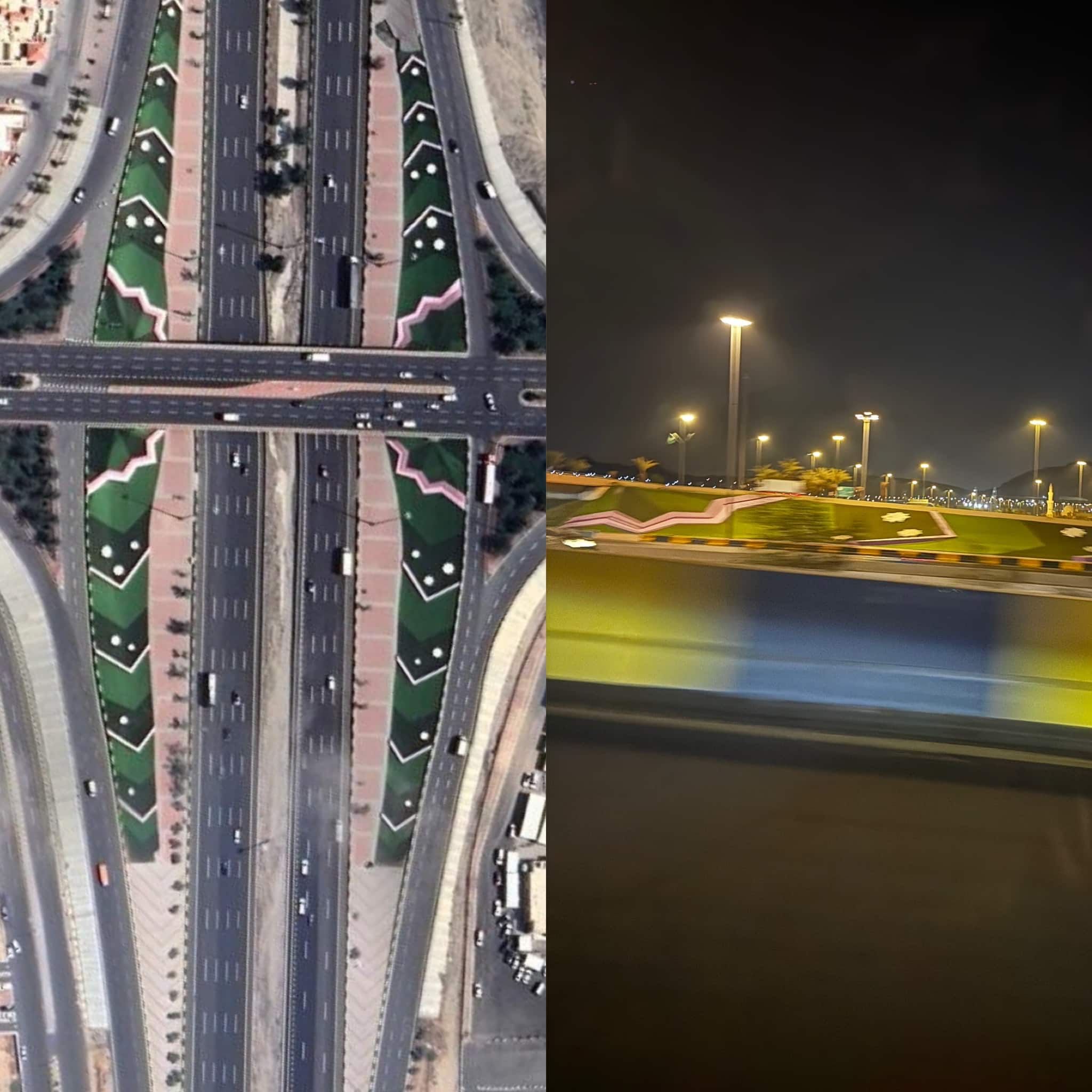
There is a stretch of highway I drive almost every week. From the bridge, a particular hardscape always catches my eye. At first glance, it feels like a fragment of Islamic geometry sharp angles, rhythmic repetition, something almost ornamental. But standing there in the car, or even walking past it, the geometry never fully reveals itself. It is confusing, unresolved.
The irony only appears when you open Google Maps. From the bird’s-eye view, the pattern suddenly makes sense. What was obscure on the ground becomes legible from above. And then the realization strikes: this design was never made for me, or for anyone passing by on foot. It was made for the satellite, for the aerial image, for the glossy abstraction of the map.
The Bird’s-Eye Illusion
This phenomenon is not rare. In many new districts of expanding cities, hardsapes and building forms are created to impress from above, not to be lived on the ground. What is the point of a geometric motif if the people moving through it drivers, pedestrians, residents cannot perceive it? A pattern visible only from 10,000 feet is not architecture. It is decoration for algorithms.
Engineering Over Architecture
Such interventions are often more engineering gestures than design decisions. They rely on geometry as surface, not as experience. Pavement mosaics, road interchanges shaped like motifs, sprawling landscaping in abstract forms—these are created for the aerial photo, not the human encounter. They are artifacts of a culture obsessed with image rather than lived space.
Global Comparisons
Compare this with Times Square in New York or Piccadilly Circus in London. There, giant screens and illuminated façades work because they serve dense flows of pedestrians. They are architectural because they form part of an urban ritual. In contrast, many highways in emerging projects rely on massive advertising screens directed at cars. But a driver, distracted and moving at 80 kilometers per hour, cannot absorb the content without risk. These interventions may look dramatic from a drone shot, but they fail the basic responsibility of architecture: to engage people where they are.
The User vs. the Viewer
The weak architect designs for the viewer, for the satellite, for the abstract audience of Google Maps. The strong architect designs for the user, for the body that walks, pauses, and touches. The paradox is cruel: the number of people who will zoom in on an overhead pattern online is negligible compared to the thousands who pass by the site daily in cars or on foot, left puzzled by a shape that never coheres.
A Human Measure
The lesson is clear. Architecture should never reduce itself to being a backdrop for aerial photography. It must be legible, coherent, and meaningful at the human scale. Otherwise, we are not building cities for people but ornaments for satellites.
When buildings and building materials serve algorithms instead of inhabitants, we lose the very essence of architecture: to shelter, to orient, to inspire. The ground is where architecture lives. If we forget that, we risk turning our urban spaces into maps, and our maps into ruins.
✦ ArchUp Editorial Insight
In this sharp and timely critique, the article spotlights an emerging architectural trend: designing for Google Maps instead of human experience. Drawing from a real-life observation, it unveils how certain public spaces appear geometrically impressive from satellite view, yet feel disjointed, confusing, or even meaningless at ground level.
This phenomenon reflects a growing obsession with digital visibility at the expense of human-scale usability. Landscapes are flattened into patterns for drones and algorithms—not for people walking, sweating, and searching for shade. The article rightly questions: Is the built environment becoming a performance for screens rather than shelter for souls?
Looking ahead, such design priorities will age poorly by 2030. What looks “viral” today may turn into urban voids tomorrow. The editorial urges architects to reclaim physicality, design for pedestrians not pixels, and remember: maps don’t feel—humans do.