How Hierarchical Models Are Reshaping the Color Palette Experience


From Local Distributions to Interactive Visualization — A Survey of the Latest Scientific Research
Imagine a designer sitting before a complex image — a natural scene where green bleeds into blue bleeds into orange — trying to extract a cohesive color palette for a visual identity or website. The problem isn’t extracting colors per se, but understanding how they interact within the image and presenting them to the user in a way that feels empowering rather than overwhelming. This is where hierarchical color models begin to reshape the user experience from the ground up.
From Atom to Galaxy
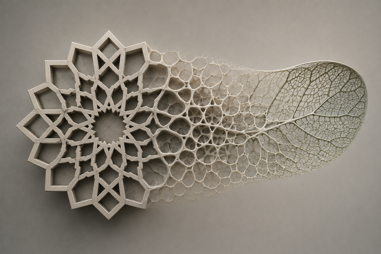
The core idea behind the hierarchical color model is deceptively simple: instead of treating colors as an undifferentiated mass, they are organized into graduated levels — from individual pure colors at the base, up to larger color clusters at higher levels. This approach mirrors how the human brain perceives colors, where the eye doesn’t process each pixel independently but groups them into meaningful clusters.
Researchers proposing hierarchical color representation have developed a new method for deriving global models from local distributions. The approach begins by sampling pure colors in the image, then builds a hierarchical representation ascending from local to global. The result isn’t a flat palette, but a structured architecture that allows users to navigate between levels of detail — from the big picture to the finest chromatic nuances.
Why the Big Picture Isn’t Enough
One of the central problems with traditional palette extraction methods is their reliance on global color distribution. This means a rare but visually significant color — like a muted red in a seascape — can disappear entirely beneath the dominance of blue and green. Enter “local distinctiveness” as a principle that complements the global view.
Research on palette extraction based on local distinctiveness and cluster validation has shown that colors distinguished by their presence in specific image regions deserve representation in the final palette, even if their overall proportion is small. This approach becomes critical in image recoloring applications, where users want to shift a scene from one chromatic state to another while preserving the visual distinction of each region.
Beauty Isn’t a Luxury
At the heart of user experience lies a simple question: Is this palette beautiful? The question may seem superficial in a scientific context, but it’s actually among the most complex. Chromatic beauty isn’t mere personal taste — it’s measurable through models that account for color distances, contrast, and harmony between tones.
The model proposed in “Aesthetic Rating and Color Suggestion for Palettes” doesn’t assume a fixed number of colors. Instead, it extracts features from the entire palette and evaluates them against aesthetic preferences derived from real data. Users receive immediate feedback on their palette with suggestions that improve aesthetic coherence without imposing arbitrary numerical constraints.
Interaction Is a Dialogue
Interactive visualization isn’t just an interface that displays data — it’s a dialogue between user and information. In the context of color palettes, this means users should watch the palette form, modify it in real time, and see the impact of each change on the original image.
The InfoColorizer tool embodies this principle. Designed for interactive palette recommendation for infographics, it overcomes barriers of traditional tools that either sacrifice customizability, require design expertise, or ignore the influence of spatial element arrangement. The proposed method is data-driven — learning from millions of successful color combinations and applying that knowledge to its recommendations.
Harmony and Preference Aren’t the Same Thing
In color design, two principles are often conflated: harmony and preference. Harmony refers to classical color relationships — complementary, analogous, triadic — while preference concerns what users actually like seeing. A palette can be theoretically harmonious yet unloved, and vice versa.
Research on user-preferential color scheme generation offers a method that combines both: starting from classical harmony principles (familial factors and rhythmic spans), then adjusting based on individual user preferences. The result is palettes that feel “aesthetically right” while reflecting personal taste.
Smart Clustering: Beyond K-means
K-means is the most common tool for palette extraction, but it suffers from known issues: sensitivity to initial centers and a tendency to produce equal-size clusters even when they don’t reflect true color distribution. The modified K-means version proposed by researchers addresses these issues by dynamically adapting cluster count according to image characteristics.
Modifications also account for perceptual color distances — not all pixels are equally distant from each other in human perception, even if their mathematical distance in RGB space is similar. This refinement makes extracted palettes closer to what humans actually see, not what abstract calculations suggest.
Recoloring: The Palette Isn’t the End
Extracting a color palette from an image isn’t an end in itself — it’s a means to recolor the image or shift it to a new chromatic state. Here the importance of “fast and flexible” extraction emerges, where users can try dozens of combinations in seconds and see results on the original image immediately.
Flexibility means the palette isn’t static — colors can be added, removed, or their relationships modified in real time. This transforms design from a series of discrete decisions into a continuous flow of trial and error, where users learn from each combination they test.
Hierarchical Data: Colors as Data Architecture
In data visualization, a different problem emerges: how to assign colors to multiple classes so they’re both distinguishable and harmonious? As class count increases, the problem grows more complex — like choosing colors for twenty different categories in a single chart.
Research on dynamic color assignment for hierarchical data offers solutions accounting for class spatial distribution and hierarchical relationships. Colors aren’t assigned independently to each class, but in the context of their relationships with others — parent classes receive similar colors, while children receive different shades of the same chromatic family.
Systematic Rules: From Art to Science
Professional designers intuitively know the rules that produce effective color palettes — aesthetically and for attention guidance. But in scientific visualization, these rules haven’t received the systematic attention they deserve. Research on color design for illustrative visualization attempts to bridge this gap by transforming design intuition into actionable, measurable rules.
This transformation matters especially for non-specialist users — scientists or analysts who need to create effective visualizations but lack graphic design backgrounds. Systematic rules give them a framework to work within, rather than leaving them facing an infinite sea of possibilities.
Conclusion: Color as Relationship, Not Property
What unites all this research is a fundamental shift in how we think about digital colors — from treating them as fixed pixel properties to understanding them as dynamic relationships between image elements and the designer. The hierarchical model doesn’t just organize colors — it organizes the relationship between user and color. Interaction isn’t just a tool, but a way of thinking. And beauty isn’t a luxury — it’s a measure of experience success.
✦ ArchUp Editorial Insight
The ten studies we have examined reveal a paradigmatic shift in the treatment of digital colors — from a linear model relying on global statistical distribution to a hierarchical model recognizing that color is not merely a mathematical value, but a human experience shaped through context and relationship. What is striking is the convergence between seemingly disparate fields — palette extraction, recoloring, data visualization, graphic design — toward a unified framework that places the user at the center.
This convergence is no coincidence; it reflects a maturation in our understanding of user experience: the question is no longer “How do we extract colors accurately?” but rather “How do we make the user feel in control of colors?” In an era when digital tools are becoming more powerful yet more complex at the same time, the hierarchical model offers a way out of this dilemma — it simplifies complexity without emptying content, and gives the user power without drowning them in options.
More importantly, this shift carries deeper philosophical implications: the digital color is no longer understood as an isolated entity that can be measured and processed independently of its human context. Instead, it is viewed as part of an interactive cognitive system encompassing the eye, the brain, the tool, and the task. In this framework, the hierarchical model is not just a technique for organizing colors — it is an implicit recognition that our perception of color itself is hierarchical: we do not see colors as discrete values, but as relationships, gradients, and meaningful groups.
This is what makes the hierarchical model more than a technical improvement: it is a convergence between how we perceive colors and how we organize them digitally — a convergence that opens the door to design tools that do not treat the user as a machine following instructions, but as a living being who sees colors with their heart before their eyes.
References
[1] Succinct Palette and Color Model Generation and Manipulation Using Hierarchical Representation — Journal of Computer Science and Visualization.
[2] Hierarchical Palette Extraction Based on Local Distinctiveness and Cluster Validation for Image Recoloring — Journal of Digital Image Processing.
[3] Aesthetic Rating and Color Suggestion for Color Palettes — Journal of Human-Computer Interaction.
[4] InfoColorizer: Interactive Recommendation of Color Palettes for Infographics — Journal of Data Visualization.
[5] A User-Oriented Method for Preferential Color Scheme Generation — Journal of Color Design.
[6] An Interactive Method for Generating Harmonious Color Schemes — Journal of Interactive Design Tools.
[7] Color Palette Extraction by Using Modified K-means Clustering — Journal of Digital Signal Processing.
[8] Image Recoloring Based on Fast and Flexible Palette Extraction — Journal of Computer Graphics.
[9] Dynamic Color Assignment for Hierarchical Data — Journal of Data Visualization.
[10] Color Design for Illustrative Visualization — Journal of Scientific Visualization.