Color Blindness in the Modern City: How Architectural Spaces Exclude One-Eighth of Humanity

Toward a Design Language That Recalibrates Visual Contrast and Guarantees “Perceptual Equity” in Wayfinding and Public Buildings
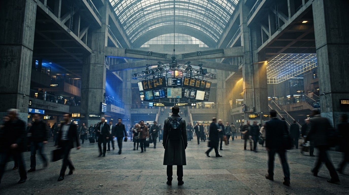
A commuter stands in the center of a vast central transit hub, surrounded by hundreds of printed directional signs and digital displays relying entirely on color-coding to regulate crowd flow. For the majority of passersby, distinguishing the “Red Line” leading to the airport from the “Green Line” serving downtown is a split-second, unconscious act. For a traveler with color vision deficiency, however, these critical visual indicators collapse into identical shades of muddy gray or brownish-yellow. In that moment, the issue expands beyond a simple graphic misstep; it becomes a physical spatial barrier that disenfranchises the visitor and strips them of independent navigation within the built environment.
Approximately 300 million people worldwide experience the physical world through non-canonical visual perception. Roughly 8 percent of men and 0.5 percent of women possess retinal structures unable to process red and green wavelengths of light normally. While contemporary architectural literature has advanced physical accessibility by embedding wheelchair ramps and elevators into international building codes, visual and perceptual accessibility remains an unstandardized territory left largely to ad-hoc design decisions. The fundamental question facing architects and urban planners today extends beyond selecting an aesthetically pleasing palette for a facade or signage system: How can designers structure spaces using algorithms rooted in “perceptual equity” to ensure built environments remain equally legible to all observers?
The Hidden Dilemma in Wayfinding Engineering: When the Red Line Becomes an Unknown Path
High-density public environments—such as hospitals, emergency rooms, airports, and multi-tier interchange stations—rely heavily on color as a semiotic apparatus to direct human flow and communicate critical hazard warnings. In hospital architecture, for instance, red designates high-risk areas or resuscitation equipment, while green marks safe egress routes and sterile facilities. When the human eye fails to process this contrast, the space shifts from a supportive spatial map into a high-risk environment characterized by acute spatial ambiguity.
The underlying scientific challenge stems from the fact that architecture is typically designed around a standard trichromatic model of human vision, which assumes three functional cone photoreceptors sensitive to long (red), medium (green), and short (blue) wavelengths. Comprehensive survey literature by researchers Zhen Zhu and Xiaoyang Mao demonstrates that color vision impairment is not a binary condition. Instead, it spans a broad continuum ranging from complete red-green dichromacy to nuanced variations of anomalous trichromacy, where the spectral sensitivity of affected photoreceptors shifts by anywhere from 20 to 100 percent.
Given this wide spectrum of human visual acuity, static color schemes selected in a design studio frequently fail to meet user requirements on the ground. This gap highlights the value of computational perception models, such as those developed by H. Brettel and Gustavo M. Machado, which mathematically simulate how color-deficient observers perceive visual input. By integrating these analytical models directly into Building Information Modeling (BIM) workflows and interactive building displays, designers can evaluate the legibility of a built space through the eyes of its actual occupants long before construction begins.
Visual Contrast Algorithms: Recalibrating Color Within Built Space
Conventional approaches in graphic and environmental design rely on a rudimentary fix: swapping problem hues with arbitrarily saturated alternatives. This technique often degrades the visual character of the space, leaving surfaces and architectural features looking overly aggressive to standard vision. Contemporary computational methods offer a more sophisticated path by deploying perception-based recoloring algorithms that operate within perceptually uniform color spaces, such as CIE Lab*, rather than standard RGB displays.
One compelling model for architectural application is the Mass-Spring Optimization framework introduced by Graciano R. Kuhn and his collaborators. This algorithm treats every color within a visual field as a physical particle connected to neighboring hues via virtual springs. When red-green contrast collapses for a color-deficient viewer, the algorithm compresses those problematic hues along the blue-yellow axis while strictly preserving underlying luminance levels.
Applied to dynamic architectural lighting and smart facades, such algorithms allow interactive displays and ambient illumination systems to redistribute color contrast locally at critical decision points without altering the broader aesthetic identity of the structure. Similarly, Jia-Bin Huang and his team proposed a Gaussian Mixture Model (GMM) approach that applies subtle rotations within the color space to optimize contrast while preserving the natural appearance of the scene. This approach provides architects with a tool to achieve precise environmental legibility without compromising design intent.
The Naturalness-Information Equation: The Designer’s Dilemma Between Aesthetics and Functionality
Recalibrating color systems in buildings and urban master plans presents architects with a classic tension: Should the design prioritize the innate visual character of materials, or should it amplify contrast to convey operational data? Artificially shifting the chromatic values of natural materials like timber, limestone, or weathered copper to sharpen visual boundaries can create an artificial, disorienting spatial experience.
Research led by Zhen Zhu offers a mathematical resolution to this design conflict by unifying two competing objectives into a single optimization framework: contrast and information enhancement versus naturalness preservation. Zhu’s algorithms evaluate the degree to which a color transformation alters the perception of standard-vision observers. Hues that color-deficient individuals already perceive correctly—such as blues and yellows—remain completely stable within the space. Meanwhile, the system remapped confusing red-green boundaries onto more legible visual axes.
This dual-target approach enables architects to construct perceptually balanced spaces. The overall identity of the architecture remains coherent and comfortable for the general public, while critical wayfinding details, surface transitions, and circulation pathways maintain clear contrast readable across all levels of visual acuity. The resulting framework ensures that functional legibility does not require the sacrifice of material integrity.
Personalized Design and Deficiency Severity: Departing from One-Size-Fits-All Logic
A major limitation of current environmental design standards is the tendency to treat color vision deficiency as a uniform condition requiring a single, standardized fix. Empirical evaluations conducted by Xiaowang Wang and his colleagues across diverse user groups—ranging from mild anomalous trichromats to complete dichromats—reveal that aggressive, high-contrast recoloring schemes suited for severe cases can prove overly harsh and distracting to individuals with mild impairments. Conversely, subtle chromatic adjustments fail to assist those with complete dichromacy.
The spatial answer lies in adopting adaptive design principles and personalized perceptual systems. In research published in IEEE Transactions on Multimedia, investigators formulated a degree-adaptable recoloring framework that adjusts transformation strength based on an individual’s specific profile. Within the physical environment, this computational approach translates into responsive lighting and digital wayfinding systems in office complexes and transit terminals, where display contrasts automatically recalibrate based on user preferences or environmental sensors.
Furthermore, recent work by Han Zhou and his research team demonstrates that optimization constrained by a perceptual loss radius in CIE Lab* space can process visual information in real time. This technical efficiency paves the way for augmented reality (AR) integration and wearable smart navigation tools in complex structures. Through these systems, a building’s spatial tracking infrastructure can dynamically recolor egress signage and wayfinding cues on a user’s personal display, tailored specifically to their retinal profile.
Clinical and Standardized Evaluation: Measuring the Success of Inclusive Space
To transition perceptual equity from an academic concept into a standard architectural methodology, spatial designs and visual systems must undergo rigorous testing that combines mathematical modeling with human clinical feedback. In computational research, recoloring performance is quantified through objective metrics such as Global Chromatic Diversity (GCD), Local Absolute Contrast (LAC), and structural similarity indices.
Within spatial design, however, true validation requires observing human behavior in real-world settings. Advanced evaluation protocols subject participants to clinical diagnostic tools—including Ishihara plates and the Farnsworth–Munsell 100-hue test—before tracking their speed and accuracy when navigating complex urban environments or reading spatial maps.
Behavioral studies analyzed through Thurstone’s law of paired comparisons reveal a distinction vital for environmental designers: color-deficient users prefer heightened, high-contrast transformations on information-dense assets like subway maps and emergency signage, but favor subtle, naturalness-preserving adjustments when interacting with general architectural surfaces and public landscapes. This distinction establishes a clear practical guideline: designers should isolate information-critical wayfinding elements from expressive architectural backgrounds, applying high-contrast algorithms exclusively where legibility and safety require them.
Toward a Perceptual Building Code: Integrating Color Engineering into Global Accessibility Standards
The ethical and professional responsibility of architects and urban designers requires re-examining the assumption that human visual perception is uniform. The concept of Universal Design must expand beyond physical measures—such as door clearances, turning radiuses, and ramp slopes—to encompass the manipulation of light spectra and color contrast within built spaces.
Integrating perception-aware frameworks and Lab*-based optimization tools into mainstream CAD, BIM, and lighting design software benefits more than color-deficient occupants. It improves overall spatial legibility for all users under challenging conditions, such as low ambient lighting, glare, or smoke-filled emergency evacuations. An environment designed with perceptual diversity in mind yields a safer, more efficient, and more inclusive public realm.
The next step for regulatory bodies and international code councils is the formulation of enforceable perceptual equity standards. Mandating that graphic and wayfinding systems in public structures undergo perceptual simulation testing prior to approval will ensure that spatial legibility is built into the environment from the outset. Only then will a transit hub cease to be a confusing field of gray for millions of travelers, allowing the city to become fully legible to every observer regardless of their visual acuity.
✦ ArchUp Editorial Insight
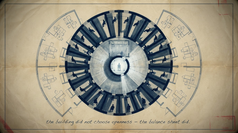
The widespread visual exclusion of color-deficient navigators in transit hubs and healthcare facilities is not an accidental graphic oversight; it is the structural outcome of institutional procurement protocols and liability-driven building regulations. Municipal procurement frameworks prioritize low-cost, static signage systems to minimize capital expenditure and maintenance liabilities, while accessibility codes remain historically tethered to physical mobility metrics due to legal precedent. Real estate developers and public transit authorities treat spatial wayfinding as a superficial branding exercise rather than an operational infrastructure system. Consequently, projects operate within narrow compliance margins that ignore human visual diversity. The spatial ambiguity experienced by millions of commuters is the physical manifestation of a risk-averse procurement ecosystem that prioritizes legal insulation and cost containment over sensory environmental legibility.
References
- Zhu, Zhen, and Xiaoyang Mao. “Image Recoloring for Color Vision Deficiency Compensation: A Survey.” The Visual Computer, 2021.
- Kuhn, Graciano R., Manuel M. Oliveira, and Leandro A. F. Fernandes. “An Efficient Naturalness-Preserving Image-Recoloring Method for Dichromats.” IEEE Transactions on Visualization and Computer Graphics, 2008.
- Huang, Jia-Bin, Ching-Te Chen, Tsung-Ching Jen, and Sheng-Jyh Wang. “Image Recolorization for the Colorblind.” IEEE International Conference on Acoustics, Speech and Signal Processing, 2009.
- Jeong, Ji-Young, Hae-Jin Kim, Tae-Sung Wang, Young-Jun Yoon, and Sung-Jea Ko. “An Efficient Re-Coloring Method with Information Preserving for the Color-Blind.” IEEE Transactions on Consumer Electronics, 2011.
- Zhu, Zhen, Masahiro Toyoura, Kenji Go, Issei Fujishiro, Kenji Kashiwagi, and Xiaoyang Mao. “Processing Images for Red–Green Dichromats Compensation via Naturalness and Information-Preservation Considered Recoloring.” The Visual Computer, 2019.
- Zhu, Zhen, Masahiro Toyoura, Kenji Go, Issei Fujishiro, Kenji Kashiwagi, and Xiaoyang Mao. “Naturalness- and Information-Preserving Image Recoloring for Red–Green Dichromats.” Signal Processing: Image Communication, 2019.
- Zhu, Zhen, Masahiro Toyoura, Kenji Go, et al. “Personalized Image Recoloring for Color Vision Deficiency Compensation.” IEEE Transactions on Multimedia, 2022.
- Wang, Xiaowang, Zhen Zhu, Xiao Chen, Masahiro Toyoura, and Xiaoyang Mao. “Evaluation of Color Vision Compensation Algorithms for People with Varying Degrees of Color Vision Deficiency.” IEEE International Conference on Cyberworlds, 2020.
- Zhou, Han, Wening Huang, Zhen Zhu, Xiao Chen, Kenji Go, and Xiaoyang Mao. “Perceptual Uniformity-Aware Image Recoloring Method for Red-Green Anomalous Trichromacy.” Nicograph International, 2024.