Showroom design with geometric shapes and gray gradient board
Vietnamese practice Limdim House Studio designed a small and compact showroom inspired by the geometric shapes and gray color palette of Hue, Vietnam.
Design Features
The 40 square meter store, named after LUPH,
was designed as a compact showroom highlighting a particular product line, displaying elegant women’s clothing.
The studio created a design concept that focused on two aspects:
Creation of blocks and the use of light, to draw attention to the products on display.
The home-like store is drawn on a rectangular plan and features a triangular courtyard,
allowing natural light to come in and reach the corners of the store.
This small courtyard may create a “sense of openness in a limited area.”

Design shape
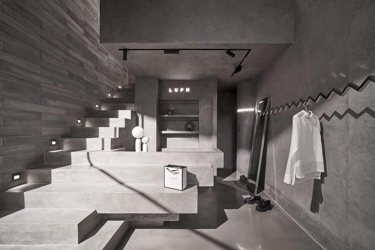
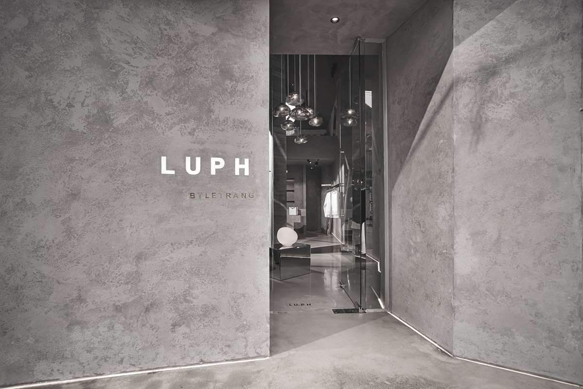
On the ground floor, customers are welcomed through the entrance and waiting area, then the patio,
the counter, the fitting room, the exhibition area, and also the stairs are added as other elements.
Mezzanine was matched with a workplace with one desk and two chairs, one for the guest.
The studio also used concrete and tempered glass as the main materials for the materials approach,
and defined the metallic color as the main color.
Inside, a triangular courtyard dominates the space and creates a new attraction for clients,
and the courtyard also features floor-to-ceiling glazing creating an interplay of transparency.
The large circular entrance on the mezzanine level aims to create the necessary heat transfer to the air,
while playing the role of visual balance with the filled rectilinear elements in the overall design of the store.
In the roof area, the designers want to focus on blocks and arrays
while maintaining the common design language of the entire building, and the design is intertwined with large blocks in each other.
Showroom design with geometric shapes and gray gradient board
The studio also designs part of the staircases initially as “floating”,
while some of them have been extended to become a reception desk.
This can help blur the boundaries between interior details adjacent to each other,
making the design seamless, and making the space feel more spacious.
Interior designers pay great attention to the use of light, as they note, for fashion show purposes,
light becomes an important criterion.
In addition, the underfloor LED system at the base of the wall helps accentuate the curves along the perimeter of the building.
The team also incorporated a ceiling lighting system that draws attention to the heart of the parlour,
on the other hand, the mirror table below creates a ‘strong impression’ on customers from the moment they set foot in the store.

As a final touch, the team also inserted some decorative lights on tables,
reception desks and mirrors to help customers get beautiful shooting angles when trying on fashion products in the store.
For more architectural news

