The Temple You Must Descend Into

Prepared by ArchUp Research Lab.
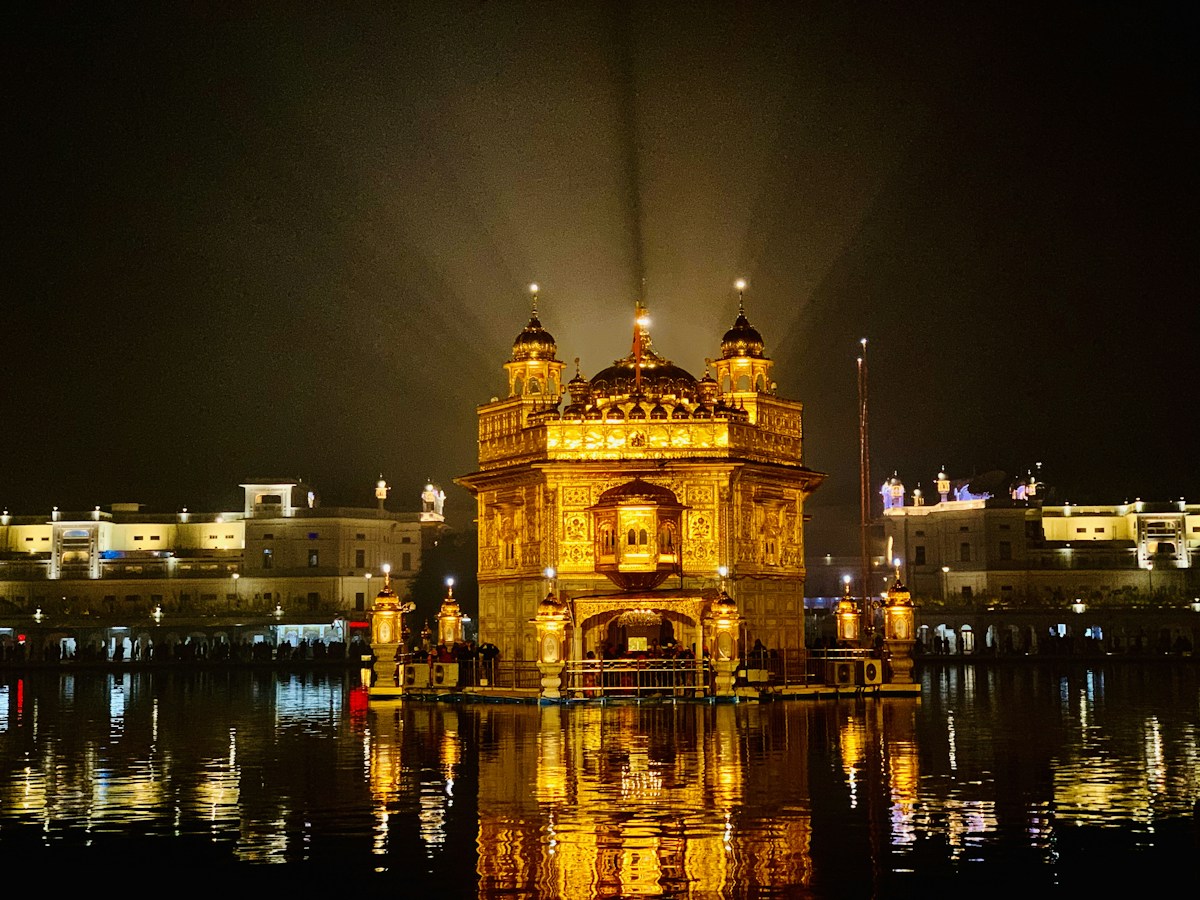
The illuminated shrine in the photograph appears to rise out of its reflection. Gold occupies the center, water repeats it, and the surrounding buildings form a quieter frame. The image records a particular view and lighting condition. It cannot tell us how every visitor feels. That distinction matters because Sikh architecture is too often explained through a convenient dictionary in which each color has one meaning and every building repeats the same message.
The title begins with a more specific architectural account. The Shiromani Gurdwara Parbandhak Committee describes Sri Harmandir Sahib at Amritsar as having been built at a lower level, with access from four sides. Its institutional history associates the arrangement with openness across social and religious divisions. [1] Reading descent as an invitation to humility is an interpretation of that account, not a rule about every Sikh building or a claim that all other religions require ascent.
Color and pattern become interesting when they are connected to movement, material, maintenance and use. A bright surface can attract attention, identify an entrance or become difficult to look at under intense light. A repeated motif can organize a wall, carry an association or simply continue a craft tradition. These possibilities coexist. The architectural question is how the particular building makes them work together.
Nikam’s literature review connects Sikh architecture with religious consciousness and communal values. [2] Its abstract supports studying architecture as more than an isolated style. It does not establish that a gold surface causes reverence, or that a visitor reads a white wall in a predetermined way. This essay therefore separates documented descriptions, interpretive readings and design proposals. The distinction protects both the scholarship and the complexity of the tradition.
The white and gold that organize a city
White and gold offer a powerful contrast at the Golden Temple. In the accompanying photograph, illuminated gilding dominates the foreground while paler buildings remain visible behind it. Water produces another layer of light and movement. What we can observe is a relationship between surfaces, illumination and viewpoint. We should not turn that observation into a universal psychological response.
Purity, humility, sovereignty and sacred radiance are possible interpretive associations in discussions of these colors. They are not interchangeable with evidence about a particular commission, patron or worshipper. A careful reading asks who assigned the meaning, at what moment, and in relation to which material. White paint, polished marble and translucent fabric can share a color while producing very different spaces. The same caution applies to gold leaf, metal sheeting and a gold colored coating.
A familiar image can travel further than the construction knowledge behind it. Designers may recognize a gilded dome before they understand its support, weathering, joints or repair history. The Golden Temple is an influential reference, but calling every later gurdwara an imitation would erase local budgets, sites, communities and building histories. Visual resemblance alone cannot explain why a community selected a particular form.
For a contemporary project, the useful question is not how much gold makes a building sufficiently recognizable. It is what the selected material contributes to the institution’s life. Can it be repaired locally? Does its cost displace a more urgent provision? Is a surface being retained because of cultural significance or replaced because a new finish photographs better? These are questions for a transparent design discussion, not conclusions about the motives of existing communities.
A grammar of pattern
If color supplies a vocabulary, pattern can provide a grammar of scale and attention. A border gives a panel an edge. Repetition allows the eye to connect distant parts. A change in density can distinguish an entrance from a background. These are analytical tools for looking at ornament, not a claim that every motif follows one theological formula.
The official description of Harmandir Sahib identifies architectural features including cusped arches and a low fluted dome with lotus ornament. [1] Those features should be read in their specific setting. A dome is not proof of a fortified function, and a shared ornamental device does not by itself establish a direct line of borrowing. Responsible comparison requires dated buildings, evidence of patronage and information about craftspeople. Similarity is a starting point for investigation, not its conclusion.
The material distinction becomes particularly clear in the SGPC’s conservation brief dated 6 September 2013. The proposed scope treats wall paintings, gold work and marble inlay as different conservation concerns and calls for historical study and condition documentation. [3] This is a commission brief, not evidence that every listed intervention was subsequently completed.
For the designer, the implication is practical. A decorative field is not one interchangeable finish. Its support, surface and joints may respond differently to moisture, cleaning and repair. A patterned replacement can preserve an outline while removing the material evidence that gave the old work historical value. Conversely, retaining a damaged surface without understanding its condition is not automatically responsible conservation. Decisions need the right specialists, a recorded diagnosis and an explanation of what each intervention is intended to preserve.
Pattern that tells a story
A wall may also tell a story, but the presence of painting does not authorize an invented account of its figures. Before identifying a person, episode or religious meaning, the image needs a reliable catalogue, inscription or specialist reading. This essay does not treat unverified descriptions of particular fresco scenes as established evidence.
The broader architectural point remains important. Narrative painting, floral ornament and geometry can occupy different roles within a building. They need not be arranged into a competition between supposedly figurative and supposedly nonfigurative religions. Regional traditions are historically varied. The more useful comparison asks how a surface is encountered: from a moving queue, from a seated position, across a courtyard or during a guided explanation. The distance and duration of looking affect which details can actually be read.
Calling ornament a readable history is a proposal about interpretation. It should not imply that every visitor possesses the same visual literacy. A practiced observer may recognize an episode where a first visitor sees an unfamiliar arrangement of figures. A child may remember a color or gesture before learning its name. Architecture can support these different encounters without requiring a single correct first impression.
An exhibition or visitor route can therefore distinguish the original object from the explanation added around it. Labels should identify what is known and what remains disputed. Translations should preserve religious terms carefully. Added illumination should help a visitor see without becoming the main spectacle. The purpose is to give the surface a context, rather than to make the building illustrate an attractive narrative that the evidence cannot sustain.
The colors beyond the shrine
Beyond the shrine, color works through recognition and public visibility. A flag, entrance sign or carefully maintained threshold may carry more immediate practical information than an elaborate dome. The Nishan Sahib is relevant to this public identity, but its meaning should not be reduced to a casual assertion that one orange tone defines every gurdwara. Religious requirements and local practice require their own informed review.
Nor should research on blue houses elsewhere in the western Himalaya be treated as direct evidence about Sikh sacred architecture. Geographic proximity is not a substitute for a relevant sample. A designer can learn from regional color studies while still admitting that their findings concern different buildings and populations. That boundary prevents a persuasive visual essay from becoming an accidental collage of unrelated cultural explanations.
At the city scale, ornament can organize a shared image while also narrowing what that image includes. Radhika Chopra’s study of Amritsar’s Heritage Street examines how redevelopment brings the city’s Sikh identity into a stronger visual narrative while obscuring aspects of a more contested history. [4] This is a situated scholarly argument, not proof that every coordinated streetscape excludes people.
The design lesson is to ask whose activities remain visible after visual coordination. Can an ordinary shop still be recognized? Can different histories be explained without forcing them into one decorative language? Does a visitor understand where public movement ends and institutional space begins? A coherent appearance may be useful, but coherence becomes a weak achievement if the people who use the street find it harder to navigate or represent their own history.
Restraint as its own ornament
The domestic dimension of the gurdwara offers another way to move beyond the facade. Bertolani, Bonfanti and Boccagni’s Southall study examines religious space through the idea of home, including the Guru’s spatial and temporal thresholds and the everyday routines of community life. [5] Its local fieldwork should not be turned into a universal claim that every private chamber is austere or every public hall richly decorated.
The architectural inference is that ornament must be considered alongside rhythms of use. A room changes when people arrive, gather, eat, clean, prepare or leave. Storage and service routes belong to that account. Restraint may help a particular activity, but its value needs to be explained through that activity rather than presented as inherently more spiritual than visual richness. A working building needs both attention and practical room for care.
The politics of shine
Renovation raises a difficult question: what exactly is being continued? A familiar silhouette, an inherited material, a devotional practice and an institution’s ability to welcome people are related but different forms of continuity. They can conflict. A new surface might be easier to maintain yet remove older evidence. Retaining an old arrangement might protect history while leaving an unresolved accessibility problem.
Our position is that these conflicts should be made explicit before design approval. Record the condition, identify significance, explain alternatives and show what will be lost as well as gained. A newer finish is not automatically vulgar, and an older fabric is not automatically dispensable. The 2013 conservation brief is useful precisely because it requires investigation across disciplines. [3] The discussion should give craftspeople, conservation specialists and the community a defined role rather than asking appearance alone to settle the matter.
From a visual concept to a working brief
A contemporary design brief should begin with a sequence of encounters. Map the first arrival, the point of orientation, the transition into worship and the routes used for food, cleaning and maintenance. This is our proposed working method, not a historical prescription. It helps prevent a decorative concept from becoming detached from the people and tasks the building must accommodate.
Test the proposed surfaces in their actual conditions. A small material sample seen in an office cannot resolve the appearance of a large field beside water or under strong night lighting. A mockup should be observed from approach routes and ordinary seated positions. The team should record which differences matter: glare, legibility, surface texture, joints and the ability to identify a threshold. This does not require assuming a universal emotional effect of color.
Accessibility belongs inside this process from the beginning. If descent is interpreted as humility, that interpretation must not make a stepped route the only dignified arrival. The concept needs to be examined with the applicable access requirements and with people who use mobility aids. A symbolic reading is stronger when it can accommodate different bodies without assigning some visitors a secondary entrance or an inferior experience.
Maintenance should receive an equally concrete drawing. Show where equipment can be placed, how a craftsperson reaches a surface, where replacement material is stored and which parts can be removed without damaging adjacent work. Record cleaning trials and obtain specialist advice for historic fabric. A maintenance manual cannot replace skilled judgment, but it can stop each new caretaker from having to reconstruct the building’s material history from scratch.
The same discipline applies to a new ornamental commission. Keep a record of its maker, materials, intended location and agreed interpretation. If a motif is adapted, identify the source and the nature of the adaptation. Do not describe a contemporary invention as an inherited tradition merely because it resembles one. Honest attribution allows new work to participate in a living culture without falsifying its history.
Finally, evaluate the building after occupation. Ask visitors whether they can find the entrance and understand the route. Ask staff which surfaces or junctions repeatedly create maintenance difficulties. Ask the community which choices continue to feel appropriate and which need reconsideration. These observations will not produce a single numerical measure of sacredness. They will reveal whether the architectural decisions actually support the institution that commissioned them.
A building beyond its image
The central lesson of Sikh architecture is not a palette that can be copied without context. It is the opportunity to ask how an institution’s values become spatial decisions, and how those decisions survive use, repair and change. The title’s descent is therefore a critical starting point, not an instruction to reproduce stairs. A contemporary interpretation must consider dignified access for people with different physical abilities.
Gold can remain visually powerful without carrying the entire burden of meaning. Pattern can enrich a building without making every motif a fixed theological statement. The more demanding test is whether the place remains legible, welcoming, maintainable and attentive to its own history. A surface succeeds when it participates in that work. The building should offer more than an image of devotion: it should make room for the practices through which devotion is lived.
Sources
- Shiromani Gurdwara Parbandhak Committee. Sri Harmandir Sahib. Institutional historical and architectural description. Accessed November 2026.
- Nikam, K. N. Building belief: The evolution of Sikh architecture and its impact on religious consciousness. Sikh Formations. Published online 22 December 2024. DOI: 10.1080/17448727.2024.2437856.
- Shiromani Gurdwara Parbandhak Committee. Invitation for Expression of Interest for Conservation Works of the Main Shrine at Sri Harmandar Sahib. 6 September 2013.
- Chopra, R. Amritsar’s Heritage Street: Mapping Heritage, Eclipsing Offence. South Asia: Journal of South Asian Studies. 2021. DOI: 10.1080/00856401.2021.1933719.
- Bertolani, B., Bonfanti, S., and Boccagni, P. At home in the gurdwara? Religious space and the resonance with domesticity in a London suburb. Religion. 2021;51(3):423–442. DOI: 10.1080/0048721X.2021.1916787.