When Ornament Is a System: What Sullivan’s Full-Scale Facsimile Makes Visible


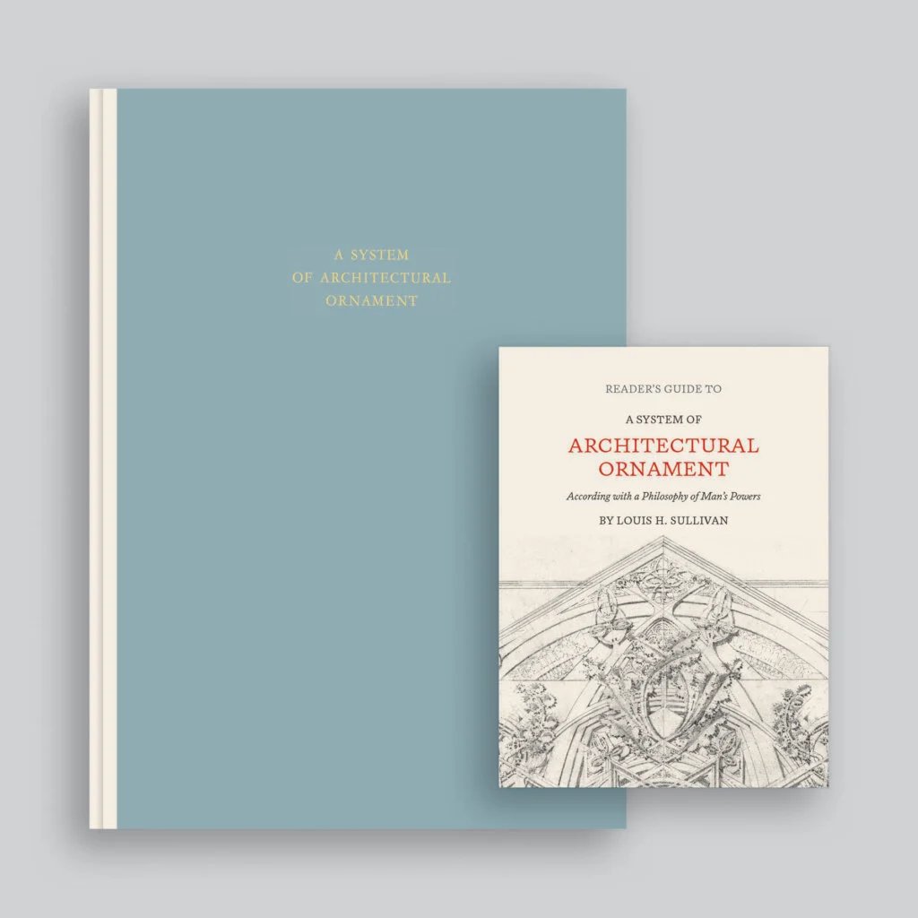
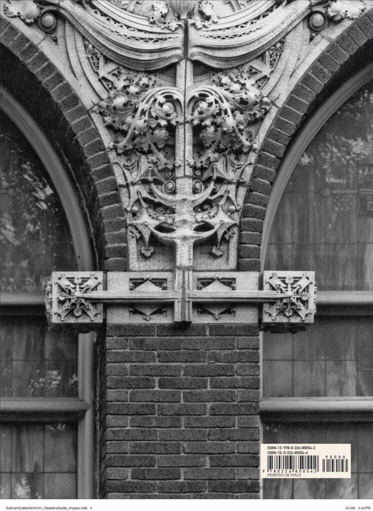
A System of Architectural Ornament According with a Philosophy of Man’s Powers is returning in a full-scale facsimile of Louis H. Sullivan’s 1924 publication, with an illustrated reader’s guide. Co-publisher Designers & Books currently announces December 2026, rather than the 10 November date previously stated here. The edition reproduces the original 14 × 20-inch format. Its architectural interest lies in what this reproduction can document and teach, and in what a printed drawing cannot establish about a built surface.
From blank block to organised growth
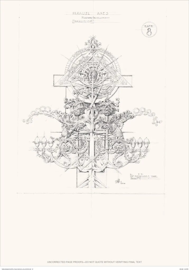
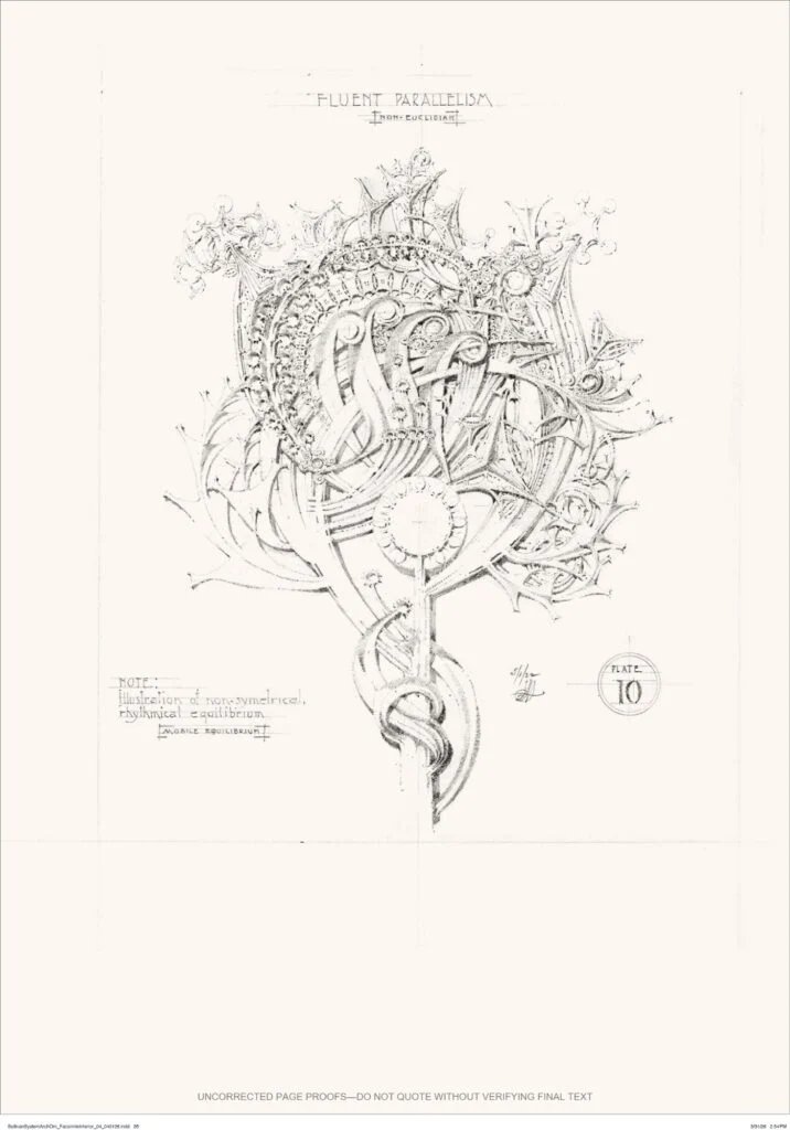
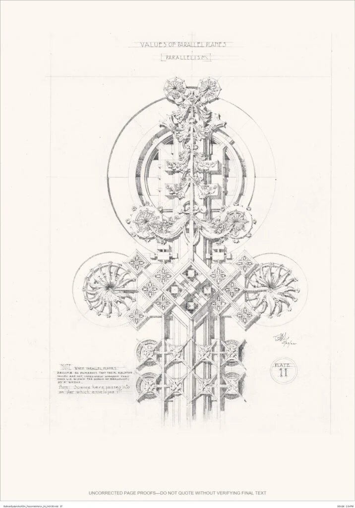
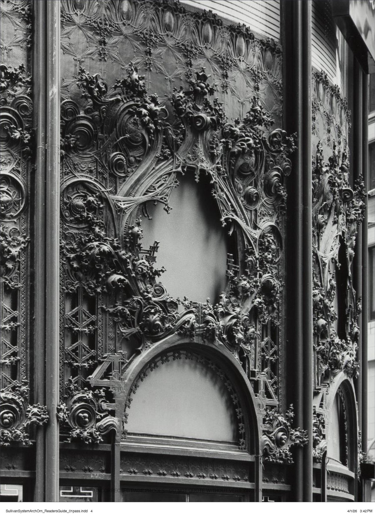
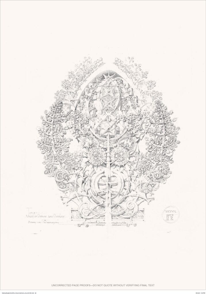
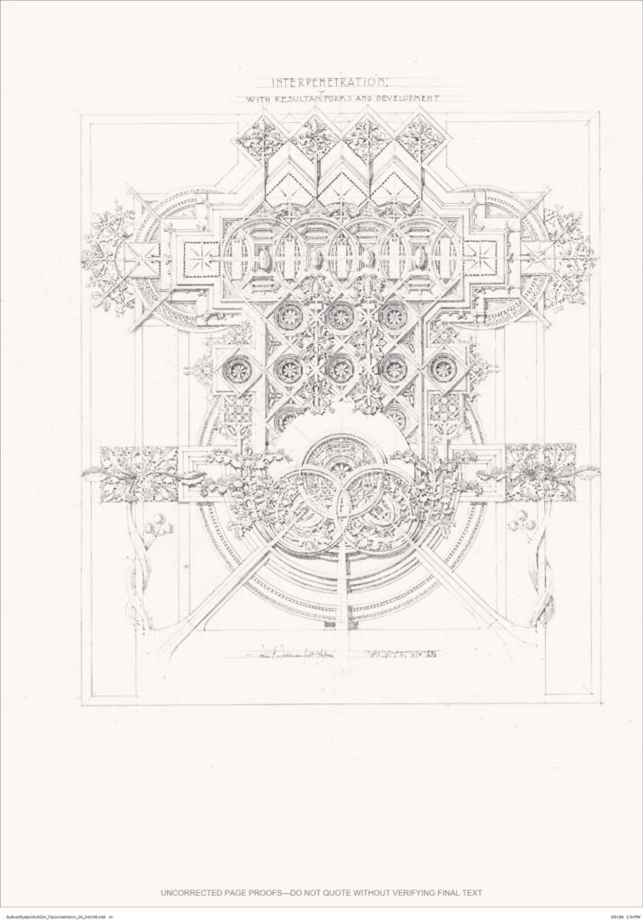
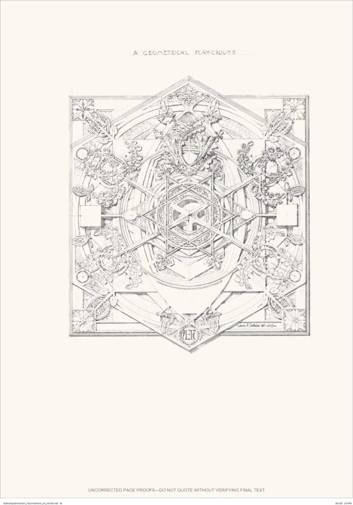
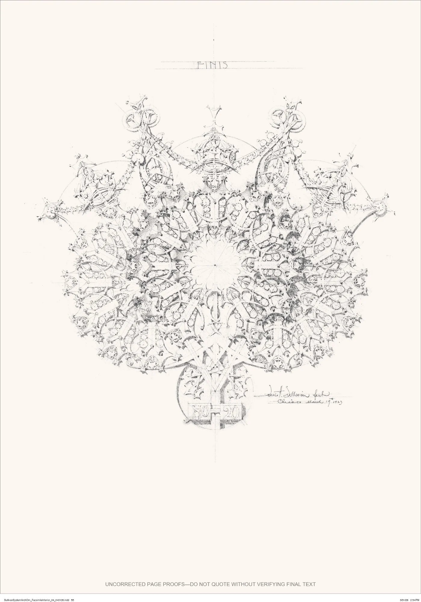
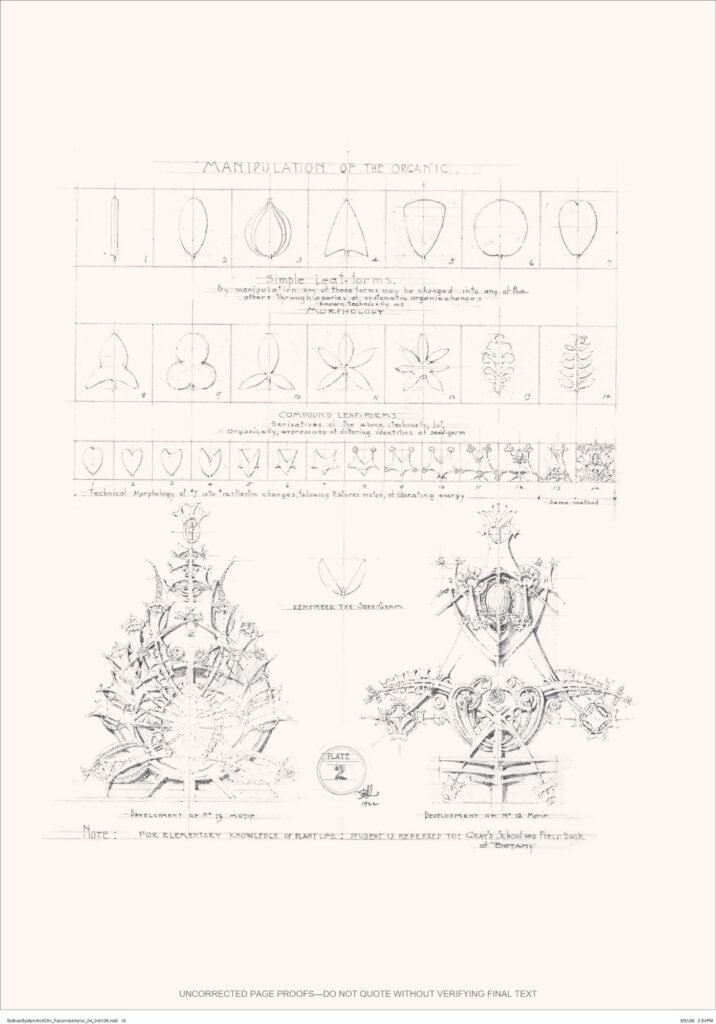
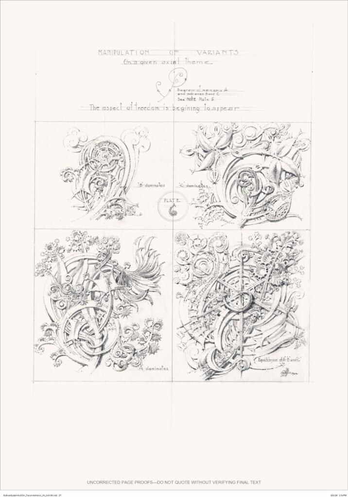
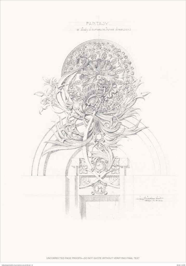
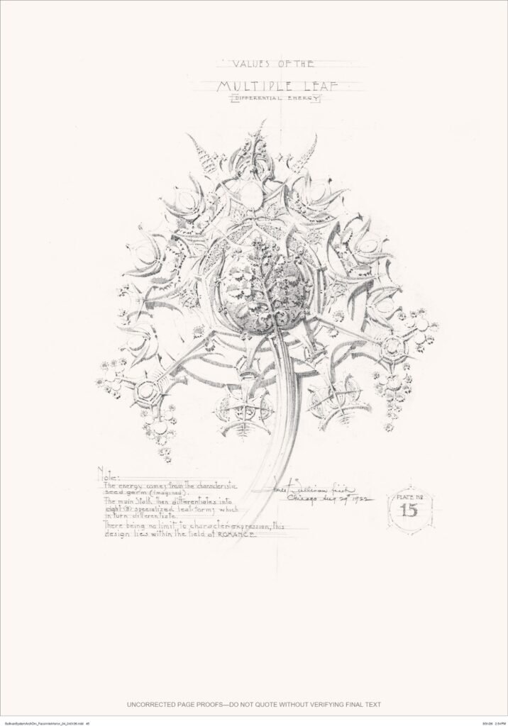
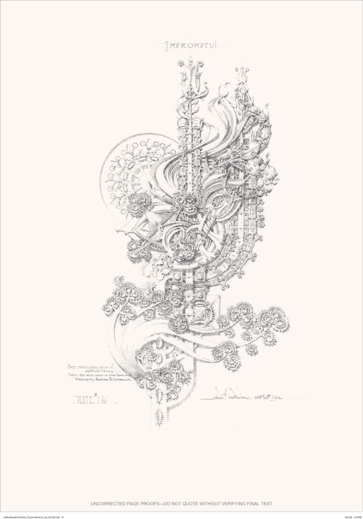
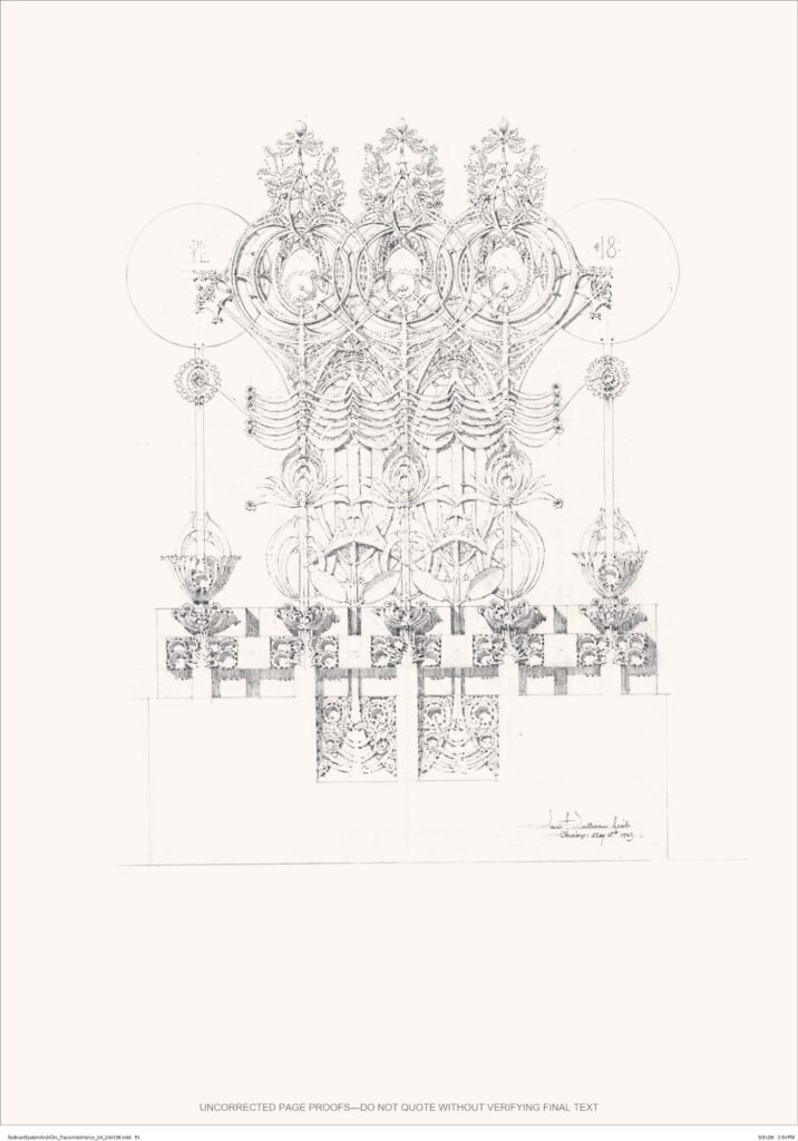
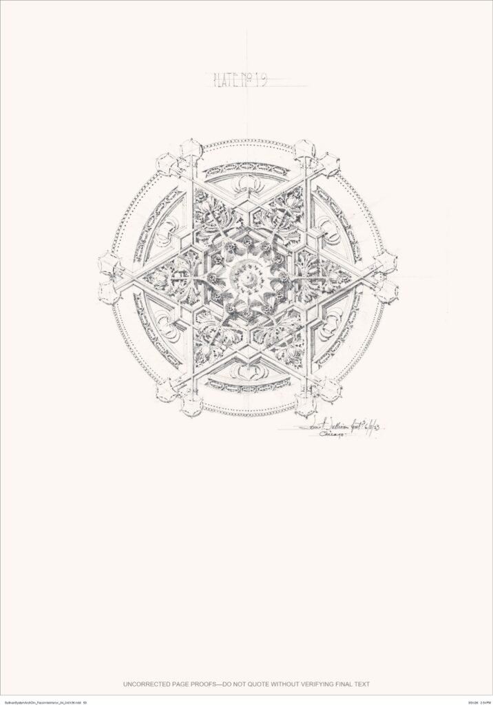
Sullivan’s plates do not treat ornament as a final appliqué. They document a sequence in which a bounded geometric field is divided, repeated and progressively transformed. Curves, stems and leaf-like structures emerge from a scaffold that remains visible beneath the organic density. Read in order, the images behave more like instructions for developing form than a catalogue of motifs.
Why the page size matters
Reproduction size can affect the ease of inspecting fine linework and comparing a motif with the whole sheet. A full-scale edition offers a consistent physical reference for that comparison; the publisher also presents detail visibility as a benefit. Neither point establishes that every reduced copy loses essential information or that a larger page necessarily slows reading. Print resolution, reproduction quality, lighting and the reader’s task remain relevant. Restoring page dimensions also does not reproduce Sullivan’s hand movement or the working process behind each drawing.
A book designed for comparison
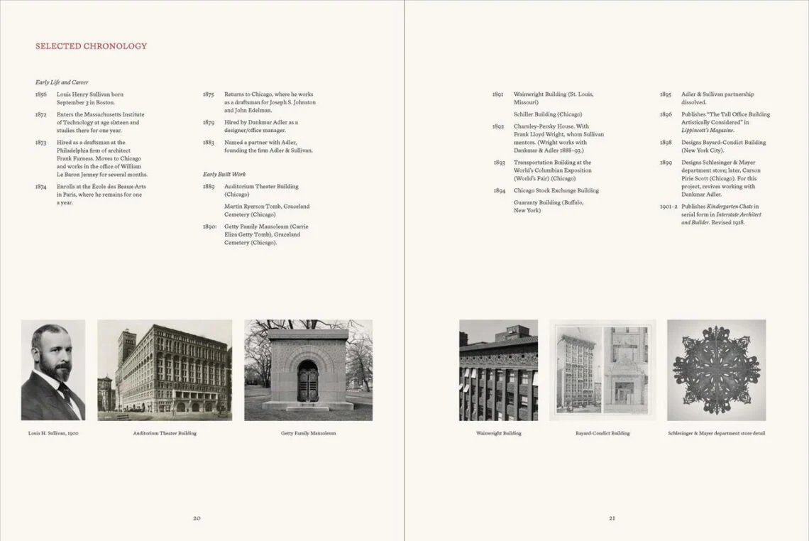
The edition is an 80-page paperback with 33 colour plates and 19 halftones. Its illustrated guide includes an essay by Alison Fisher, curator of architecture and design at the Art Institute of Chicago, examining the work’s historical reception and continuing relevance. That supplementary layer matters because it helps distinguish Sullivan’s method from later stylistic imitation.
Ornament as a rule, not a surface effect
Sullivan’s relevance does not require a return to nineteenth-century imagery. The transferable lesson is the disciplined relationship between part and whole: a motif is accountable to a larger field, and variation occurs within a visible order. That logic can inform screens, cast elements, digital fabrication and surface assemblies, but only if material thickness, joints, maintenance and viewing distance are considered alongside geometry.
Credits
Original work: Louis H. Sullivan, commissioned by the Art Institute of Chicago and first published by the American Institute of Architects in 1924. Facsimile edition and reader’s guide: University of Chicago Press. Reader’s-guide essay: Alison Fisher.
✦ ArchUp Editorial Insight
A full-scale facsimile is most defensible here as an instrument of documentation and teaching. It gives a library, archive or design studio a physical reference for comparing the organization of Sullivan’s drawn fields without treating an original copy as a working object. That is a narrower and more useful claim than suggesting that an enlarged page automatically improves design understanding. For historians, the reader’s guide can help separate the 1924 publication from its later reception; for students, the plates can support exercises in describing how a unit changes across a composition. Those are proposed uses, not outcomes measured in this review. For a practising architect, the transfer to a contemporary screen or facade remains a separate design problem involving material, joints, fabrication and maintenance. A faithfully reproduced drawing is not evidence that the same geometry will perform successfully in another assembly. The practical question is therefore whether this edition supports a specific reading or teaching task better than the copies already available to that reader. Its size and fidelity are means to that task, rather than sufficient reasons to acquire it.
Who is this edition useful for?
Its clearest use is as a reference for architectural history, collection documentation and teaching from reproduced drawings. A design practitioner may use the plates to analyse relationships between a repeated unit and its field, but the edition should not be treated as a construction-detail manual or evidence of contemporary facade performance. This assessment draws on the publisher’s description, contents and the reproduced material available for this article; it is not a review of every page or an inspection of a printed copy.
Editorial review and correction — 22 October 2026: The publication timing was corrected to the co-publisher’s current December announcement; unsupported effects of page scale were qualified and the edition’s documentary uses and review limits clarified. Reviewed by ArchUp Editorial Committee.