The Lens: Daylight Without an Open View from the Street


A house can welcome daylight without offering the street an equally clear view inside. At The Lens, in Montreal’s Villeray neighbourhood, that distinction organizes the building. A curved glass-brick wall filters the southern edge, while a much more transparent rear elevation opens family rooms toward the garden. The contrast is not simply between two facade treatments: it distributes privacy, outlook and shared activity around an exposed urban site.
The residence was built after demolition of the original house, for a couple and their children. A street runs along the southern boundary, with alleys to the east and north. The brief called for a welcoming family home with privacy, and the response assigns different degrees of openness to different edges rather than treating transparency as a uniform goal.
Arrival separates the front door from the garage
Pale beige concrete brick forms the largely solid street elevations. A staircase rises to a recessed entrance, while a sloping driveway descends beneath it to the basement garage. These two movements distinguish the pedestrian threshold from the vehicle route. An existing white spruce was retained within the landscaping, where grasses, shrubs and flowering plants soften the meeting between masonry and pavement.

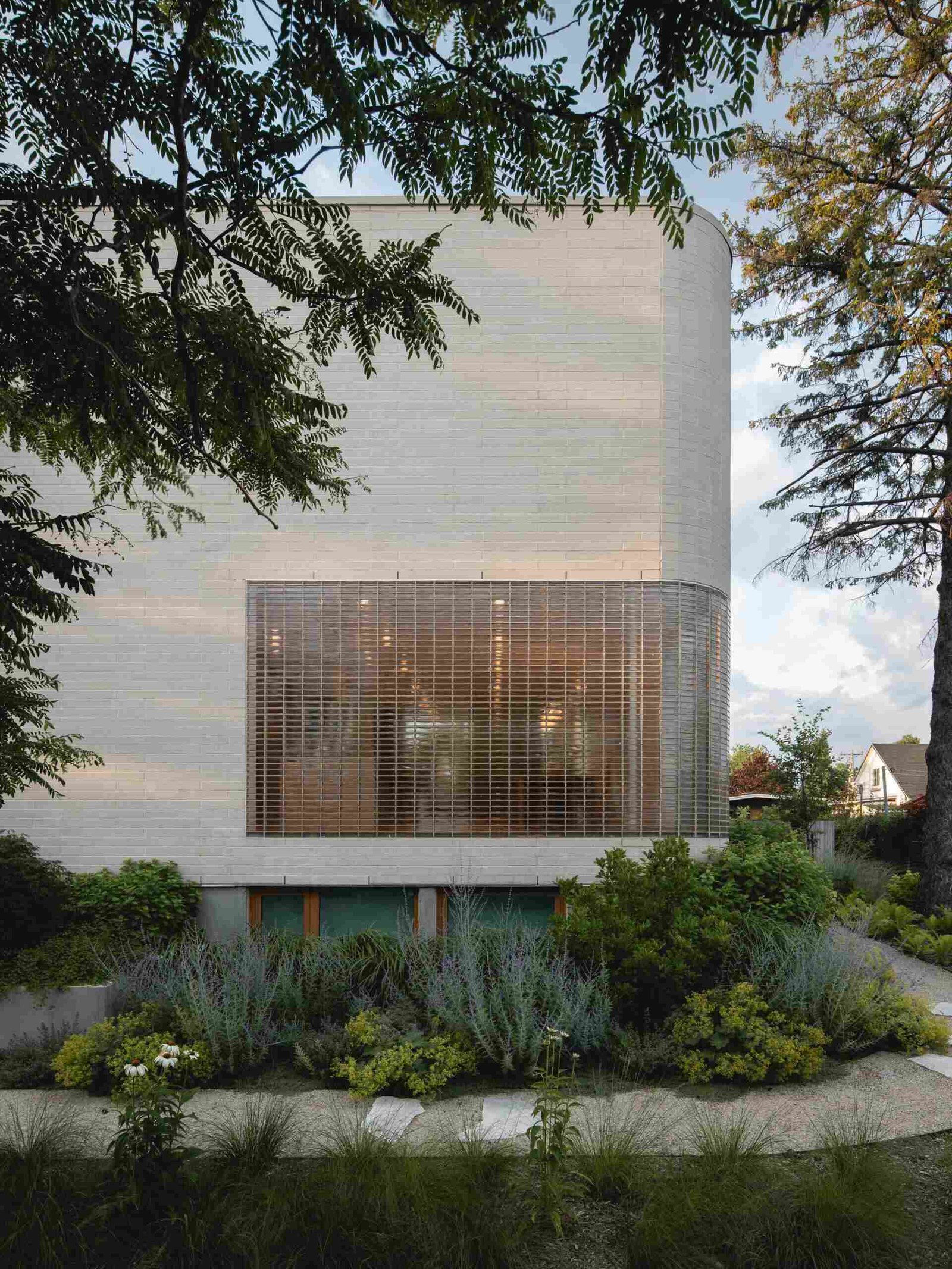
The rounded glass-brick corner interrupts the solidity at the main living level. Above it, more selective windows keep the upper rooms from repeating the same exposure. At dusk, light from inside makes the curved surface more apparent; its role changes visually even though its position in the envelope remains fixed.


A luminous boundary beside the dining table
From inside, the curved wall gives the dining area a broad band of filtered daylight. It softens outside detail into changing colors and movement rather than providing an uninterrupted view. The project relates this approach to the Japanese shoji tradition, but its practical significance here is specific: a room close to the street can receive light without being enclosed behind an opaque wall.
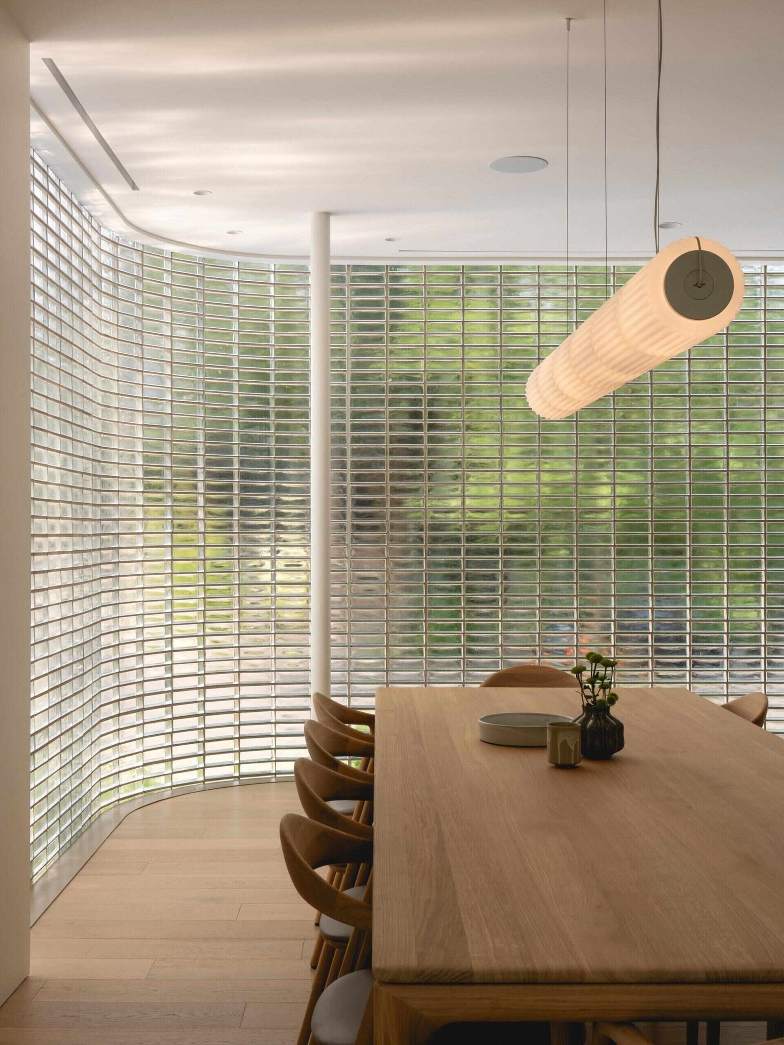


The timber table and chairs sit alongside the curve, with a fluted pendant by A-N-D Light above. The dining setting and the wall have different geometries: one anchors a group of people around a rectangular surface, while the other wraps the room’s edge. That distinction leaves the glazing as a spatial boundary rather than asking the furniture to imitate its shape.
A comparable question appears in Concrete Flakes, where a metal screen adds a filtering layer outside office glazing. The assemblies are different, but both separate the visual character of an opening from the amount of exterior detail seen through it. Neither appearance alone establishes thermal or acoustic performance.
The garden side permits a different kind of openness
At the rear, floor-to-ceiling glazing and a double-height living volume replace the more guarded street face. Broad steps descend toward the lawn and pool. A covered veranda contains outdoor dining, a kitchen and barbecue, while a terrace from the primary suite occupies the level above. A green roof and planting add further surfaces to the outdoor composition.

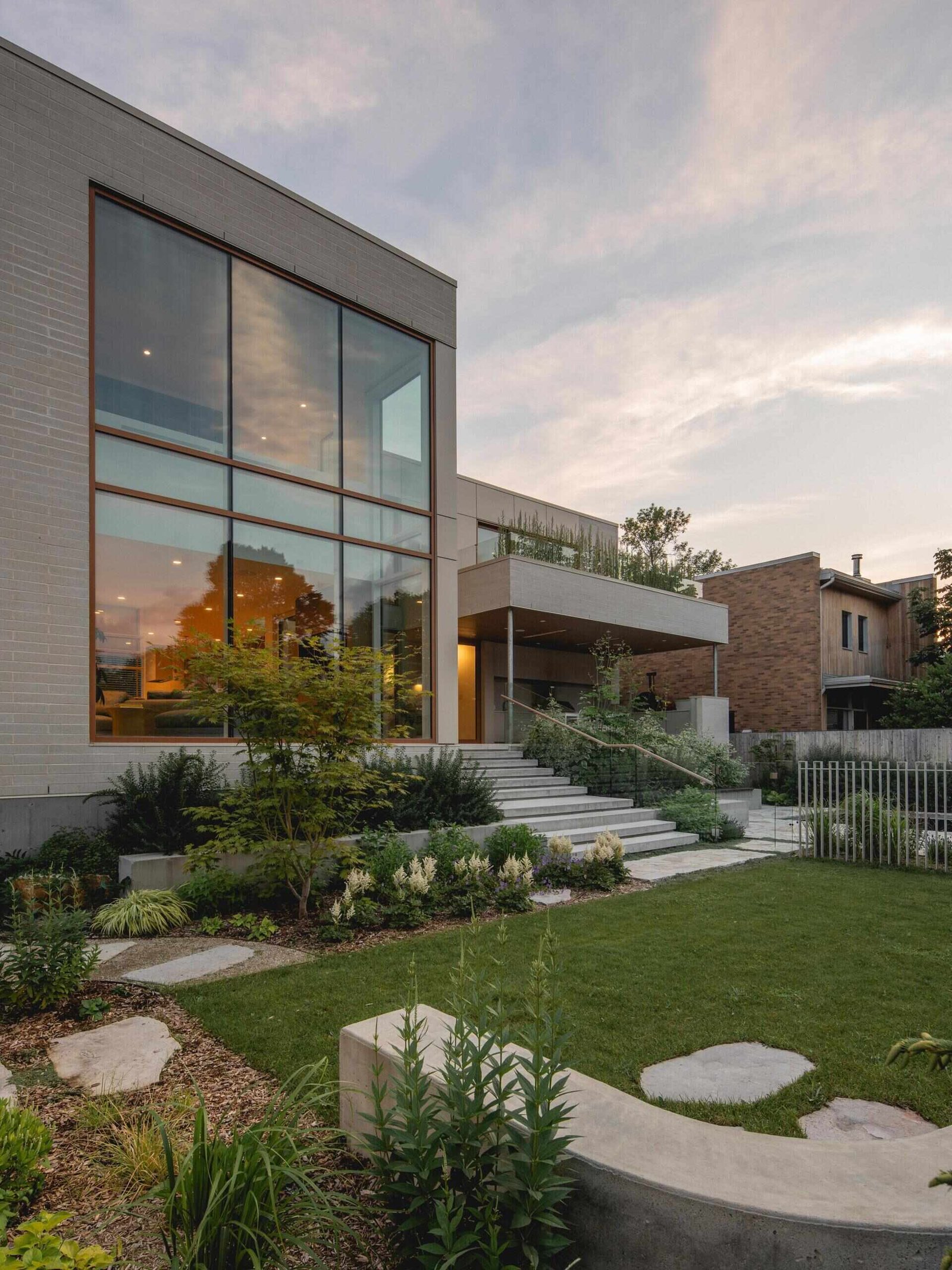

These spaces provide different positions within the same garden relationship: sheltered dining, an upper terrace and a lower pool edge. They also make changes in level part of daily circulation. The outdoor spaces are therefore not one continuous terrace, but a sequence with distinct access points and degrees of cover.
Shared rooms are connected without becoming identical
The living room uses its increased height to establish a recognizable family gathering place within the open main floor. A sectional sofa forms the seating area, while timber paneling incorporates the television. The mezzanine office overlooks the volume, extending visual connection between levels rather than closing the room at a single ceiling plane.


Beside the dining area, full-height walnut cabinetry concentrates kitchen storage and integrated appliances along one wall. A long island combines walnut panels with a pale porcelain top that continues down one end. The island provides work space and informal seats, while the dining table remains a separate place to gather.
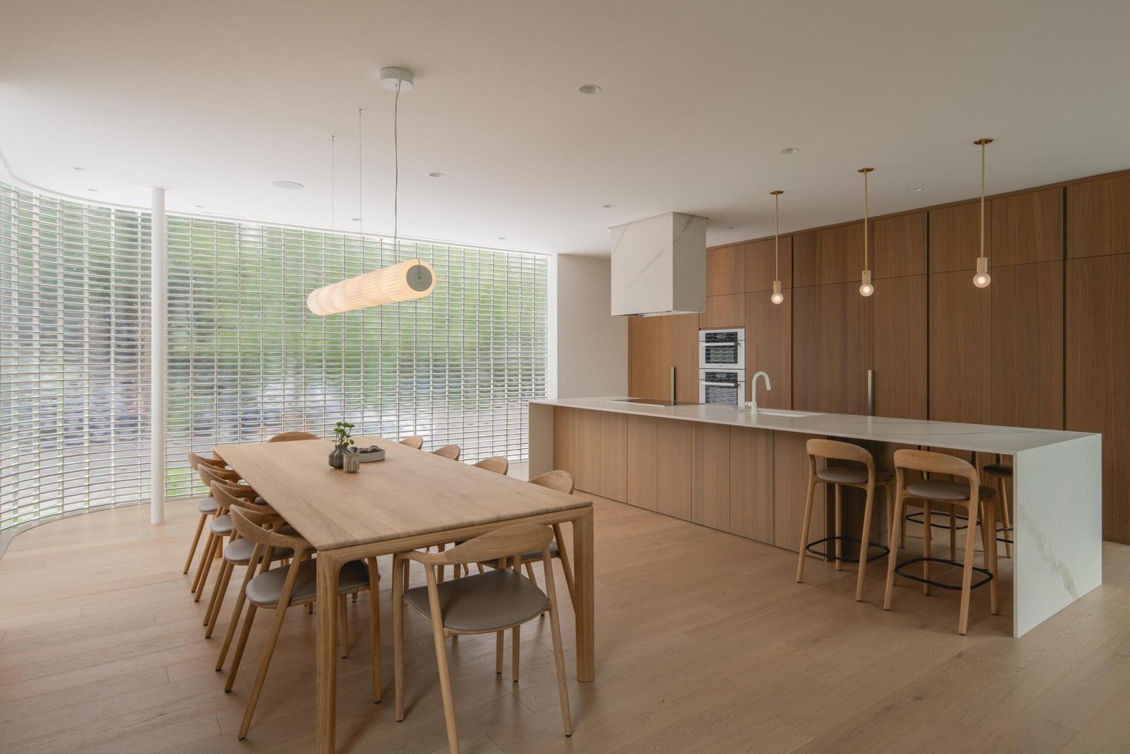
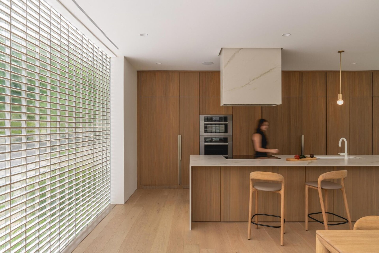
The repeated timber tones link the rooms without giving them the same task. For everyday use, the important distinction is between routes through the room and positions where people stop to cook or sit. Keeping those activities legible matters more than making every surface visually continuous.
The stair connects light and movement
A white steel staircase with open risers and glass balustrades occupies the vertical connection through the house. Adjacent glazing and the open volume allow views and daylight to extend beyond an enclosed stairwell. Glass-lined upper walkways overlook the space, while another stair continues to a rooftop lounge and terrace.


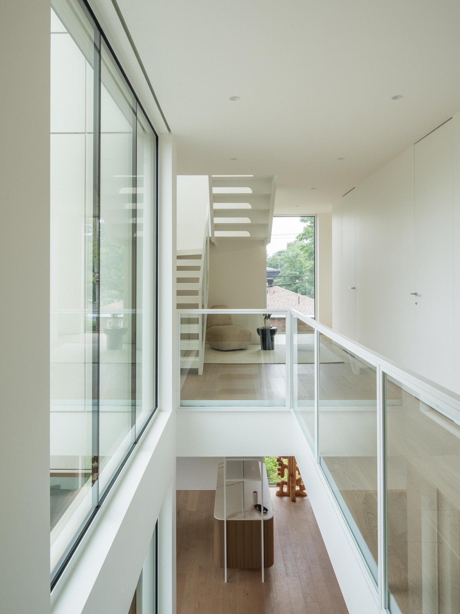
This arrangement creates continuity between floors, but it also makes the circulation spaces part of the shared interior rather than acoustically separate passages. The distinction is relevant to the mezzanine office: visual connection and quiet work are not automatically the same condition.
Private rooms and a separate working entrance
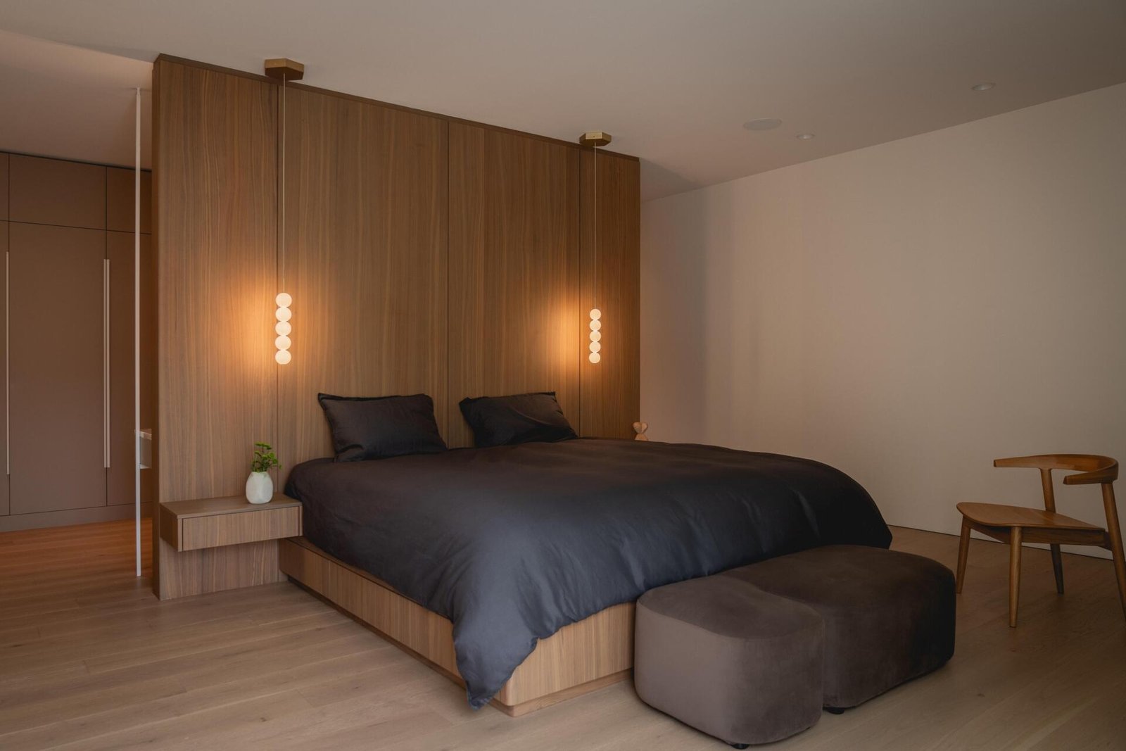
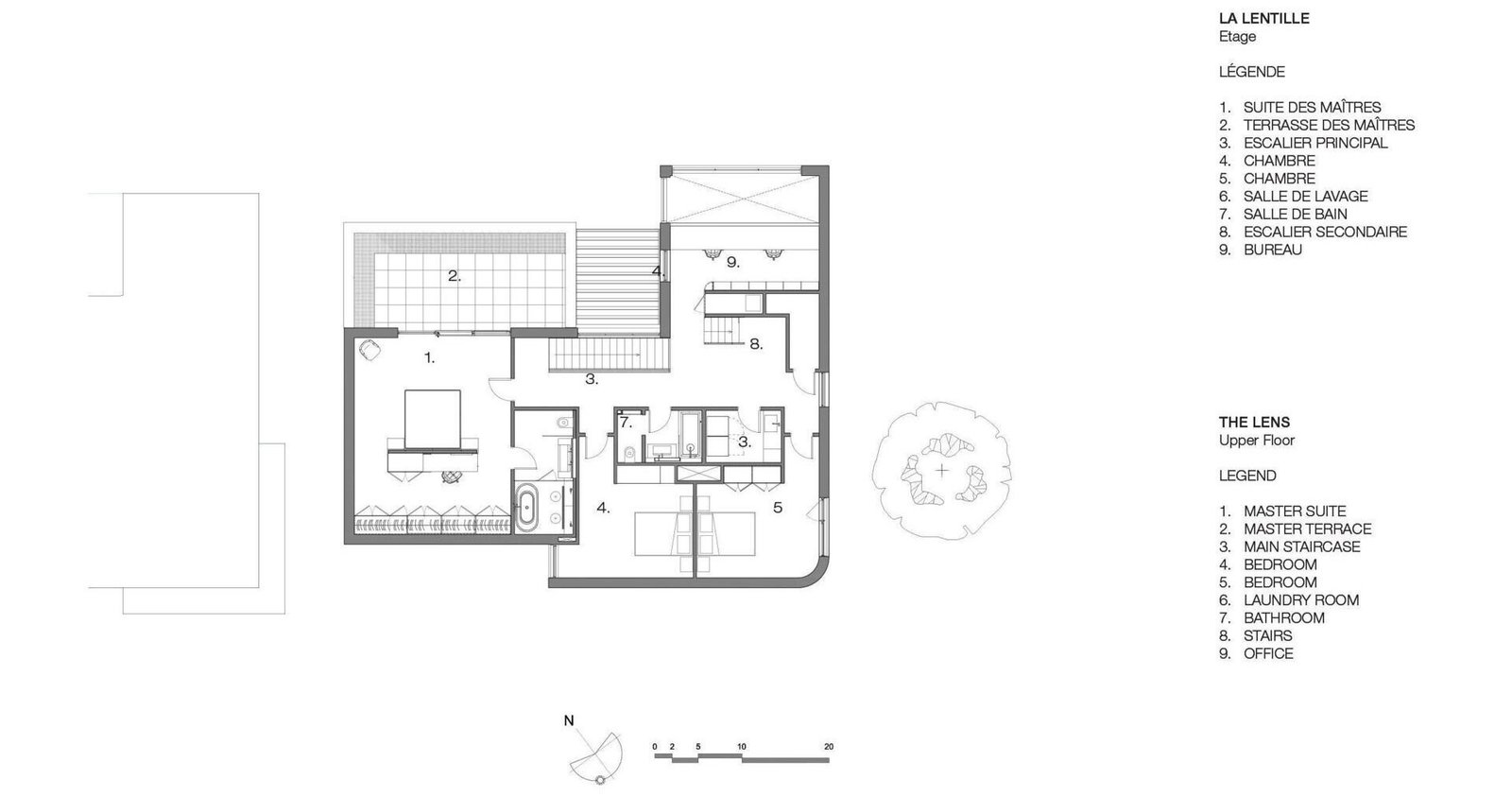
The primary bedroom uses a walnut wall with integrated bedside tables, while the bathroom combines pale porcelain, timber cabinetry and brass fittings. Two children’s bedrooms share a bathroom and nearby laundry facilities on the upper floor. The primary suite opens to its own garden-facing terrace.

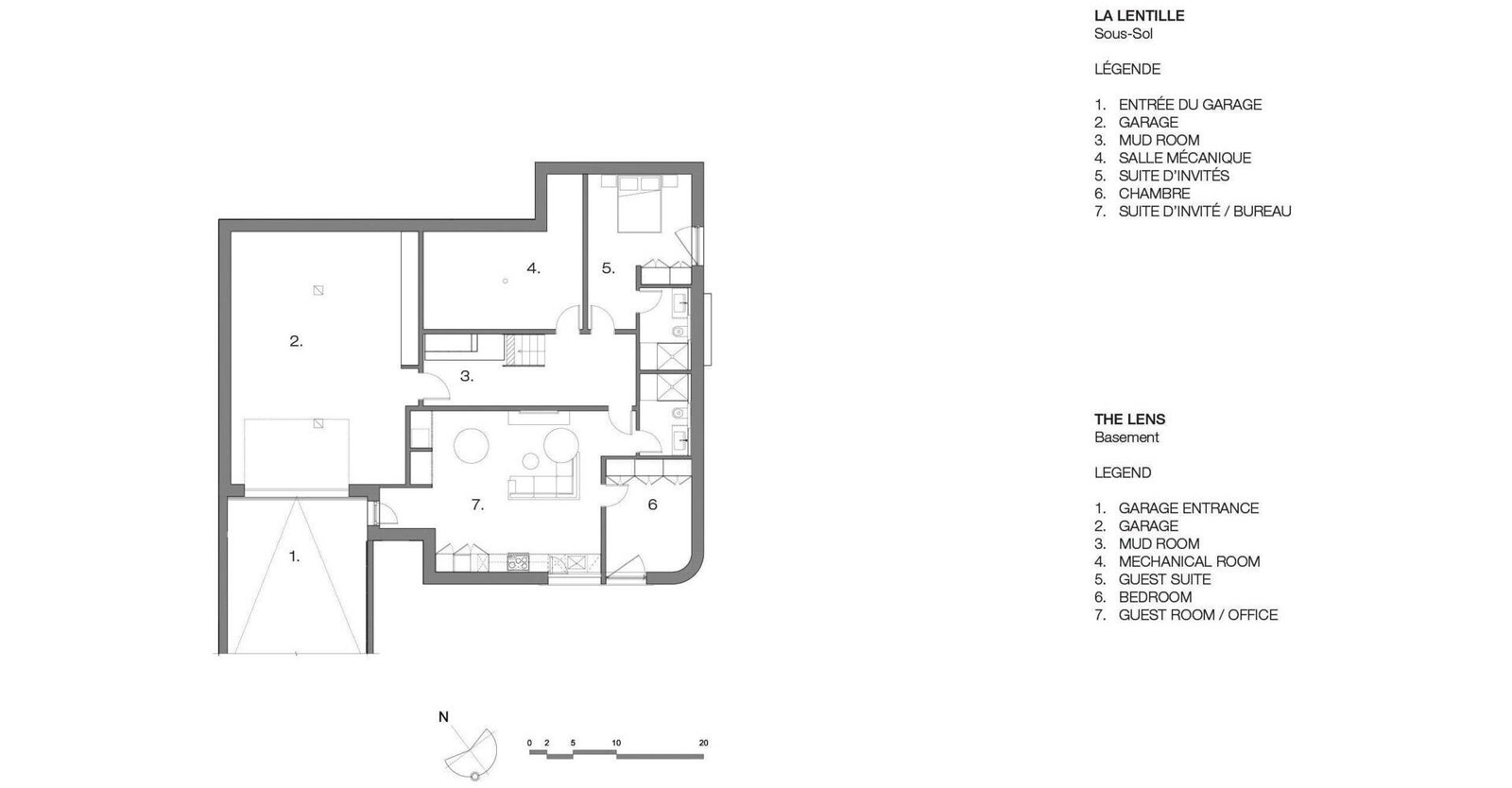
The basement accommodates the garage, a mudroom, guest space and a flexible room that can serve as an office. Its separate access from the driveway allows visitors to reach that workspace without using the principal domestic entrance. This is a second form of privacy in the project: not filtering what can be seen, but controlling which route different users take.
Original floor plans
The drawings show the distribution from basement access to the shared main floor and the bedrooms above. They are presented at full width so room labels and circulation remain readable.

✦ ArchUp Editorial Insight
A family home bordered by a street to the south and alleys to the east and north faces a specific conflict: useful daylight arrives from directions that also expose domestic life to public view. The Lens answers with different kinds of boundary rather than a uniformly open envelope. Solid masonry limits exposure, curved glass bricks admit light without offering the same clarity as a window, and large rear glazing directs everyday views toward the garden. This produces a house with an intentionally uneven relationship to its surroundings. The dining area occupies the filtered edge, while the living room takes advantage of the clearer outlook. A separate basement approach adds another distinction, allowing a workroom to receive visitors without routing them through the principal family spaces. The trade-off is that openness remains selective and must be supported by detailed construction: the curved wall, its joints and its meeting with adjacent materials are as important as its photographic effect. ArchUp reads the project’s transferable lesson as the separation of daylight, outlook and access. These are three different requirements; treating them separately can be more useful than asking a single large window to solve all of them.
Project credits: The Lens, Villeray, Montreal. Architecture: MU Architecture; team: Jean-Sebastien Herr, Charles Cote, Magda Telenga, Michelle Belair, Andree-Anne Godin, Pierre-Loup Pivoin, Tommy Chouinard and Karine Taillon. Cabinetry: Atelier Notre-Dame. Structural engineering: Poincare Ingenierie. General contractor: Construction OVI. Landscape: Atelier Friche. Masonry: Hardy inc. Photography: Raphael Thibodeau. Drawings: MU Architecture.