Cine Tutu: From Street-Level Gathering to the Screening Room

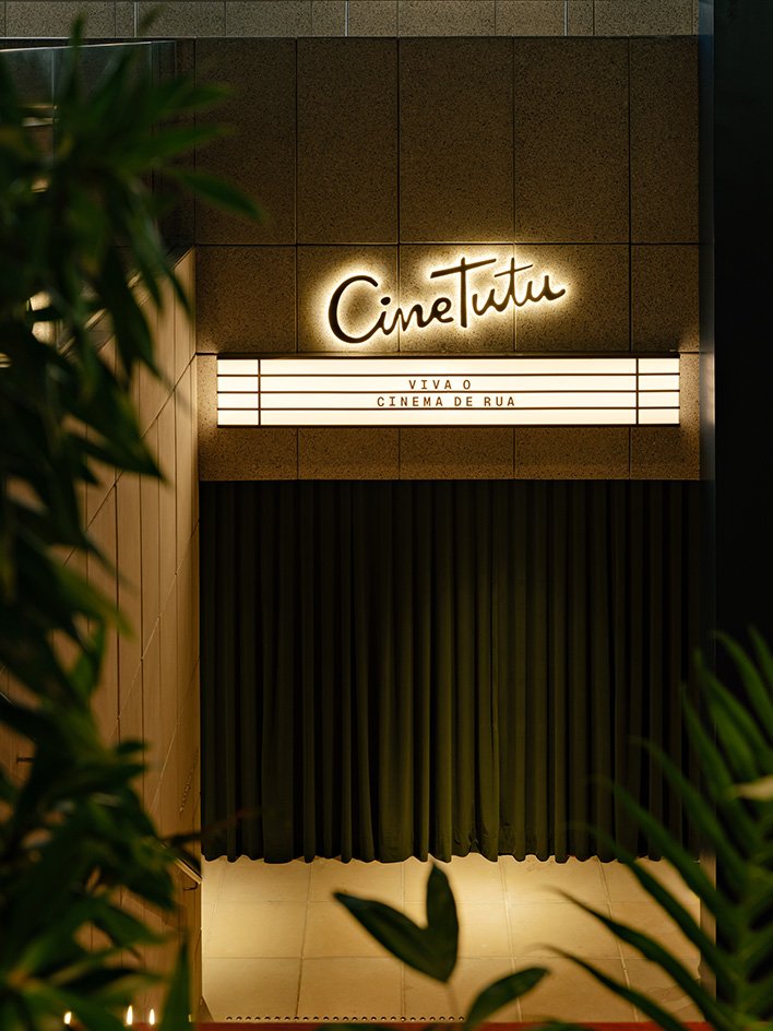
At Cine Tutu, the transition from meeting people to watching a film is expressed through three distinct interiors: a café under a blue ceiling, a cork-lined foyer and a dark green auditorium. The 114-seat independent cinema at Rua Girassol 555, in São Paulo’s Vila Madalena, shares its entrance with the Barouche café-bar, which is also open to visitors without a cinema ticket. Colour, surface texture and the direction of light give each stage a different character.
A blue ceiling, a timber edge and a place to pause
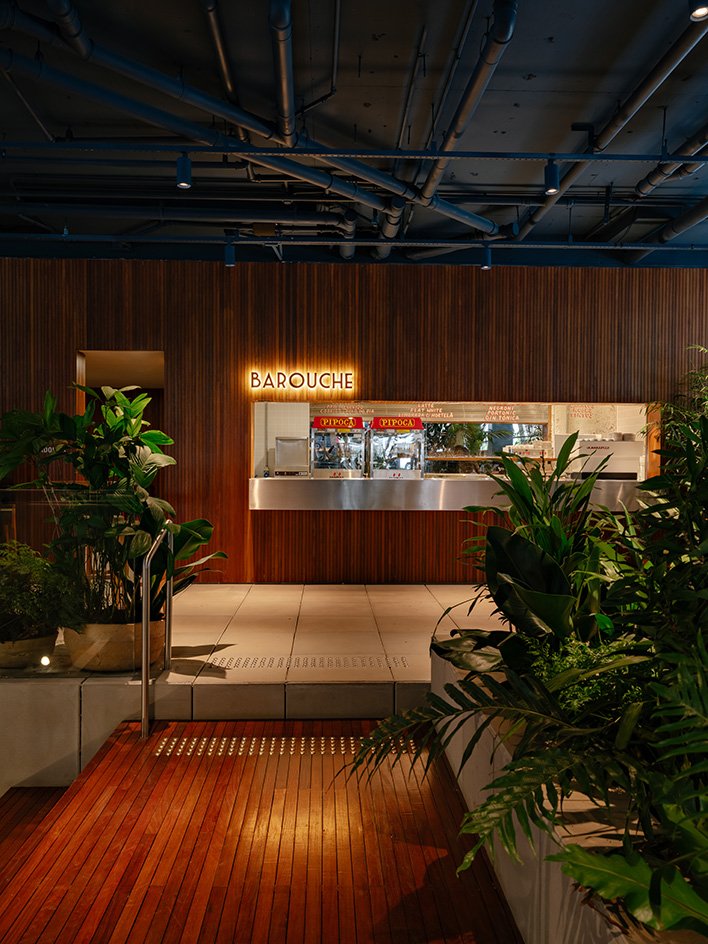
The café makes a clear distinction between what happens overhead and what meets the visitor at eye level. The architect removed the suspended ceiling and painted the exposed water and fire-service installations deep blue. Across the pipes, supports and ceiling, this common colour visually groups a complicated assembly without disguising its parts. Below it, closely spaced vertical timber strips create a finer, more regular rhythm. The horizontal serving opening cuts across that rhythm, making the counter easy to pick out within the wall.
Light strengthens this distinction. The counter and its metal edge catch brighter highlights, while the blue ceiling remains comparatively subdued. Planting flanks the approach rather than occupying its centre. At the change of level, the handrail, contrasting floor surfaces and visible tactile markers provide different kinds of information: something to hold, a visual boundary and a textured warning underfoot. Together, these details mark the transition between the two floor levels.
Cork and reflected light make the foyer a room
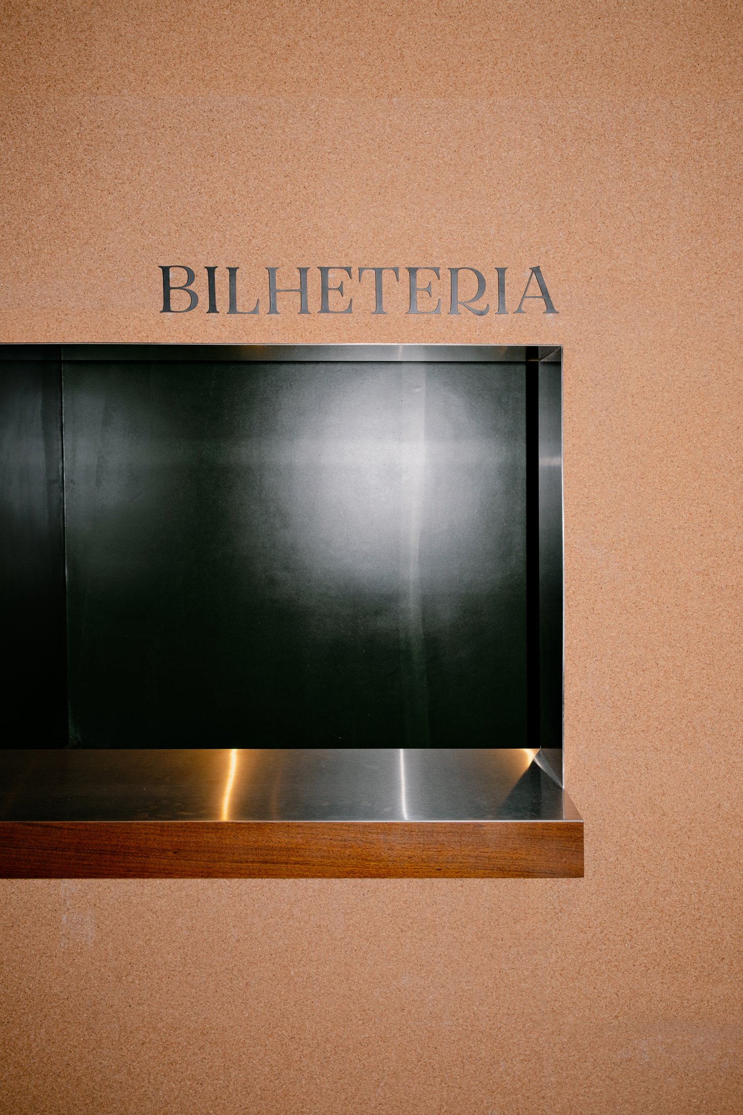
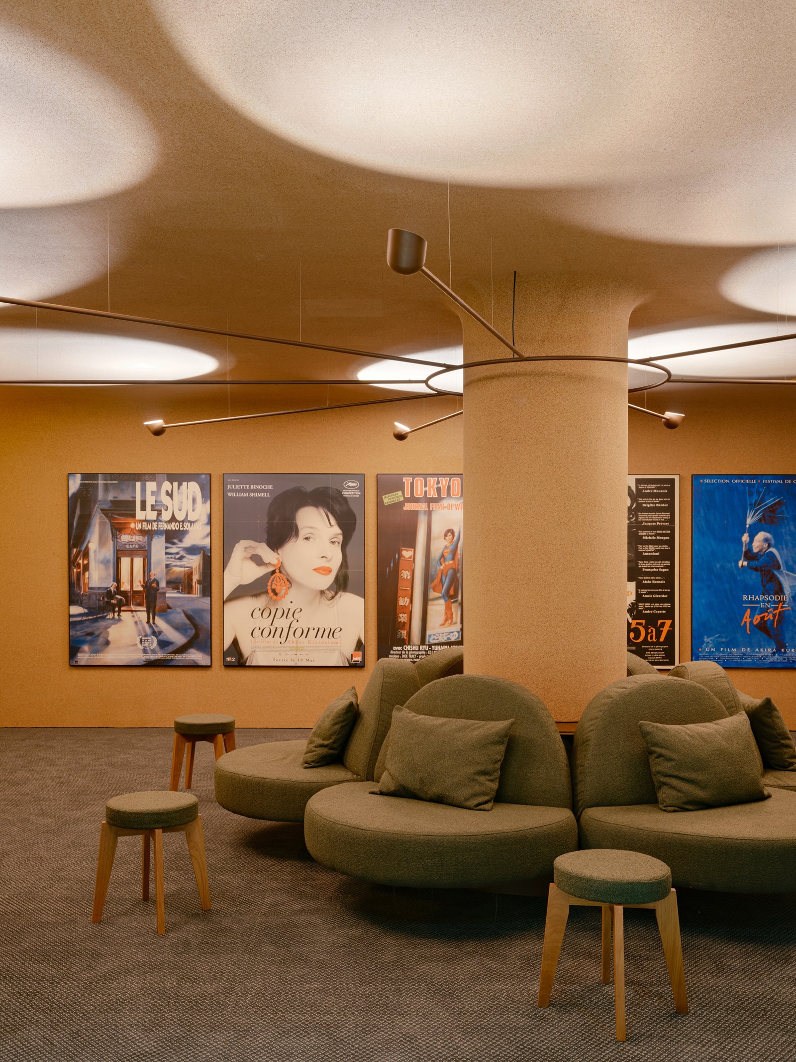
Cork covers the foyer walls and ceiling. Its fine-grained surface gives these planes a similar texture, so the ceiling reads as part of the enclosure rather than as a separate white lid. The film posters remain sharply framed interruptions within that continuous background. This is a different use of contrast from the café: the room is held together by a warm-toned surface, with individual images providing the detail at eye level.
The branching light fixture around the central column directs light upwards. Distinct pools of illumination spread across the ceiling, with darker intervals between them; the ceiling itself becomes a visible part of the lighting composition. The result is not a uniformly glowing room. Light establishes a centre over the seats while leaving the perimeter comparatively quiet. Because the light lands on the cork, the surface texture and the illumination are read together rather than as separate effects.

A central seat that looks outwards
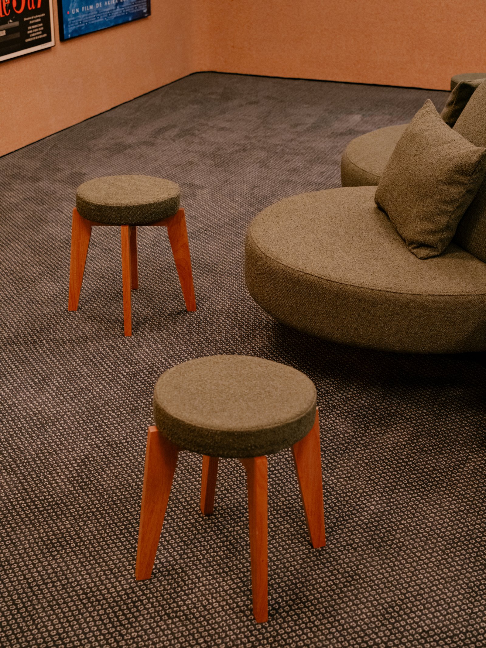
The curved sofa wraps around the column, but its occupants face out into the foyer, not towards a shared centre. That distinction matters: it offers several views and small pockets of seating rather than one large face-to-face group. The low stools can provide facing positions beside those pockets. Above and below, the radial light fixture and rounded upholstery give the substantial column a clear role as a landmark. They do not remove its physical presence; they make that presence part of where people stop.
Green surfaces with different jobs
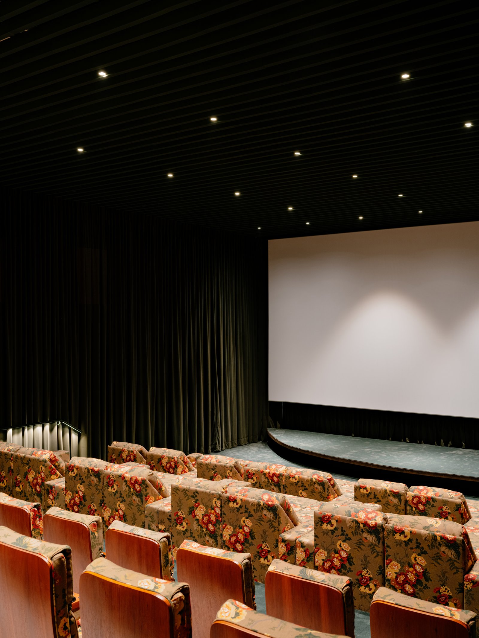
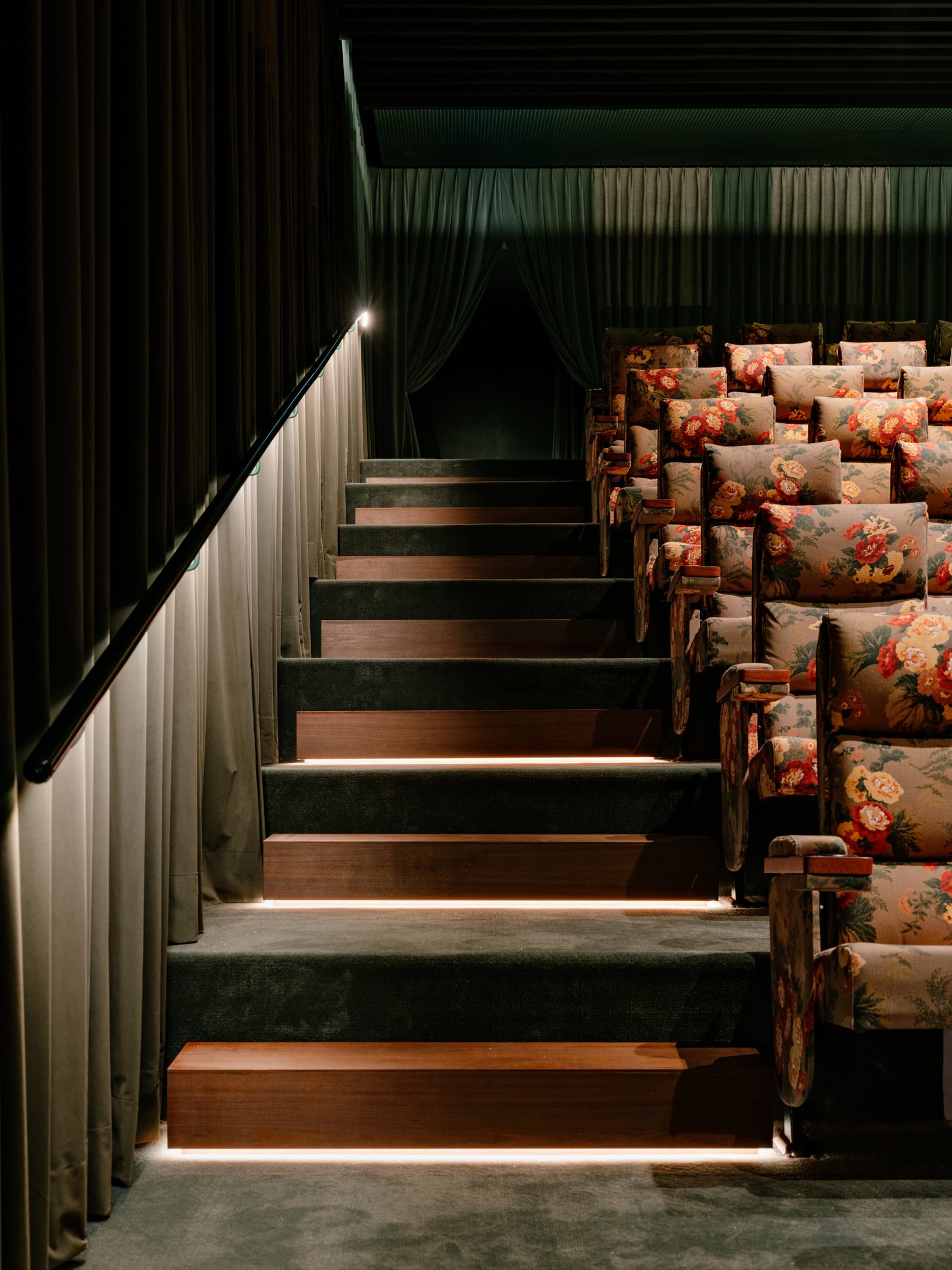
Inside the auditorium, the green changes from a colour accent to an enclosing background. Velvet curtains conceal the speakers, while green acoustic ceiling elements screen the services overhead. The curtain folds introduce vertical shadows; the repeated ceiling elements give the room a transverse rhythm. Although their textures differ, the shared colour reduces the visual separation between wall and ceiling. In ArchUp’s reading, this lets the patterned seating stand out without requiring a separate decorative treatment on every surface.
The architect specifies the ceiling elements as sound-absorbing. Their role concerns sound within the room; it should not be confused with a measured level of isolation from neighbouring spaces. Architecturally, the same layer combines an acoustic function with concealment of the services, giving the ceiling a continuous finish.
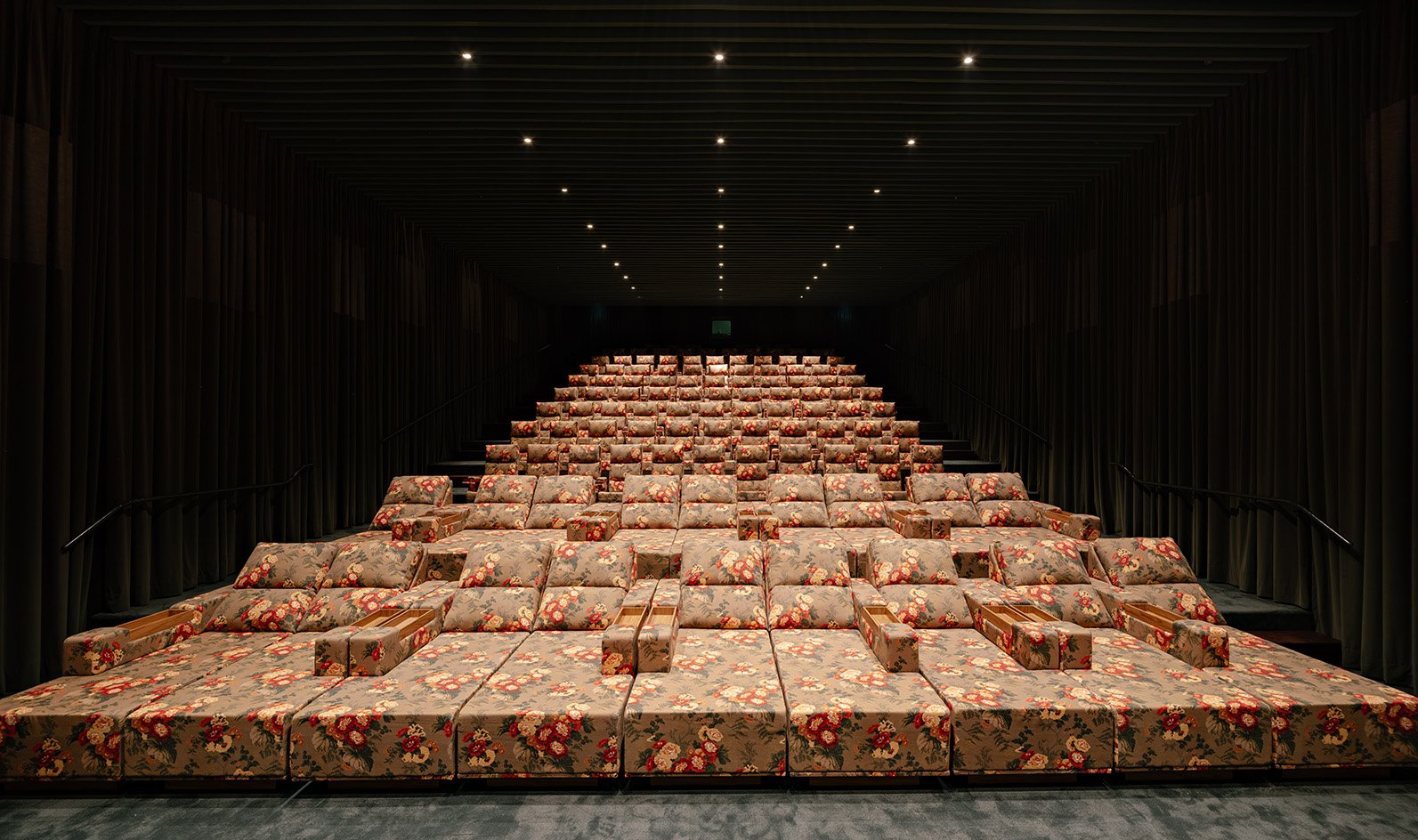
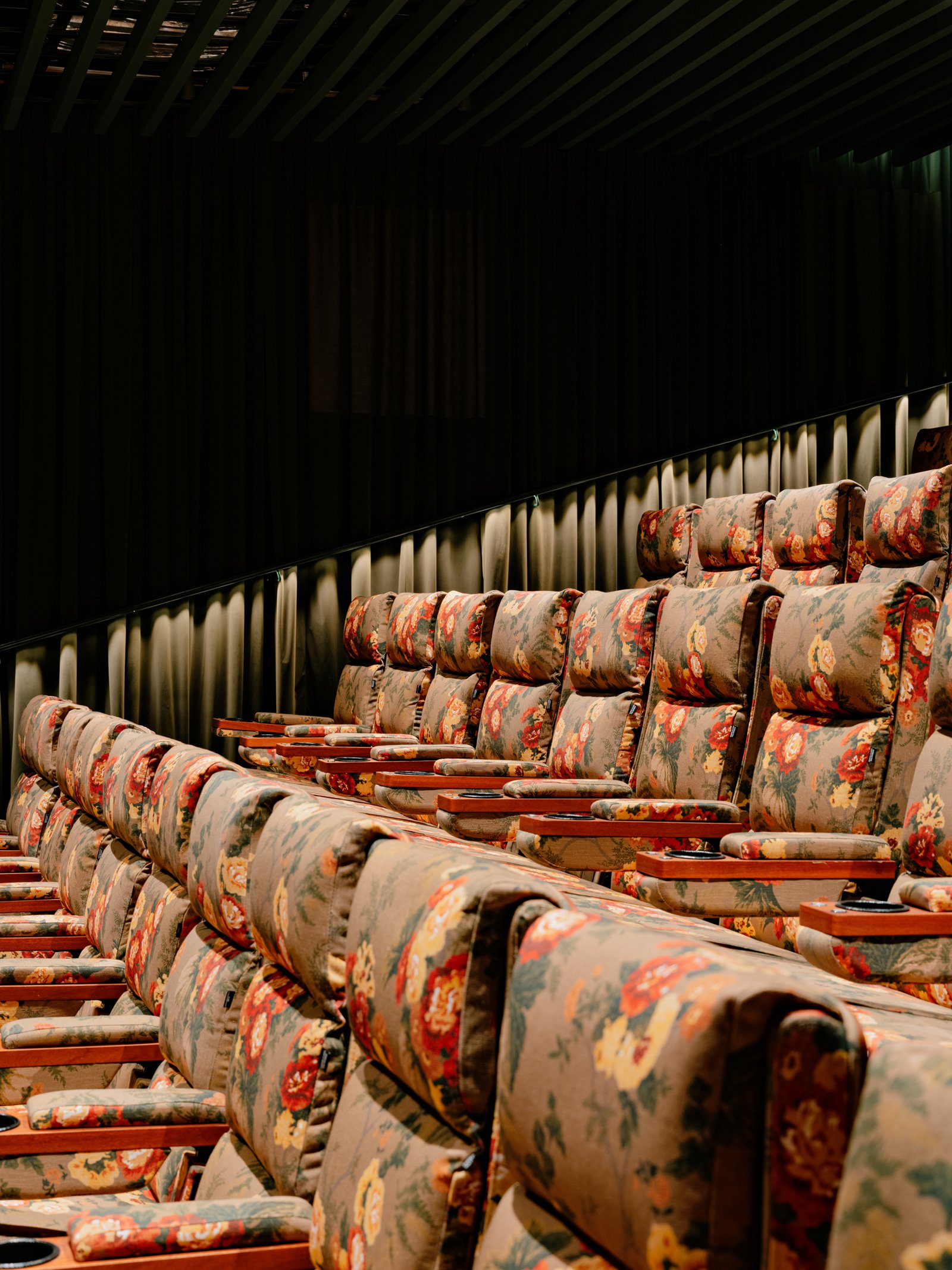
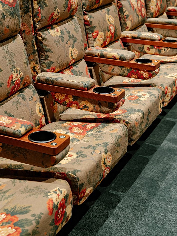
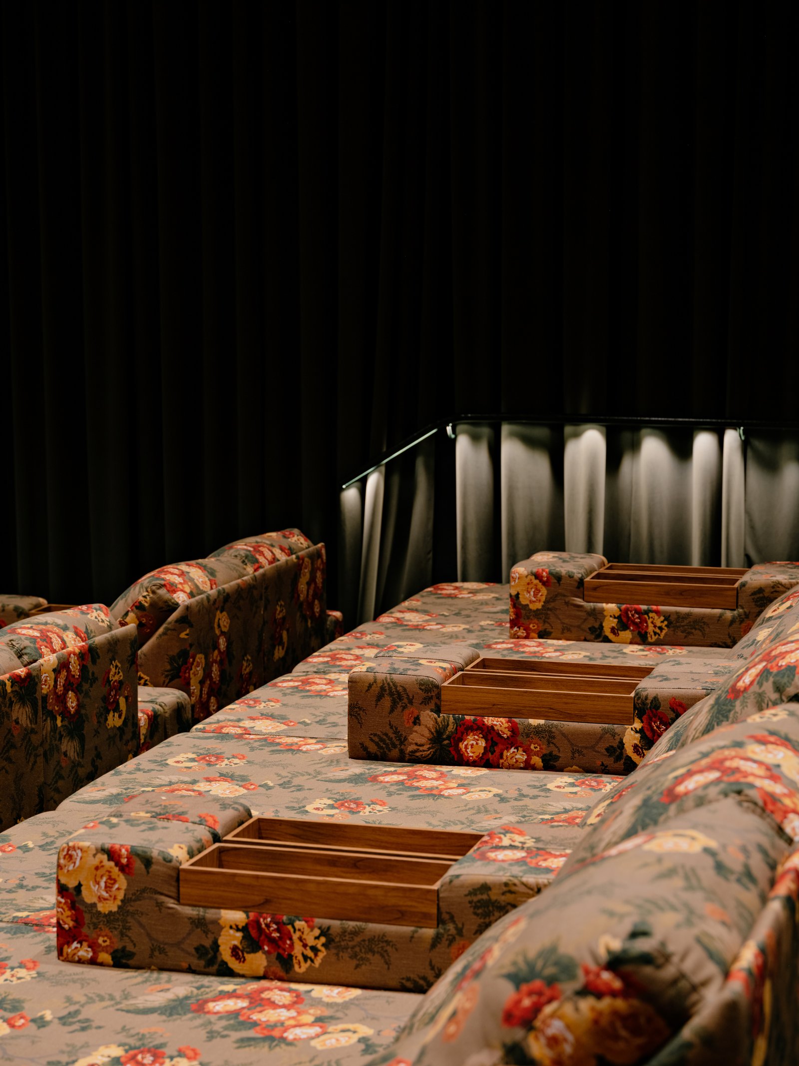
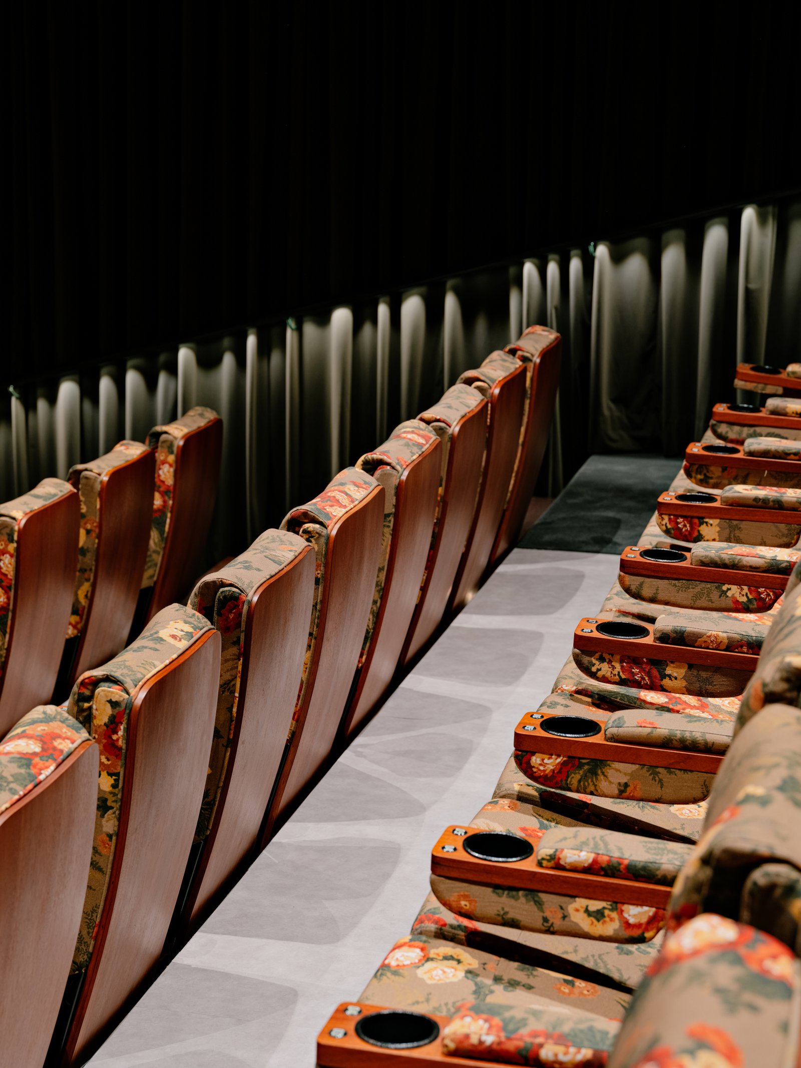
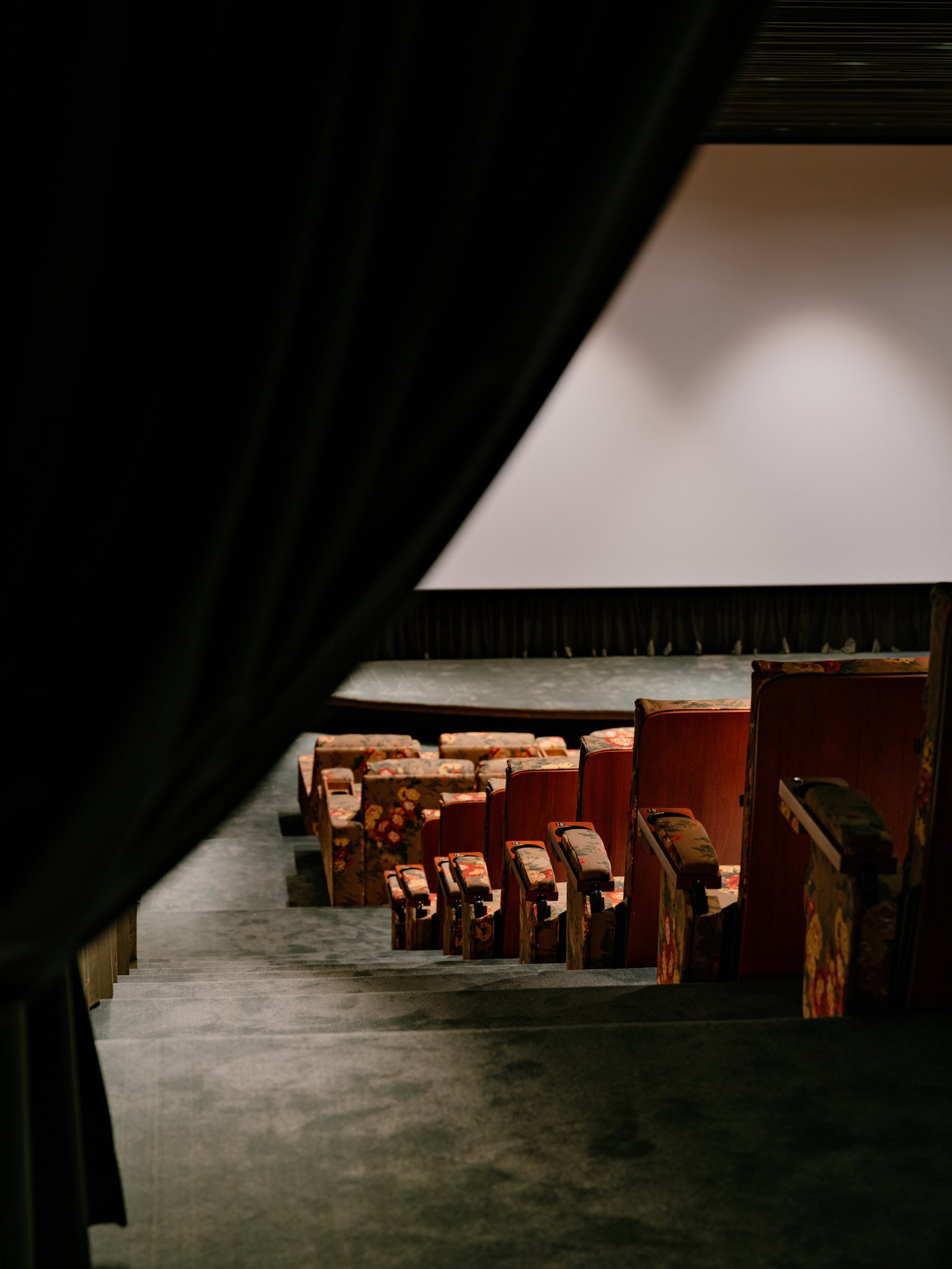
The floral fabric concentrates reds, pale tones and greens on the seats, close to the visitor’s body. From the front of the room, the repeated pattern reads almost as one continuous field; the timber arms and darker gaps then separate individual places within it. Up close, the smooth timber edges contrast with the padded surfaces. The front loungers are visibly deeper and more reclined than the upright rows behind, so the room offers more than one sitting posture rather than repeating a single chair throughout.
A physical foreground to the screen
The curved platform below the screen gives the front of the room a defined edge distinct from the rectangular image above it. The architect identifies talks and performances among its uses. This makes the front of the cinema readable both as a surface to look at and as a place someone can occupy. The deeper seats nearest it reinforce a different scale from the more compact rows rising behind; the contrast is spatial, not simply a change of upholstery.
Light follows the steps, not just the ceiling
At the side aisle, narrow strips of light trace the lower edges of the step risers, while lighting along the handrail picks out the curtain folds. The eye can follow the ascent through a repeated sequence of lit horizontal lines. This is more precise than describing the room as dim or atmospheric: the upper enclosure remains dark while the points needed to read the change in level become visible. Unlike the foyer’s upward lighting, these low lines describe a route rather than a centre.
Architecture and interiors: Isay Weinfeld studio. Photography: Fran Parente.
✦ ArchUp Editorial Insight
An unused cultural space within an existing commercial building had to become a cinema connected to a café open beyond the audience for each film. The design responds by giving gathering and viewing different spatial rules. In ArchUp’s reading, its most convincing move is the change in what the visitor is asked to notice: the counter and exposed ceiling at arrival, the illuminated column and outward-facing seats in the foyer, then the seating tiers within a dark enclosure. Materials support that progression through texture and continuity, not simply through a collection of finishes. The foyer sofa is a particularly clear example. It turns an obstacle into a recognisable stopping place, yet its outward orientation distributes attention rather than bringing everyone into one conversation. That is a specific choice, not a universal model of sociability. The auditorium reverses it: different seating postures coexist with a common viewing direction. The architectural value lies in making those differences understandable through furniture, colour and light, rather than relying on an identical atmosphere throughout. A place to linger without watching and a room for watching together can belong to the same cinema without becoming the same kind of room.