The Portuguese Facade: Urban Isolation and Interior Space
The Social Threshold in Everyday Space
The text refers to a daily practice in a rural context where chairs are placed outside into the street in the evening, allowing residents to gather with their neighbors and catch the evening breeze. This practice reflects a lifestyle based on spontaneous social interaction and demonstrates the connection between public space and unstructured daily relationships.
The Facade as a Tool for Visual Slowness
The argument is based on the idea of returning to slower patterns of life, where the Facade becomes an element capable of stopping the movement of passersby and prompting them to look and pay attention. Here, the facade is not treated as an isolated element, but as part of the architectural experience itself, contributing to the creation of a moment of pause and contemplation within the urban context.
The Intermediate Space Between Public and Private
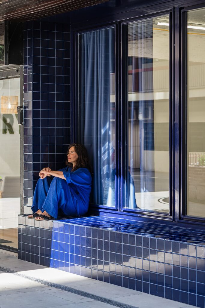
Based on the concept of the intermediate space in Japanese architecture known as Engawa, the text addresses the relationship between public and private through an indirect architectural boundary. In this context, the separating edge is employed without necessarily transforming it into a public space, but rather as a transitional zone that allows stopping and sitting without a defined activity, where the private realm indirectly serves the public realm.
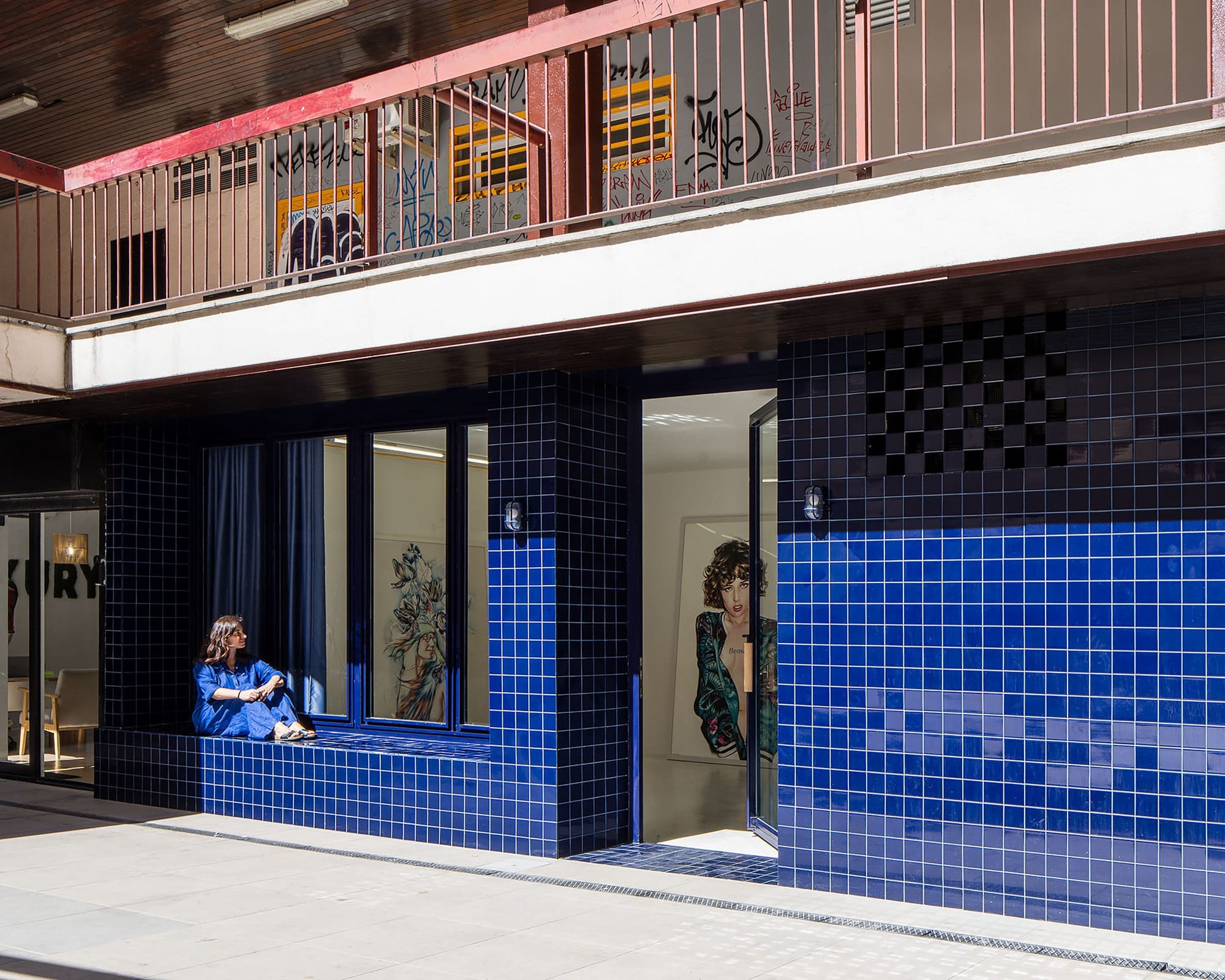
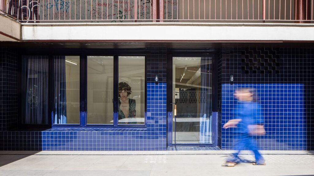
The Facade as a Visual Layer Between Interior and Street
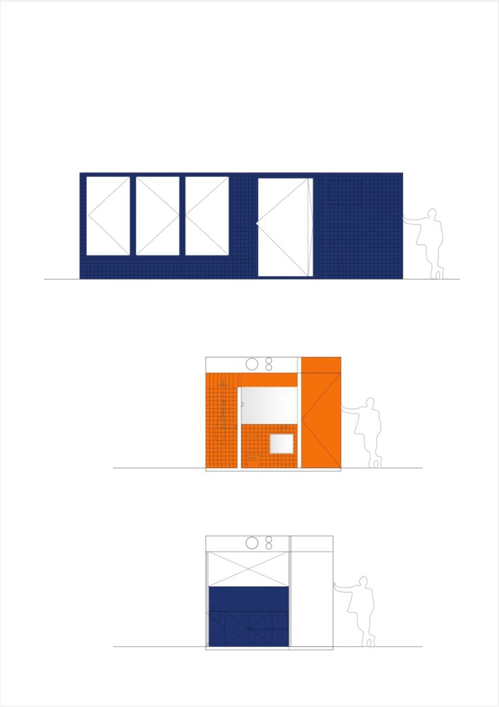
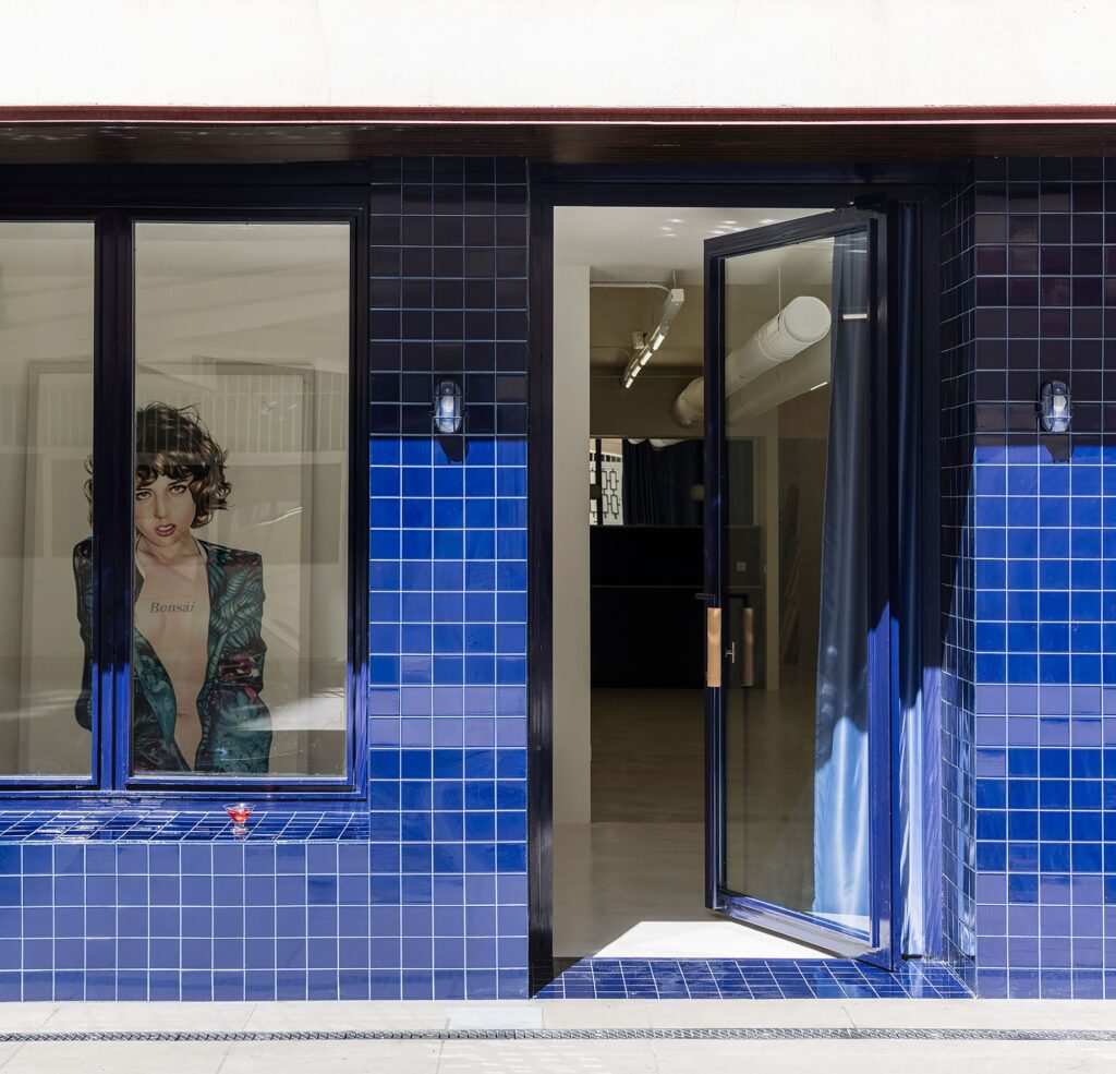
The design relies on a Portuguese-style facade, clad in 10×10 cobalt blue ceramic tiles. This material produces shifting reflections that interact with the surrounding street, while large windows act as a visual mediator that allows the relationship between interior and exterior to be read without fully merging them.
Urban Isolation and External Connectivity Boundaries
The project is situated within a dense fabric of residential blocks, where its connection to the external world is limited solely to the facade. In contrast, the remainder of the building mass is fully isolated. After passing through the facade, the internal organization transforms into a vertical extension of space, without direct continuity with the surrounding environment.
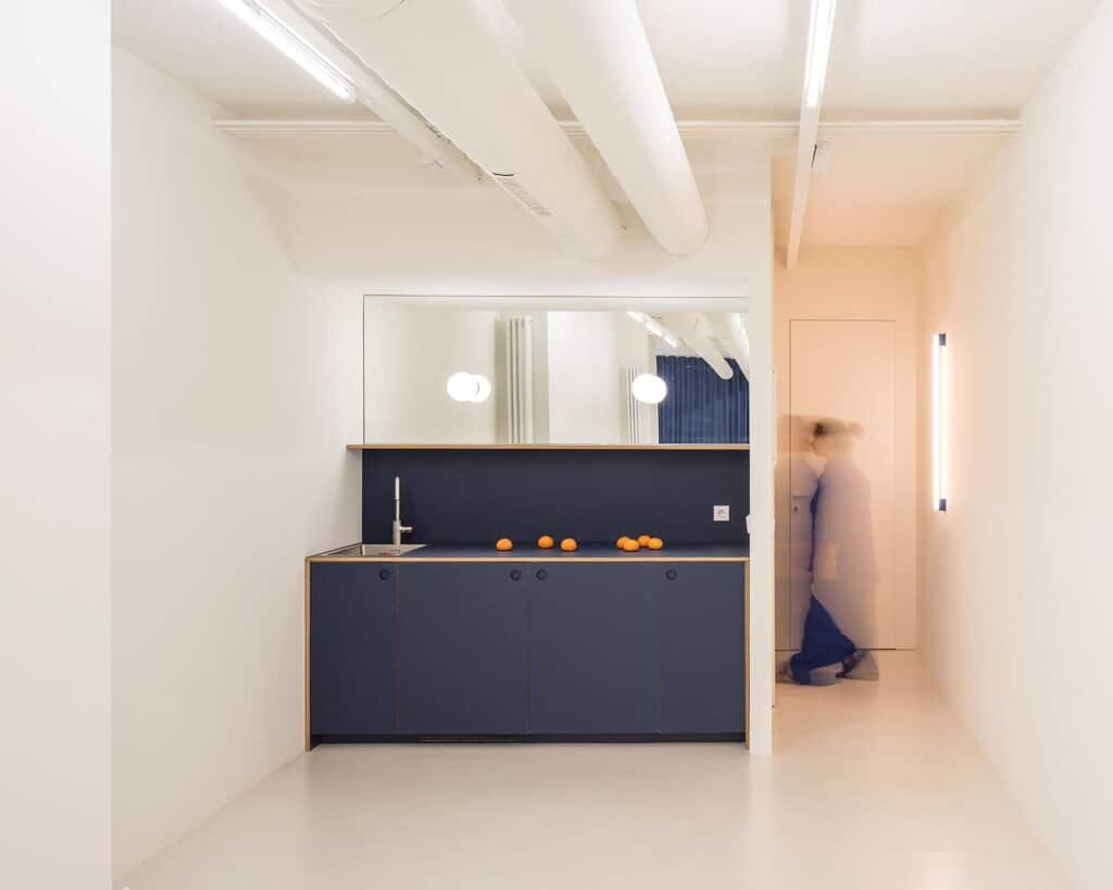
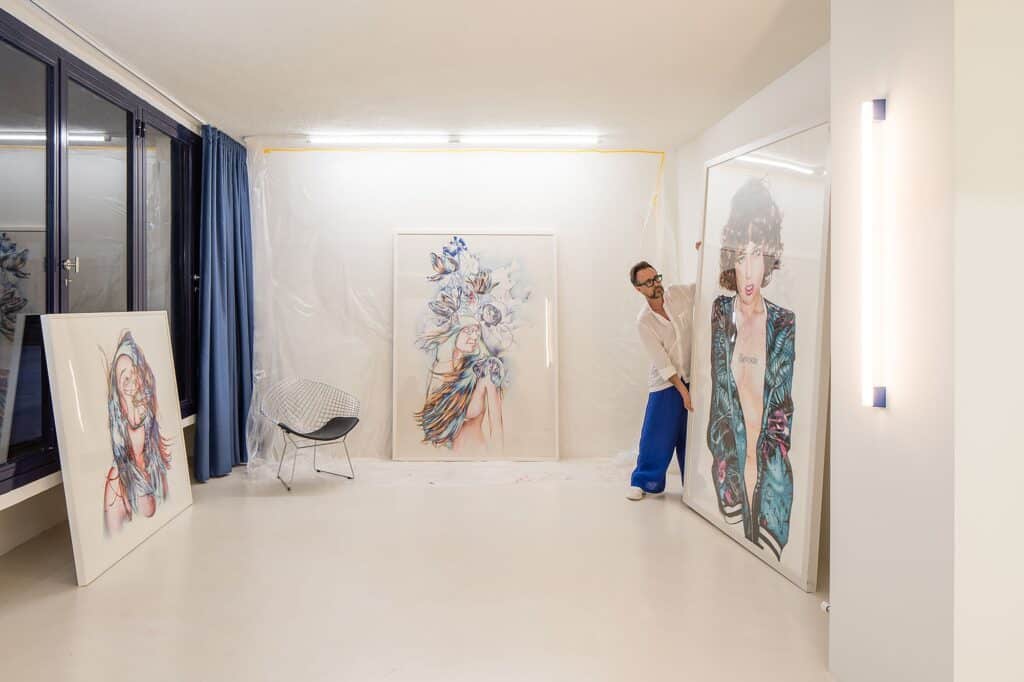
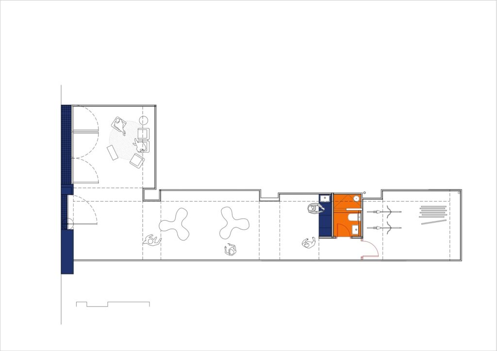
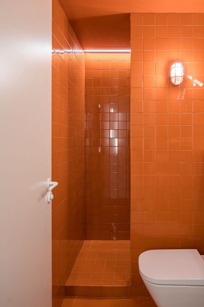
Interior Space and the Functional Color System
The Interior Space consists of an open space that concludes with limited essential functions, including a small kitchen, a bathroom, and a storage room. White walls form the primary backdrop of the space, acting as a neutral and usable surface. Within this framework, a chromatic distinction emerges between white as a working surface, and blue and orange associated with elements of organization and use, reflecting a functional visual system within the space.
✦ ArchUp Editorial Insight
This spatial organization results from proximity economics within the urban context, where informal social practices, such as placing chairs outside into the street in rural settings, become a low-cost alternative to structured construction infrastructure. Here, the facade is not understood as an aesthetic decision, but as a regulatory response aimed at controlling pedestrian movement and redistributing interaction within a dense residential fabric shaped by planning accumulations and real estate pressure.
The intermediate space, inspired by the concept of Engawa, operates as an organizational mechanism between public openness and private enclosure, producing a transitional zone that is non-productive yet capable of absorbing interaction. The interior reflects a logic of construction efficiency and material standardization, where white surfaces are used as a low-cost neutral grid, while colors are transformed into a functional coding system that defines use rather than expression within the interior environment.