Stevens Ranch Library: Making Room for Reading, Work and Play


A person arriving to read quietly and a family arriving to explore need different things from the same public building. At the Central Library at Stevens Ranch in Bend, Oregon, that difference shapes the project. The three-storey, approximately 100,000-square-foot facility brings collections, work settings, making spaces and early learning into a shared timber structure. Its architectural task is to keep that variety understandable.
Arrival begins outside the doors
Planting, a stone base and outdoor seating establish a lower, more immediate edge beneath the large facade. The entrance precinct offers places to pause before going indoors, while the aerial views explain the relationship between the building, access routes and surrounding grounds. The library’s size is evident, but the approach is broken into smaller encounters with a path, a bench and an entrance canopy.


A facade that mediates light and outlook
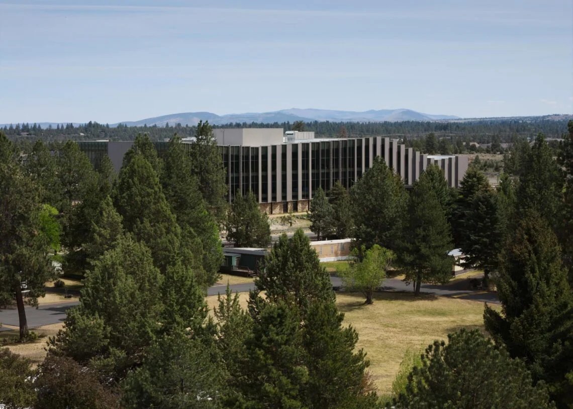
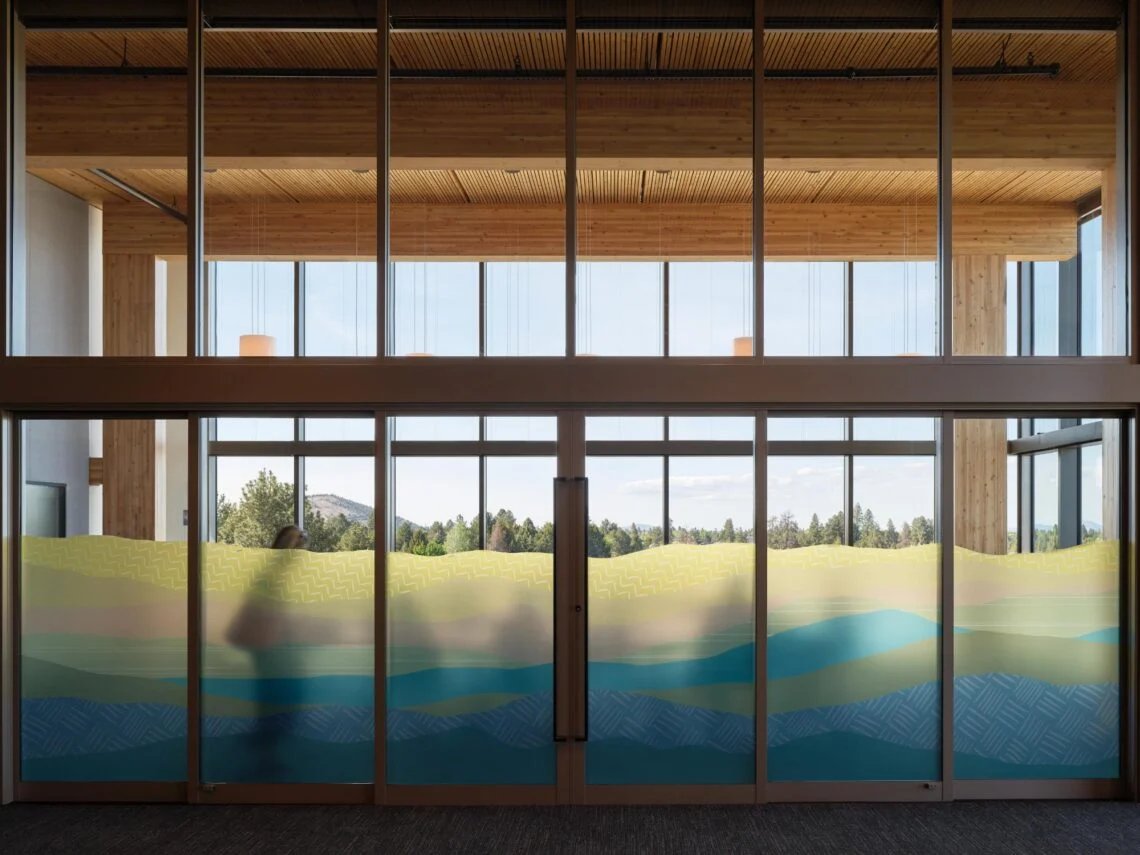
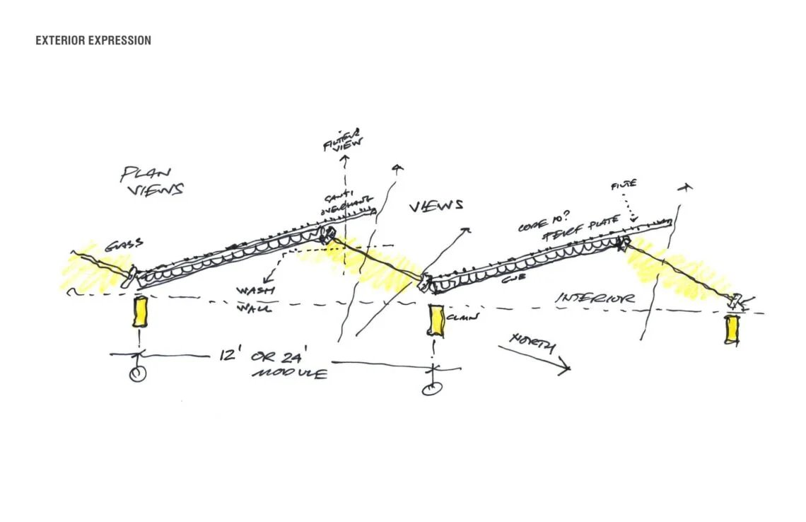
Angled, overlapping facade units alternate with glazing, responding to the strong sun of Central Oregon’s high-desert climate while retaining views. Close views clarify the depth of this outer layer: it is not simply a flat pattern applied to a wall. The repeating panels and staggered roof establish a changing profile around the building.
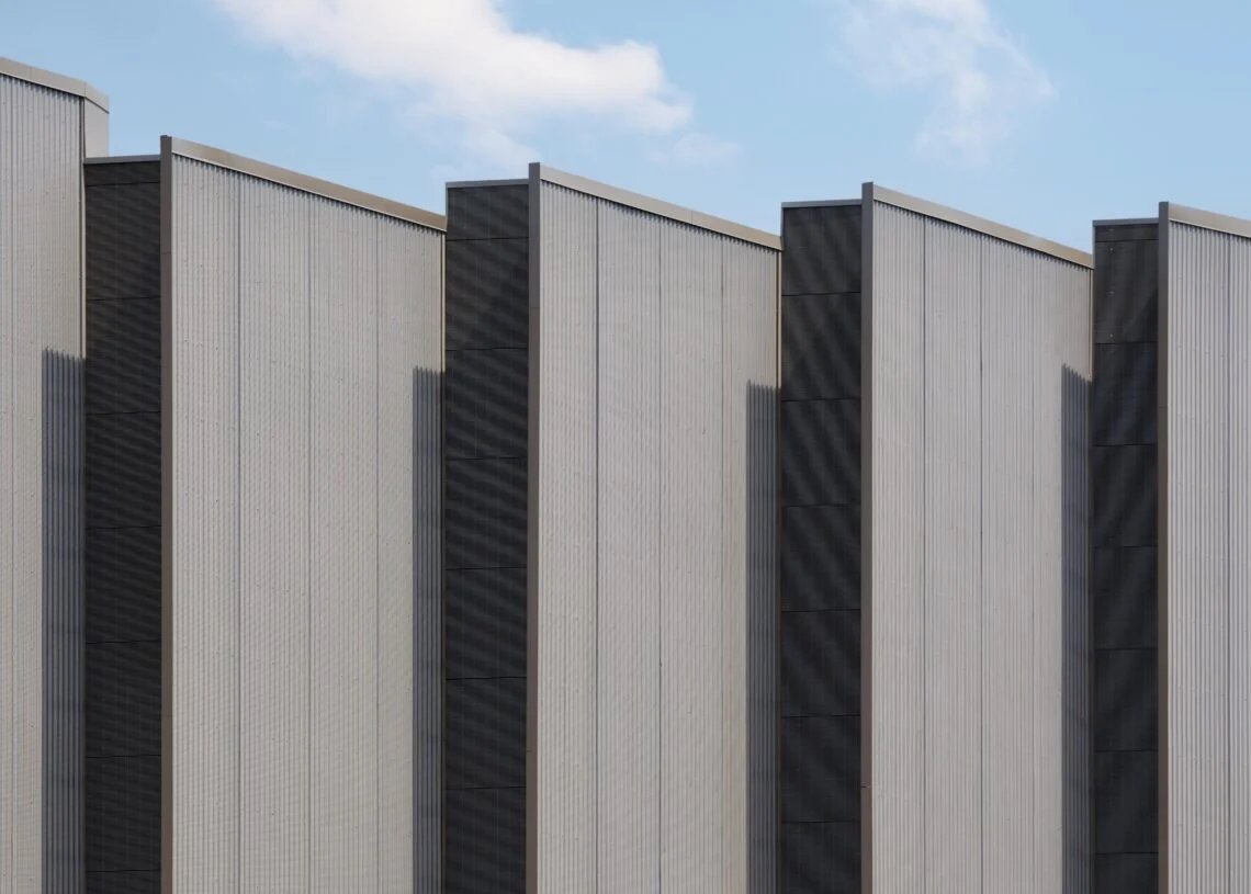
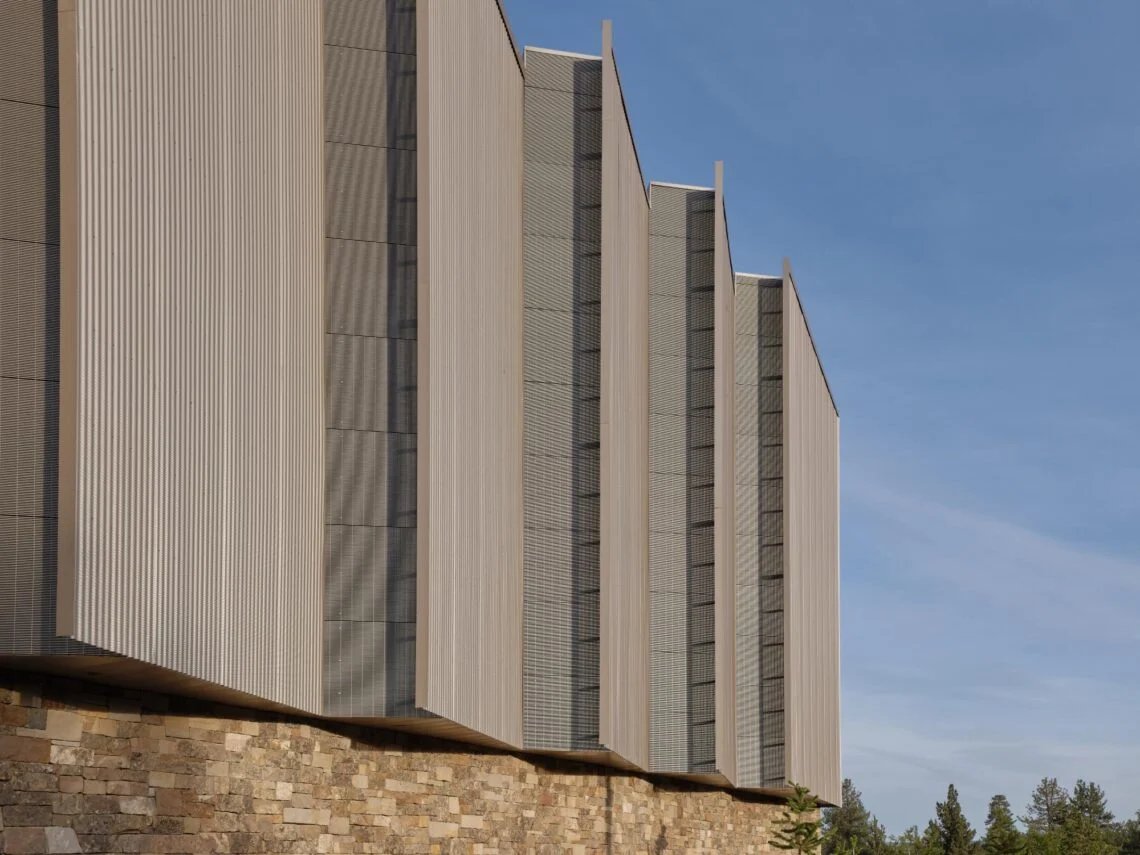

There is a useful contrast with the operable shutters of Casa Vereda. Both projects place an additional layer beside glazing, but the house lets residents reposition that layer, while the library’s fixed geometry makes orientation and panel arrangement central to the result.
The atrium makes the route visible
Inside, a tall atrium and a broad stair provide a reference point for movement between levels. Landings overlook public areas, allowing the visitor to see part of the building’s organization before choosing a destination. A suspended artwork occupies the upper volume and changes appearance as people climb, adding a visual landmark to the circulation sequence.


This shared view supports orientation, but it also brings several activities into one perceptual space. Clear routes around seats and displays remain important: a generous atrium is useful when people can understand where to go without treating every occupied area as a passage.
Browsing and staying require different positions
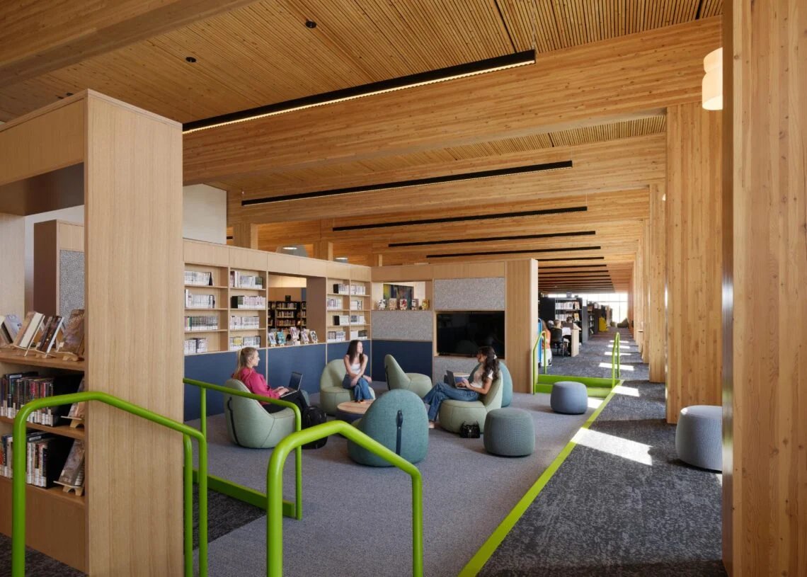
The library program combines conventional collections with genre-based groupings intended to encourage browsing. Spatially, shelves sit within the repeated timber bays, while window-side tables and smaller seating positions offer alternatives to the main circulation routes. A visitor can move through a collection, stop briefly or settle for longer without each activity requiring an entirely separate floor.
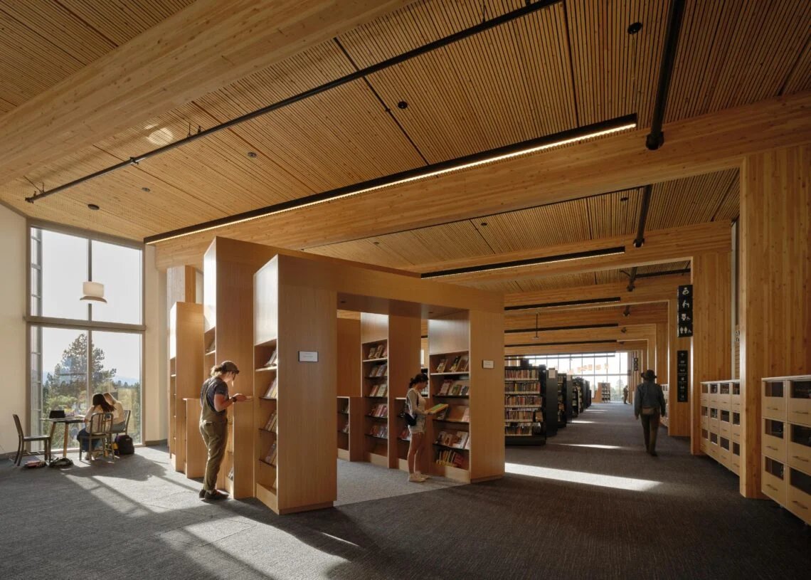


That variety is more useful than a single undifferentiated open room. A seat beside a window, a table behind a shelf and a workstation near other users offer different balances of outlook and enclosure. Their relative location determines how comfortably reading can coexist with movement.
Children learn through the space as well as the books
The early-learning area uses low platforms, shaped surfaces, small sheltered seats and book displays to invite movement and discovery. Children encounter the collection at several heights and from different positions, while caregivers have places to sit nearby. Mobile activity carts extend the program beyond one fixed arrangement.
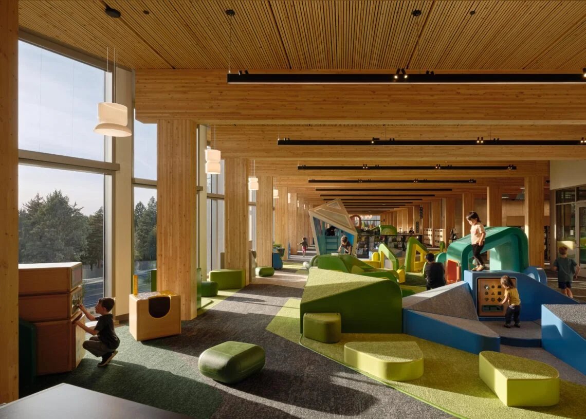
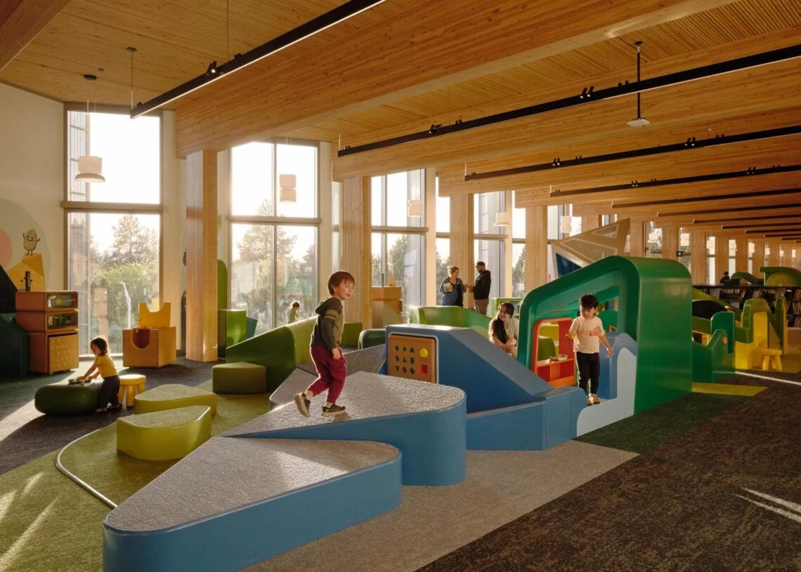



The photographs make the difference between a play object and a spatial system clear: these elements connect sitting, climbing, browsing and watching. Their usefulness also depends on maintaining clear sightlines and routes around active areas, particularly when several families occupy them at once.
Borrowing extends to equipment and practical work
The expanded Library of Things includes equipment for domestic tasks and hobbies, widening access beyond books. Coworking, flexible activity areas and places for making add further patterns of occupation. Enclosed rooms and shared tables provide settings for activities that need more separation or a different working surface.

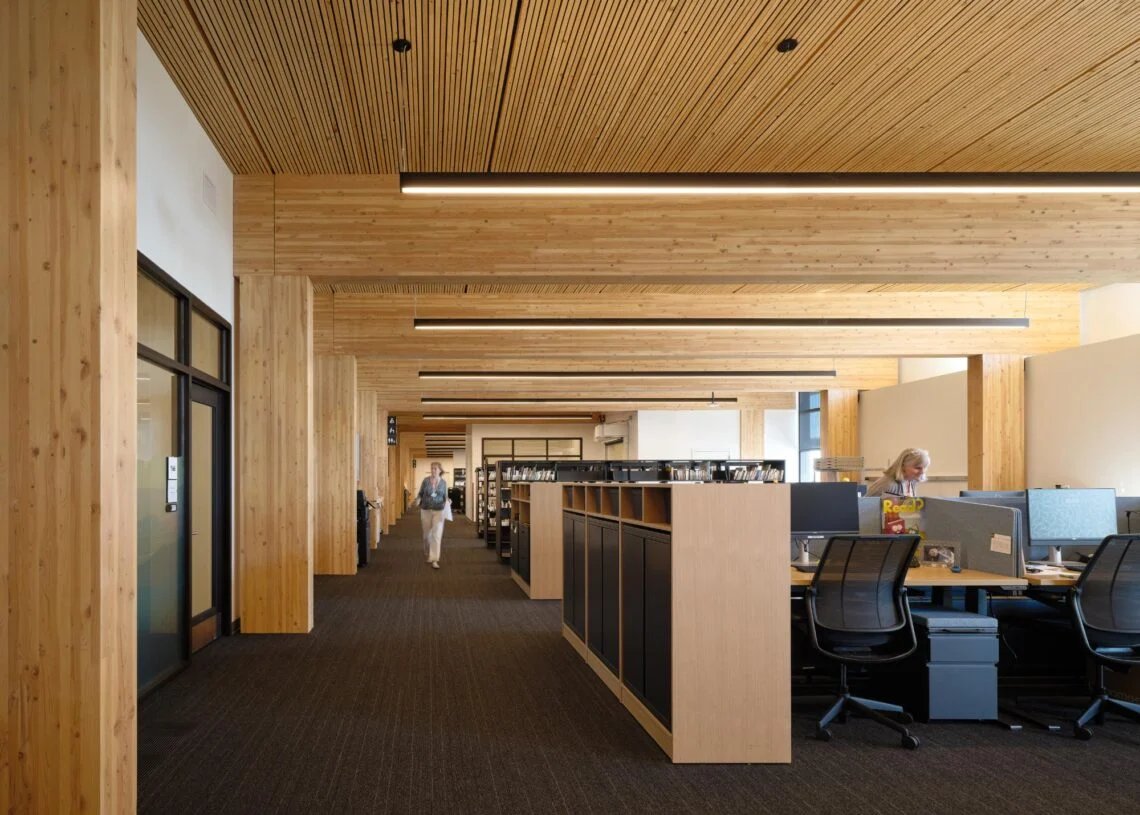


Lending an object also creates a sequence of return, inspection, storage and redistribution. Those operational tasks are part of the space a service needs, even when they are less visible than the activity itself. Flexible rooms are therefore most valuable when support and storage can adapt alongside them.
The timber frame supports change
The primary structure combines timber columns and beams with acoustic dowel-laminated timber decks. Concrete cores provide lateral stability, limiting the need for diagonal bracing within the main occupied areas. The decks participate in structure, visible finish and acoustic treatment, so the overhead surface is doing more than establishing a warm material palette.


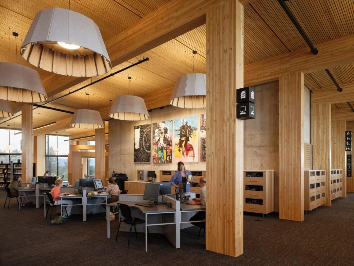


Long spans allow layouts with fewer columns. A raised access floor accommodates building services and helps keep much of the overhead timber visible. From an operational perspective, accessible service routes matter because moving a workstation can require power and data changes as well as moving furniture. Acoustic absorption, meanwhile, controls reverberation rather than providing the same separation as an enclosed room.
Environmental measures and their practical limits
The project includes an all-electric building-services strategy, photovoltaics, battery backup, an enhanced envelope, daylight and ventilation measures. Roof photographs show the solar array within the stepped profile. These are identifiable design provisions; their combined operational outcome depends on commissioning, use and maintenance. The project’s LEED Gold ambition should be understood as a target, rather than a confirmed certification.


Drawings connect the site, section and facade
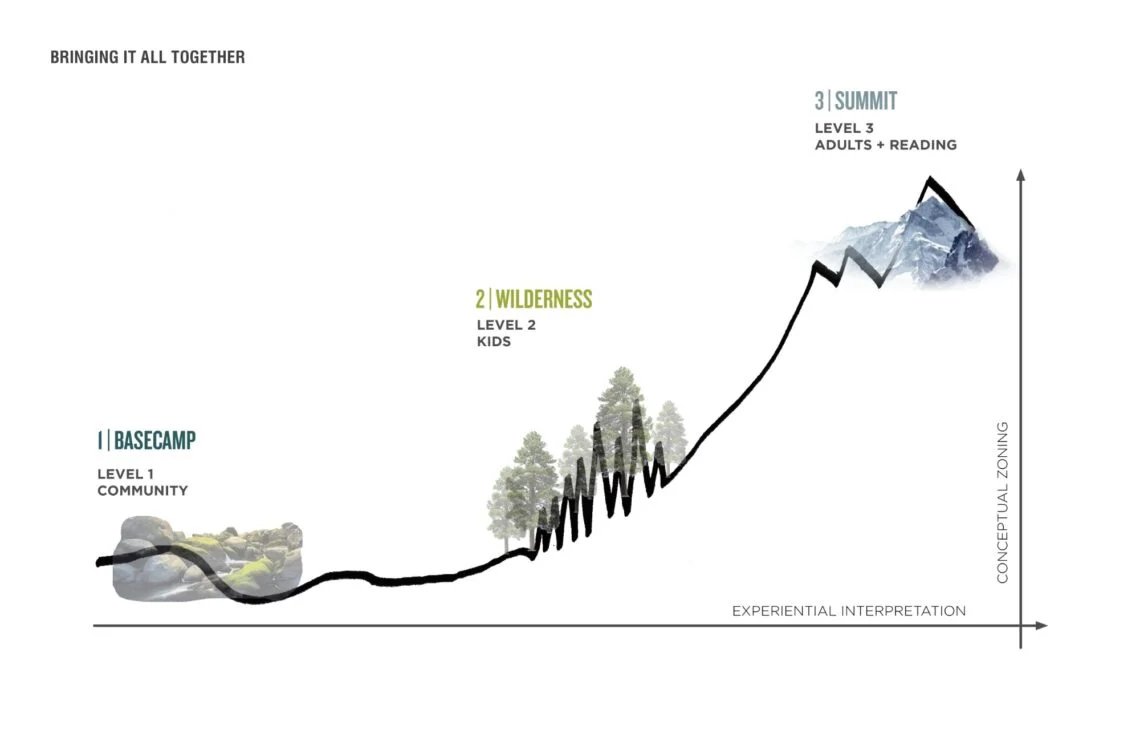
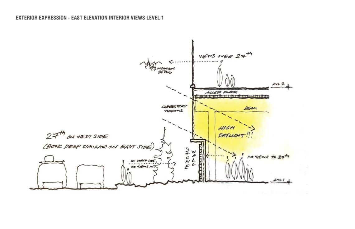
The site plan places the building within its access and landscape arrangement. The accompanying studies link changes in spatial scale with the surrounding landscape, and explain how perimeter geometry addresses daylight. Read beside the interior photographs, they connect the exterior envelope to the experience of sitting and moving within it.

✦ ArchUp Editorial Insight
A library that lends equipment, hosts collaborative work and welcomes active early learning faces a practical pressure: these uses do not share the same expectations of noise, visibility or duration of stay. Stevens Ranch responds with a continuous timber framework containing different scales of occupation, from a tall public atrium to smaller reading positions and dedicated rooms. ArchUp sees the strength of this decision in the relationship between a stable building system and a changing public program. Long spans and accessible service routes can make later rearrangement more feasible, while the visible structure gives visitors a consistent spatial reference. The trade-off is that an open framework does not, by itself, resolve conflicts between activities. Acoustic absorption helps control reverberation, but quiet work still depends on separation, placement and operational choices. Likewise, borrowing tools adds useful public access while introducing storage, checking and maintenance responsibilities. The building is therefore most convincing when understood as support for a managed range of activities. Its civic value depends on how reliably people can find the setting they need, and on whether that variety remains legible as the library’s collections and services evolve.
Project credits: Design architect: The Miller Hull Partnership; local architect: STEELE Associates Architects. Client: Deschutes County. Contractor: Kirby Nagelhout Construction Company. Structure: KPFF Consulting Engineers; civil: HWA; building services: Interface Engineering; landscape: Walker Macy; lighting: Blanca Lighting Design; signage: Mayer Reed; early learning: Plus and Greater Than; acoustics: Tenor Engineering Group; envelope: Morrison Hershfield; accessibility: Studio Pacifica. Atrium art: John Grade. Photography: Kevin Scott.