The Anchor Desk Organizer: Making Room at the Edge

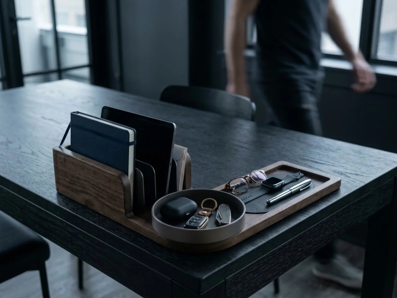
A useful desk needs somewhere for the hand to work and somewhere for objects to wait. The Anchor desk organizer explores that distinction through an L-shaped arrangement: papers and devices stand along one side, while small belongings occupy shallow trays along the other. Its architectural interest lies in this modest division of territory, between an active centre and an organised edge.
Presented as a design concept, the piece proposes walnut, dark steel detailing and leather-lined resting surfaces. The arrangement remains open to view. Rather than adding a closed storage volume, it gives different objects recognisable positions within a single footprint.
Reading the desk as a small plan
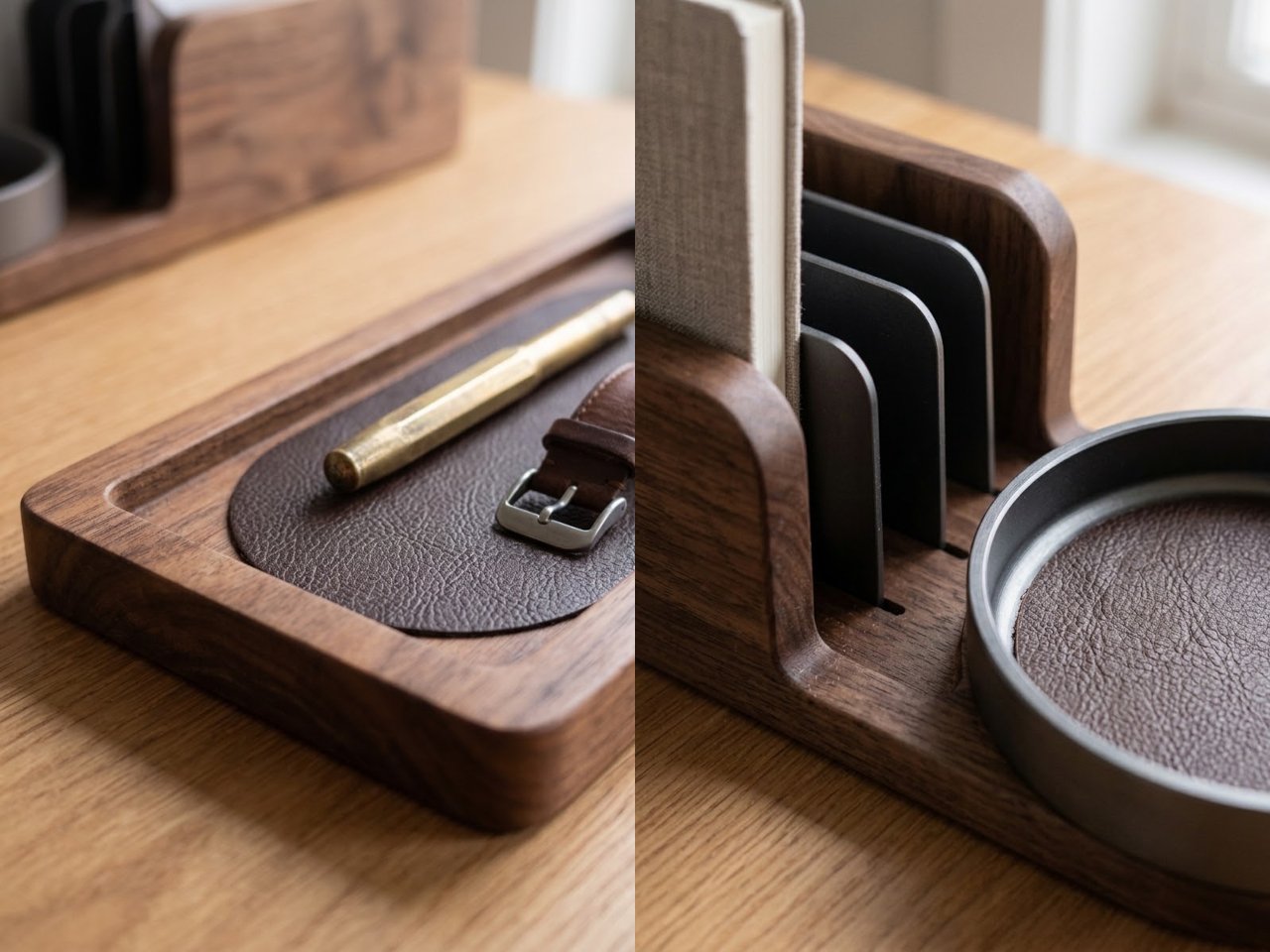
The right angle establishes two different heights. Upright dividers form a short screen for a notebook, tablet or correspondence; the lower arm stays close to the desktop. A circular tray occupies the junction. Seen together, these elements make a compact plan in which shape signals use before labels are needed.
That difference in height matters when the organiser sits beside a working area. The taller section can gather the items that otherwise lean against a wall or spread across a surface, while the lower tray leaves smaller objects visible. Its position would need to follow the actual desk layout: a corner already occupied by a lamp or monitor support is not automatically spare space.
From arriving to beginning work
The concept becomes clearest through a short everyday sequence. Keys and an earbud case can be set down in the round tray; a watch or glasses can rest in the longer recess; a notebook can remain upright until needed. This is a proposed pattern of use, but it explains how the object might shorten the transition between arriving at a desk and starting work.
Visibility is central to that pattern. The open compartments offer a quick view of what is available, without opening a drawer. They also leave possessions on display, making the design better suited to frequently handled items than to private documents or the full contents of an office.
Materials at the points of contact
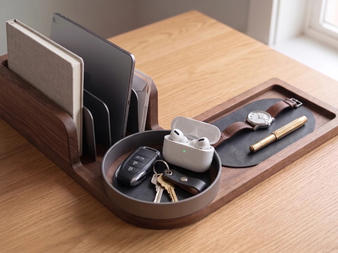
Walnut gives the proposed body a continuous visual presence, while dark dividers describe its narrower intervals. Leather introduces a softer contact surface where objects are placed down. In the detailed views, rounded edges and recessed channels make the transition between materials as significant as their individual appearance.
The concept identifies the liners as replaceable. If developed with an accessible removal detail, that could allow a worn contact surface to be renewed separately from the main body. The practical value would depend on how the inserts are retained and whether replacements remain available. Similarly, cleaning between the upright dividers would benefit from a detail that allows easy access.
The space around the object
The organiser’s usefulness would ultimately depend on its relationship with neighbouring equipment. A tablet stored vertically needs clearance above the slot; a hand reaching for keys needs room beside the tray. Charging cables would also need a route, since integrated charging and cable management are not established in the available concept information.
These are small-scale versions of the relationships that shape an interior: placement, reach, visibility and the space left for movement. Our reading of Align Studio’s organisation of material, movement and light considers those relationships at room scale. Here, they occur within the reach of a seated person.
✦ ArchUp Editorial Insight
Repeatedly putting possessions down and retrieving them is a small but persistent part of desk work. The Anchor proposes to organise that behaviour by assigning objects stable positions, shifting some of the effort of remembering into the arrangement itself. This also establishes an implicit rule: the user’s belongings and habits should fit the categories anticipated by the designer. A tablet, notebook and keys are accommodated; different equipment or confidential paperwork may require another system. The relevant test is therefore whether the arrangement reduces daily handling without demanding continual adaptation from its owner. The proposed replaceable liners extend this question from behaviour to product support. Replacement has practical value only if the insert can be removed, reproduced or obtained when it wears out. A durable wooden body could otherwise remain dependent on a shorter-lived component whose future availability the user does not control. This is a conditional dependency, not an established failure of a concept still awaiting production. Read through these decisions, the L-shaped footprint becomes a negotiated boundary: it reserves the centre for changing tasks while committing the edge to a particular routine. Its lasting usefulness would depend on how much variation that routine can absorb.
Design credits: The Anchor, BAYT (baytbyseen). Product design concept. Image rights belong to their respective owners.