The Sample Is Not the Specification: A CMF Portfolio for Interior Design


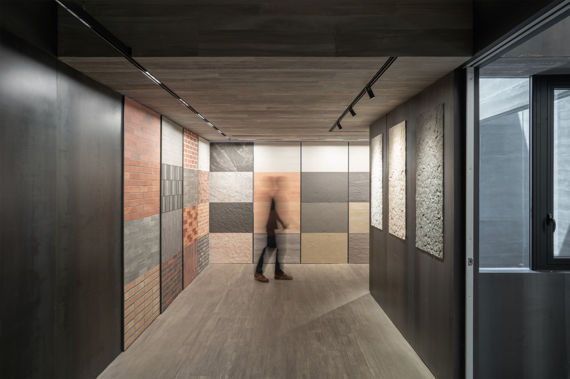
In the material showroom, a wall of samples offers an apparently simple promise: choose a surface and imagine a room. Yet the person standing in front of it is judging several things at once. Colour meets light, texture meets distance, and an attractive fragment suggests an interior that does not yet exist. The photograph shows a display, not the performance of an installed system. That distance between what a sample suggests and what a building needs is where a serious CMF portfolio begins.
CMF means colour, material and finish. In interior design, these are connected decisions about what occupants see, touch, clean, maintain and eventually replace. A portfolio can make those decisions intelligible. Its value lies in explaining why a particular combination belongs in a particular place, what alternatives were considered, and which conditions must hold for it to work.
The central argument is straightforward: the strongest CMF portfolio is a record of judgment. It connects atmosphere to use, a visual proposal to a physical assembly, and a specification to the people who must live with it. Beautiful presentation matters, but it becomes professionally useful when another person can understand and carry forward the decision.
Three words, three different questions
Colour asks how surfaces relate visually. Material asks what those surfaces and their supporting components are made from. Finish asks how their exposed faces are treated. A timber panel can be stained, painted, oiled or coated. A metal surface can be polished, brushed or textured. Similar colours can therefore belong to assemblies with very different behaviour, repair methods and procurement requirements.
Treating these as interchangeable produces an avoidable gap. A board labelled “warm grey stone” communicates an intention but leaves the contractor to determine the stone, thickness, backing, edge, fixing and surface treatment. The resulting object may resemble the image while failing the intended use. A CMF portfolio should reveal which decisions are conceptual and which have progressed to specified products and assemblies.
This distinction also protects creative work. Precision does not require an early commitment to a brand. At concept stage, the designer can describe a visual and tactile objective, identify the performance questions it raises, and keep several possible materials open. Specificity should increase as the project acquires evidence, budget and technical coordination.
Start with a person and an activity
Before assembling a palette, write a short account of the room in use. Who enters it? What do they carry? Where do hands, shoes, furniture and cleaning equipment meet its surfaces? Which areas receive daylight, splashes or concentrated traffic? Who maintains the room, and when can maintenance happen without disrupting its purpose?
These questions create a useful brief for selection. A residential reading corner and a busy reception desk may share a restrained visual language while needing different edges, cleaning access and replacement strategies. The point is not to assign a universal material to each building type. It is to prevent an attractive image from becoming the only description of the problem.
The portfolio should make this brief visible beside the proposal. One concise paragraph can explain the occupants, activity and constraint. A small plan can locate the material. A detail can show the vulnerable junction. Together, they tell the reader what the designer is trying to achieve before asking whether the composition looks convincing.
Separate technical suitability from sensory judgment
Piselli and colleagues developed a method combining technical selection with sensory assessment in a study of professional kitchen appliances. Their work examined metal and polymer alternatives and included a sensory evaluation involving 37 participants. The useful lesson is the deliberate connection between technical requirements and perceived qualities, rather than treating either as a substitute for the other. Its appliance context does not establish a universal specification for interiors. [1]
For an interior portfolio, this suggests two connected records. The first identifies requirements that a candidate must meet in its intended assembly. The second records how people experience the alternatives. A pleasing texture cannot compensate for failure to meet a required performance condition. Equally, a technically suitable material does not automatically create the intended atmosphere or feel comfortable at a contact point.
Keep the criteria visible. If one option is rejected because its edge is difficult to repair, say so. If another is preferred because its texture reads more clearly under the proposed lighting, show the comparison. The reader should see a decision developing through explicit reasons rather than through a sequence of increasingly polished images.
A colour is always part of a scene
An isolated swatch is a useful identifier, but a room is a field of relationships. The same finish occupies different proportions of the visual scene when used on a small cabinet, a full wall or a ceiling. Adjacent surfaces, light direction and viewing position must therefore enter the discussion before the palette is approved.
Avoid presenting a fixed colour ratio as a law of good design. A dominant field, supporting field and accent can help organize a composition, but the appropriate balance depends on the room and the intended hierarchy. A portfolio is stronger when it explains what should attract attention, what should recede, and how that intention is tested in the proposed space.
Nor should preference be mistaken for a universal rule. Wagner and colleagues studied colour customization in automotive interiors using a web contest. Their findings concern preferences within that setting and participant group. They are useful evidence that colour combinations can be investigated systematically, but they cannot establish one preferred palette for homes, clinics, workplaces or different cultures. [2]
Give light its own page
Lighting should not arrive as a final rendering effect. Place the proposed materials under the lighting conditions relevant to the project, and record what was actually used for the comparison. Daylight at a window, an illuminated shelf and a ceiling spotlight create different viewing situations. A presentation that conceals these conditions makes its own visual claims difficult to assess.
The comparison page can show the same sample arrangement under more than one proposed scene, with the camera position and editing approach kept consistent. Include a close view for texture and a wider view for spatial relationships. Record orientation and mounting position where they affect how a surface is seen. A horizontal sample is not a complete demonstration of a vertical installation.
A photograph remains a representation. It cannot replace handling a sample or reviewing a physical mockup when those are necessary. Its job in the portfolio is to document the comparison clearly enough that the reader understands the next decision, not to pretend that screen colour is an approval standard.

Move from a fragment to an assembly
Material selection becomes architectural when it reaches a junction. Consider where a floor meets a wall, where a countertop turns an edge, or where a panel ends beside a door. The sample rarely contains the adhesive, substrate, fixing, sealant or movement allowance that the installed work requires. These components belong in the decision even when they remain invisible.
Show at least one consequential detail for each developed case study. Indicate which parts are proposed, which are coordinated, and which still require specialist confirmation. The objective is not to turn an employment portfolio into a complete construction package. It is to demonstrate that the designer understands the relationship between surface appearance and the system that supports it.
This is also where alternatives should be compared honestly. Two visually similar products may require different supporting work. Comparing only their purchase price can obscure that difference. The portfolio can set out the relevant scope without inventing a final cost: preparation, installation, access, maintenance, local replacement and eventual removal.
Build a decision matrix that can be challenged
A matrix is useful when it exposes tradeoffs. It becomes misleading when arbitrary scores create the appearance of measurement. Start with requirements that are genuinely mandatory, then distinguish evidence from judgment. A laboratory report, a supplier statement, a sample observation and a designer’s preference are different kinds of information.
| Decision | What to show | What remains to be resolved |
|---|---|---|
| Visual relationship | Samples beside their neighbouring finishes | Appearance at room scale and under proposed light |
| Contact and texture | Observations at the actual contact location | Feedback from intended users where appropriate |
| Technical suitability | Relevant product and assembly documentation | Project specific compliance and specialist review |
| Maintenance | Cleaning instructions and access strategy | Operator acceptance and replacement availability |
| Environmental comparison | Comparable declarations and stated boundaries | Missing data and assumptions about service life |
If a numerical scoring system is used, explain its weights and test whether changing them changes the preferred option. Otherwise the final number simply conceals a preference. For many portfolios, a clear explanation of why an alternative was retained or rejected is more credible than a complicated ranking with unsupported decimal precision.
Show one decision changing
Consider an illustrative reception counter. The first proposal uses one pale finish across the front and work surface to create visual continuity. During development, the team identifies different demands at the public face, the writing edge and the staff worktop. The original single finish is then reconsidered.
A useful portfolio sequence would show the initial intention, the locations of contact, the alternatives reviewed, and the revised junction. It might retain continuity through colour while changing the material at the work surface. Or it might preserve one material while revising the edge and protection detail. Neither outcome should be declared successful before the relevant checks are completed.
This is a design scenario, not a reported project result. Its value is to demonstrate the form of the argument: an intention encounters a constraint, alternatives are assessed, and the design changes without losing its purpose. A finished photograph alone cannot communicate that intellectual work.
Maintenance belongs inside the palette
A finish will encounter a routine. Someone will wipe it, move furniture against it, replace a damaged component or search for a matching spare. Ask the proposed operator to review these actions before the selection is treated as complete. A beautifully resolved surface can become an operational burden if routine access has not been considered.
The maintenance page should identify what can be repaired locally and what requires replacement of a larger area. It should distinguish an intended aging process from damage that undermines use. It should also record whether the visual proposal depends on a degree of uniformity that will be difficult to reproduce when a batch changes or a component is replaced.
These are questions for the specific product and installation. “Durable,” “washable” and “low maintenance” are not sufficient descriptions by themselves. The portfolio should connect each important claim to the documentation or test relevant to the intended use, while leaving unresolved decisions visibly unresolved.
Sustainability requires a comparison boundary
An environmental argument should begin by defining what is being compared. Are two options providing the same function over the same period? Does the assessment include supporting layers, transport, maintenance and replacement? A natural appearance does not answer those questions. Neither does a recycled content claim describe every environmental consequence of a finished assembly.
Where environmental product declarations are available, use them within their stated scope and check that the comparison is meaningful. Where data are missing, the portfolio can still show design actions such as reducing unnecessary layers, allowing access for repair or retaining existing components. Present these as specific decisions rather than as an unmeasured promise of a greener interior.
The most useful environmental page makes the reasoning inspectable. It identifies the function, alternatives, information available and unresolved assumptions. It can also show a reversible detail or a replacement sequence. A sustainability icon attached to a material photograph provides much less information about what the designer has actually changed.
A professional portfolio is edited for its reader
A client needs to understand the atmosphere and consequences of a choice. An employer needs to understand the designer’s contribution and judgment. A contractor needs a coordinated specification. A portfolio may address more than one audience, but it should not assume that the same page serves them equally well.
For each case study, use a consistent sequence: brief, intention, alternatives, comparison, selected assembly and reflection. Keep product schedules available without allowing them to overwhelm the central argument. Identify individual responsibilities when work was collaborative. Concept work, competition proposals and built projects should be described accurately rather than arranged to imply the same level of completion.
Smith’s study of interior design students’ accounts of developing expertise draws attention to relationships, knowledge culture and access to resources. It supports taking learning seriously as a social process, rather than treating design judgment as an isolated gift. It does not establish a formula for portfolio length or hiring success. [3]
What a reviewer should be able to reconstruct
After reading a case study, a reviewer should be able to explain the problem, identify the governing constraint and describe why the selected option survived comparison. They should know how the sample relates to a room, how the room relates to an assembly, and what evidence supports the consequential claims.
They should also be able to identify the next unresolved decision. This is not a weakness in presentation. It is evidence of control over the project’s stage. An early concept becomes less credible when it borrows the language of completed verification. A developed proposal becomes more useful when it makes responsibility and approval status clear.
Editing therefore means removing repetitions and adding missing connections. Ten similar renderings may contribute less than one carefully explained change of direction. A material photograph earns its place when it answers a question that a drawing or sentence cannot answer as well.
From an attractive board to a dependable decision
The CMF portfolio sits between imagination and delivery. It should preserve the pleasure of colour, the character of a material and the subtlety of a finish. But it should also explain how those qualities become available to the people who use the space, under the conditions in which the building will actually operate.
The sample is therefore a beginning. The professional contribution is the chain of decisions that follows it: observing use, comparing alternatives, testing appearance, resolving assemblies and planning for maintenance. A portfolio becomes persuasive when it allows another person to follow that chain without having to invent the missing reasoning.
The strongest final page is not simply the most beautiful room. It is the room whose beauty the preceding pages have made technically intelligible, operationally plausible and open to informed judgment.
The operational consequences of these selections continue in Why Would Anyone Rent This Building?, which examines design through tenant choice and continued use.
Cover: Phomi material showroom, from the ArchUp archive. Photograph © Tedy Dimas.
Sources
- Piselli, A., Baxter, W., Simonato, M., Del Curto, B., and Aurisicchio, M. Development and Evaluation of a Methodology to Integrate Technical and Sensorial Properties in Materials Selection. Materials & Design, 153, 2018, pp. 259–272. DOI: 10.1016/j.matdes.2018.04.081.
- Wagner, A. S., et al. Visual Customization: Diversity in Color Preferences in the Automotive Interior and Implications for Interior Design. Color Research & Application, 43(4), 2018, pp. 471–488. DOI: 10.1002/col.22218.
- Smith, K. M. Conditions Influencing the Development of Design Expertise: As Identified in Interior Design Student Accounts. Design Studies, 36, 2015, pp. 77–98. DOI: 10.1016/j.destud.2014.09.001.