Atherton Residence: Making Room for Art and Everyday Life

An art collection can occupy a house without determining how it works. At the Atherton Residence, it helped shape the layout, finishes and material palette. The useful question is not how many objects the rooms can display, but how a person encounters them while arriving, sitting down, eating or moving upstairs. Art enters the sequence of ordinary use rather than being confined to a room set apart.
The interiors combine pale timber, stone, glass and dark accents, with different furniture and lighting arrangements giving individual rooms their own identity. Generous openings connect the domestic spaces to the garden. These shared elements establish continuity without asking every room to repeat the same composition.

The first view starts before the front door
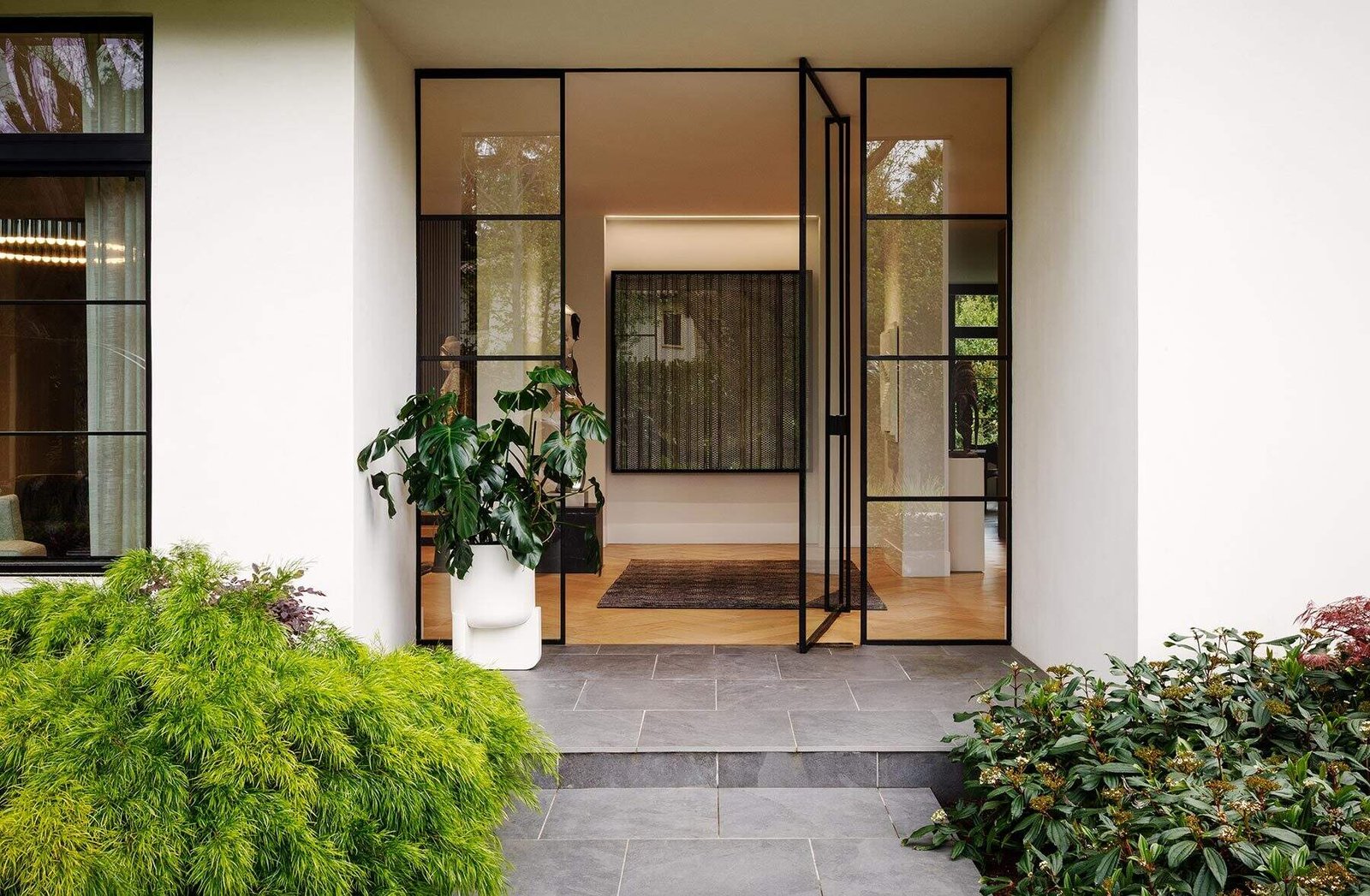
A black-framed glazed entrance reveals a substantial artwork from the approach. Grey paving and planting bring the visitor to the threshold, while the transparent door lets the interior begin visually before entry. The artwork is therefore a marker in the arrival sequence, not an object discovered only after the entrance hall has been crossed.
That relationship between a clear frame and a strong focal point recurs inside. It can make a route easier to read, but transparency is not automatically privacy or glare control. Those remain separate design questions, especially where glass connects rooms and landscape.
A living room with more than one center
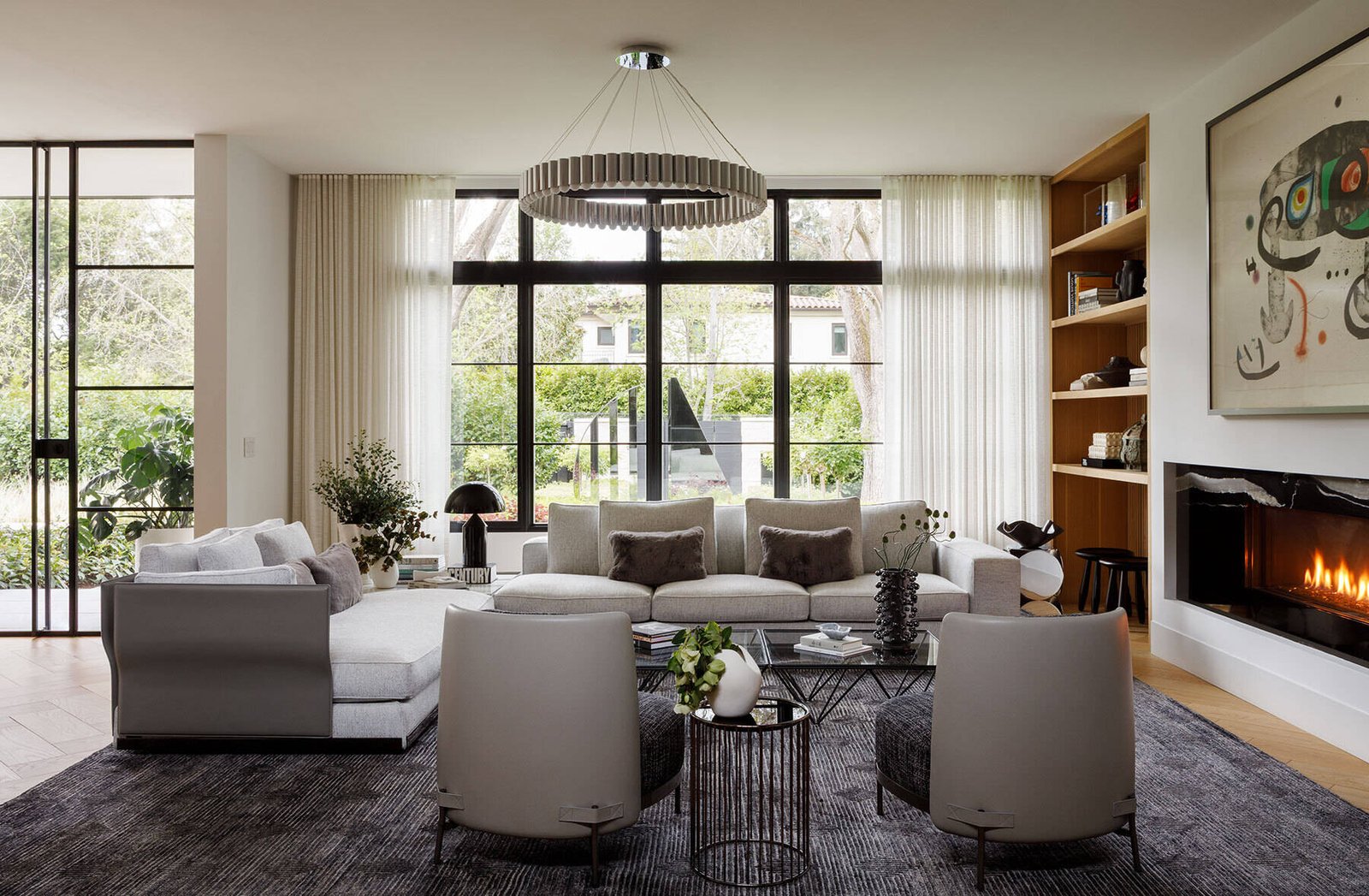
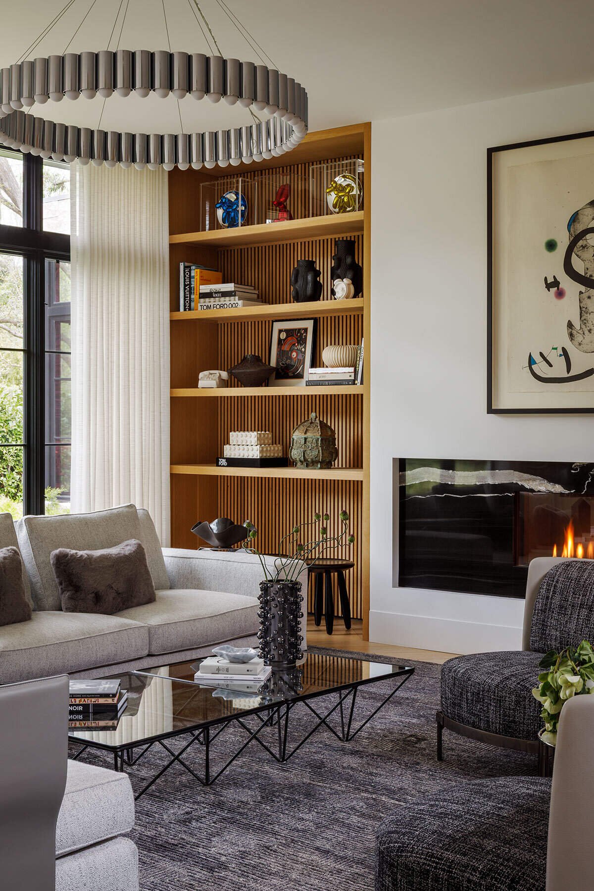
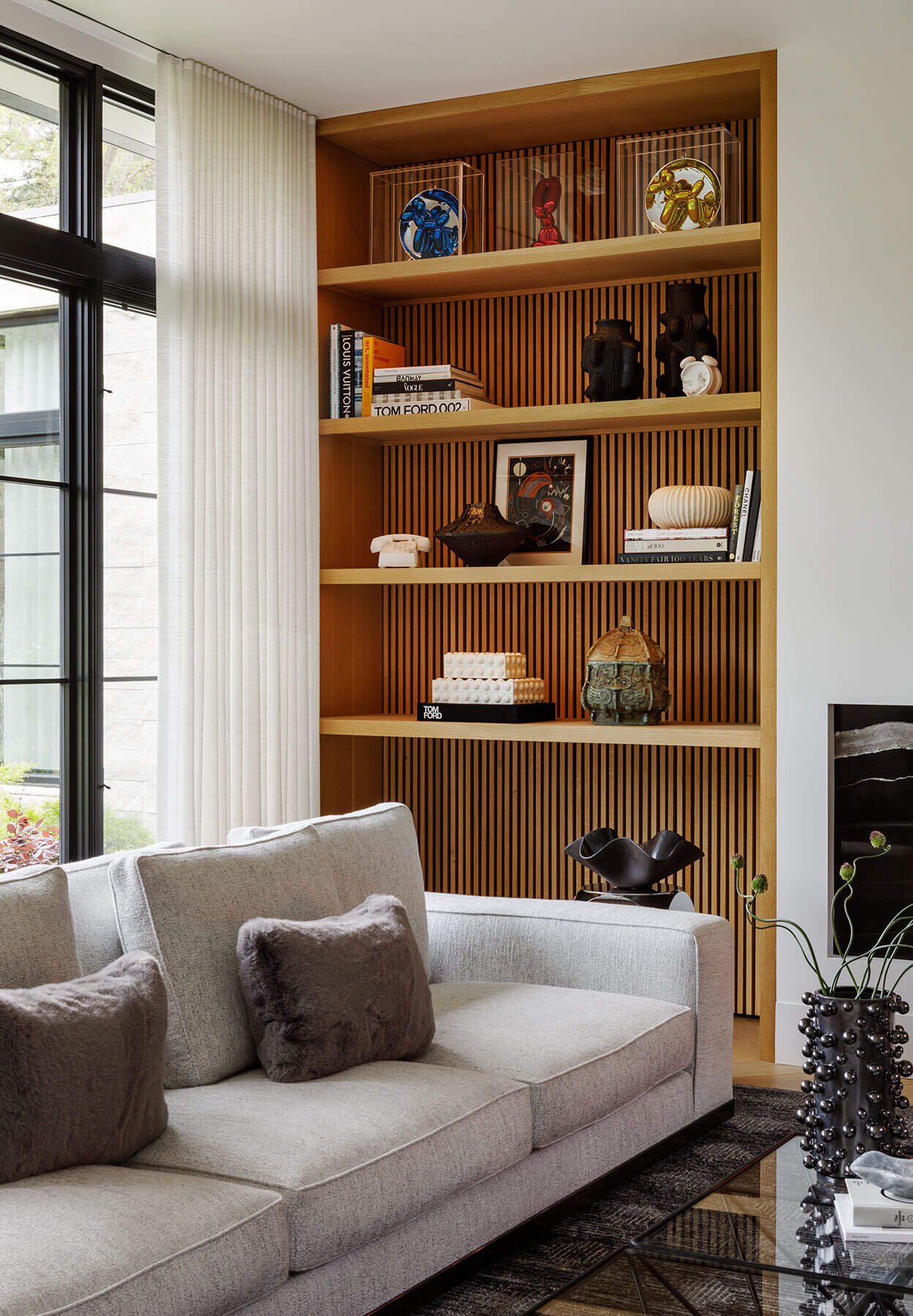
The living room uses a broad sectional and textured armchairs to establish the place for sitting. A long fireplace gives the wall a domestic focus, while an artwork above it and adjacent bleached-oak shelving bring the collection into that same setting. Books, ceramics and sculpture occupy the shelving rather than a dedicated display room.
The distinction matters: a room can contain several points of attention without making all of them circulation destinations. Seated viewing and passing views need different distances. Here the arrangement suggests that the seating group, fireplace and shelves can be read together, while the repeated pale finishes and dark window frames keep the surrounding elements connected.
The sectional is by Minotti; the Carousel chandelier is by Lee Broom. Their role in the composition is one of scale as much as identity: substantial furniture gives the large room a recognizable occupied center, while the suspended fixture adds a second level of visual weight above it.

Dining: objects share the table’s field of view
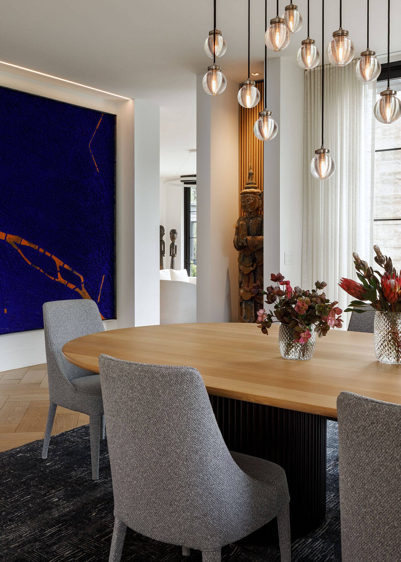
A custom two-tone table, upholstered grey chairs and a dark rug organize the formal dining room. Individually suspended glass spheres spread the lighting composition across the ceiling. A large blue artwork and a freestanding sculpture introduce further points of attention around the setting.
The effect is not a blank room with art added afterward. Dining, looking across the table and viewing a sculpture occupy the same space. This increases the importance of clearances around chairs and objects: the success of the arrangement depends on movement remaining available when the room is in use, not only when photographed.


The kitchen gives everyday use its own setting
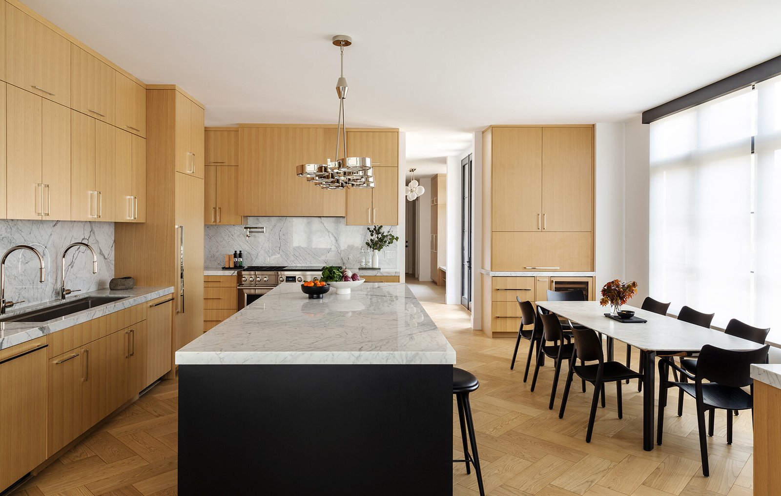
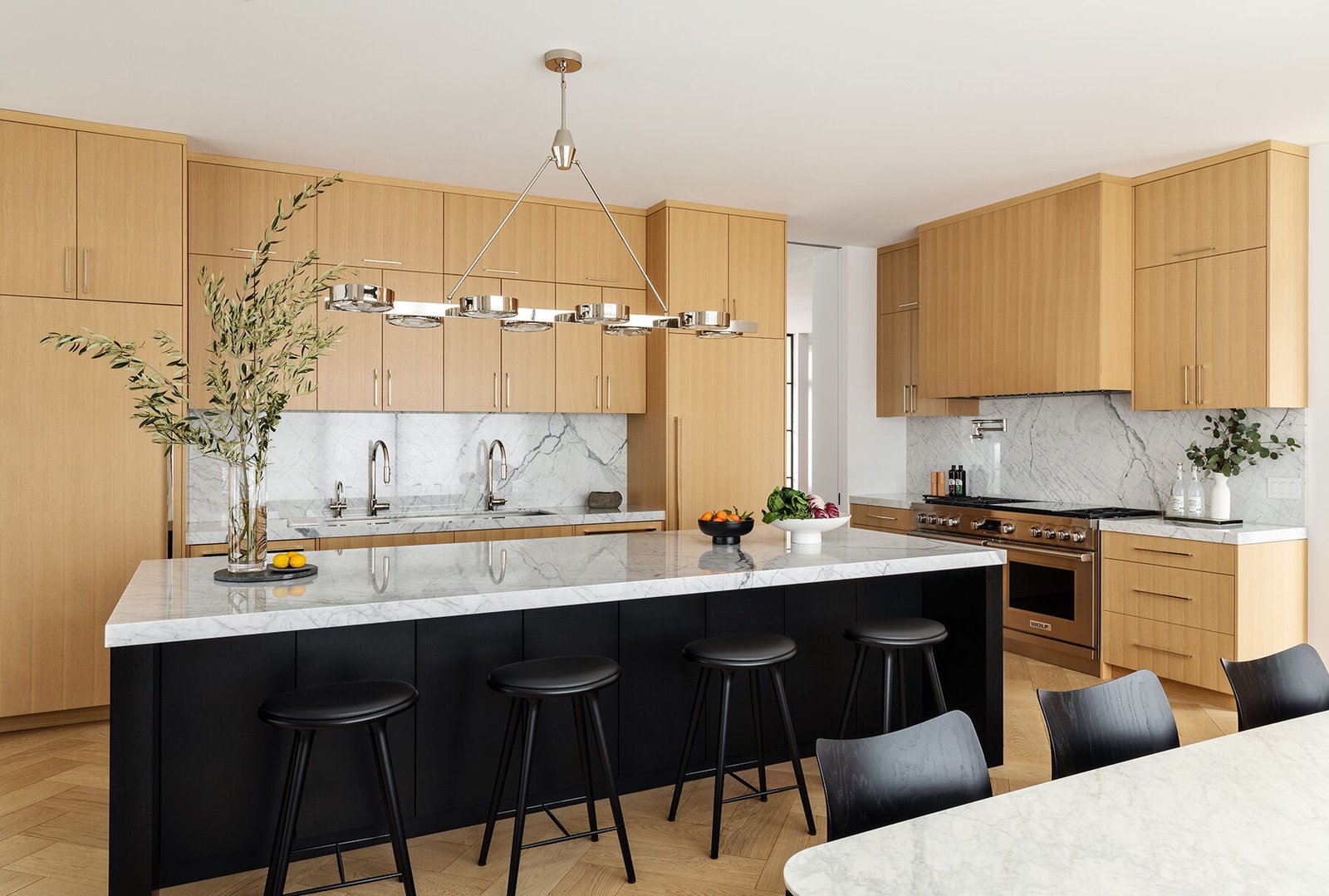
The kitchen keeps the pale timber but changes the balance. A dark island defines the working center, with veined stone at the counters and backsplash and storage around the room. The adjacent casual dining table sits by the windows, giving everyday meals a setting distinct from the formal dining room.
This distinction is a practical part of the interior story. Different uses need not be expressed by unrelated materials; changing the furniture arrangement and the relationship to daylight can be enough to mark the transition. Stone surfaces and detailed junctions still require suitable cleaning and sealing specifications rather than assumptions based on appearance.

The stair is a transition, not a break
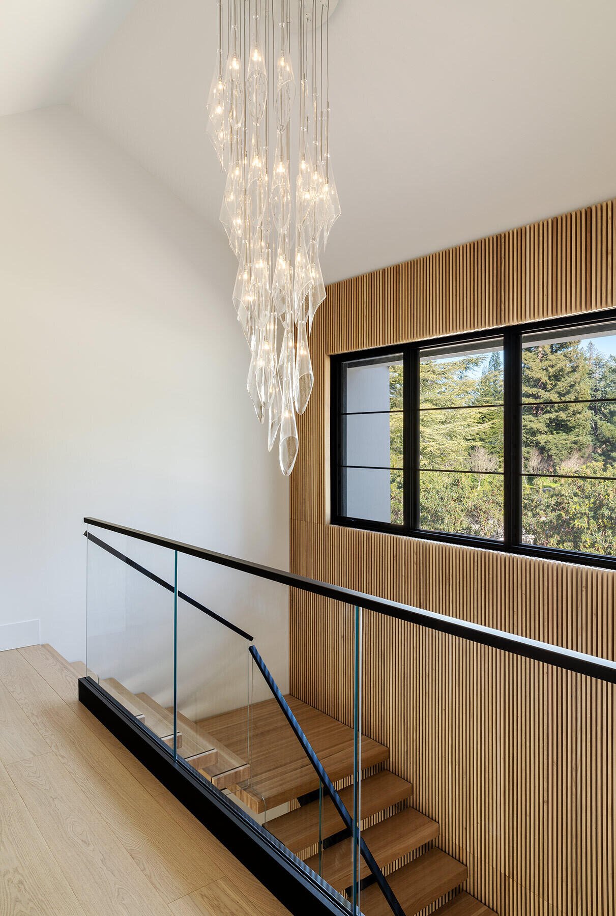
Pale timber treads and clear glass balustrades carry familiar materials between levels. A tall slatted wall adds a finer repeated pattern, while a large window and a suspended glass light occupy the stair volume. The vertical passage becomes another composed interior rather than an undecorated gap between rooms.
Glass maintains visual openness, but its edges, handrails and cleaning access remain important parts of the detail. The photographs show a light visual assembly; they do not by themselves establish acoustic performance or the effort required to maintain it.
Bathrooms vary the surface language
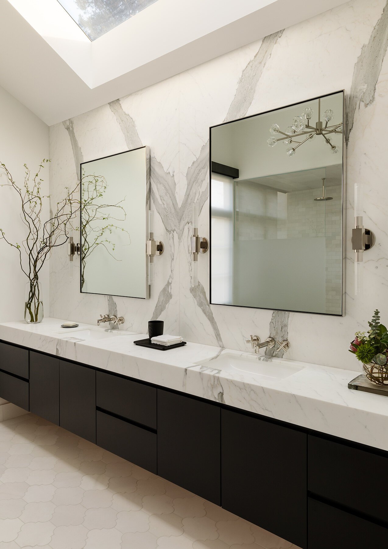
The principal bathroom combines a freestanding bath, a glazed shower and a long dark double vanity. A rooflight brings daylight into the vanity area, where veined stone extends behind two narrow mirrors. The combination makes illumination and the wash area central to the composition.

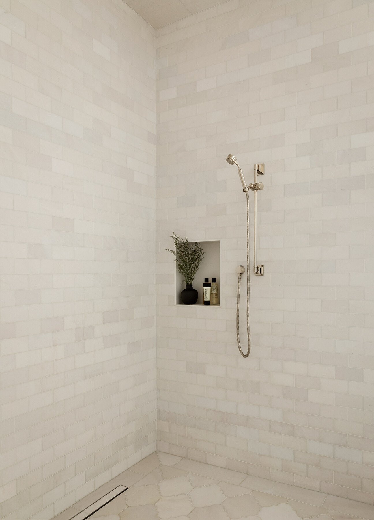


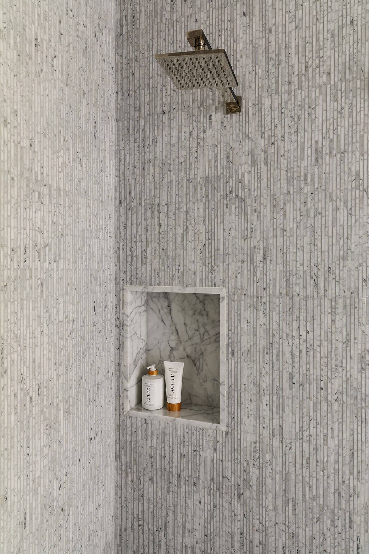
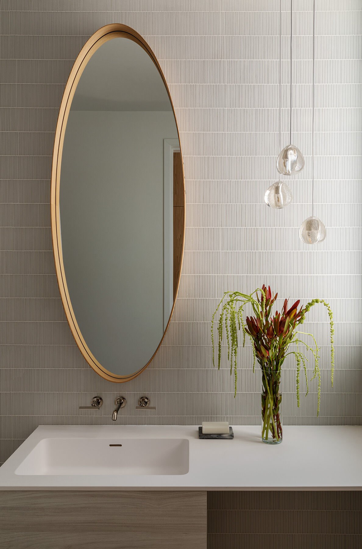
Other bathrooms change the scale of pattern: floral mosaic accompanies pale-blue cabinetry in one, narrow grey mosaic and a stone-lined niche define another, and an oval timber-framed mirror softens a smaller powder room. These are variations within a shared palette rather than identical rooms repeated throughout the house. More numerous mosaic joints also mean more joints to specify and clean, a useful operational counterpoint to the visual texture.



✦ ArchUp Editorial Insight
A home organized around an existing art collection has two overlapping demands: works need legible settings, while occupants need seating, storage and routes that remain useful when nobody is looking at the art. Here, the collection informed the layout and finishes, and the interior responds through a repeated relationship between quiet backgrounds and concentrated points of attention. The entrance introduces a work before arrival; the living room places art beside the fireplace and display shelving; the dining room brings sculpture into the same field as the table and suspended lights. This distribution makes viewing part of everyday movement rather than a separate activity. The architectural consequence is a house with several centers of attention, not a continuous gallery corridor. Its trade-off is that visual calm depends on coordination: additional objects, moved furniture or a changed collection could alter the balance between display and circulation. Pale timber and dark framing provide continuity, but they cannot alone resolve glare, conservation or cleaning access. Those require detailed decisions beyond the photographed arrangement. The transferable lesson is therefore not a neutral palette or a shopping list of furniture, but the placement of art in relation to where people enter, sit, turn and pause.
Project credits: Architecture: SDG Architecture. Interior design: Paulina Carcach Studio. Photography: Michele Lee Willson Photography.