DSK Bank Sofia: A Continuous Architectural Ribbon

The Green Ribbon’s Kinetic Movement and the Shaping of Spatial Experience
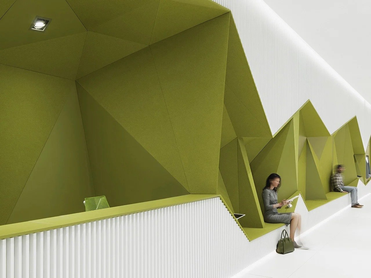
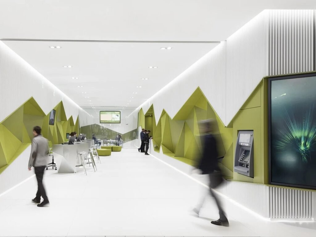
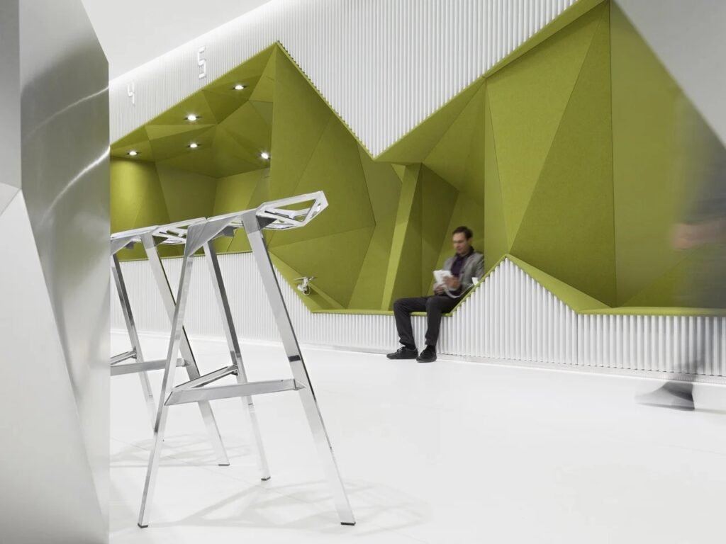
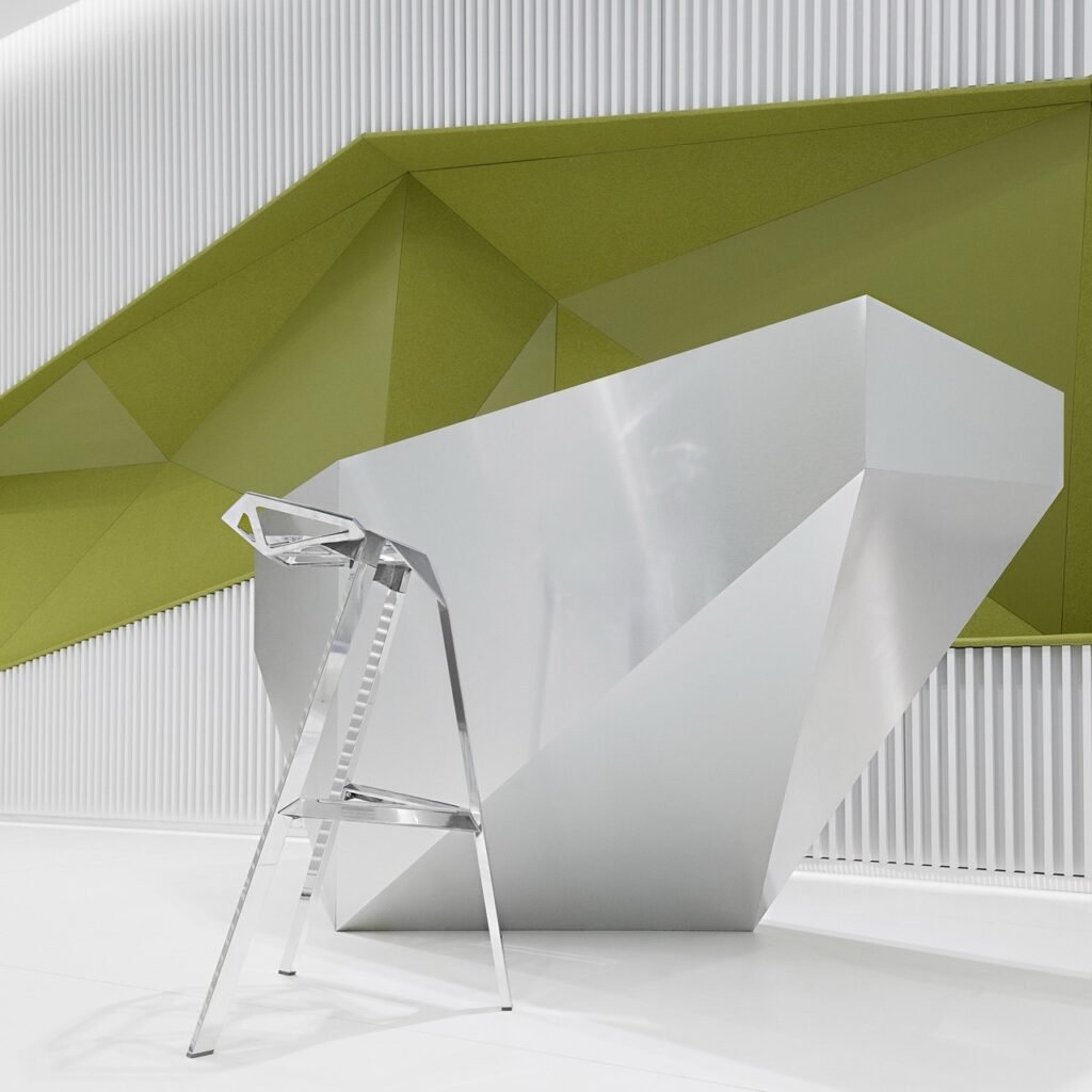
The interior architecture of the DSK Bank branch in Sofia is defined by a single design element that establishes the identity of the space and directs movement through it: a continuous folded surface in olive green extending along the length of the interior. In doing so, it moves beyond the traditional role of a wall to combine separation, fixtures, and furniture. The surface follows a continuous trajectory, with sections transforming into waiting benches, service desks, an ATM enclosure, and lighting elements. Through this approach, different functions are integrated into a single structure, while the conventional distinction between walls, furniture, and service elements recedes.
Geometric Folds and Interaction with Space
The successive folds of the green ribbon give the interior a distinct visual rhythm, particularly as they are framed by white elements that define the edges of the volumes and emphasize variations of light and shadow across their surfaces. Some of these curves and recesses also accommodate areas for use and seating, creating a gradual transition between the architectural surface and the elements with which visitors interact. Rather than appearing as a fixed boundary between the user and the space, the wall becomes a usable element that guides movement and accommodates a range of everyday functions.
Reorganizing Movement Around the Perimeter of the Space
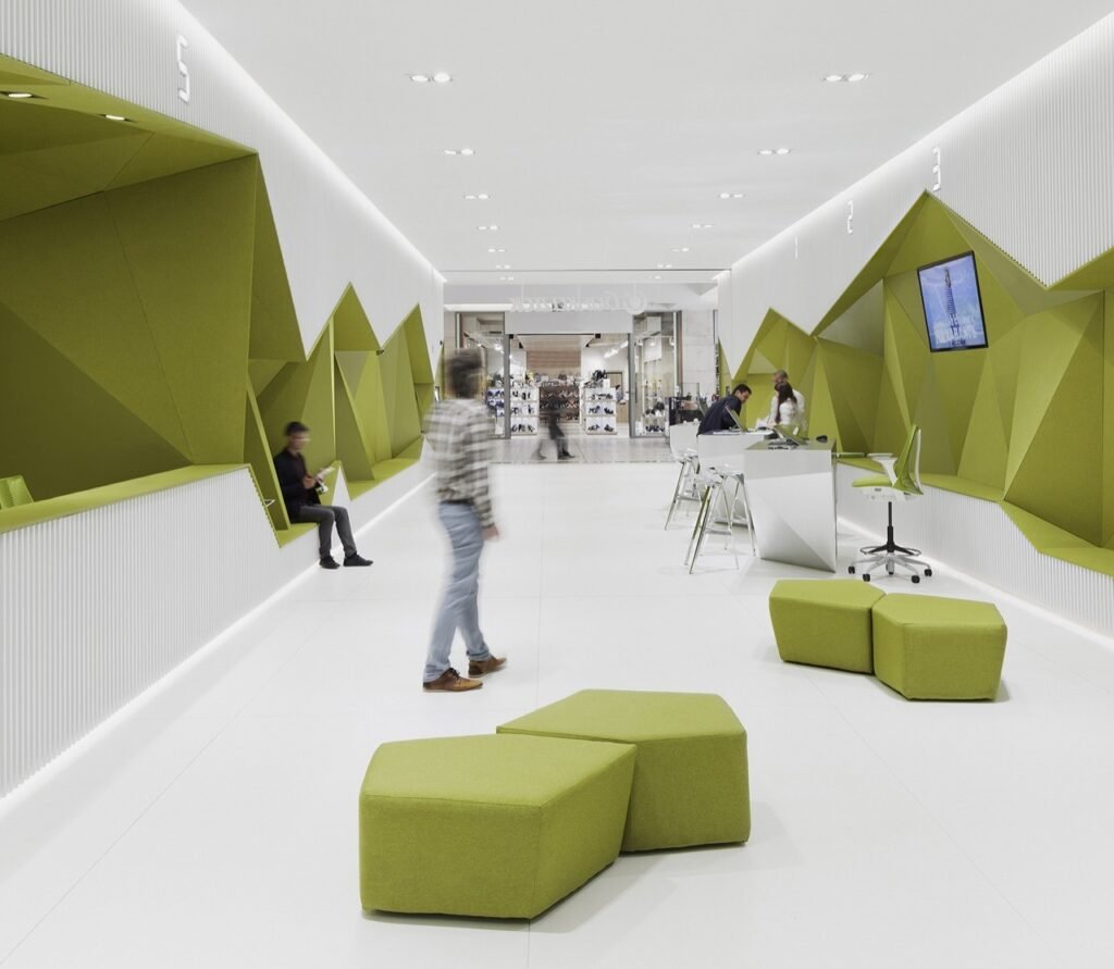
At the DSK Bank branch located in The Mall, movement is reorganized within an area of 270 square meters by keeping the central portion of the interior open and shifting most service functions toward the perimeter. This arrangement allows visitors to move through a space relatively free of obstacles and intermediate elements, while service points and equipment are distributed along the continuous wall. The absence of large functional volumes from the central area helps preserve a more open visual field and makes movement between service and waiting areas more legible.
Concentrating Functions Along the Perimeter
The perimeter ribbon functions as a framework that accommodates a range of banking and technological functions, with units, screens, and equipment integrated into the wall volumes rather than distributed separately throughout the space. This allows the center to remain open while providing service points along the circulation path. The organization also corresponds to the changing nature of bank branches, which increasingly rely on digital devices and services, meaning that not every function needs to occupy a separate area within the interior.
Material Contrast and Design Unity
The materials used reinforce the unified design concept by combining solid surfaces, metal elements, and dedicated seating components. MDF panels appear alongside polished stainless steel, which reflects light and introduces contrast with the olive green and white surfaces. The ribbon itself also varies according to function: some sections appear as solid surfaces accommodating equipment and fixtures, while others become upholstered areas designed for seating. This variation helps maintain formal unity while distinguishing different functions within the same element.
Variable Transparency and Privacy
At the rear of the branch, the circulation path reaches an area dedicated to private consultations, separated from the rest of the interior by a glass partition capable of shifting between opaque and transparent states. This solution allows the level of privacy to be adjusted according to need, without relying on a solid wall that would permanently isolate the area from the rest of the branch. In this way, the partition becomes a variable element within the interior organization, combining visual openness when required with visual separation during private consultations.
✦ ArchUp Editorial Insight
The DSK Bank branch redefines the banking interior as an integrated service structure rather than a collection of separate rooms and fixtures. The continuous green ribbon combines circulation, seating, services, equipment, and lighting around the perimeter of the space, deliberately leaving its center open. This spatial economy corresponds with the declining reliance on in-person banking services, while the variety of materials allows different functions to be distinguished without fragmenting the unity of the architecture.
However, this integration may overstate the notion of efficiency. Concentrating the operational infrastructure along the perimeter does not eliminate functional complexity; it conceals it within a single visual element. The folded surface becomes a controlled interface whose adaptability is shaped by technological requirements, maintenance, and the conditions of use. Therefore, the open center does not represent pure flexibility, but rather a residual space that has been carefully controlled; reducing visible elements may be closer to repackaging complexity than to eliminating it.