SR Ice Cream Miyakojima: A Local Ice Cream Experience

Spatial Experience and the Moment of Transition
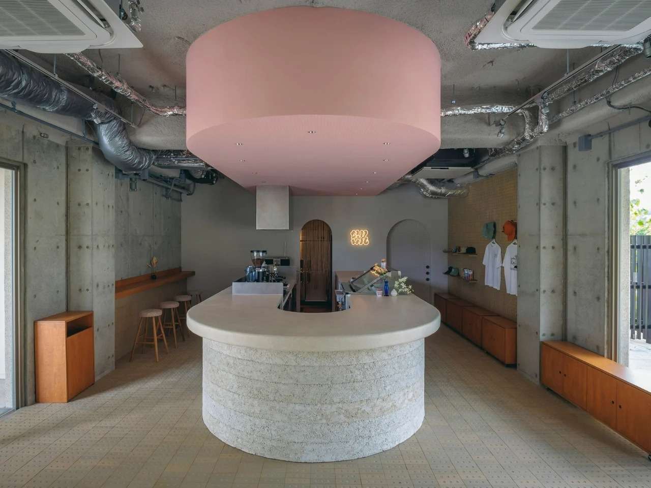
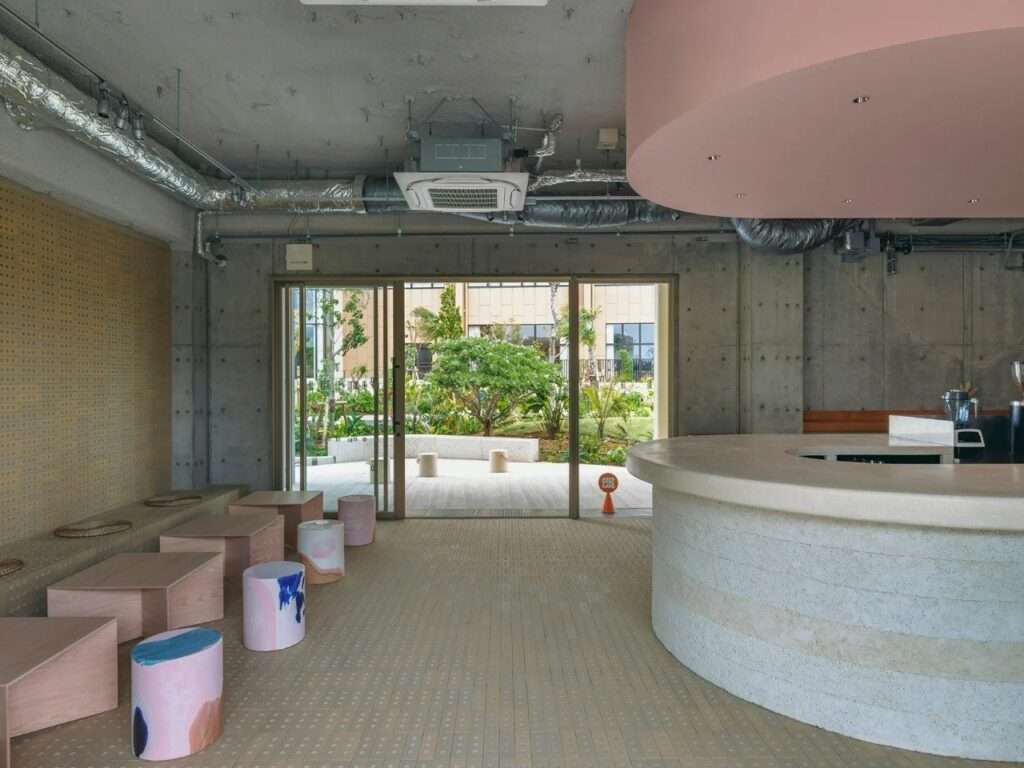
Despite the project’s small footprint, the store was designed to offer visitors a calm and direct experience as they transition from the exterior environment into the interior. The openness of the space and the organization of movement within it contribute to a sense of spaciousness while maintaining a clear relationship between the interior and the natural context surrounding Miyakojima Island. Rather than relying on dense partitions, the design is based on a simple spatial arrangement that allows movement and interaction with the elements of the space to become an essential part of the experience.
Studio name (Kii), founders (Arai, Nakatomi), technical details (Ryukyu limestone, perforated block for hurricane resistance)
Light and Material in Shaping the Atmosphere
Materials and surfaces play a fundamental role in shaping the project’s interior character, interacting with natural light to reveal variations in texture and shadow throughout the day. This treatment extends beyond the visual dimension, giving the space a sense of warmth and calm that suits the nature of the store and its function as a place to enjoy ice cream and pause for a short while. In this way, light becomes part of the interior composition, alongside the materials and colors that give the space its distinctive character.
Handcrafted Details and the Expression of Texture
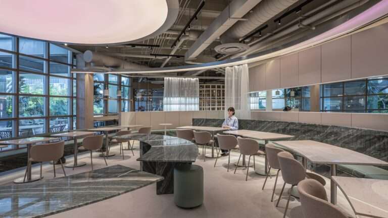
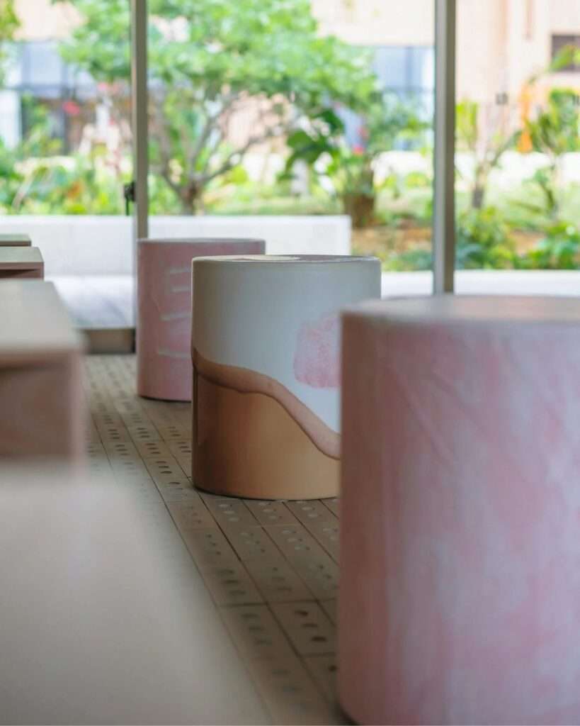
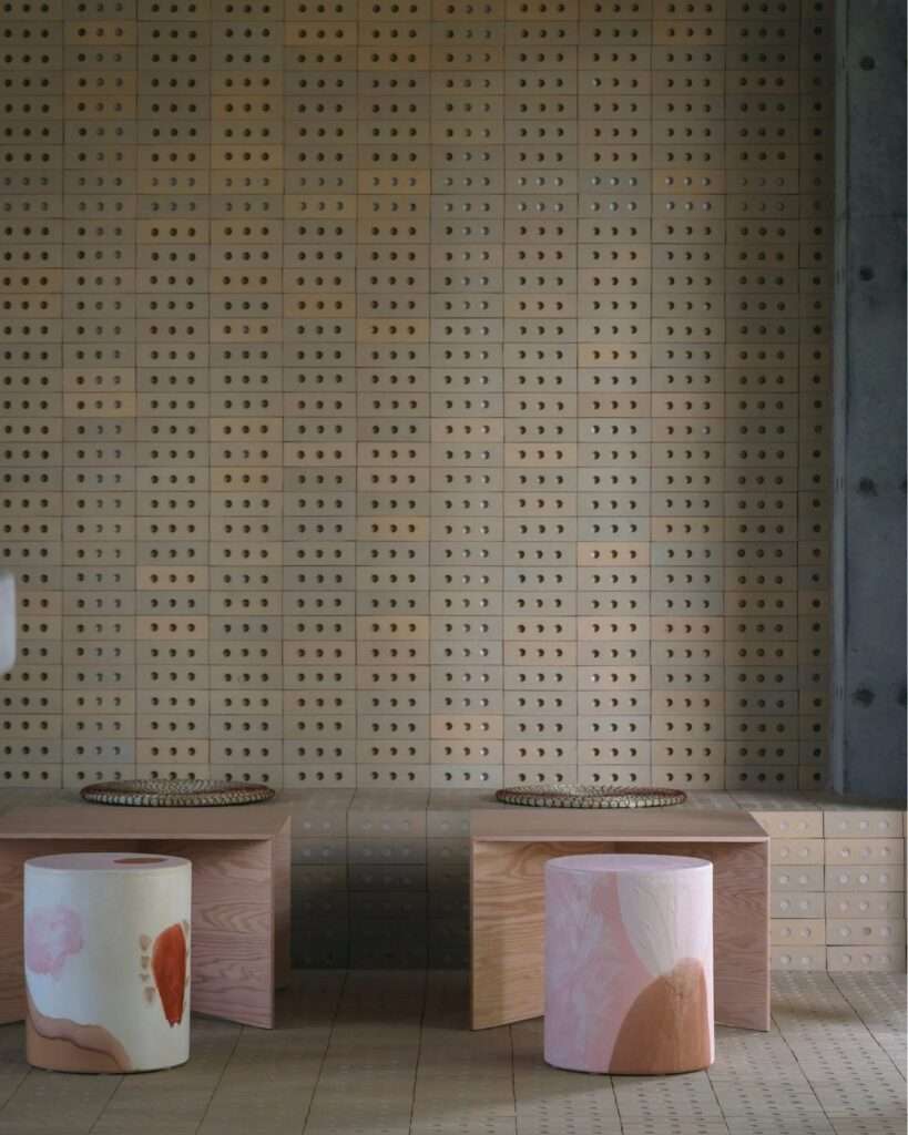
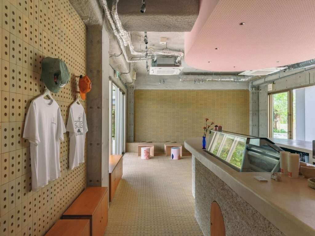
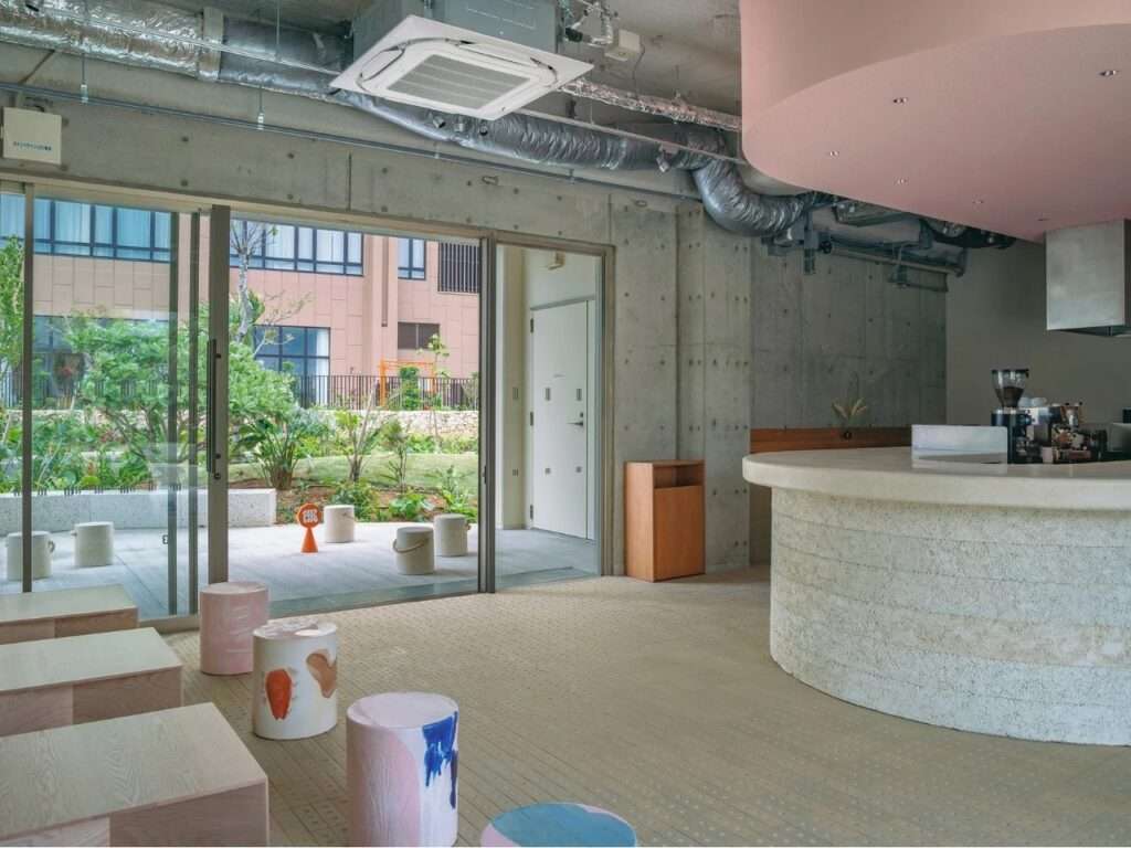
Attention to detail is particularly evident in the handcrafted seating designed by NOTA, characterized by layered pastel finishes inspired by the appearance of melting ice cream. Variations in surface colors and detailing give each piece its own visual presence, introducing a tactile diversity that simultaneously complements the project’s playful and tranquil character. These seats function not only as practical elements but also contribute to establishing the visual identity of the space and connecting its interior details with the product it offers.
Local Materials and the Reframing of the Familiar
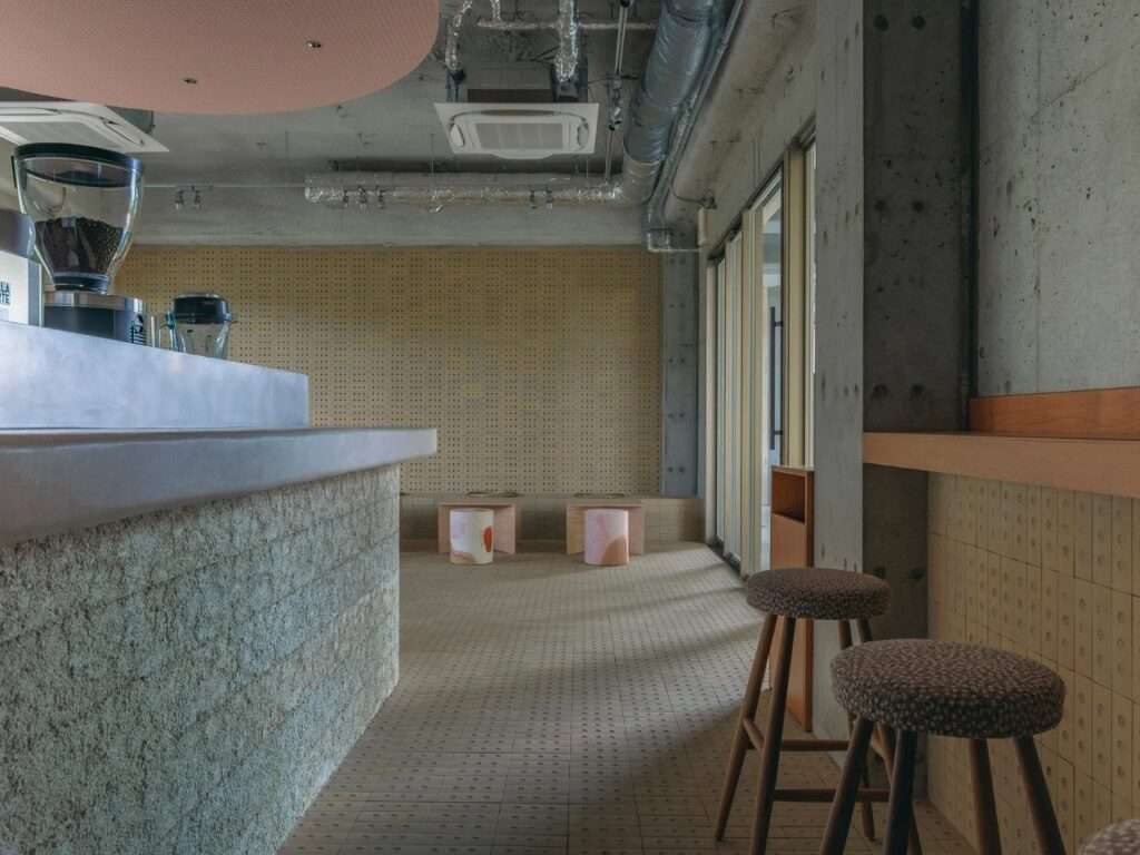
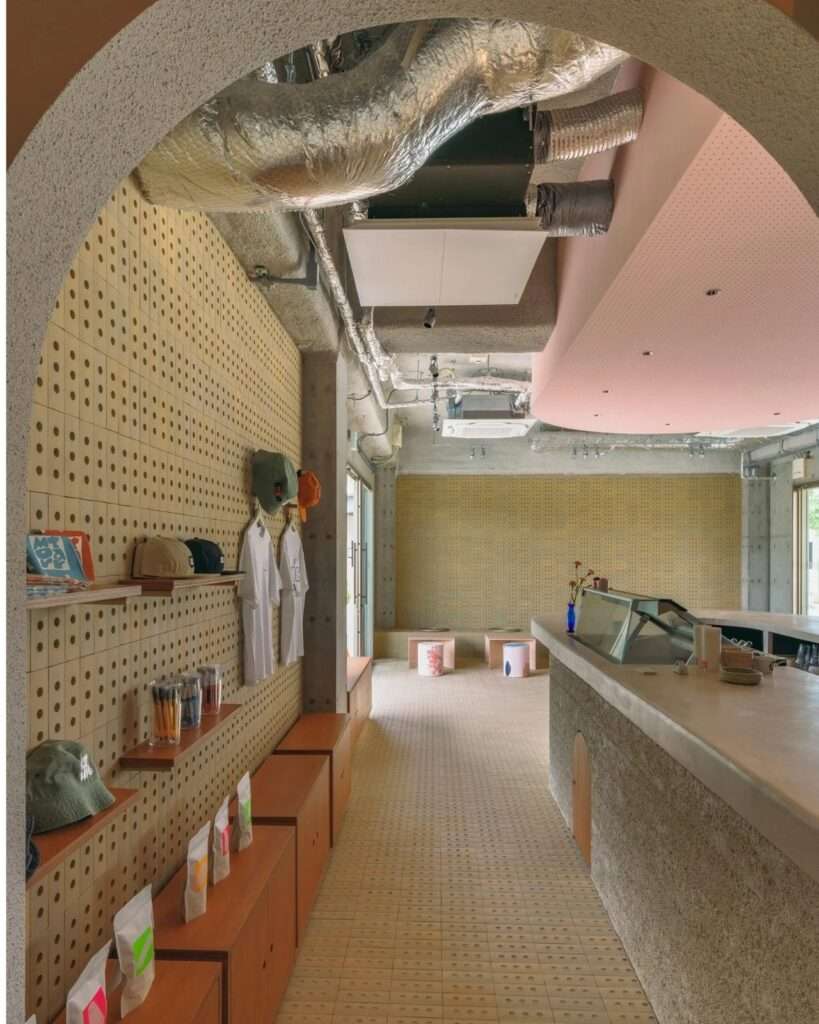
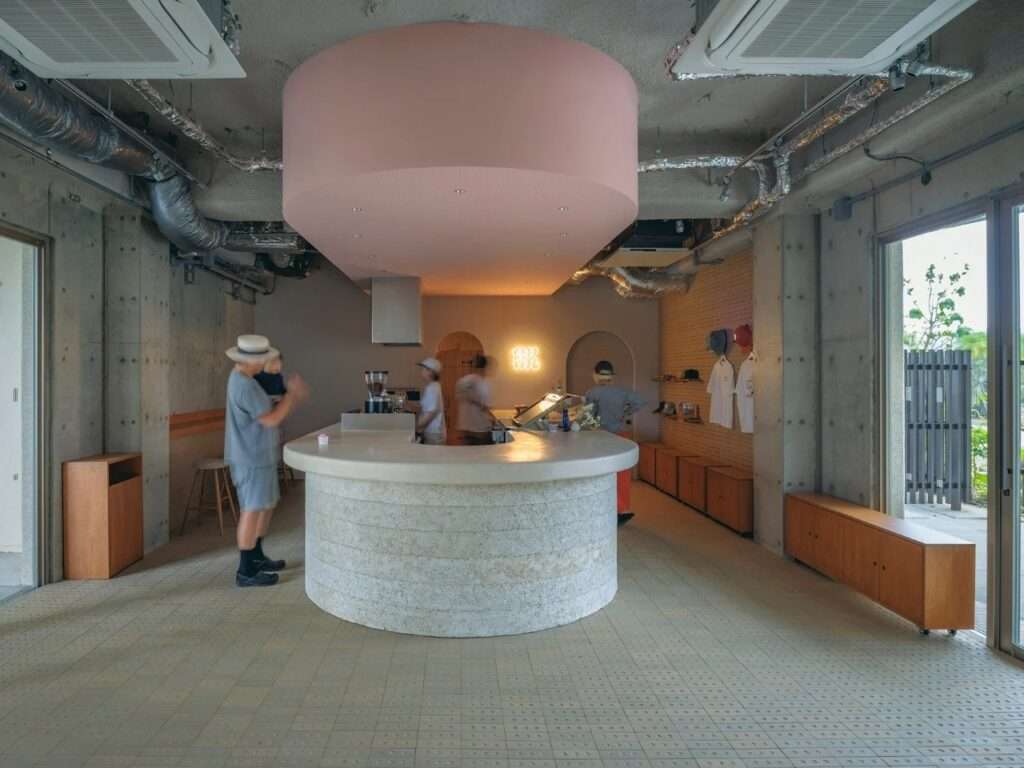
The attention to texture extends to the service area, where layers of local limestone plaster cover the counter surface, giving it a rough appearance that contrasts with the smoother, more polished surfaces of the tables. Another treatment of materials can be seen in the use of perforated concrete blocks within the walls and floors, alongside custom tiles developed in collaboration with Tajimi Tiles. This material diversity creates clear contrasts in texture and shadow while giving familiar everyday elements a renewed presence within the space, connecting the interior design to Okinawa’s local material and architectural context.
Ceiling Dynamics and Functional Gestures
Above the service counter, a curved ceiling with a light pink finish establishes a distinct visual presence for the central area without overpowering the other elements of the space. The color emphasizes the ceiling’s curved form and its interaction with the natural light entering the store, while small details add a functional dimension to the design. Among them is a small arched door integrated into the body of the counter, providing access to the filter for maintenance purposes while preserving the continuity of the counter’s overall form. This detail reveals the project’s careful approach to integrating technical elements into the architectural composition rather than leaving them detached from the interior scene.
A Visual Identity Rooted in Detail
The store’s identity does not depend on a single element but emerges from the interaction of a range of material and chromatic details. The handcrafted seating, surfaces with varied textures, and pink ceiling, together with the use of local materials, work collectively to create an atmosphere that is both simple and distinctive. Variations in texture and color give the space an intentionally heterogeneous character, so that the elements do not appear to form a uniform collection of finishes, but rather function as complementary parts of the place’s identity.
The Relationship Between Design and Context
The project takes advantage of its location on Miyakojima Island through the presence of materials and textures associated with the local context, rather than relying on a decorative treatment detached from its surroundings. This is evident in the use of local limestone plaster, perforated concrete blocks, and custom tiles, alongside subdued colors and handcrafted details. In this way, the store’s character emerges from a series of material decisions that establish a connection with the site while maintaining a contemporary character suited to its function as an ice cream shop.
Details That Invite a Slower Pace
The project’s elements combine functionality with the visitor’s everyday experience through a compact space that relies on texture, color, and light rather than a density of decorative details. The seating, surfaces, and curved ceiling provide visual and tactile variety, while the organization of these elements helps create a calm atmosphere suited to the nature of the place. Rather than presenting a visual experience detached from use, the architectural details are directly connected to how time is spent inside the store, from sitting and enjoying ice cream to observing the materials and light surrounding the visitor.
✦ ArchUp Editorial Insight
The project reframes the small ice cream shop as a carefully calibrated spatial pause rather than merely a container for commercial activity. Its strategy relies on material variation, controlled color, handcrafted seating, and local finishes to establish an identity without excess spatial intervention. Limestone plaster, perforated concrete blocks, custom tiles, and the curved pink ceiling establish a sensory architecture that replaces traditional ornamentation with material distinction.
Yet this reading may romanticize the specificity of the materials. Local plaster, custom-designed tiles, handcrafted furniture, and integrated maintenance details are not neutral elements; they require specialized execution, coordination in sourcing, and a higher degree of complexity during construction. As a result, the apparent simplicity conceals an advanced production system. Perhaps the project’s strength lies less in its contextual authenticity than in its transformation of a limited commercial space into a materially dense experience, in which building materials carry an economic and perceptual weight greater than their actual physical scale.