Calm Haven House: Levels, Light and the Space Around the Stair

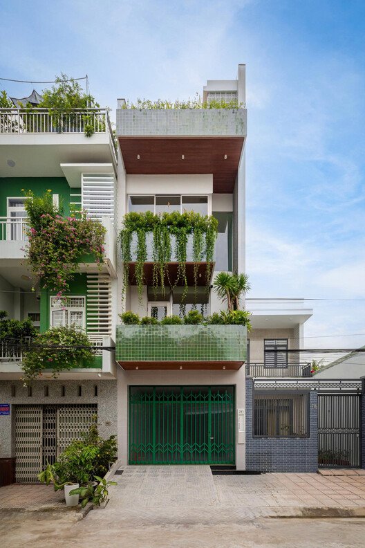
At Calm Haven House, the most revealing view is not the planted street façade but the space beside the stair. A tree rises through a tall opening, a red-tiled kitchen occupies a raised floor, and the route upward remains visible from below. Movement, planting and domestic work share the same scene without becoming the same place.
The 320-square-metre house in Can Tho was completed in 2025 for a young couple working in medicine and preparing for their first child. Their brief emphasized a warm, restful home. The interior gives that request a spatial form through contrasts: open and enclosed areas, bright vertical spaces and lower ceilings, continuous views and clearly marked thresholds.
Entering without seeing everything at once
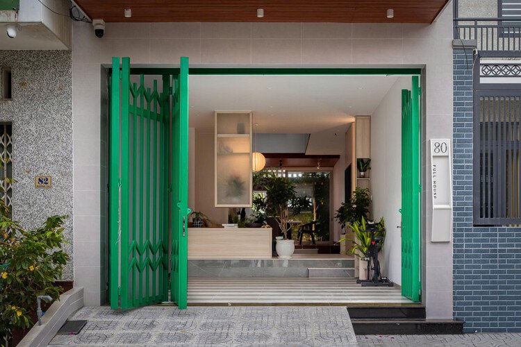
With the green entrance gates open, the photograph from the street shows a view extending into the house. Yet the interior is not presented as one uniformly lit box. Overhead planes, furniture and planting divide the depth into successive places. The entrance remains a recognizable boundary even when the view passes through it.
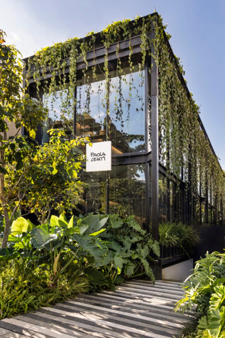
This distinction between a physical opening and complete exposure matters in a home close to the street. A long sightline can help someone understand where to go, but privacy depends on what sits beside that line and what can be closed. The façade’s planted balconies offer another layer above the entrance without making greenery a substitute for a closable boundary.
The kitchen has an edge, not a wall
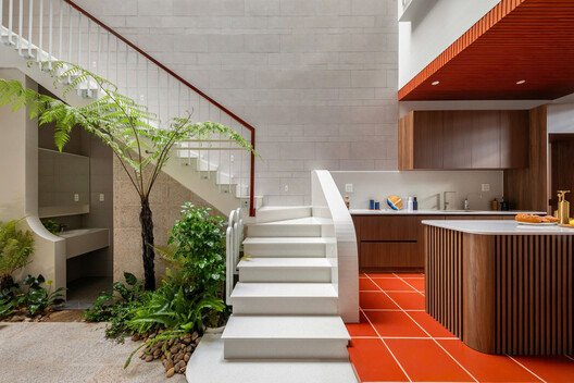
The architects describe the ground level as a sequence of garage, living area, shared courtyard and kitchen-dining space, defined without physical partitions. Changes in floor and ceiling level do some of the separating work instead. In the kitchen photograph, red tiles, timber-faced cabinetry and a higher floor make the cooking area legible beside the white stair and planted bed.
The raised edge is more than a colour transition. It makes crossing between activities a small bodily action. That clarity carries a trade-off: a step also interrupts a route for a pushchair, a trolley or someone with reduced mobility. The image demonstrates the level change, not the presence of an alternative step-free route.
The stair occupies a room of its own
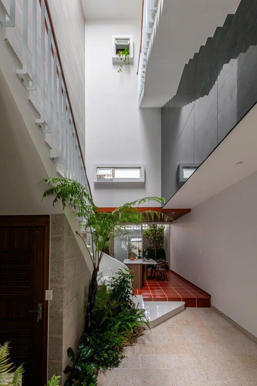
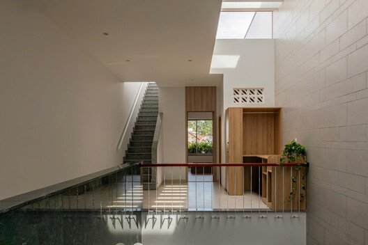
The tall opening around the stair gives movement a visible place in the house. Pale walls return light into the space, and the plant bed follows one side of the route. Above, landings and railings reveal the connection between floors rather than concealing it behind a door.
That connection is useful for orientation, but it also links sounds and household activity. The quieter experience sought in the brief therefore relies on the balance between the shared void and the rooms that can be enclosed. Openness and retreat are complementary provisions, not competing stylistic choices.
A smaller room and the work of daily care
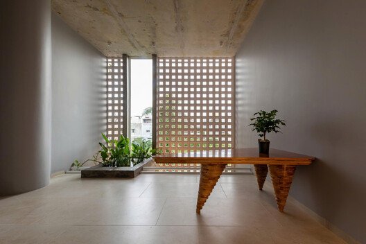
A more enclosed room offers a contrasting scale. Its perforated screen breaks the exterior view into small openings, while a narrow clear opening preserves a more direct sightline. The visible concrete ceiling, plain walls and low planting keep the number of competing surfaces limited. This is a change in the way the outside is encountered, not simply a darker version of the shared space.
Planting appears at several boundaries, including beside circulation and near the screen. It can frame a view and soften the visual edge of a room; watering, drainage and cleaning remain separate practical tasks. Likewise, the transition from red tile to pale floor gives each area a clear identity, but its success in daily use depends on durable edges and surfaces that can be maintained where activities meet.
✦ ArchUp Editorial Insight
The owners’ brief was for a welcoming home where a young medical couple could recover from demanding work as they prepared for their first child. That need does not translate into a measurable promise of calm; it creates a design question about how domestic activities meet and separate. The interior answers with a planted vertical opening, changes of level and smaller enclosed spaces above. In ArchUp’s reading, the main achievement is to make circulation part of the inhabited space rather than a leftover passage: the stair has light, the planting occupies a visible edge, and the kitchen has a distinct position without being visually isolated. The same choices introduce practical obligations. Steps make routes less continuous for wheeled movement, open volumes connect household sounds as well as views, and planted beds beside occupied rooms require access for watering and cleaning. The project is therefore most useful as an example of coordinated thresholds, not as a formula for wellbeing. Its spatial generosity depends on treating light, privacy and daily care as connected decisions, while retaining places where a person can close a door and withdraw.
Project credits: Calm Haven House, Can Tho, Vietnam. Architecture: ADA Design & Build; lead architect: Chau Thang; design team: Nguyen Huynh Duy Anh. Interiors: TimeDesign. Lighting: Real Lighting. Landscape: NinhKieu Landscape.