A Clinton Hill Brownstone Reorganized Around Gathering and Retreat

In a four-story brownstone in Clinton Hill, Brooklyn, the most telling change is not a color choice. It is the decision to put a dining table where a kitchen island might normally stand. That shift captures the larger renovation: an existing house becomes a setting for everyday meals, reading, family visits and an established collection of furniture and art, rather than a succession of rooms organized around display alone.
The owners moved from Tribeca to a landmarked nineteenth-century house that had previously been divided into short-term rentals. Much of its ornament had already disappeared. The renovation retains surviving details while changing the interior organization, giving the home a contemporary pattern of use without attempting to reproduce everything that had been lost.
The entrance makes the route visible
Olive front doors open toward a terracotta-toned vestibule, a yellow staircase and a red runner. The sequence uses color to distinguish the threshold from the route upward. A person arriving can read several layers at once: the doorway, the stair and the rooms beyond. The effect comes from their alignment as much as from the saturation of the paint.

On the parlor level, diagonally laid white oak boards recall the geometry of historic parquet while relating to a relocated stair down to the garden level. Here the floor is more than a background finish: its direction helps connect the rooms to the revised route between levels. Precise junctions at doorways and stair edges matter if that continuity is to remain convincing in use.
Keeping ornament without recreating a period room
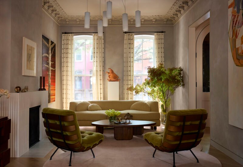
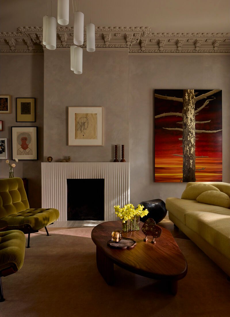
Original plaster crown moldings and a restored ceiling rosette remain prominent in the living room. Below them, a working fireplace has been reclad in textured porcelain tile. A Richard Tuttle chandelier and an existing collection of art and midcentury furniture occupy the same setting. Old and new are therefore encountered together, rather than assigned to separate historical and contemporary rooms.
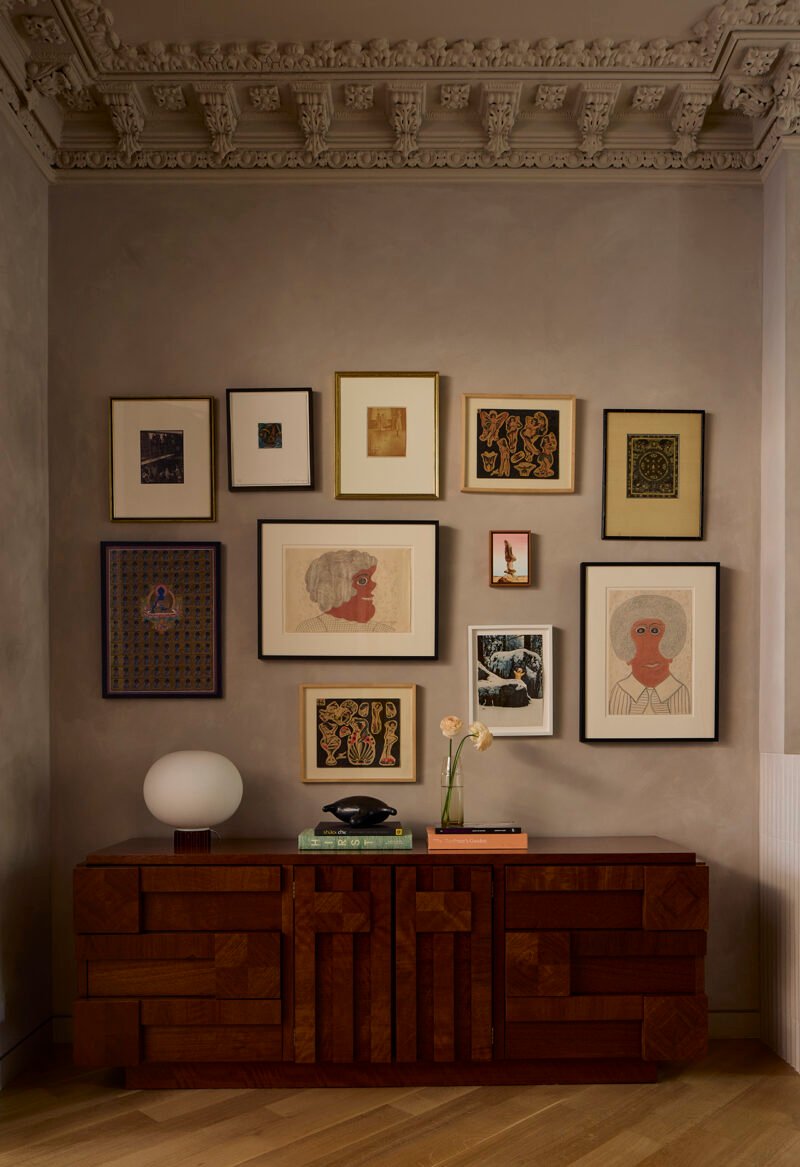
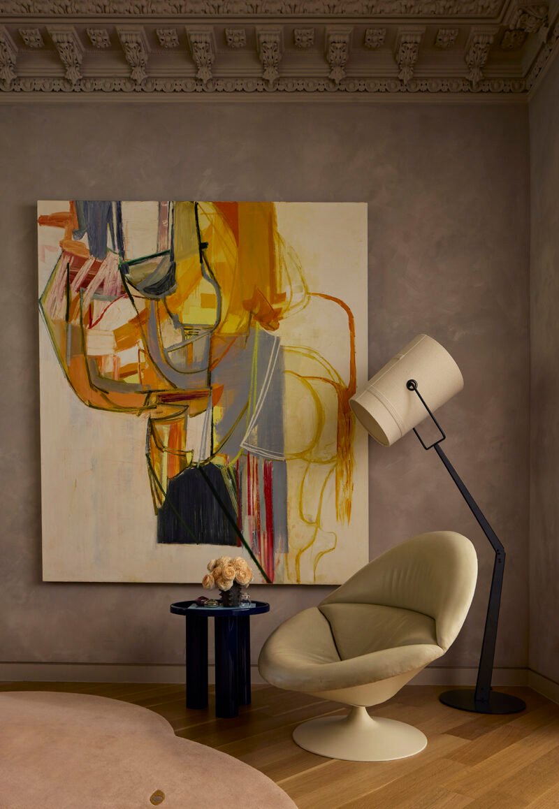
The sideboard wall demonstrates the value of an intermediate scale. A group of smaller works sits between a low cabinet and the ceiling ornament, while elsewhere a single larger painting sits behind a chair. These arrangements create different viewing distances: some works can be taken in from a seat, others invite a closer look. Wall space, furniture and the path through the room have to remain legible together.
The kitchen gives its center to the table
Cabinetry wraps the room perimeter, combining white oak with honed soapstone counters and a lilac marble backsplash. A dining table sits in the center beneath two vintage aluminum pendant lights sourced in France. Moving the working surfaces to the edges gives the middle of the room a less fixed role: people can sit opposite one another rather than line up along the edge of a preparation island.
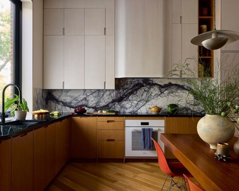

This is a spatial choice with a practical exchange. A table can serve meals, conversation or occasional work, but it does not provide the same built-in storage or equipment integration as an island. Perimeter storage and clear space behind occupied chairs become correspondingly important. The success of the arrangement lies in how these elements work together, not in a general rule that kitchens should abandon islands.
A useful comparison is the Atherton Residence, where a central island and an adjacent everyday dining area separate preparation from sitting. Both houses integrate an art collection into ordinary use; their kitchens show different ways to divide, or combine, domestic tasks.
A shared level with room to withdraw
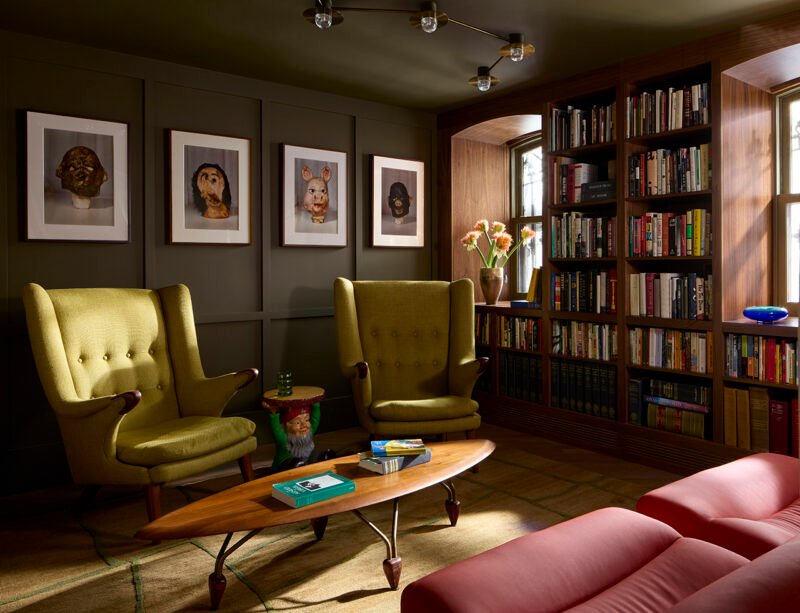
The stair down to the garden level is accompanied by three hand-blown glass milk-drop pendants by Jeff Zimmerman. At the rear, a family room opens toward the landscaped garden. At the front, a darker library contains a custom walnut bookshelf and two Hans Wegner Papa Bear chairs. The two settings offer different relationships to activity: one extends toward outdoor life, while the other concentrates attention around books and individual seats.

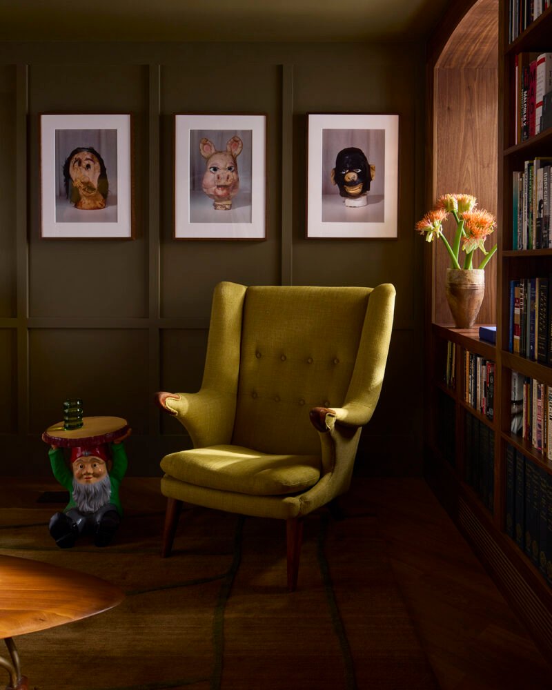
The contrast avoids making every shared room perform identically. A reading retreat does not need the same visual openness as a family room. Equally, darker finishes should be understood as part of the room’s atmosphere, not a substitute for adequate reading light. Furniture position and task lighting remain the practical counterparts to the palette.
Privacy changes the scale of the interior
The primary suite brings russet, ochre and moss-green tones into a quieter setting. A hand-painted landscape mural wraps the bedroom, while a white oak reading nook overlooks a small terrace. In the bathroom, limewash walls meet a blue-green zellige shower and an arched vanity. The material transitions distinguish sleeping, reading and washing without requiring an entirely separate design language.


The top floor accommodates the couple’s three adult children in bedrooms arranged around a skylit lounge. That organization gives visits a shared point of arrival within a more private part of the house. Across the levels, the renovation relies on such differences in use to give the color and collection a framework.
✦ ArchUp Editorial Insight
A house previously divided into short-term rentals had to become a coherent home for two people while accommodating their collection and visits from three adult children. The renovation responds by giving different activities distinct settings rather than making every floor equally open. A table replaces the kitchen island, a darker library contrasts with the garden-facing family room, and the upper level groups bedrooms around a shared lounge. The result is a domestic sequence in which gathering, withdrawal and visiting have recognizable places. Color reinforces those distinctions, but the consequential decisions concern circulation and furniture: where a chair can be pulled out, where a reader can remain undisturbed, and how daily movement connects the levels. There are trade-offs. The table gives the kitchen a more social center while relinquishing the fixed storage and preparation space an island might provide; a highly coordinated palette also asks future additions to negotiate an already expressive setting. ArchUp reads the project as an argument for selective continuity. Keeping surviving plasterwork does not require reconstructing an entire period interior, just as introducing contemporary objects does not require erasing the house’s remaining history.
Project credits: Brownstone renovation, Clinton Hill, Brooklyn, New York. Architecture and interiors: Barker Associates Architecture Office (BAAO), with the homeowners on furniture selection and art placement. Photography: Gieves Anderson.