Napa Bistro: How Ceilings, Glass and Seating Turn One Hall into Rooms

At Napa Bistro and Wine Bar Stonecrest in Charlotte, the most consequential change is not a decorative reference to wine country. It is the subdivision of an existing open restaurant into connected settings. The interior offers a useful question: how can a dining room feel contained at the table without becoming a collection of disconnected boxes?
A ceiling for the room, a backrest for the table
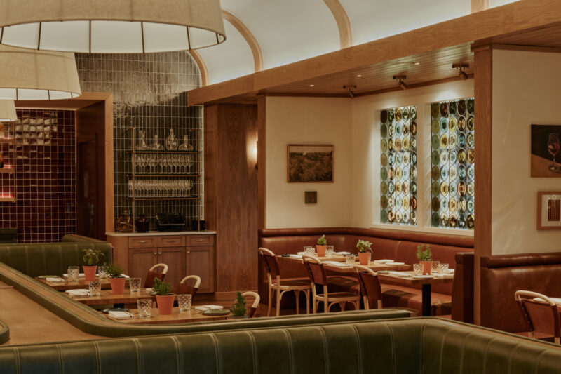
In the main dining room, the pale ceiling curves down toward horizontal timber edges. Slender timber strips make that curve readable across successive bays. Below it, olive-green booth backs draw a different, lower boundary around the tables. The two systems work at different distances: the ceiling gives the room continuity, while the upholstered backs bring an edge close to the seated body. Large pale pendant shades occupy the space between them, so the eye does not have to travel all the way to the ceiling to find a nearby reference.
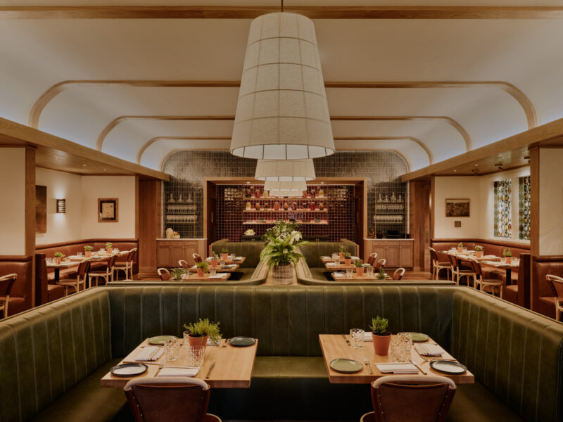
The designer specifies acoustic plaster in the arched ceiling. Its purpose concerns sound absorption within the room; it should not be confused with sound isolation between rooms. No measured result is available here. Visually, the pale upper surface also contrasts with the darker green seating: the room reads as a relatively bright volume above a denser band of furniture, rather than as a uniformly dark interior.
Smaller rooms change the distance of attention
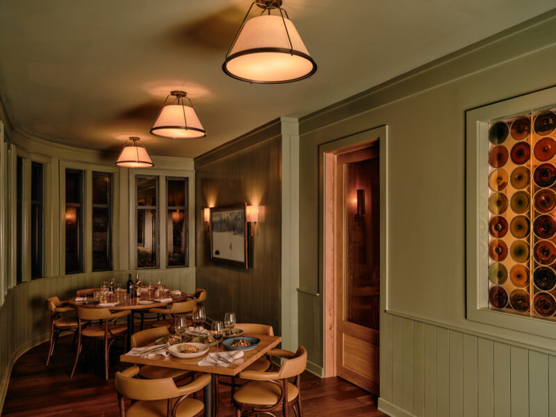
The side room makes the shift particularly clear. Green panels continue from the lower wall into the door surround, while the dark-looking floor and closer sequence of pendant shades keep attention around the tables. A timber-framed glazed door interrupts the green surface. Through it, a warmer-colored adjoining space remains visible; enclosure is established by the frame and wall depth, not by eliminating every view out. Wall lights pick out an artwork and the vertical surface behind it, while the pendants illuminate the table zone from above.
Colored glass: brightness without a clear view through
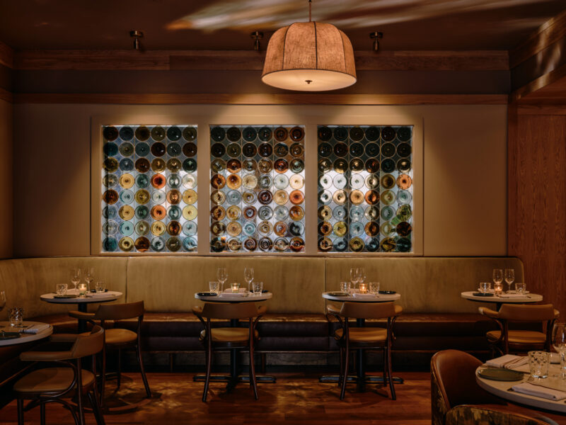
Above a continuous banquette, circular glass pieces sit in rectangular fields. Their amber, blue-green and dark tones repeat some colors already present in the upholstery and timber, but with a different behavior: transmitted light makes individual circles stand out against the shaded ceiling. The designer identifies these as hand-blown rondels. Their visible variation turns the window into something to look at, not merely through. At seated eye level, this interrupts a clear view beyond while retaining a bright surface. It is a visual filter, not evidence of complete privacy.
The bar is marked underfoot as well as overhead
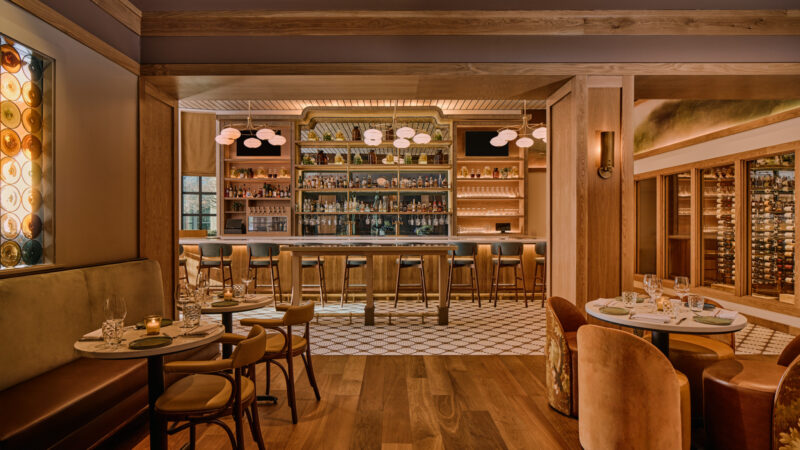
The bar exchanges the dining area’s broad timber-colored floor surfaces for a small-scale, contrasting mosaic. Its repeated dark lines describe a distinct zone without requiring a partition. Blue upholstered stools form another continuous band along the counter; against the warmer timber front, they make the seating edge easy to distinguish. The counter’s pale top catches light along its length, whereas the vertical front reads as a sequence of narrow strips. This is a tangible contrast between the surface approached by the hand and the surface encountered by the eye below it; the photograph does not establish their exact material specification.
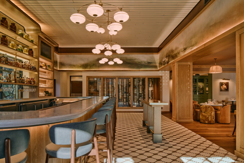
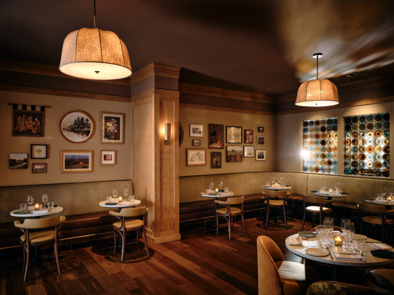
Globe lights concentrate brightness above the bar, with additional light outlining shelves and the upper wall. In the adjacent dining corner, fabric-like shades and wall lights produce smaller illuminated areas. The difference is not simply “bright versus dim”: the bar emphasizes display and a long shared counter, while the dining settings emphasize shorter distances around individual tables.
Connections remain visible
A timber-faced pier separates two seating bays, but the continuous banquette and repeated wall finish tie them together. Small framed artworks sit above the backrest rather than competing with the ceiling. In another view, a broad framed opening reveals the bar from the dining tables. The floor pattern changes at this threshold, giving the moving guest a second cue alongside the timber frame. These photographs show how the zones connect; they do not establish route widths or accessibility compliance.
✦ ArchUp Editorial Insight
The documented starting point was an open restaurant shell, with a fixed existing structure and a carefully managed fit-out budget. The meaningful decision here is to spend spatial effort on boundaries: booth backs, framed openings and changes in ceiling shape, rather than rely on decorative objects to suggest separate rooms. At a table, these elements reduce how much of the overall restaurant occupies the immediate view; when moving, the larger openings preserve glimpses of the next setting. That combination matters more than whether an individual lamp looks French or Californian. The stained glass extends the same argument at a smaller scale, making a luminous surface out of an opening instead of leaving every view transparent. There is also a genuine operational question attached to this approach: a series of rooms asks the service team to maintain awareness across several visual thresholds. The photographs show connections, not evidence of how service performs at capacity. Likewise, acoustic plaster is a specified treatment, not proof of quiet dining. The project’s strongest contribution is therefore a legible hierarchy of shared room, seating bay and individual table, with its performance limits kept distinct from its visual coherence.
Project credits: Interior design: FictionWorks. Architecture: In Situ Studio. Location: Charlotte, North Carolina, USA. Photography: Pablo Enriquez.