The Green That Could Not Survive Its Own Purity


Research and analysis: ArchUp Research Lab.
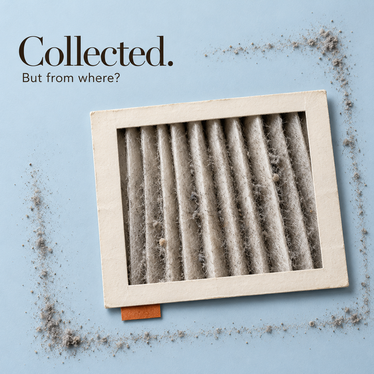
The cover places a green leaf and a fading leaf inside a transparent box. It is an editorial metaphor for preservation, not a photograph of a Coromandel screen or a scientific demonstration of pigment decay. The contrast offers an entry into a more difficult material question: what does it mean to preserve a colour when its appearance depends on the structure that is becoming unstable?
The supplied research describes an unusual green pigment on a seventeenth century Coromandel lacquer screen at the Victoria and Albert Museum. Its particles appeared spherical and translucent, unlike the irregular fragments associated with many familiar mineral pigments. The investigation identified copper resinate in a proteinaceous binding medium [1]. The important observation was not merely the unusual shape. Different green passages on the same object had survived differently. That contrast makes the screen relevant to interior design, provided it is read as evidence from a particular material system rather than a universal law about pure colour.
What the spheres actually were
The technical account identifies the pigment as copper resinate, formed from a copper compound and resin, probably from a pine species. The research overview describes complementary chemical and microscopic analyses. Their value lies in connecting the appearance of a particle with evidence about its composition and its binding medium. A visual resemblance alone would not identify a material reliably.
This distinction is central to conservation research. A paint sample contains more than a colourant: its binder, additives, substrate and alteration products can all affect what an instrument records. The supplied account of the study is therefore treated here as a reported identification, not as an analysis conducted by ArchUp. Detailed analytical assignments should be checked against the original paper before they are reused in a treatment specification.
The spherical morphology is interpreted in the study as a consequence of manufacture. It suggests that the pigment's form carries information about a process, rather than only a mineral source. That does not mean that shape alone proves a particular recipe. The useful finding is the association between morphology, composition and the paint system in which the particles were found.
For the designer, this offers a wider lesson about material description. A product name can conceal a complex arrangement of particles and binder. Two surfaces described by the same colour may differ in how their components interact, how they scatter light and how they respond to cleaning. The specification needs to reach beyond the label when those differences affect service or conservation.
Two greens, two fates
The supplied account reports that lighter or olive green passages containing lead white were glossy and well preserved, while darker passages using the copper resinate without that white pigment were matt, powdery and affected by loss [1]. This is a significant comparison, but it is not a controlled experiment. The surviving passages may differ in binder distribution, layer structure, application, exposure and subsequent history as well as composition. Their adjacency does not eliminate those variables.
The observation supports investigation of the formulation. It does not establish that dilution was the only cause of survival or that lead white simply reduced the total pigment volume. Adding one pigment to another changes a paint system in more ways than one. Lead white is part of this historical account, not a recommendation for contemporary interior products.
A matt appearance describes how a surface reflects and scatters light. In some historic paints, a high pigment load and inadequate binding can contribute both to a matt appearance and to friability. That possible connection helps explain why consolidation may change the look of an already fragile layer. It does not make mattness synonymous with weakness.
Modern formulations can achieve low sheen through different binders, particle arrangements and additives. A durable matt finish is not a contradiction. The responsible design inference is to test the particular product and application, not to reject a whole visual category. Conversely, a glossy surface is not automatically well bonded or chemically stable. Optical character and material performance must be described separately before their relationship can be assessed.
Why this belongs to interior design, not just to chemistry
A Coromandel screen is also a spatial object. It divides views, directs movement and introduces a decorated surface into the room. Its conservation therefore involves more than recovering the chemistry of a fragment. Placement, light, handling and the relationship between an object and its support shape the conditions under which the surface survives.
This is where conservation becomes relevant to contemporary interior specifications. A saturated cabinet front, a matt wall and an historic painted screen may share an optical ambition while requiring very different care. An analogy can sharpen the questions asked of them; it cannot make their material behaviour interchangeable. The designer's task is to identify the conditions of use before turning a sample into a room wide commitment.
Matt finishes often serve an aesthetic purpose: they can soften reflections and allow colour or form to be read without a strong highlight. That purpose deserves to be preserved, but it should be expressed alongside functional requirements. A finish beside a chair back, a circulation corner or a frequently touched handle experiences a different pattern of contact from a protected display surface.
The problem is not that matt colour is inherently unsuitable for inhabited interiors. It is that a visual choice can arrive without an adequate account of abrasion, cleaning and repair. Where that account is missing, the maintenance team inherits an unresolved design decision. The Coromandel case is useful because it makes the gap between appearance and cohesion visible, not because it predicts how every contemporary product will fail.
The formulation bargain
The central design proposition is a formulation bargain. Colour, sheen, cohesion, cleanability and repairability are connected requirements, and a decision that improves one may alter another. The supplied essay called this a dilution bargain, but the historical comparison cannot support an inverse law between chromatic purity and permanence. It supports a more precise question: which formulation delivers the intended appearance under the conditions the object will actually face?
That question leaves room for technical improvement. A deep green need not be made paler merely because a historic dark green proved fragile. A different binder or product may meet the same visual goal. In conservation, however, replacing an original formulation with a stronger modern one can destroy the very evidence being preserved. Contemporary design and heritage treatment share the need to understand materials while operating under different rules about replacement.
Physical loss is only one possible change. Research on copper acetate and copper resinate in model paint systems also examines photochemical darkening, with behaviour dependent on the copper complex and binding oil [2]. It adds a separate category of concern: an attached paint layer can change colour even when its particles remain in place. Findings from an oil system should not be transferred automatically to the protein bound Coromandel paint.
For a specific object, light exposure, environmental conditions and cleaning compatibility require assessment together. There is no universal solvent or cleaning method that follows simply from the word green. Even dry contact may be damaging to a friable surface. Preventive conservation should define the exposures to reduce and the activities to avoid through diagnosis, rather than turn a pigment story into a household cleaning recipe.
How you would actually treat it, and why that is a lesson too
The supplied overview reports that the Coromandel treatment used immiscible solvents and a consolidant to address powdering while retaining the matt appearance [1]. The result is relevant as an example of controlling delivery, not as a procedure that can be repeated without the original methods, testing and object assessment. This article does not specify a recipe or claim independent examination of the treated screen.
The underlying difficulty is intelligible without a recipe. A consolidant can alter the spaces between particles and the way light passes through a layer. The treatment may improve cohesion while increasing saturation or sheen. The correct outcome is consequently not maximum adhesive content. It is sufficient stabilisation with acceptable optical and material change.
A separate study of two Vietnamese paintings found Aquazol suitable after investigating the particular paint layers and testing candidate materials [3]. Its significance is the dependence of treatment choice on diagnosis and application. It does not establish Aquazol as the universal solution to all matt paint, nor does it prove the same material would be appropriate for the Coromandel screen.
This restraint reaches beyond a single painted object. A conservation intervention must explain which properties it is protecting and which changes it is prepared to accept. An apparently stronger surface may be a poorer conservation outcome if it loses an original texture, conceals evidence or forecloses later treatment. Equally, preserving a fragile appearance does not mean leaving active loss unmanaged.
The institutional responsibility is to make that balance explicit. Conservation, display design and maintenance should work from the same account of significance and vulnerability. When each discipline operates with a different definition of success, a treatment can be celebrated in the workshop and undermined by the lighting, handling or cleaning arrangement that follows it.
The green that could not survive its own purity is therefore a title for a particular material dilemma, not a law of colour. The screen records unequal survival within a historic paint system. It does not disclose everything its maker knew, nor establish that intense colour must always be sacrificed for durability. The useful conclusion is more demanding: appearance is produced by a material arrangement, and that arrangement must be understood before it can be conserved or specified responsibly.
A specification that begins after the photograph
Consider a hypothetical hotel lounge with a deep matt green wall behind loose furniture. An approved sample communicates colour under one set of conditions. It says much less about repeated chair contact, oily fingerprints, uneven cleaning or local repair. None of those outcomes can be predicted from the Coromandel screen, but its conservation problem suggests the questions that the project should answer before approval.
A useful mock up should reproduce the proposed substrate, preparation, application and lighting. It should be assessed from the distances and angles that occupants will encounter. The cleaning method should be part of the evaluation rather than supplied after the finish is installed. If a repaired patch becomes visible because its sheen differs, that is a service consideration even when its colour is a close match. The point is to evaluate a system, including repair, rather than a pristine square of colour.
Touch should also be mapped spatially. A protected upper panel and a surface at hand height do not need identical performance criteria merely because they share a colour. The design may distribute materials according to exposure, introduce a replaceable component or change the position of furniture. These are design decisions, not admissions of aesthetic defeat. They allow the desired atmosphere to coexist with ordinary behaviour.
This scenario is a proposed design exercise, not evidence that a particular commercial finish is defective. Its purpose is to translate conservation thinking into questions for contemporary procurement without borrowing conclusions that the historical study did not test.
Keeping the evidence visible
For an historic screen, documentation needs to distinguish original appearance, alteration and treatment. A general photograph may record the composition while missing a local change in sheen. A close view may show particle loss while concealing the spatial conditions that caused contact. A useful record brings these scales together and states the limits of each image.
Monitoring should follow the same logic. The team needs consistent points of comparison and a clear reason to revisit the condition assessment. A new loss, change in surface response or alteration in display conditions may justify review. The schedule should follow the object's vulnerability and institutional resources; this essay does not invent a universal inspection interval.
Documentation is also a form of coordination. A conservator may know that a surface cannot tolerate contact while a cleaner sees only an accessible panel and a designer sees only an interruption in the composition. A concise care brief connects those perspectives. It should make the object understandable to the people responsible for its daily surroundings, rather than bury essential limits in a technical report that never reaches them.
A useful selection record should distinguish the visual target from the evidence used to approve it. The first may be expressed through a sample, while the second concerns the substrate, application and intended use. Recording both allows a later change in product or maintenance to be assessed against the original decision. Without that record, an apparently equivalent substitution can quietly alter the project's obligations. This is a proposed coordination practice, not a performance claim for a particular coating.
The colour is part of the room's future
The conservation case does not ask design to surrender intensity. It asks design to account for what intensity is made of and what conditions will sustain it. The same colour can be a pigment, a coating, a visual relationship and a maintenance responsibility. Those descriptions belong together, even when different specialists are responsible for them.
The institutional conclusion is therefore practical: specify appearance and continued care as a single commitment. For new interiors, demand evidence appropriate to the actual finish and its use. For historic interiors, preserve original material and document the limits of intervention. A surface succeeds when its visual purpose can continue within an intelligible plan for its care, rather than when its opening photograph briefly makes deterioration impossible to imagine.
Method and evidence limits
This is an analytical review of the supplied research overview and accessible publisher abstracts and extracts. It does not claim independent full reading of every original paper or laboratory testing by ArchUp Research Lab. The Coromandel account is mediated through the supplied overview; its bibliographic record was cross checked. Design scenarios and the formulation bargain are the team’s interpretations, not findings of a new experiment.
Sources
- Burgio L, Rivers S, Higgitt C, Spring M, Wilson M. Spherical Copper Resinate on Coromandel Objects: Analysis and Conservation of Matt Green Paint. Studies in Conservation, 52, 241–254, 2007.
- Alter M, Binet L, Touati N, et al. Photochemical Origin of the Darkening of Copper Acetate and Resinate Pigments in Historical Paintings. Inorganic Chemistry, 58(19), 13115–13128, 2019. DOI: 10.1021/acs.inorgchem.9b02007.
- Ebert B, Singer B, Grimaldi N. Aquazol as a consolidant for matte paint on Vietnamese paintings. Journal of the Institute of Conservation, 35(1), 62–76, 2012. DOI: 10.1080/19455224.2012.672813.