A Glass Kitchen and Curved Cabinetry Reorganise a Turin Apartment


In this Turin apartment, the most consequential interior element is not a colour or a piece of furniture. It is a transparent room placed inside the shared living area. Architect Maurizio Pol of KKArchitettura enclosed the kitchen with floor-to-ceiling glazing and slender black frames, allowing cooking to become physically separate while remaining visually connected to dining and living.
A kitchen that closes without disappearing
The enclosure wraps two sides of the kitchen and is entered through a sliding glass door by HenryGlass. The frames establish a clear geometric boundary against the pale cabinetry, while the transparent panels allow daylight and views to continue across the apartment. When the door is closed, the kitchen remains present in the composition rather than becoming a sealed back room.
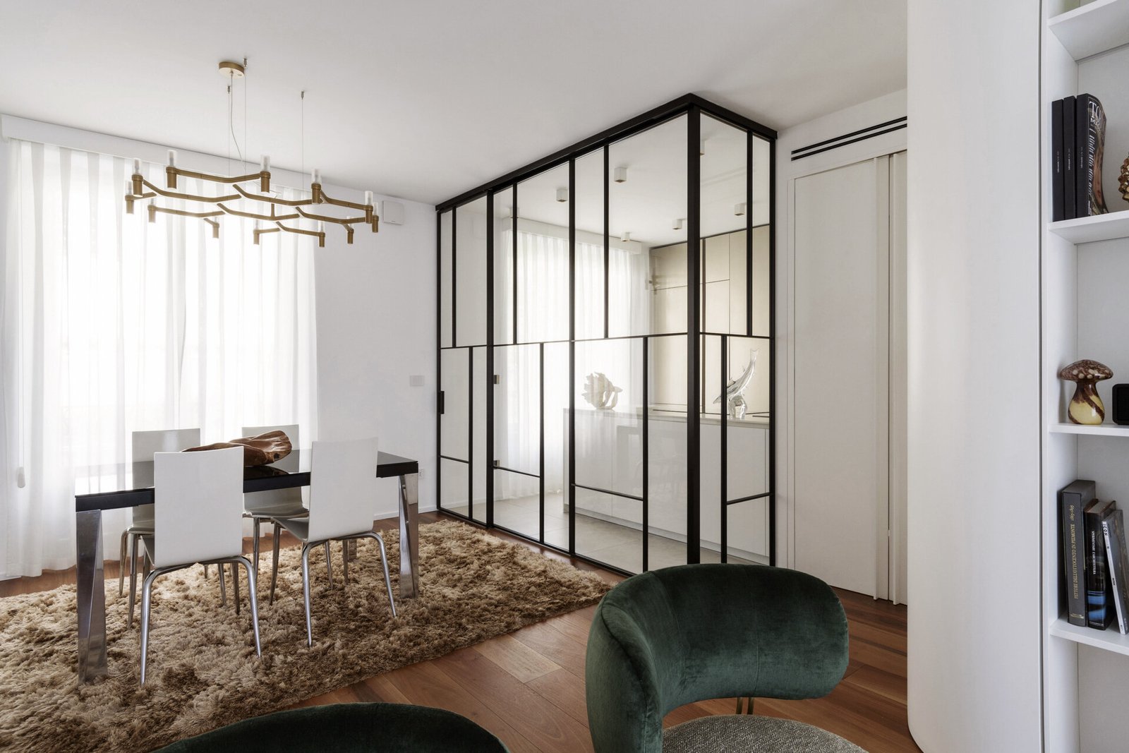
Arrital AK Project cabinetry lines the kitchen, with full-height storage at the rear and a peninsula for preparation. An induction cooktop is integrated into the pale marble-look surface, and the same veined finish continues at the backsplash. The peninsula keeps the principal work surface close to the transparent boundary, so the person cooking remains oriented towards the adjacent room.
The glass can help contain cooking activity, but the photographs cannot demonstrate acoustic isolation or odour performance. Those depend on seals, ventilation and how the sliding door is used. Transparency also makes countertop organisation visible from the dining area, turning everyday storage discipline into part of the room’s appearance.
Curved cabinetry thickens the wall
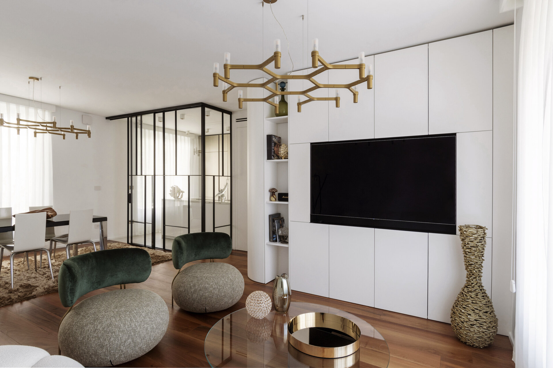
In the living room, a custom white boiserie extends across a full wall. It contains the television, closed storage and a narrow open display zone, then turns the corner with a rounded end. The curve softens the junction between surfaces and avoids a projecting cabinet corner near the seating area.

Walnut parquet provides the darker continuous ground beneath the white cabinetry. Rounded upholstered chairs and a Bubble sofa add freestanding forms, while the built-in system establishes the fixed edge. The room therefore distinguishes what is expected to remain in place from what can be rearranged.
Dining remains between kitchen and living
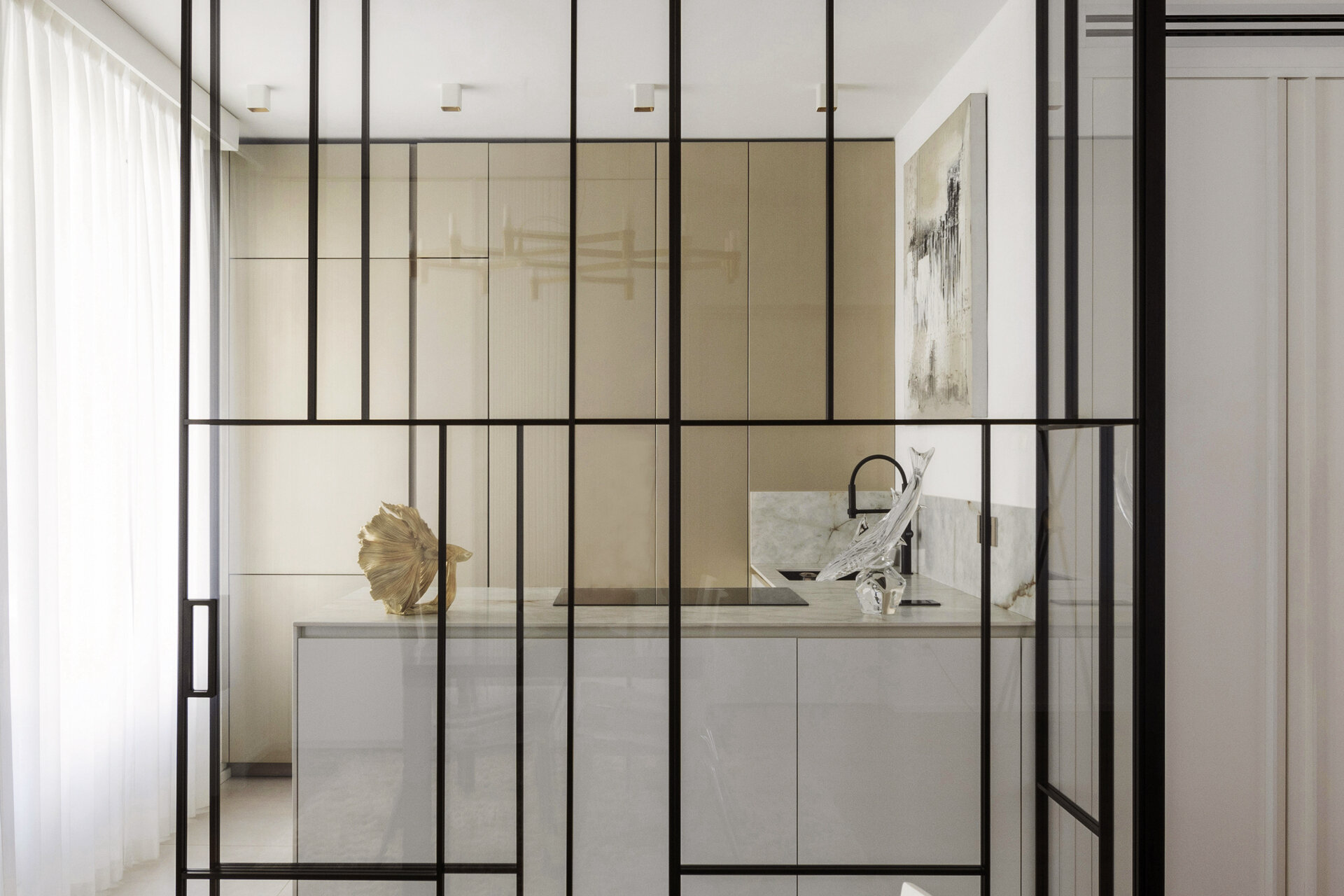
The dining table sits immediately beside the kitchen enclosure. A branching brass chandelier gives the zone a strong overhead marker, while a rug defines its footprint on the timber floor. Because the glass wall continues behind it, the dining area can face both the kitchen and the living room without becoming a corridor between them.

Storage conceals the route to private rooms
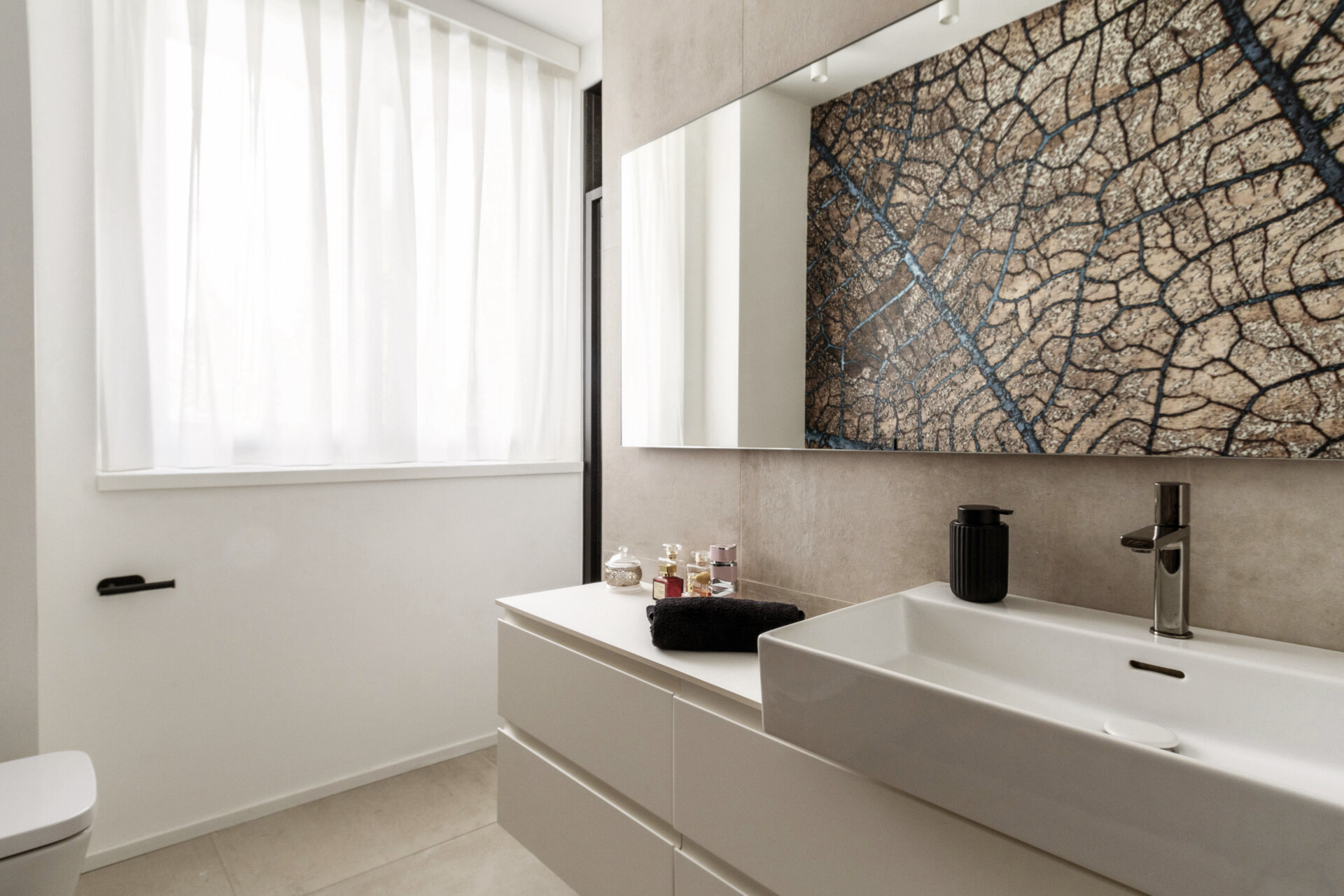
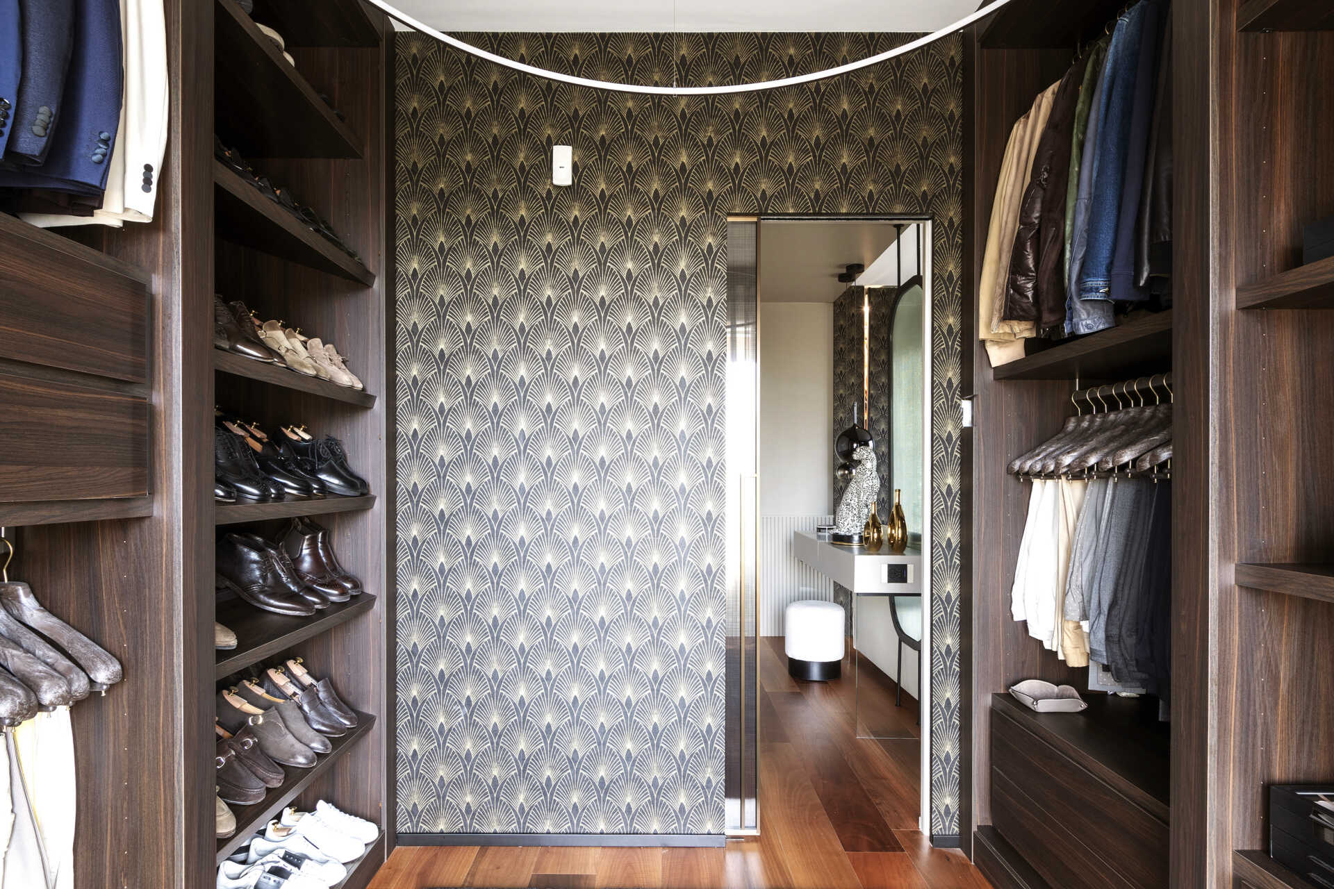
Between the shared rooms and the sleeping zone, the white cabinetry incorporates a flush door. Vertical grooves and aligned surfaces reduce the visual interruption, allowing the wall to read as one storage system. Beyond it, built-in panels and doors continue through the hall.
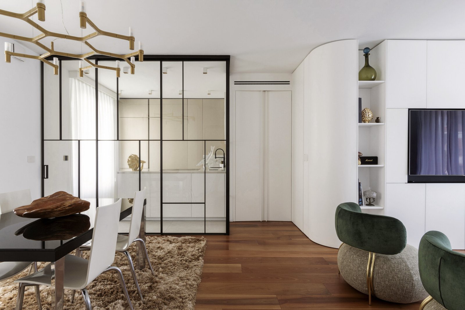
Concealment can reduce visual clutter, but a household still needs the route to remain intuitive. Hardware, lighting and daily familiarity therefore carry wayfinding work that a conventional door frame would normally perform. The solution is most convincing where the hidden opening does not conflict with emergency access or frequent guest use.
The bedroom uses furniture as infrastructure
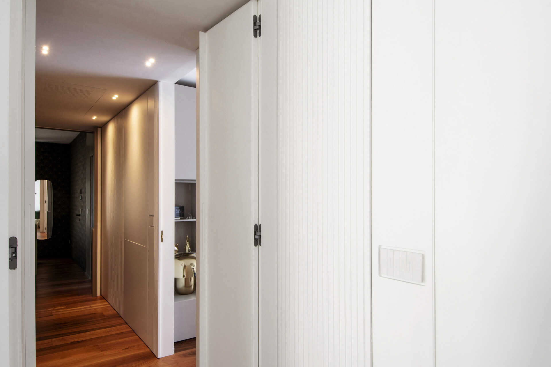
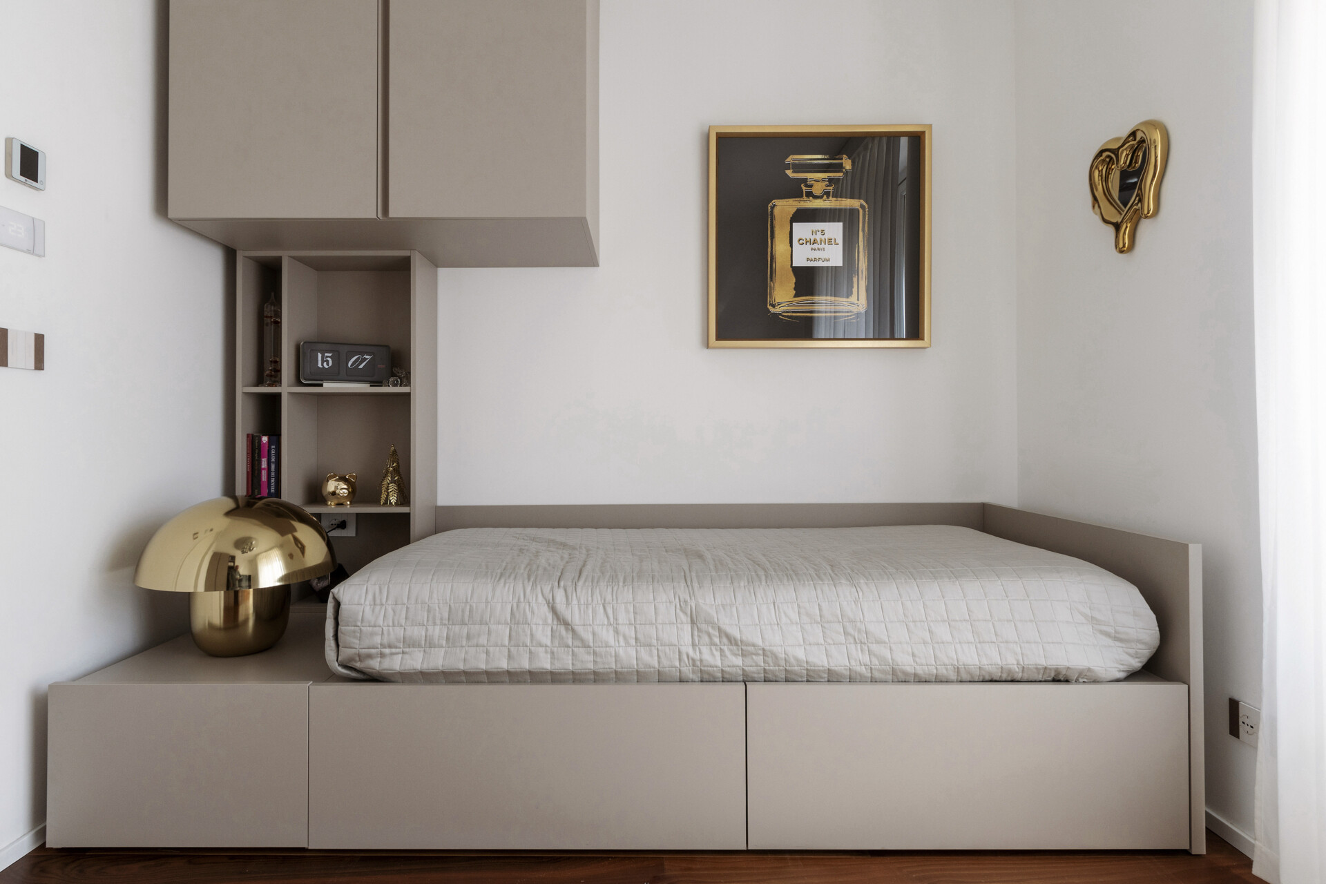
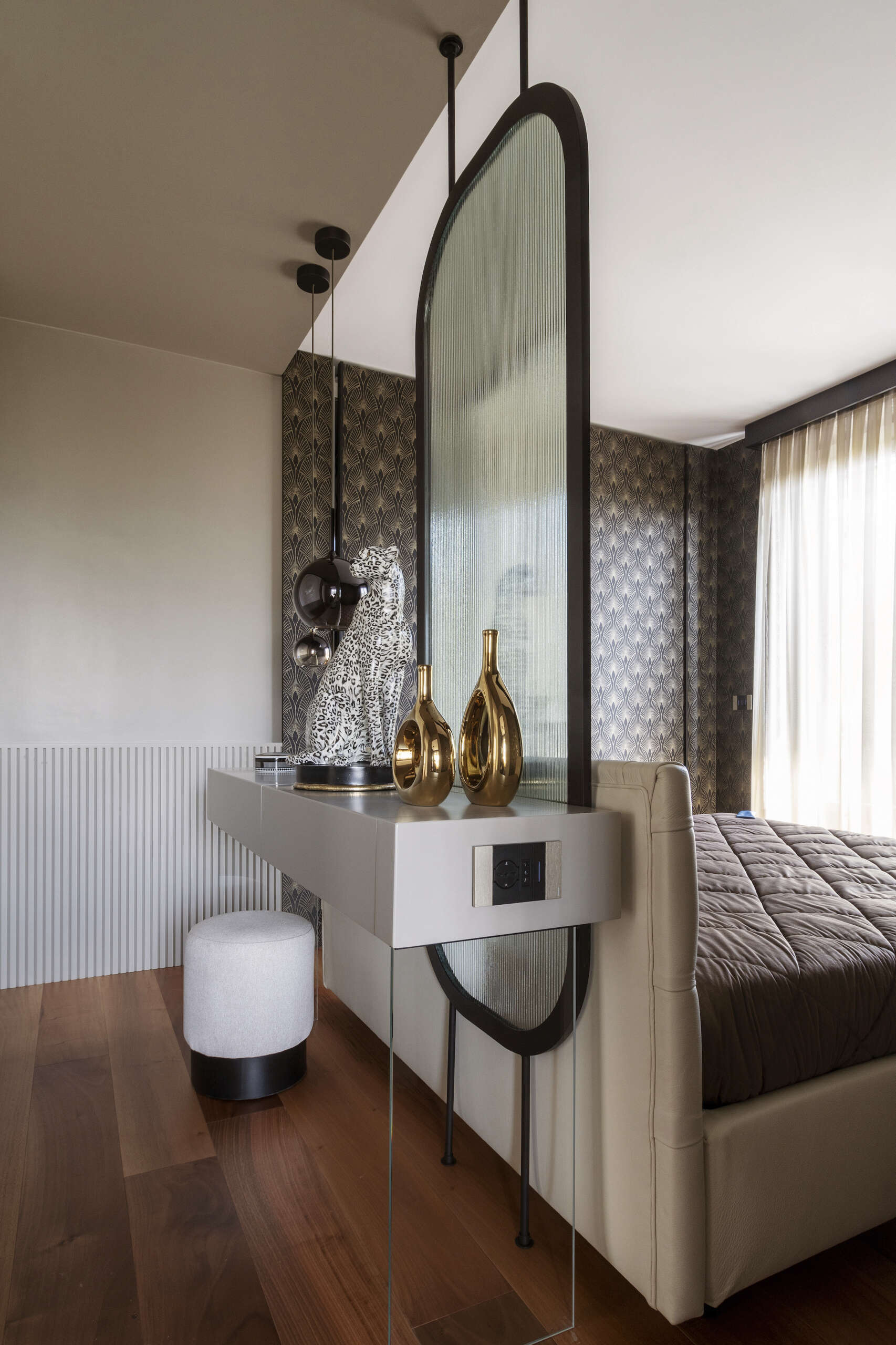
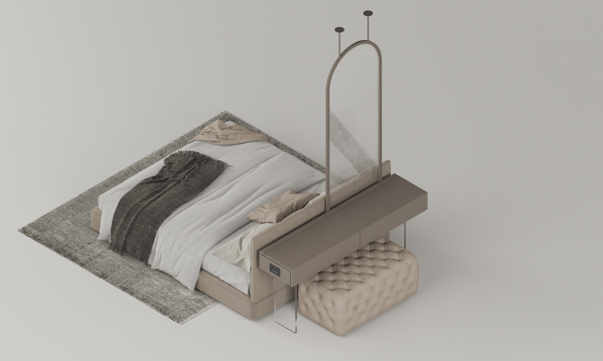
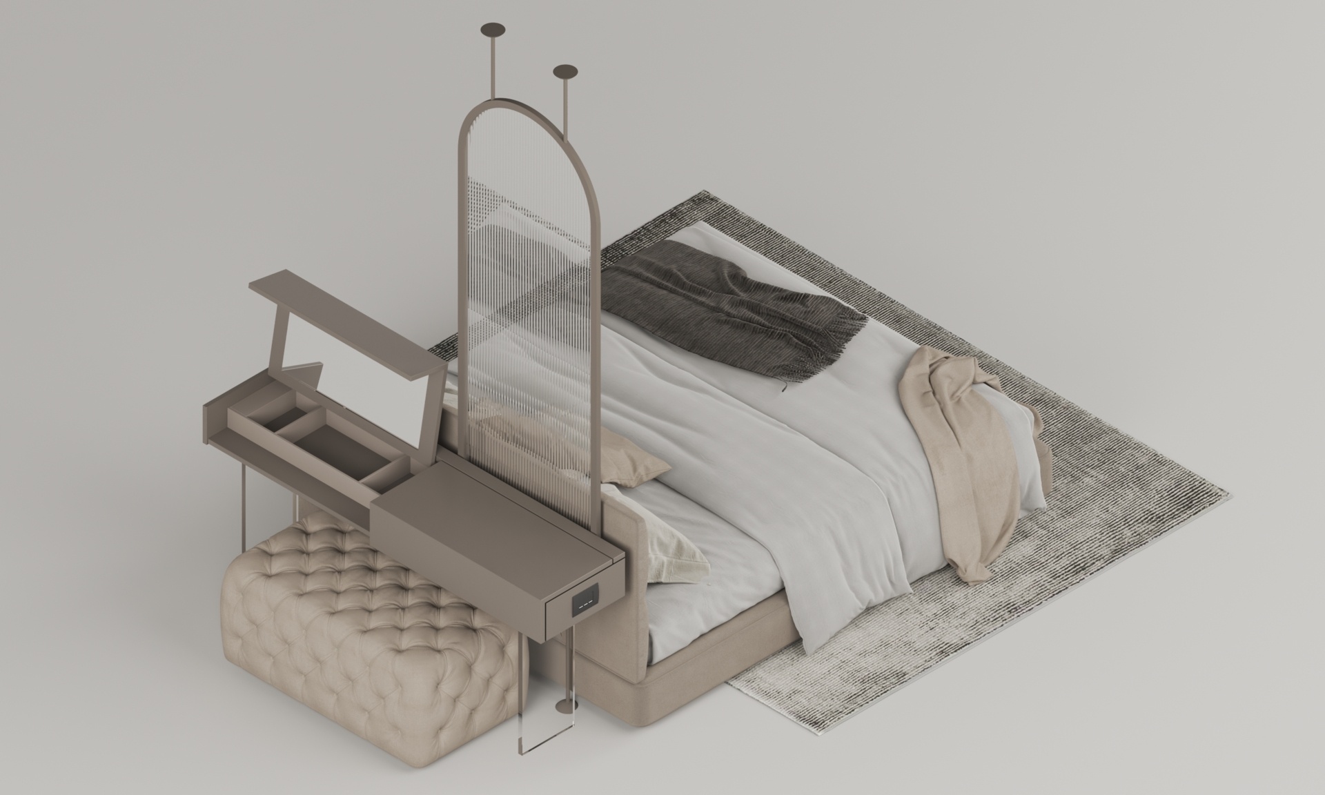
Behind the primary bed, a custom counter combines dressing and study functions. An arched screen of vertically ribbed glass divides the counter while transmitting light. The source notes that existing systems prevented new electrical services from being placed in the floor, so power and lighting had to be coordinated with the bespoke furniture.
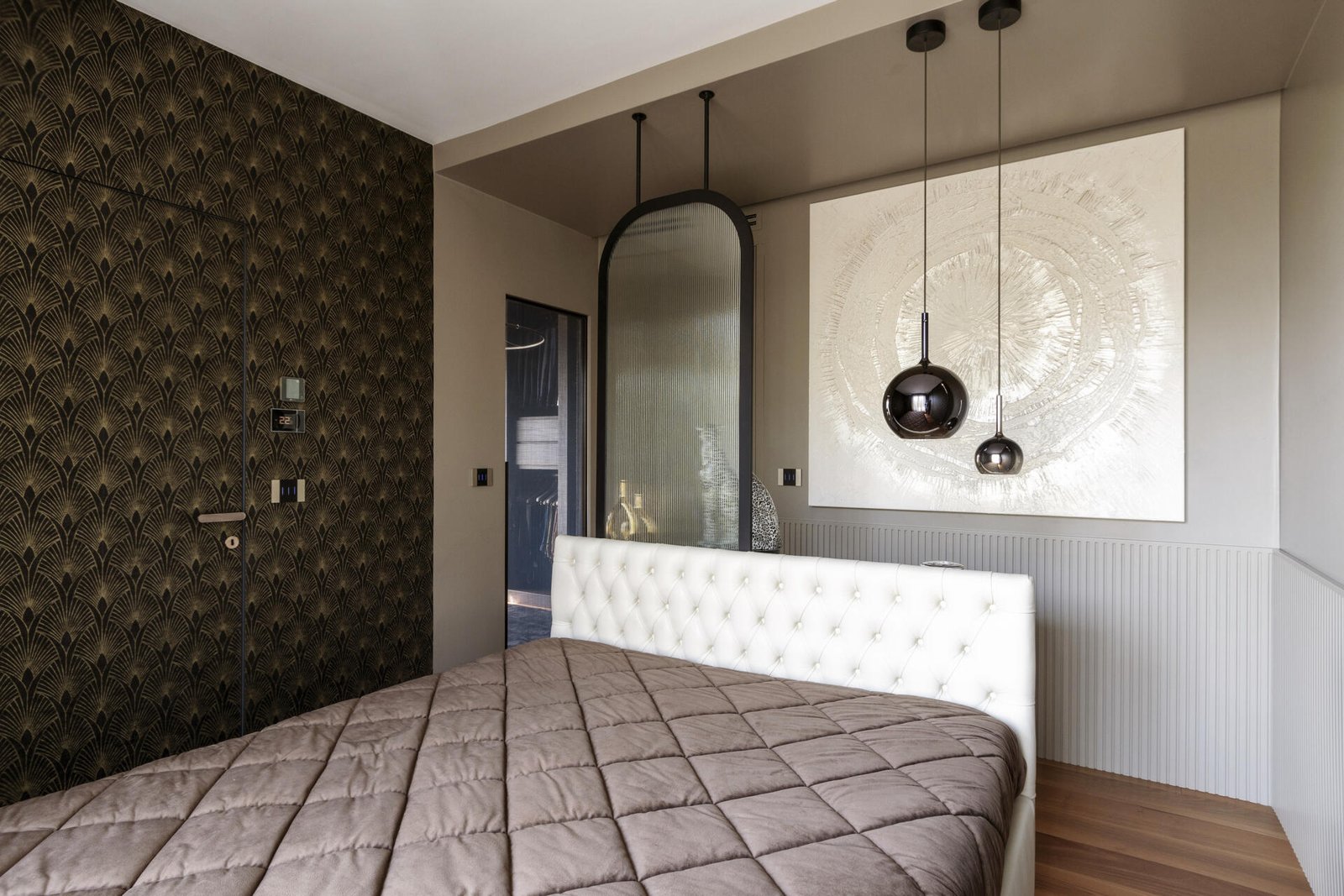
This is a useful example of a design constraint becoming an organising device. Instead of forcing a floor outlet into the existing construction, the furniture gathers several uses in one zone. The trade-off is reduced independence: modifying the bed, desk or electrical arrangement later may require changes to the whole assembly.
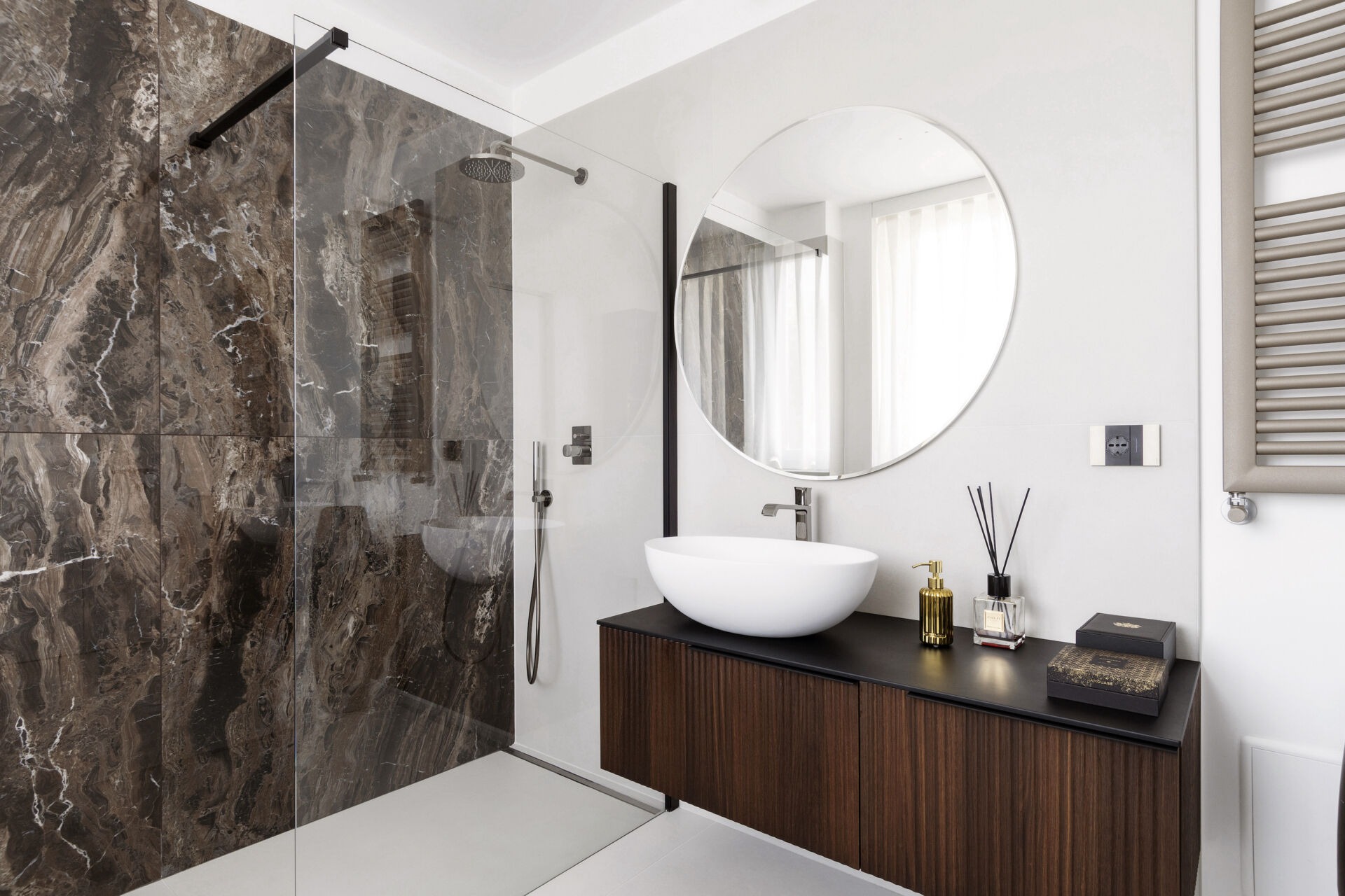
The plan shows three kinds of boundary

The plan clarifies three different boundary types. Transparent glass encloses the kitchen; thickened cabinetry defines the shared rooms and hides circulation; conventional partitions secure bedrooms and bathrooms. The project’s coherence comes from assigning each boundary a specific role rather than repeating one solution everywhere.
Project credits: Interior architecture: Maurizio Pol, KKArchitettura. Kitchen enclosure: HenryGlass. Kitchen cabinetry: Arrital. Photography: Vanni Stroppiana.
22 October 2026 — Expanded the visual sequence to cover the kitchen, storage, bedrooms, bathrooms and furniture design visualisations, with local captions and credits. Review: ArchUp Editorial Committee.
✦ ArchUp Editorial Insight
The renovation begins with a fixed pressure: much of the apartment’s partitioning and technical infrastructure already existed, while a family still needed clearer distinctions between cooking, gathering, sleeping, study and storage. The principal decision is to create separation without making every boundary opaque. A glass enclosure gives the kitchen its own room while preserving sightlines and borrowed daylight; curved cabinetry absorbs storage and doors; and a custom counter behind the bed combines dressing and work functions where new floor services could not be added. In ArchUp’s reading, the result is not an open plan or a return to conventional cellular rooms. It is a layered plan in which transparency, concealment and furniture each perform a different kind of division. The trade-off is that visual continuity can coexist with practical friction. Glass near a working kitchen needs frequent cleaning, sliding tracks require maintenance, concealed doors must remain legible enough for daily use, and bespoke furniture can make later changes more difficult than freestanding pieces would. The photographs demonstrate spatial continuity and material contrast, but they do not establish acoustic isolation or odour control. The project’s value lies in making constraints useful, provided its detailed components remain serviceable over time.